Table of Contents |
Bloom Valley Nursery operates as a local, family-owned plant nursery in the area, specializing in the sale of a wide variety of plants, trees, and gardening supplies. It aims to connect with gardening enthusiasts and homeowners in the community who share a passion for horticulture. While the client does not have an existing website, it envisions a digital presence that reflects the natural beauty of its plant nursery and resonates with gardening enthusiasts in the local community. As the client focuses on sustainability and creativity in its operations, the primary goal of the website is to enhance visibility in the local market, foster community engagement, and facilitate customer inquiries and orders. Its target audience comprises local gardening enthusiasts and homeowners seeking high-quality plants and gardening supplies.
Hours of Operation:
The client is considering three different color palette options and has asked you to recommend the best one for its website.
Directions: Choose one color palette from the three options presented below.
1. Review the three color palette options. It is important that you use what you have learned about accessibility and web design best practices when deciding among the three options.
2. Select one color palette to recommend to the client. You will use the colors in your chosen palette as you design the website.
3. Once you have selected the correct color palette, you will need to download at least one of the matching client logos to use in your website design. It is important that you do not mix and match logos among color palettes.
Color codes are provided with each color palette. You will use these codes to implement your choices in your website design.
You learned in the client scenario above that Bloom Valley Nursery envisions a digital presence that reflects the natural beauty of its plant nursery. Which of the following color palettes meets the client’s expectations? Are all the color palettes accessible to a wide audience, including customers with visual impairments?
Refer back to the UI/UX Design Concepts lesson for more details on color and accessibility.
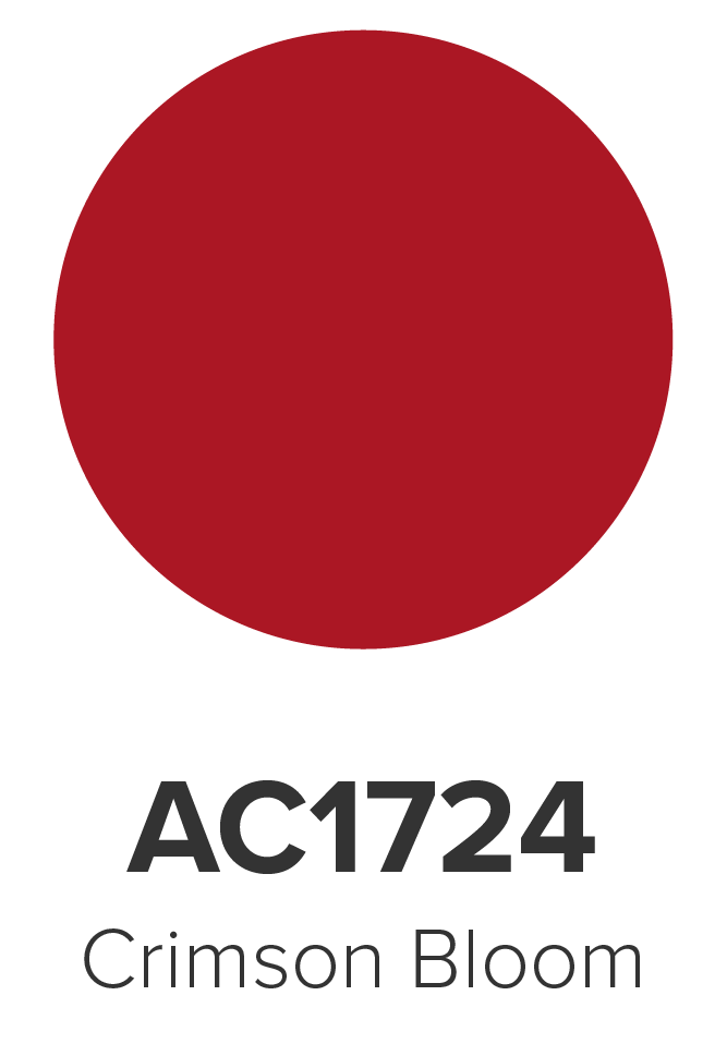
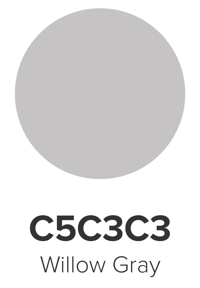
Color Palette 1 contains the following colors:
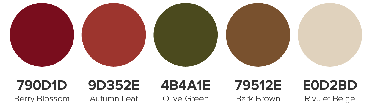
Matching logos are available for each color in Color Palette 1:

|

|

|

|

|
Color Palette 2 contains the following colors:
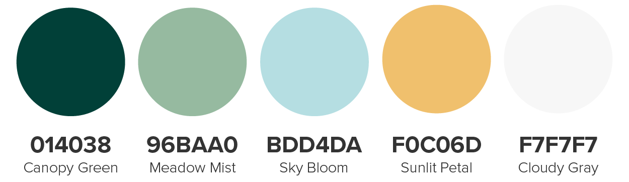
Matching logos are available for each color in Color Palette 2:

|

|

|

|

|
Color Palette 3 contains the following colors:
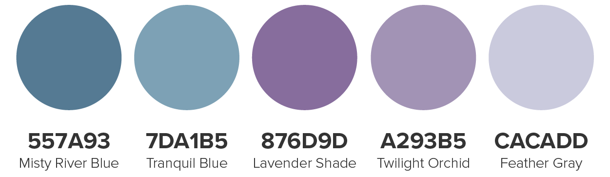
Matching logos are available for each color in Color Palette 3:

|

|

|

|

|
The client is considering three different font color options and has asked you to recommend the best one for its website.
Directions: Choose one font color palette from the three options presented below.
1. Review the three font color options. It is important that you use what you have learned about accessibility and web design best practices when deciding among the three options.
2. Select one font color to recommend to the client. You will use the font color you select as you design the website.
Color codes are provided with each font color. You will use these codes to implement your choices in your website design.
Which font color works best with the color palette you selected? Are all the font colors accessible to a wide audience, including customers with visual impairments? You will need to test how the font colors work with various background colors from your chosen palette and finalize your selection prior to submitting your project.
Refer back to the Typography and Web Fonts lesson for more details.
The client is considering three different typography options and has asked you to recommend the best one for its website.
Directions: Choose one typography option from the three options presented below.
1. Review the three typography options. It is important that you use what you have learned about fonts, accessibility, and web design best practices when deciding among the three options.
2. Select one typography option to recommend to the client. You will use the fonts in your chosen typography option as you design the website. It is important that you do not mix and match among the typography options.
Font names and sizes are provided with each typography option. You will use this information to implement your choice in your website design.
You learned that it is important for web designers to select fonts that are legible on-screen and align with the tone and purpose of the website. How will each font’s attributes impact the overall effectiveness of the page’s written content? Are the fonts web safe?
Refer back to the Typography and Web Fonts lesson for more details.


The client has provided the following nine images for use on the Gallery page. These images represent the products that the nursery would like to feature on its website. You will organize the images in a 3 X 3 grid pattern on the Gallery page (three rows and three columns). The clarity and dimensions of the images are appropriate for this layout. These images have been licensed from Adobe Stock Photos and may be used without citations in your project.
You will need to download all of the gallery images to your device in order to use them on your website. You can save each file individually or download and extract this ZIP file of all the images:
Bloom Valley Nursery Gallery Images.zip
Refer to the Images lesson for more details.
 |
 |
 |
 |
 |
 |
 |
 |
 |