Table of Contents |
User interface/user experience (UI/UX) refers to a field of study focused on promoting positive user interface and user experiences when interacting with technology. UI/UX focuses on a set of principles and best practices for designing effective digital experiences for users.
UI design is concerned with how the interface is structured, how information is presented, and how users interact with the visual elements and controls. Elements such as buttons, menus, forms, typography, colors, icons, and layout all need to be carefully considered during the design phase of the website’s pages. UI design also incorporates the concept of responsive web design (RWD), which is a website’s ability to adjust the UI design and layout based on the size and orientation of the device’s screen. RWD will be discussed in more detail in a later unit as it is important that the UI design concepts will need to be applied differently and dynamically depending on the screen’s size.
The user interface has a direct impact on the user’s experience and whether or not they will return to a site or use an application.
Effective user interfaces are focused on what is important to the user and make it easier for the user to accomplish their goals. An interface should be simple, easy to recognize, visually appealing, and easy to use.
EXAMPLE
Poorly designed search and filtering tools reduce the visitor’s ability to locate and purchase the product they want, likely causing the user to locate another, more effective retail site.
UX focuses on the user’s perception and satisfaction during or after their interaction with the product, service, or site itself. UX design aims to create meaningful and valuable experiences by understanding user needs and considering factors like usability, accessibility, efficiency, satisfaction, and the overall impact of the product on the user. The meaningful organization of content, the ease of navigation, accessibility, and even the emotional impact of the site can affect the user’s experience.
EXAMPLE
Poorly designed sites are not only displeasing to look at and difficult to use, but they also do not instill a sense of confidence and legitimacy regarding the organization or the site’s content.
| Considerations for UI | Considerations for UX |
|---|---|
|
|
User Interface/User Experience (UI/UX)
Refers to the field of study on how the design of a computer application or website’s interface can impact the perception of the user.
Responsive Web Design (RWD)
A design approach for user interfaces that addresses a range of device types and screen sizes and enables a user interface to automatically adjust.
Usability
The effectiveness, efficiency, and overall satisfaction of users interacting with a website or application.
Accessibility
The ability of individuals with disabilities to access the same benefits and resources from a site, system, or application.
While the set of principles varies, let’s take a look at five of the more common principles, including user-centered design, consistency, simplicity and minimalism, feedback and responsiveness, accessibility, and the power of color.
User-centered design focuses on ensuring all elements and design decisions are made from the perspective of the user and support their goals. Understanding the target audience, including their motivations and goals for using the site, is a critical first step in ensuring the design supports the intended audience.
Menus, headings, visual designs, and functionality should all be focused and aligned with the user’s needs and should make it easier for them to fulfill their goal.
User-Centered Design
A design approach wherein all aspects are designed to be focused on the user’s needs and convenience.
Consistency refers to the continuity of the site as a whole. Navigation menu styles and the organization of buttons should also remain consistent across an entire website.
The visual style and design of the site should not change from one page to the next unless the change is meaningful.
Also, processes and functions that are common among most sites should follow a similar sequence and flow. In other words, don’t reinvent the wheel when it comes to a simple user account registration process, for example.
By removing unnecessary elements and reducing visual clutter, the user interface can be focused on helping the user accomplish their goal. The purpose of a page should be clear to the user. Furthermore, by reducing the amount of unnecessary content, you will reduce the amount of time it takes for the website to load and generally improve performance.
Avoid unnecessary distractions and elements that take away from the site or page’s intended purpose.
The feedback and responsiveness of a site refer to when the site provides some indication that it has received the user’s command. If the user clicks on a button to start loading the web app, the button should visually indicate that the click has been registered and should show that the web app is loading.
Another aspect of feedback and responsiveness, on a more strategic level, is providing the users with an opportunity to provide feedback on their experience using the site and the site itself.
User feedback is a valuable gift to developers and should always be taken into consideration when making design revisions or changes.
The responsiveness in this case comes in the form of site changes in response to users’ comments and feedback.
The proper use of progress bars and loading spinners is important to the user’s perception as it helps them know that the software is working and has not stalled or hung.
EXAMPLE

Progress Bars
Visual indicators of how far along something is in a process.
Loading Spinners
Active visual indicators that software is currently loading or processing and has not stalled or frozen.
Accessibility is the concept of designing a site to be inclusive of all potential users, even those with disabilities such as visual or even physical impairments. Impairments can vary from permanent (paralyzed or missing arm), temporary (arm in a cast), or even situational (person holding a baby). Users with impairments often use special software or techniques to interact with websites.
EXAMPLE
The visually impaired use screen reader software that reads the content out loud for them as they navigate and interact with the site. As such, when including important images or graphics on a webpage, those visual elements need to include an alternative text description. This allows the screen reader software to describe the image to the user as opposed to skipping over it altogether.
Additionally, navigation menus should provide some indication of what page the user is currently on; however, this is usually done with some visual cue, such as an arrow, symbol, or use of a different color for the navigation menu button. Most screen readers won’t read aloud symbols and do not mention the different colors of the menu buttons, so additional location cues that are hidden from view should be included in the menu.
Visual impairment might also include someone who simply has poor eyesight. As such, a site should be designed with appropriate levels of contrast and be able to scale to make it easier to read. The browser’s native zoom feature is one option users can utilize; however, the site needs to use a responsive design technique to ensure all content scales correctly. Another option is to provide high-contrast and zoom options directly on the website that allow users to easily select from different text sizes and levels of contrast and have those settings apply to the entire website.
Another possible visual impairment that we need to be aware of and design our site to work with is color blindness. Color blindness does not always refer to someone who can only see in shades of black and white, most people affected with color blindness struggle with seeing red and green colors and less commonly blues and yellows.
EXAMPLE
Samples of color blindness.| Vision Type | Example |
|---|---|
| Normal Vision |

|
| Protanopia / Deuteranopia |

|
| Tritanopia |

|
| Monochomacy |

|
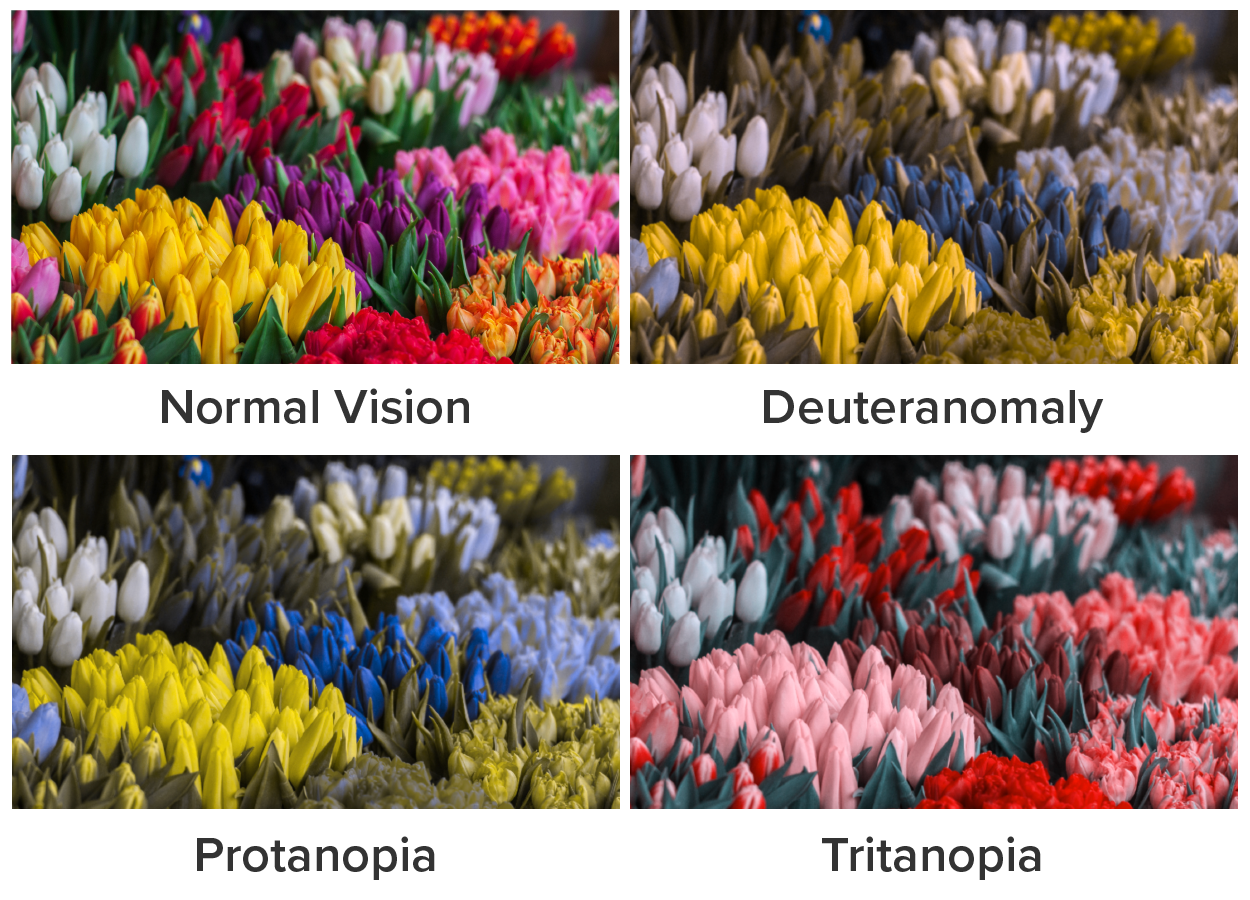
When designing for color blind accessibility, remember to never solely use color as emphasis, meaning, or an indicator of anything without backing it up with something non-color related. For example, if you wanted to emphasize a single word in a paragraph using a background color, you should also include another aspect to emphasize the word such as bold font, underline, italics, etc. Additionally, due to the relative rareness of tritanopia, which is the inability to perceive yellow and blue, yellows and blues are some of the safer colors to use. Regardless, remember to avoid using color as the sole element for communicating meaning or additional information.
There are organizations that provide sets of standards that serve as valuable guides to what elements need to be made accessible in order to provide an all-inclusive website.
EXAMPLE
Section 508 of the Rehabilitation Act and the Web Content Accessibility Guidelines (WCAG 2.1) of the World Wide Web Consortium’s (W3C) Web Accessibility Initiative are two bodies that provide extensive research, recommendations, and solutions to provide accessible information technology resources.
The Americans with Disabilities Act (ADA) is a federal law that governs everything related to website accessibility for people with disabilities. The law dictates that any website belonging to a government organization or private business that is accessible to the public must be accessible to individuals with disabilities.
Some of the basic concepts of accessibility include providing the following:
For your Touchstone, you will be asked to perform an accessibility test for your website design choices using Adobe's accessibility tools here: https://color.adobe.com/create/color-accessibility.
Screen Reader Software
Specialized computer software that reads content on the screen out loud for the user and that is primarily used by individuals with visual impairment.
Alternative Text Description
A written description of an image’s content that is included with the image. Used when an image cannot be displayed or when using screen reader software.
Section 508 of the Rehabilitation Act
A requirement that federal agencies ensure their electronic information and communication technology are accessible to people with disabilities.
Web Content Accessibility Guidelines (WCAG 2.1)
Guidelines developed as part of the World Wide Web Consortium’s Web Accessibility Initiative to provide detailed documentation and guidance for developers to ensure accessibility on websites, web applications, and other electronic resources.
Americans With Disabilities Act (ADA)
A U.S. civil rights law that prohibits discrimination based on a person’s disability.
Color plays a significant role in influencing emotions and can have a profound impact on website visitors’ perceptions, moods, and behaviors. Color theory is used by web designers to communicate a message, feeling, or action to the target audience. Color theory focuses on guidelines and the meanings of different colors. Colors can evoke different emotional responses, and understanding the psychological effects of color can help designers create websites that effectively communicate and resonate with users. Furthermore, the combination of different colors that complement each other can also influence the perceptions of the site’s visitors, as the colors can invoke a sense of professionalism.
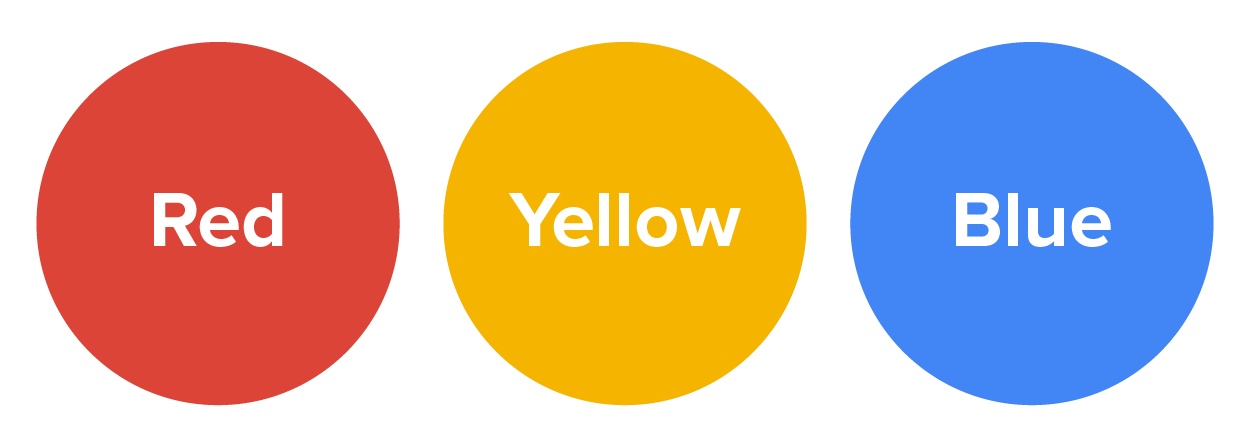
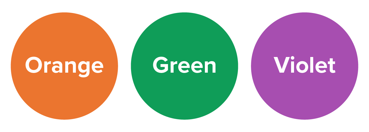
Designers may refer to a color wheel diagram when selecting a color palette for their site. Color wheels model the relationship between primary, secondary, and tertiary colors. Basic color wheel diagrams often have 12 colors representing three primary colors (red, yellow, and blue), three secondary colors (orange, green, and violet), and six tertiary colors formed from mixing a primary color with a secondary color (red/orange, yellow/orange, yellow/green, blue/green, blue/violet, and red/violet).
EXAMPLE
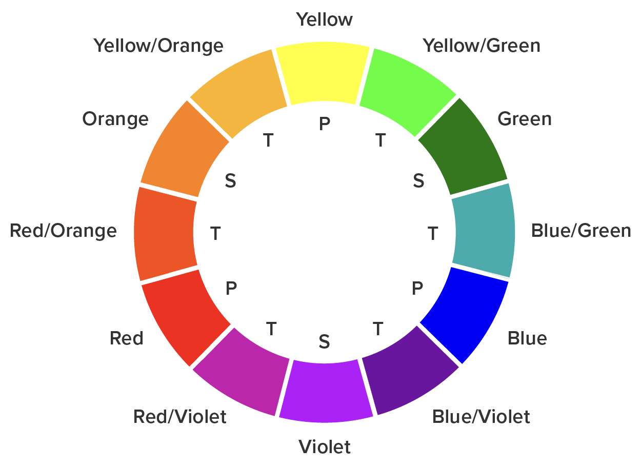
Color wheels can have more than 12 basic colors. The web-safe color palette, for example, consists of 216 colors that have been standardized to display consistently across browsers.
It is important to understand the basic psychology of colors, how they impact the viewer, and how to form color palettes that align with the site’s purpose and the brand’s style. We will start with understanding how color affects viewers.

|

|

|
| Red is associated with strong emotions such as passion, excitement, and urgency. It can create a sense of energy and grab the user’s attention. | Blue is commonly associated with calmness, trust, and reliability. Lighter shades of blue can create a sense of serenity, while darker blues convey professionalism and authority. | Yellow is often associated with optimism, happiness, and energy. It can grab attention and convey a sense of warmth and friendliness. However, too much yellow can be overwhelming or cause feelings of anxiety. |

|

|

|
| Green is closely associated with nature, growth, and harmony. It can evoke feelings of relaxation, balance, and freshness. Green is often used in designs related to health, sustainability, and outdoor activities. | Orange combines the energy of red with the friendliness of yellow. It can evoke feelings of enthusiasm, creativity, and warmth. Orange is often used to create a sense of excitement or to call attention to specific elements on a website. | Purple is often associated with luxury, royalty, and creativity. It can evoke a sense of elegance, mystery, and spirituality. Lighter shades of purple can have a soothing effect, while darker shades can be associated with power and sophistication. |

| ||
| Neutral colors include black, white, gray, tan, and brown. White conveys cleanliness, simplicity, and purity. Gray can evoke feelings of professionalism, stability, and balance. Black is associated with sophistication, power, and formality. | ||
There are several variations of the basic colors discussed in the previous table that can have different effects, but the overall effect remains the same. Every color chosen should be used strategically and thoughtfully to convey the right impression to the target audience.
EXAMPLE
A random color should never be chosen and used within a webpage just to add a pop of color or because that color hasn’t been used yet.
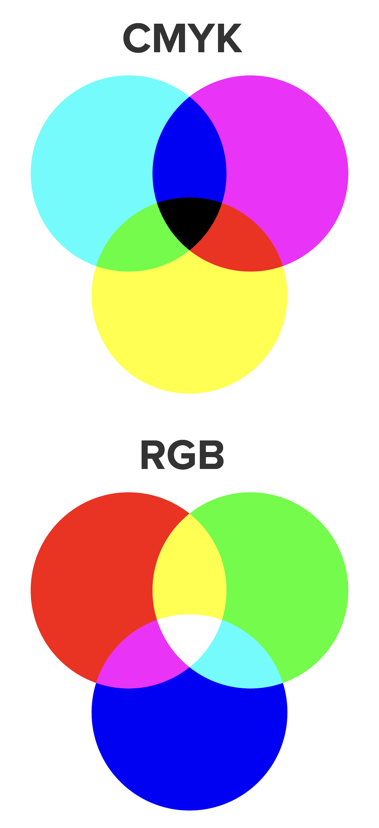 As we learned earlier, secondary and tertiary colors are made by mixing different colors together. There are two main color modes for mixing colors in graphic design: CMYK and RGB. RGB (red, green, and blue) is used primarily for digital designs, and CMYK (cyan, magenta, yellow, and black) is used primarily for printed designs. In fact, you may have noticed that a color printer has four main colors of ink. CMYK has a limited color palette designed for precise colors that can be reproduced accurately in any printer. We will focus on the RGB color mode in this course, but web developers may be asked to work with preexisting CMYK colors in their projects. In the RGB color mode, computer colors are made up of the different values for red, green, and blue.
As RGB is the standard color mode for digital devices, there are multiple ways to represent RGB colors. One of the more common methods is to use Hex codes. “Hex” is short for hexadecimal, which is a base-16 numbering system (decimal is our normal base-10 numbering system).

Each RGB Hex color starts with the pound/hash symbol, followed by a six- or eight-digit Hex number. The six digits are made up of three pairs of Hex digits. Each pair represents the amount of that color from 0 to 255(ff), 0 being 0% and 255 being 100%. Another commonly used method is to use the RGB() function, which allows you to use decimal values from 0 to 255 in place of Hex values. If there is a fourth pair of Hex digits, it refers to opacity, with 0 being invisible and 255(ff) being fully visible. There is also the RGBA() function, which takes a fourth value ranging from 0.0 to 1.0 (0.0 being 0% and 1.0 being 100%) to indicate the opacity. The “A” in RGBA stands for Alpha Channel, which is a color component that indicates the amount of opacity.
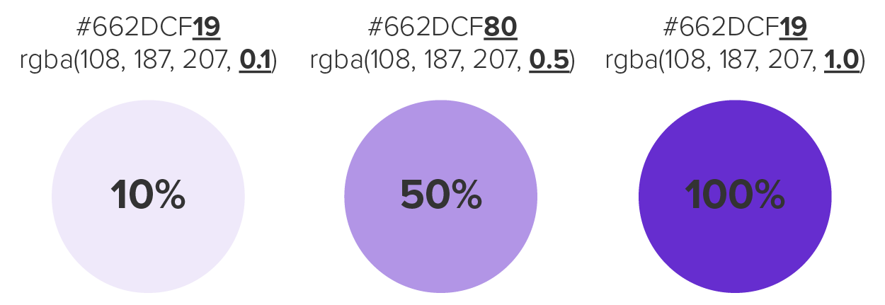
You can see an interactive example of the different methods of representing colors in the W3schools.com color picker. Choose a color and wait for the page to update; you will see the color represented in the RGB, HSL (hue, saturation, and lightness), and Hex versions.
CMYK
Stands for cyan, magenta, yellow, and black. It is the color mode used primarily for printing.
RGB
Stands for red, green, and blue. It is the color mode used primarily for digital work.
Opacity
The opposite of transparency; how solid an object appears.
Alpha Channel
A component of digital graphics that refers to the opacity of an object or color.
Additionally, the organizational branding strategy needs to be considered as well. Branding is the use of colors, logos, and typography to establish brand recognition, the ability of individuals to quickly recognize a particular company based solely on these elements. Branding is not typically something that a web designer or developer has any say about. Instead, designers are informed about the organization’s branding strategy and must stay within the given color palette and other guidelines.
In a situation where you, as the web designer and developer, are in charge of choosing the site’s colors, there are some guidelines that can help you design an effective color palette.
1. Choose two to three primary colors to serve as the core colors that can identify your brand and should be the primary colors of the logo.
EXAMPLE
2. Secondary colors are used to highlight and complement the primary colors. It is common to use anywhere from one to six colors, but more could be used as needed.
EXAMPLE
3. Tertiary colors are the third level of colors added to a brand’s color palette. Tertiary colors should be complementary to the primary and secondary colors. While not always used on each page, or even any page of a site, tertiary colors can add diversity to the overall design when they are needed.
EXAMPLE

4. While black may or may not be part of a color palette, one best practice for using black in digital settings is to NOT use pure black. Pure black, on a computer, means using a value of 0 for red, blue, and green. Pure black elements on digital devices can be visually overpowering, taking attention away from other elements. Pure black also creates more strain on the viewer’s eyes. Instead of using pure black, the best practice is to use a very dark shade of gray, but not pure black.
EXAMPLE
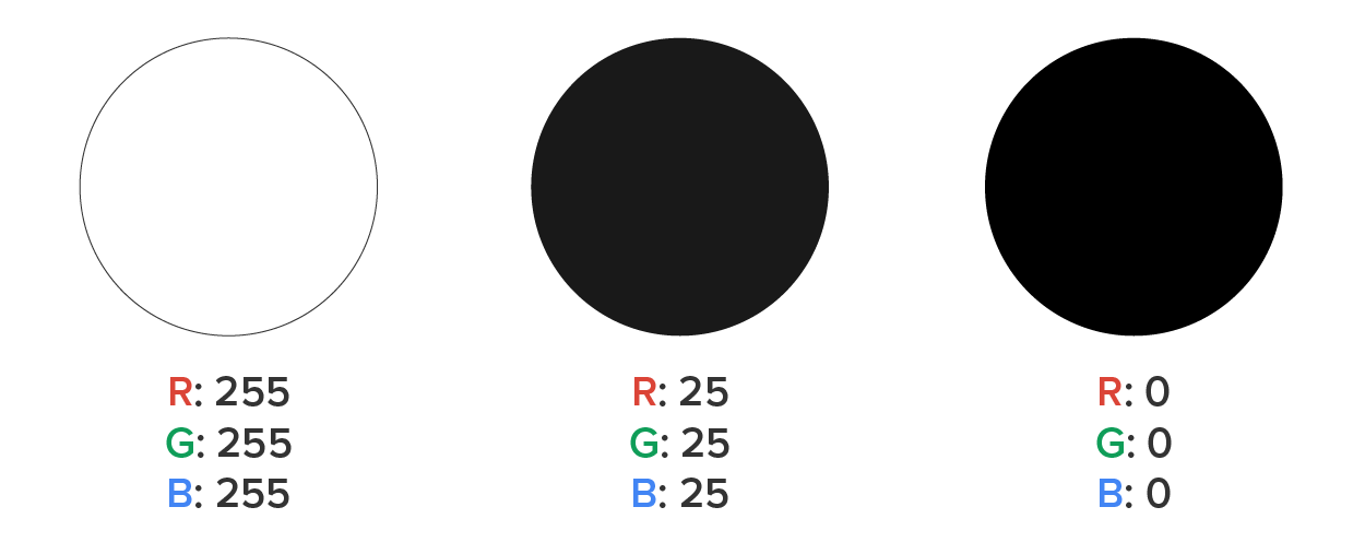
Pure black is made using a value of 0 for red, green, and blue.
Pure white is made using the maximum value of 255 for red, green, and blue.
As such, the ideal black for a website would be something close to 25-red, 25-green, and 25-blue.
When designing a color palette, make sure to carefully consider your audience and the intended message and attitude that you want to convey to your audience. The tone of your site and its content should align with the colors you choose.
EXAMPLE
A site for extreme motorsports should want to convey excitement and adventure, instill a sense of edginess, and appeal to younger audiences. Orange, red, and high-energy bright greens and blues should be some of the colors chosen. Colors like pastels, beige, coffee, and dusty browns and greens would not align with the site’s high-energy content.
On the other hand, a website for a relaxing spa should not use high-energy colors; instead, it should use calming greens, light browns and tans, and soft blues and should convey elegance and relaxation.
Visit Usability.gov for more color basics.
Branding
The use of colors, logos, and typography to establish brand recognition, the ability of individuals to quickly recognize a particular company based solely on these elements.
Let’s practice with a real-world example now that you have learned how color can impact your site audience.
IN CONTEXT
Returning to the bakery website, let’s put together a color palette that meets the needs and tone of the site. The owner sent us the following image of the store for inspiration:

Directions: Consider the following questions about a bakery business. Reveal the answers to see if you’re on the right track.
We want to choose colors and combinations that reflect the chosen descriptors for the company’s online presence. For example, “fresh, bright, and clean” lends itself to lighter colors that are bright. Additionally, “professionalism” is conveyed with more elegant color choices with lower amounts of contrast. “Natural” leans more toward earthy colors, such as cream, wheats, yellows, and light browns.
Directions: Looking at the following color palettes, which one do you think works best for a bakery?
Color Palette 1:

Color Palette 2:

Color Palette 3:

Color Palette 4:

Color Palette 5:

There are a couple of the choices that may work overall, depending on the theme or style of the bakery. Color Palette 1 could be made to work, but the colors are a bit dim and the bakery should be bright and clean. Color Palette 3 is bright and earthy, but the colors are too rich. Color Palettes 4 and 6 are the least ideal as the colors are too dark or high energy for the bakery. The best choices are palettes 2 and 5. They are bright, clean, and earthy.
You will review client options and make recommendations for color and typography in Touchstone Task 1: Selecting Your Client and Planning Your Website Design.
Source: This Tutorial has been adapted from "The Missing Link: An Introduction to Web Development and Programming " by Michael Mendez. Access for free at https://open.umn.edu/opentextbooks/textbooks/the-missing-link-an-introduction-to-web-development-and-programming. License: Creative Commons attribution: CC BY-NC-SA.
REFERENCES
Interaction Design Foundation. (n.d.) Color Theory. Retrieved from https://www.interaction-design.org/literature/topics/color-theory