Table of Contents |

Typography is the art and technique of arranging type or text, including letters, numbers, and symbols, in a visually appealing and readable manner. It involves the design and selection of fonts, the layout and organization of text, and the overall presentation of written information. When it comes to typography in web design, there are several important considerations to ensure the text’s readability and aesthetics and help improve the overall user experience. You will learn about these different considerations and how font attributes can impact the overall effectiveness of the page’s written content.
Typography
The art and technique of arranging type or text, including letters, numbers, and symbols, in a visually appealing and readable manner.
A typeface, often referred to as a font, is a set of characters with a consistent design and style. While every typeface is different, there are categories of typefaces that group together different fonts, which include serif, san-serif, script, monospaced, and display. These categories represent typefaces that include certain common characteristics.
A serif typeface includes little projections that are present at the ends of the stroke. The projections are called serifs. Times New Roman is an example of a serif typeface. While serif typefaces are ideal for printed materials, on the web, they are better for larger-sized text such as titles and large headings. When using serif for body text, which is usually smaller, computer screens often struggle to display the smaller details.
EXAMPLE
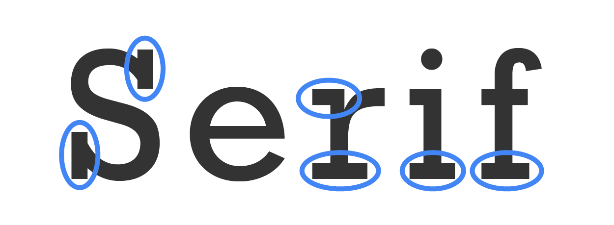
A sans-serif typeface does not contain the projections at the end of the letter’s stroke. Calibri is an example of a sans-serif typeface. Sans serif is generally more suitable for smaller text on a webpage as it is easier for monitors to clearly display.
EXAMPLE

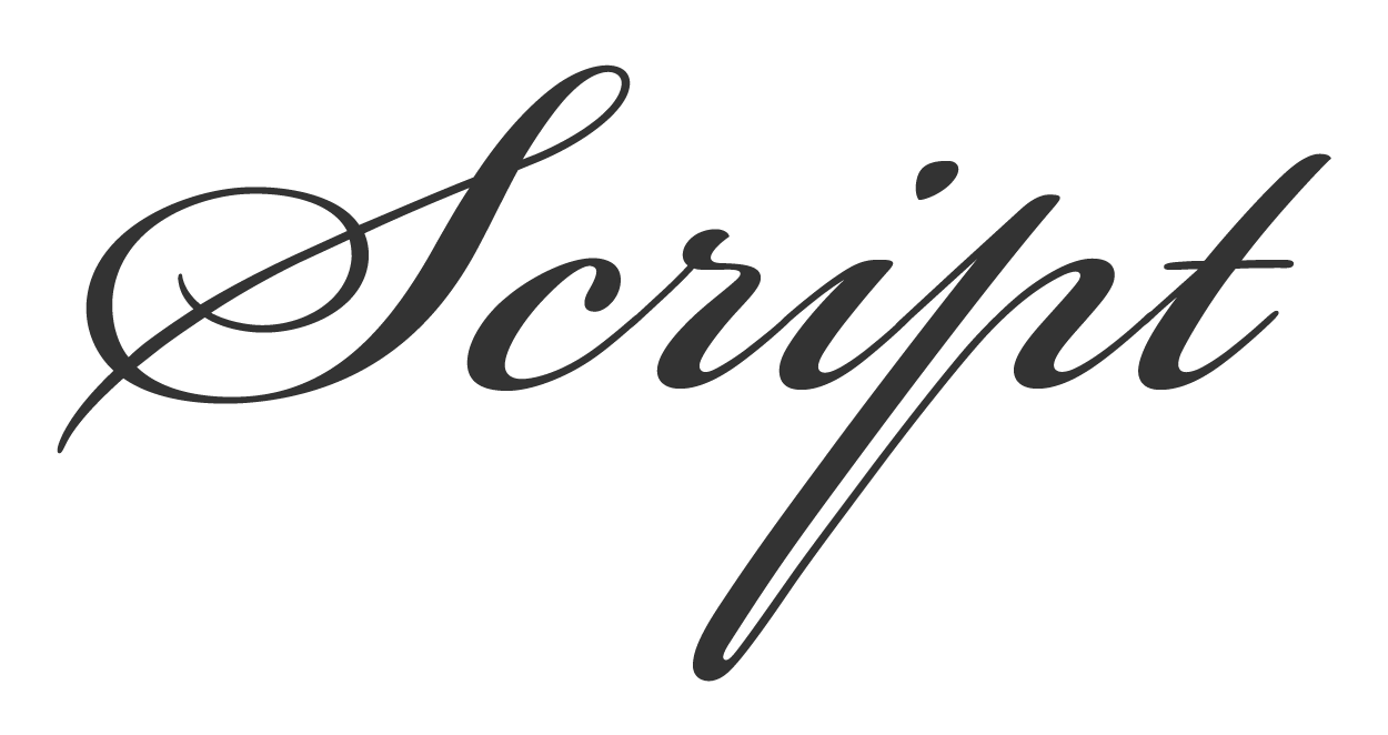
A script typeface is designed to mimic the fluid strokes of handwritten cursive or print text. Script typefaces are sometimes classified as display. Edwardian Script is an example of a script typeface. Because script typefaces are thin, curvy, and detailed, they are often used for large headings and titles. Script typefaces should always be avoided in smaller body text.
EXAMPLE
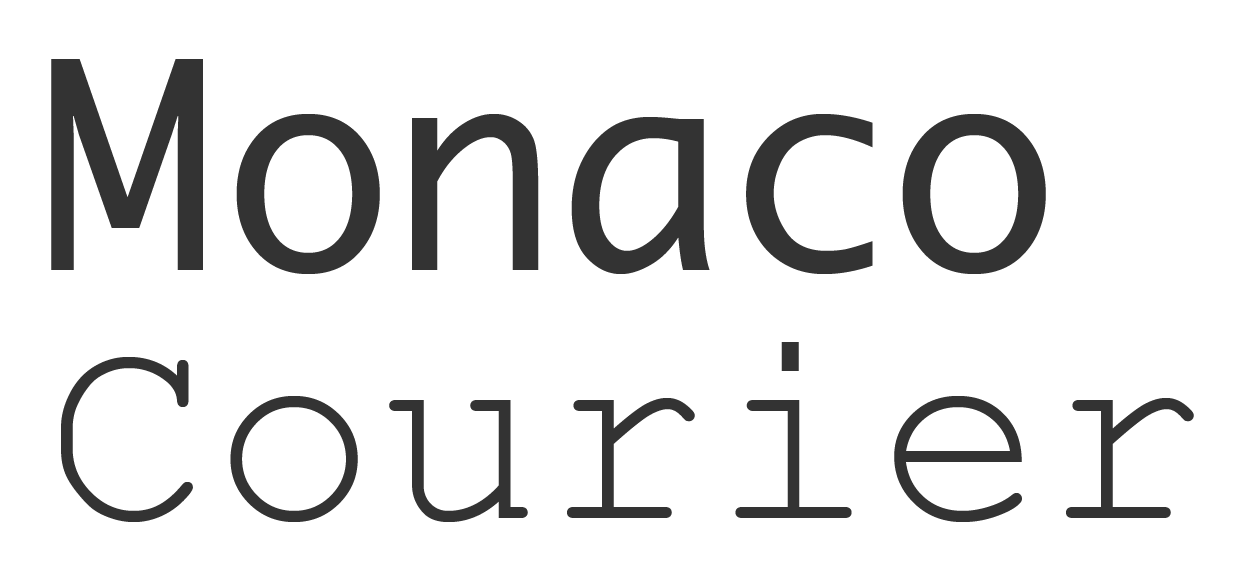
In a monospaced typeface, the characters all take up the same amount of horizontal screenspace and are evenly spaced apart. Monospaced fonts can be serif like Courier New or sans serif like Consolas. Monospaced typefaces are often used to represent computer programming code or commands on a webpage. Because of the design of some typefaces, capital Is (as in “Infant”) are often mistaken for lowercase ls (as in “color”), which makes them a poor choice for displaying computer code due to the high level of detail and clarity needed to show programming code.
EXAMPLE
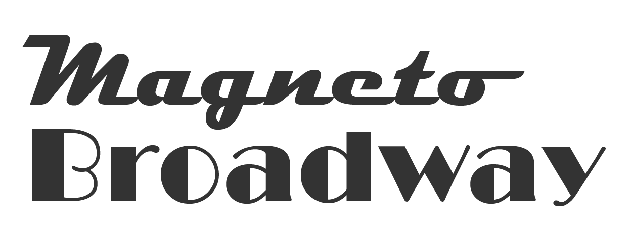
Display typefaces can vary widely in appearance, are usually unique and heavily stylized, and can be practical and used as a novelty. Magneto and Broadway are two examples of display typefaces. The use of display typefaces is often limited due to readability concerns. Displays are good for printed materials, logo text, and large headings and should be avoided for smaller body text.
EXAMPLE
A font family refers to a collection of related typefaces that incorporate the same overall characteristics and design but vary by weight, dimensions, and italic slant. Weight refers to the thickness of the letter strokes and is where the term “bold” comes from. Bold typefaces have heavy and thick lines, while light typefaces have thinner lines. Bold text can show emphasis as well as draw the user’s attention. Typefaces in a font family can also vary by the horizontal dimensions, which include narrow and rarely wide. These variations simply change the width of each character as well as the spacing. Italics is another variation of a typeface within a font family. Italics is when the letters of the font are slanted to the right and are often used for emphasis and to make words or lines of text stand out from the rest.
It is important for web designers to select fonts that are legible on-screen and align with the tone and purpose of the website.
EXAMPLE
The font selection for a relaxation spa’s website should be light, simple, and elegant (smooth and flowing versus blocky, rigid, or complex). This helps visually convey a similar perception of calm and relaxation. Heavy and blocky text would conflict with the overall image that the organization would want to convey.
Typeface
A collection of characters with consistent properties and visual attributes, often referred to as a “font.”
Serif Typeface
Any set of characters that include small projections on the ends of the strokes of each letter.
Sans-Serif Typeface
Any set of characters that do not include the small projections or “serifs” on the ends of each letter’s stroke.
Script Typeface
A set of characters whose design resembles natural handwriting.
Monospaced Typeface
A set of characters in which all characters take up the same horizontal space and are evenly spaced apart.
Display Typeface
A special character set that is unique, heavily stylized, and often used as a novelty or in graphic design.
Font Family
A group of typefaces that possess the same design elements and style but vary by weight, width, italics, and possibly other attributes.
In addition to the font family variations themselves, there are type properties that can have an impact on the readability and overall aesthetics of a webpage’s text. Overall, the following font attributes contribute to the overall layout of a page’s text-based content. Let’s explore them and their impact on visitors.
Font Attributes
Different design, layout, and arrangement characteristics of typefaces that change their appearance and readability.
Kerning refers to the spacing of individual letters from each other. Too much kerning makes it difficult for the viewer’s brain to connect the letters into a word. Not enough kerning can make text look odd and make it difficult for the viewer’s brain to see the individual letters and make sense of the words.
Kerning
The amount of horizontal space and overlap of individual characters that helps visually group letters into a word.
Pronounced “ledding,” leading refers to the strips of lead metal that were used back in the day of printing presses to space one line of text away from the next lower line of text. The purpose remains the same today, but it is often referred to as “line spacing.” Leading today refers to the amount of space between the baseline of one line of text to the baseline of the upper or lower line of text. Lower amounts of leading help visually connect lines of text together as a unit, such as a paragraph. Too much leading and the lines of text appear separate and unconnected. Too little leading and the lines of text become difficult for our eyes to follow as well as keep track of where in the paragraph of text we are.
Leading
The amount of space between the baseline of one line of text to the baseline of the upper or lower line of text.
The text alignment refers to where the spacing of the text extends from. For example, left-aligned text means the letters start flush to the left margin and extend out to the right from there. Right-aligned text does the opposite. Centered text starts from the middle of the screenspace and extends out in both directions. The left and right alignment can be dictated by culture, like Arabic and Hebrew writing. Alignment plays a role in visual aesthetics and can help guide a reader’s eyes along the body of text. Centered alignment is often used for taglines under a logo or site title. Centered text should be avoided in most other situations as it can make a page appear messy because of the jagged appearance of both the left and right sides of the body of text.
EXAMPLE

Justified text is a special alignment that ensures the paragraph takes up as much space as possible by automatically adjusting the spacing between words. This makes a paragraph look like a block of text where both the left and right appear to line up against the margin.
Text Alignment
The direction from which lines of text begin and extend from.
Text contrast is an important consideration with webpage text as it can have a large impact on the readability of text as well as the visual flow. Contrast refers to a detectable difference between different objects. In the case of text, contrast most often refers to color, but it can also refer to a clear visual difference in any of the font’s attributes. Kerning, leading, weight, and, of course, typeface can all be used to create contrast, which can draw attention and most certainly aid in readability.
Text Contrast
The amount of visual difference between different text, such as color, size, and weight.
White space is any empty space between different paragraphs or sections of a webpage. The amount of white space between objects can impact the perception and the viewer’s ability to visually navigate the page’s content. White space can be used strategically to make one section stand apart from the rest and lower the visitor’s anxiety by reducing the busyness of a page.
White Space
The space between text and visual elements that contains no content and creates a visual separation.
Typography hierarchy is the overarching strategy of using typography to provide a clear hierarchy of information on a page. Using appropriate typefaces and white space, varying the font weight, and providing adequate contrast help draw the viewers’ attention, guide them through the page, and indicate the information’s relative importance.
Typography Hierarchy
The use of font size and weight to visually guide viewers to important content.
Web-safe fonts refer to font families that come preinstalled on all or most modern operating systems. When you select a typeface for your website, if a visitor’s computer does not have that specific font installed, it will default to one of the built-in fonts to render the page. This often has a negative impact on the design and appearance of the site and will not appear as intended. Additionally, these fonts are also considered accessible. This simply means that the font families are designed in such a way that they are easier to read on most display screens.
EXAMPLE
Some of the common accessible web-safe fonts include the following:Arial (sans serif)
Arial Black (sans serif)
Tahoma (sans serif)
Times New Roman (serif)
Verdana (sans serif)
EXAMPLE
Other web-safe fonts that are not considered as accessible as the ones above include the following:Courier New (monospaced)
Georgia (serif)
Impact (sans serif)
Trebuchet MS (sans serif)
Regardless of accessibility, using any of these font families will ensure the vast majority of your visitors will be able to see your site as you have designed it and with the font you intended to use. When you select fonts that are not considered web safe, there is a good chance that your visitor may not have the font installed, and their web browser will fall back to what is defined in the browser as a last-chance font.
But what if you really want to use a typeface that is not web safe? There is an option that does not rely on the fonts installed on the visitor’s computer.
Web-Safe Fonts
Typefaces and font families that are preinstalled and available on most computer operating systems.
When web designers want to use typefaces that are not considered web safe, their options include embedding the font file into the website itself or linking out to an online font source such as the Google Fonts API. Remember that an API is a web service that helps different systems communicate and share information via the web. The Google Fonts API is a web service that allows users to download or link to Google’s open-source fonts for use on their websites.
If you go with the first option of embedding a font file, such as a .TTF, .OTF, .WOFF, or .WOFF2, directly into your web server alongside the site files, it allows the site’s code to access the custom font from the file and transfer it to the user’s computer (temporarily; it does not install the font on the user’s system). It can then be rendered in the browser. The concern with this approach is licensing. Not all fonts are free, and many are licensed to the user who purchased them. When we then embed this font into the site, there is the potential to violate the license, especially if the user is able to download the font file from the web server.
The second option avoids this as all fonts from Google Fonts can be used and downloaded freely. This avoids the licensing issue since all Google Fonts are free to use and download and are open source. Additionally, using Google Fonts is easy to do. To use a Google Font on your website, you simply need to use the HTML <LINK> tag and point it to the address of the Google Fonts API that includes the font family and other possible attributes.
Let’s take a closer look at how to use Google Fonts on a website with the following HTML code snippet:
EXAMPLE
<head>
<meta charset="utf-8">
<link rel="stylesheet" href="">
<style>
body {
font-family: 'Tangerine', serif;
font-size: 48px;
}
</style>
</head>
In this example HTML code snippet, the <LINK> tag points its “href” attribute to the Google Fonts API at  .
.
EXAMPLE
<head>
<meta charset="utf-8">
<link rel="stylesheet" href="">
<style>
body {
font-family: 'Tangerine', serif;
font-size: 48px;
}
</style>
</head>
The “?” comes directly after the website address and indicates the beginning of a query string. The query string is an optional part of the URL that sends data back to a server.
EXAMPLE
<head>
<meta charset="utf-8">
<link rel="stylesheet" href="">
<style>
body {
font-family: 'Tangerine', serif;
font-size: 48px;
}
</style>
</head>
The text after the “?” is called a key-value pair. The key-value pair varies based on the action you want it to perform. In this case, the key-value pair specifies the font family we want to import, Tangerine.
EXAMPLE
<head>
<meta charset="utf-8">
<link rel="stylesheet" href="">
<style>
body {
font-family: 'Tangerine', serif;
font-size: 48px;
}
</style>
</head>
A set of <STYLE> tags can be used to apply the font to the entire webpage body.
EXAMPLE
<head>
<meta charset="utf-8">
<link rel="stylesheet" href="">
<style>
body {
font-family: 'Tangerine', serif;
font-size: 48px;
}
</style>
</head>
Within the <style> tags, the CSS font-family property is assigned the new “Tangerine” typeface. This will apply the Tangerine typeface to the entire webpage body.
Notice above that the properties in CSS that are multi-word always use hyphens. While we refer to a collection of similar fonts as a “font family,” the CSS property is “font-family.”
EXAMPLE
<head>
<meta charset="utf-8">
<link rel="stylesheet" href="">
<style>
body {
font-family: 'Tangerine', serif;
font-size: 48px;
}
</style>
</head>
While additional typeface properties such as weight and italics can be requested in the <link> tag, it is easier to simply use the CSS properties, as we did in the example above with the <style> tag. You will learn about CSS properties in future lessons.
To learn more about the Google Fonts API, how to use the fonts, and what font families are available, you can visit developers.google.com/fonts. There, you can learn more about how to link to and use Google Fonts as well as browse the available fonts.
While you now have a wide range of font families that will work on your site, it is important to remember the concepts of good typography and apply them to your design when choosing what typefaces you wish to incorporate.
Google Fonts API
An online service for accessing and embedding free and open-source font families into websites.
Key-Value Pair
In a key-value pair, the key is the name or identifier of a piece of data, while the value is the actual piece of data being referenced by the key.
A common tool that website developers use to fill in the text while coding and organizing a page’s content is Lorem Ipsum. Lorem Ipsum is a semi-randomized body of text that is written in Latin. While the text overall is nonsensical and has little to no meaning, it is a tool that has been used for decades in typesetting and allows designers to see the final visual appearance of typography and typesetting without the need for meaningful text. In web development, a developer can plan for and prepare the webpage for bodies of text and can adjust their attributes to maximize the impact and aesthetics, all before the real written copy is provided.
IN CONTEXT
Imagine you are a web designer beginning a new site development project. You have been given a complete and comprehensive branding and style guide to follow, as well as the site plan. However, you have not been given any copy (written content) from the marketing team or anyone for that matter. Lorem Ipsum will allow you to go ahead and build the pages; organize the content; adjust the layout, spacing, typefaces, weights, etc.; and ensure you are following best practices and conforming to the branding and style guide, long before you receive any copy.
Lorem Ipsum is free to use, and many programs used in publication design as well as web design include tools that can generate Lorem Ipsum.
EXAMPLE
The following excerpt is from Lorem Ipsum:Lorem Ipsum
Placeholder text commonly used to demonstrate the visual form of a document, webpage, or typeface without relying on meaningful content.
Let’s practice what you have learned about typography with a real-world example.
IN CONTEXT
Returning to the bakery website, let’s use what we know about typography to make appropriate selections for the client’s new website. The owner wants to ensure that the font is legible and presents a clean look and feel across the site. They are also interested in a sophisticated look but would like to avoid a cursive font.
Directions: Consider the following typography samples to determine if they are a good fit for the bakery client. Reveal the answers to see if you’re on the right track.
EXAMPLE
Typography Sample 1
The font choices in typography sample 1 are not well suited for a webpage, particularly for a bakery website. Pacifico and Impact are challenging to read and might pose accessibility issues, while Courier New lacks the warm and inviting feel expected for a bakery. Comic Sans is considered unprofessional and may negatively impact the website’s credibility. Impact, used for body text, is heavy and not ideal for readability.
EXAMPLE
Typography Sample 2
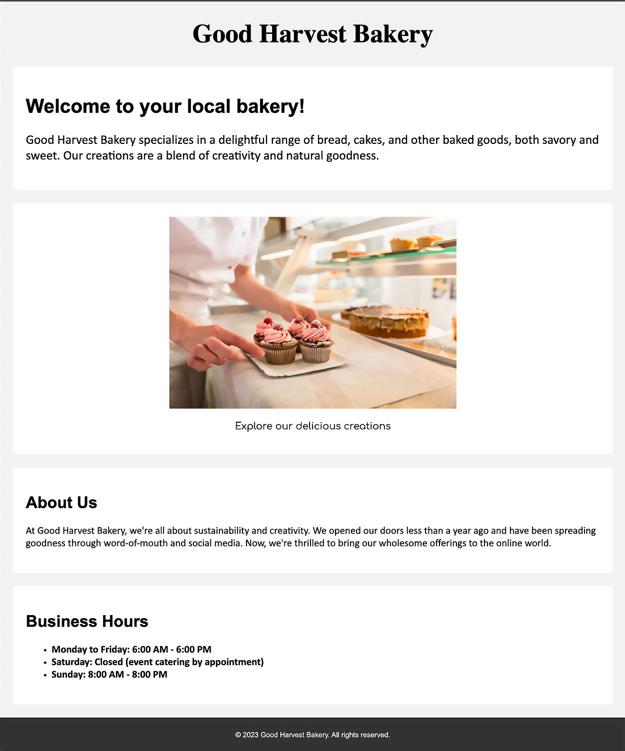
San-serif font was chosen for most of the typefaces because of its readability and clean feel and look. The display font was set to Garamond for the company logo to provide a visual contrast to the rest of the text on the site. Furthermore, the client (i.e., me, the learner) chose Garamond because it felt a bit more elegant without being scripty or too fancy. The subtitle was set as Comfortaa, which provides a lighter feel and will be used as subtitles for product names under the product images.
The following is a mock webpage for the bakery that demonstrates the use of the different fonts and styles according to typography sample 2.
EXAMPLE
You will review client options and make typography selections for your website in Touchstone Task 1: Selecting Your Client and Planning Your Website Design.
Source: This Tutorial has been adapted from "The Missing Link: An Introduction to Web Development and Programming " by Michael Mendez. Access for free at https://open.umn.edu/opentextbooks/textbooks/the-missing-link-an-introduction-to-web-development-and-programming. License: Creative Commons attribution: CC BY-NC-SA.