Table of Contents |
One way to improve how a paragraph looks is by adjusting the vertical space between its lines—this is called line spacing.
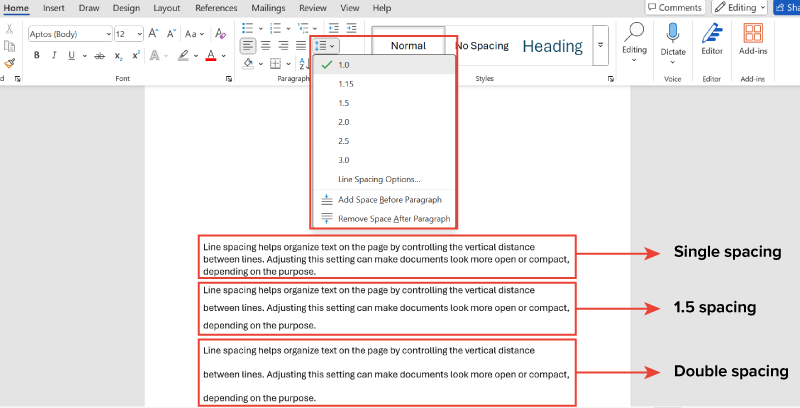
Line spacing controls how tightly or loosely text appears within a paragraph (Microsoft, n.d.). Common options include single (1.0), one-and-a-half (1.5), and double (2.0). Single spacing is most common for letters, memos, and other communications, while double spacing is most common for longer documents that will be reviewed by an editor or graded.
Single spacing fits the most text on a page. Double spacing helps reviewers and screen readers and makes text easier to follow and scan.
EXAMPLE
A company prepares a report draft using double spacing so reviewers can add comments easily. Once approved, the final version is formatted with single or 1.5 spacing to save space and improve readability.The screenshot below shows how the same paragraph looks when formatted with different line spacing options. Notice how the text takes up more space and becomes easier to scan as the spacing increases from single to double.
After setting line spacing, another important formatting choice is how your text aligns on the page. It affects both the appearance and readability of each paragraph.
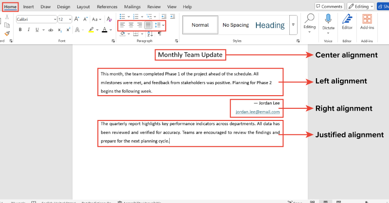
Text alignment controls how paragraphs line up between margins (Google, n.d.). Different alignment options serve different purposes in a document. The table below explains these options.
| Alignment Type | Common Use | Readability Note |
|---|---|---|
| Left alignment | Used commonly for business documents | Easiest to read—lines start at a consistent point |
| Center alignment | Used for titles or headings | Draws attention but can be harder to read in large blocks |
| Right alignment | Used for dates, names, or signatures | Less readable—best used for small sections |
| Justified alignment | Used to create straight edges on both sides | Can cause uneven word spacing, which may reduce readability |
EXAMPLE
Jorge formats newsletters with centered titles, left-aligned body text for readability, and right-aligned contact info for visual balance and quick reference.The screenshot below shows how each alignment type appears in a real document. Notice how the alignment changes the position of the text and affects readability.
In addition to alignment, how much space appears between paragraphs also affects how professional and readable your document looks. This is achieved through paragraph spacing settings.
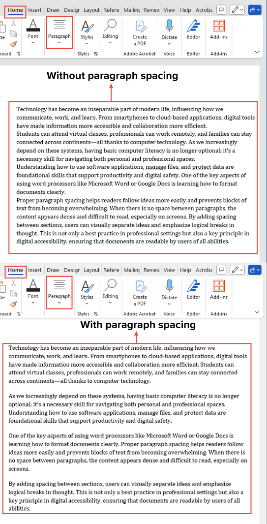
Paragraph spacing controls the space before and the space after each paragraph (Microsoft, n.d.). The table below explains these.
| Setting | What It Does | Common Use |
|---|---|---|
| Space before | Adds extra space above a paragraph | Used for headings or to separate sections |
| Space after | Adds extra space below a paragraph before the next one begins | Used to separate paragraphs in body text |
Proper spacing helps readers distinguish between ideas and makes documents easier to scan. Most word processors add space after paragraphs automatically.
Standard business documents use 6 to 12 points of space after paragraphs. Use paragraph spacing controls instead of pressing Enter multiple times for consistent results.
EXAMPLE
Akito formats training manuals with 10 points of space after paragraphs and 18 points before headings. This makes content easier to scan and helps trainees find information faster.The screenshots below show two versions of the same message:
Just as spacing improves readability between paragraphs, lists help break up text and highlight key points.
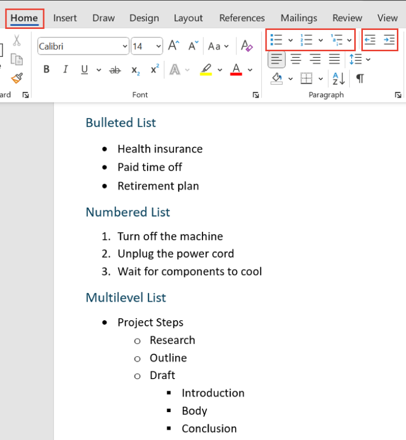
Bullets and numbering organize information into easy-to-read lists (Google, n.d.). Multilevel lists take this a step further by showing subpoints beneath main ideas, making complex information more digestible.
Always use your word processor’s bullet or numbering tools—typing dashes or numbers manually does not create proper lists and can lead to formatting issues.
The table below explains each list type and when to use it effectively.
| List Type | When to Use | Tips |
|---|---|---|
| Bulleted list | For items that do not need a specific order | It works well for features or benefits. Use simple styles like circles or squares in business documents. |
| Numbered list | For steps, rankings, or when sequence matters | It is best for procedures or instructions. Keep numbering simple and consistent. |
| Multilevel list | For organizing main points with subpoints | It is used to show hierarchy or structure in outlines and step-by-step tasks. Maintain clear formatting and indentation. |
EXAMPLE
In an employee handbook, Fahmida uses bullets for benefits and numbers for safety steps that must be followed in order.Multilevel lists use indents to show the hierarchy between main points and subpoints. An indent is extra space between the margin and the start of a line, helping organize information visually.
The table below shows how to adjust list levels using keyboard shortcuts or toolbar buttons in most word processors.
| Action | What It Does | How to Do It |
|---|---|---|
| Indent to lower level | Moves list item to a subpoint | Press Tab or click Increase Indent in the Home tab. |
| Outdent to higher level | Moves item back to a main point | Press Shift + Tab or click Decrease Indent in the Home tab. |
The screenshot below shows how bulleted, numbered, and multilevel lists appear in a document. Each format helps organize information in a clear and structured way.
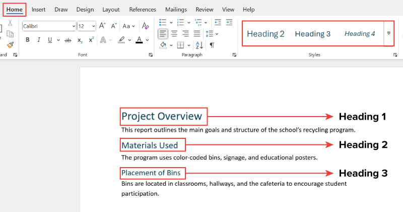
Just like lists help organize related points, headings are essential for organizing entire sections of a document.
This organization is achieved through a heading hierarchy, which uses different heading levels (such as Heading 1, Heading 2, and so on) to show the relationship between sections and subsections.
Heading levels create structure and help readers navigate long documents (Microsoft, n.d.). The table below mentions the purpose of common heading levels.
| Heading Level | Purpose |
|---|---|
| Heading 1 | Main sections |
| Heading 2 | Subsections |
| Heading 3 | Smaller divisions/subpoints |
EXAMPLE
In a school report:Most word processors include built-in heading styles that automatically apply appropriate fonts, sizes, and spacing. Using these styles ensures a consistent document structure and simplifies the creation of tables of contents.
Avoid simply bolding or resizing text—proper heading styles enhance both organization and accessibility.
The screenshot below shows how different headings appear in a document.
The full range of features in Microsoft Word and similar software is more than we can cover in this class. However, two more features that you will need to know are under the Insert menu.
Tables are often used for displaying numeric data, such as a list of items and expenses, but are also used for any situation where presenting information in rows and columns will make it easier for readers to scan the content.
To add a table, go to the Insert menu and click the table icon. You will then decide the size of your table, that is, the number of rows and columns. Once the table is created it is easy to add and subtract columns or rows, so you can make your best guess if you are not sure what size the final table will be.
In the example below, a teacher is building a syllabus and uses the table to help students find each week and understand their tasks.
| Week | Topic | Reading | Assignment |
|---|---|---|---|
| Sept 3–9 | Machine Learning | Chapter 1 | Reading Journal |
| Sept 10–16 | Generative AI | Gladwell Essay | Reading Journal |
| Sept 17–23 | Computer Ethics | Chapter 3 | First Paper Due |
Images might be used to include important graphics (like a map included with directions in an invitation), or which always appear in your external communications (like a masthead or logo). They can also be used as decorations, to liven up a page.
To insert an image go to the Insert menu and select Picture. You will then be able to choose whether the picture will be uploaded from your device, a shared drive, or the Web. You can also choose a stock image from the Microsoft Library.

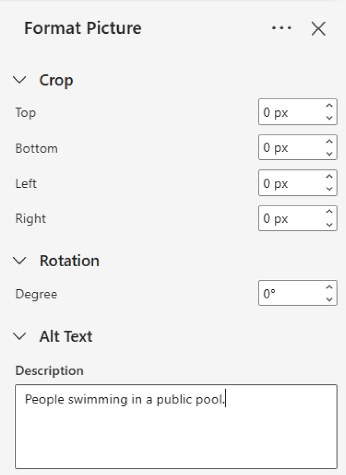
While we will not go in depth on the options for resizing and formatting images, one image property is especially important: adding alt text. Alt text tells people who cannot see the image what it depicts, and a few words will usually suffice. To assign alt text, select the image, then look to the menu above—the Picture menu should appear automatically. Select the Alt Text button, and then enter descriptive text in the Alt Text window.
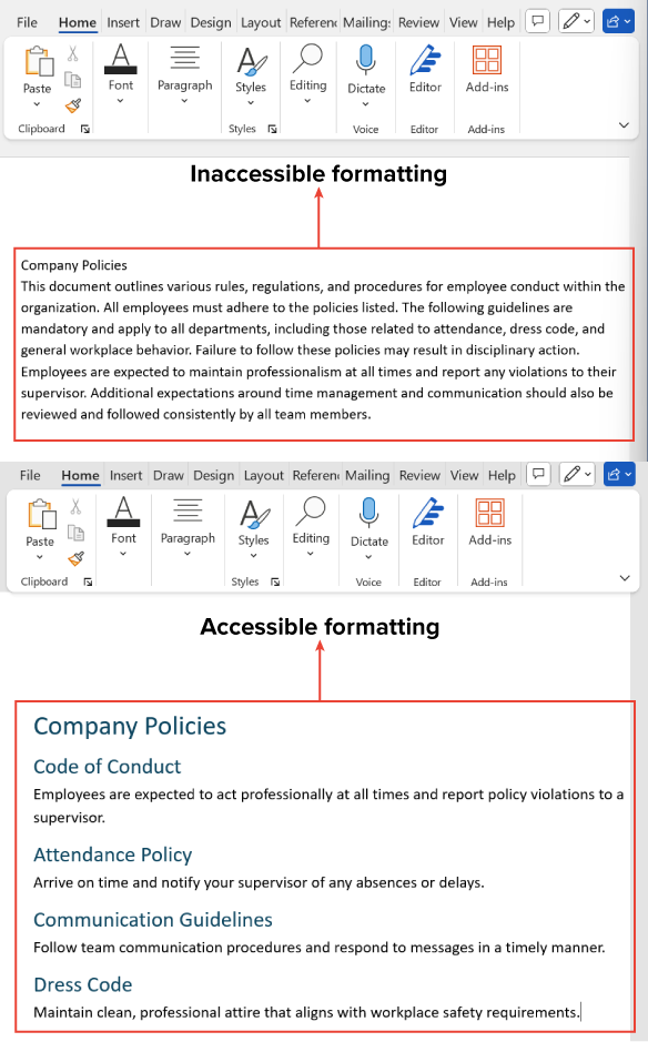
Beyond organization and appearance, formatting also impacts how easily different users can access and understand a document.
Accessible design makes documents easy to read for everyone, including people with visual impairments (WebAIM, 2020). Here are some guidelines for accessible paragraph formatting:
EXAMPLE
Abel formats policy documents with consistent headings, short paragraphs, and clear spacing to support screen readers and improve readability for all workers.The screenshots below compare inaccessible and accessible formatting.
Source: THIS TUTORIAL HAS BEEN ADAPTED FROM OPENSTAX "WORKPLACE SOFTWARE AND SKILLS." ACCESS FOR FREE AT OPENSTAX.ORG/DETAILS/BOOKS/WORKPLACE-SOFTWARE-SKILLS. LICENSE: CREATIVE COMMONS ATTRIBUTION 4.0 INTERNATIONAL. Accessed by June 2025.
REFERENCES
Google. (n.d.). Change how paragraphs & fonts look. Google Docs Editors Help. support.google.com/docs/answer/1663349
Microsoft. (n.d.). Change the line spacing in Word. support.microsoft.com/en-us/office/change-the-line-spacing-in-word-04ada056-b8ef-4b84-87dd-5d7c28a85712
WebAIM. (2020, April 14). Introduction to web accessibility. webaim.org/intro/