Table of Contents |
When formatting a document—which means changing how the text looks to make it clear and easy to read—the first step is usually choosing a font and font size. The following table explains these elements.
| Topic | What You Should Know | Examples |
|---|---|---|
| Font |
|
Arial, Calibri, Times New Roman, Georgia |
| Font size |
|
12 pt, 14 pt, 20 pt |
EXAMPLE
In a workplace email, Rebecca uses 12 pt Calibri to make the text easy to read and look professional.Use the following table to help you choose fonts and sizes for different parts of your document.
| Document Part | Font Size | Recommended Fonts |
|---|---|---|
| Main text (body) | 11–12 pt | Arial, Calibri, Times New Roman |
| Headings or titles | 14–18 pt | Arial, Georgia |
| Footnotes/notes (small text at the bottom for extra info) | 9–10 pt | Times New Roman, Calibri |
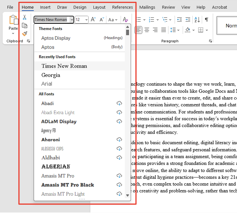
The screenshot below shows the font selection menu in Microsoft Word, where you can choose different font styles and sizes for your document.
Once your font and size are set, you can use special tools to draw attention to certain words. These are called text stress tools. They help readers know what is most important.
The table below shows the common ways to stress text.
| Tool | What It Does | When to Use It |
|---|---|---|
| Bold | Makes words darker and thicker | Titles, section names, or important deadlines |
| Italics | Slants words | Book titles, new terms, or soft reminders |
| Underline | Puts a line under words | Sometimes used for headings but less common on digital screens because it can be confused with clickable links (Microsoft, n.d.) |
Use these tools carefully. If everything is bold or underlined, nothing will stand out. Too much stress makes the page look crowded and hard to read.
When you format a document, you want the most important parts to stand out. One way to do this is by using highlights and color.
Highlighting means adding a colored background behind the text. The following table shows the best ways to use highlighting in your documents.
| Use Case | Tip |
|---|---|
| Draft (first version) | Use yellow or light colors to mark changes or comments. |
| Team review document (for shared feedback) | Use consistent colors to show different types of edits. |
| Final version (completed document) | Avoid highlighting—use bold or italics instead for a clean, professional look. |
EXAMPLE
While reviewing contracts, Yaiza uses yellow highlight to mark review areas, then switches to bold for key details in the final version.Changing the font color is another way to add meaning to your writing. The table below shows some smart ways to use font color.
| Color | Common Use | What It Does |
|---|---|---|
| Blue | Links or contact information | Signals interactivity—readers know it is clickable |
| Red | Warnings or critical information | Grabs attention, but should be used with care—it can feel harsh or be hard to read |
| Dark gray/black | Standard work documents | Clear and professional—offers the best readability for body text |
To make your content easier for everyone to read, aim for strong contrast—meaning a clear difference between the text and the background color.
Good contrast helps text stand out, especially for people with low vision or color blindness. Do not rely on color alone to convey meaning. Use formatting and symbols to support your message. The table below shows what to use and what to avoid.
| Use | Avoid |
|---|---|
| Dark text on a light background (best for reading) | Yellow on white |
| Consistent formatting (so color is not the only clue) | Red on green |
| Other signals like bold text or symbols | Only using color to show meaning |
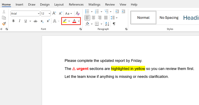
The screenshot below shows an example of how to use font color and highlighting to make key information stand out in a document.
Bright colors might look fun, but they can make text hard to read. Stick to dark, easy-to-read colors and use other tools—like bold or headings—to organize your document.
Sometimes, words are not enough. In professional writing, you may need special characters—like ©, ™, or °—to make your message clearer and more accurate. These are characters that are not part of the regular alphabet or number keys.
Some of these special characters are called symbols, such as the percentage sign (%) or an arrow (→). Symbols are often used in business, math, or step-by-step instructions.
Special characters and symbols include the following:
EXAMPLE
In a user guide, Jameela adds ™ after a product name and uses → to show some steps.Most word processors have a symbol library that lets you find and insert these with just a few clicks.
Some special characters and symbols are used so often that you can insert them with a keyboard shortcut instead of searching through menus.
The table below shows special characters and symbols and how to type them quickly.
| Symbol | What It Means | Windows Shortcut | Mac Shortcut |
|---|---|---|---|
| © | Copyright | Alt + 0169 | Option + G |
| ® | Registered trademark | Alt + 0174 | Option + R |
| ™ | Trademark | Alt + 0153 | Option + 2 |
| • | Bullet point | Alt + 0149 | Option + 8 |
| → | Arrow | Alt + 0174 or use the Insert menu | Using menu or emoji picker |
| ± | Plus/minus (math) | Alt + 0177 | Option + Shift + = |
| ° | Degree symbol | Alt + 0176 | Shift + Option + 8 |
If you do not want to memorize shortcuts, you can always use the Insert tab in Word or Google Docs to find what you need.
Use symbols when they make the message shorter and clearer, like % instead of writing “percent.” But do not overuse them. Too many can make your writing hard to follow.
Many documents, particularly ones that are used online, will include web addresses. In most cases, simply typing or pasting a link in full will automatically be hyperlinked by Word. If you would rather have other text for the hyperlink, you can type the text you want readers to see, then select it and go to Insert > Link to enter the web address you want it to link to.
Even if your text is well written, a cluttered layout can make it hard to read. A clean and professional design helps everyone understand your message, especially people with different reading needs or vision levels.
Easy access formatting means making documents that are clear and readable for everyone—including people with low vision or color blindness. These small design choices help all readers, not just those with special needs.
EXAMPLE
Maya uses bold text and bullet points instead of color so that everyone can read their report easily.The following table shows simple ways to make your documents look clean and easy to use.
| Design Area | What to Do |
|---|---|
| Font choice | Use a clear sans-serif font like Arial or Calibri for screen-based documents, as these fonts are generally easier to read on digital displays (WebAIM, 2020). |
| Font size | Keep the body text at 12 pt or larger to enhance readability and maintain accessibility compliance, ensuring that the content is usable for people with visual impairments or reading difficulties. |
| Color contrast | Use dark text on a light background. Avoid yellow on white or red on green. |
| Document structure (how text is organized) | Use clear headings, short paragraphs, and extra space between sections. |
| White space (blank areas around text) | Leave a blank space around text to avoid clutter and help guide the reader’s eye. |
Some people are color-blind, which means that they have trouble seeing certain colors. That is why it is important to use other clues to share vital information. Instead of using just color, try the following:
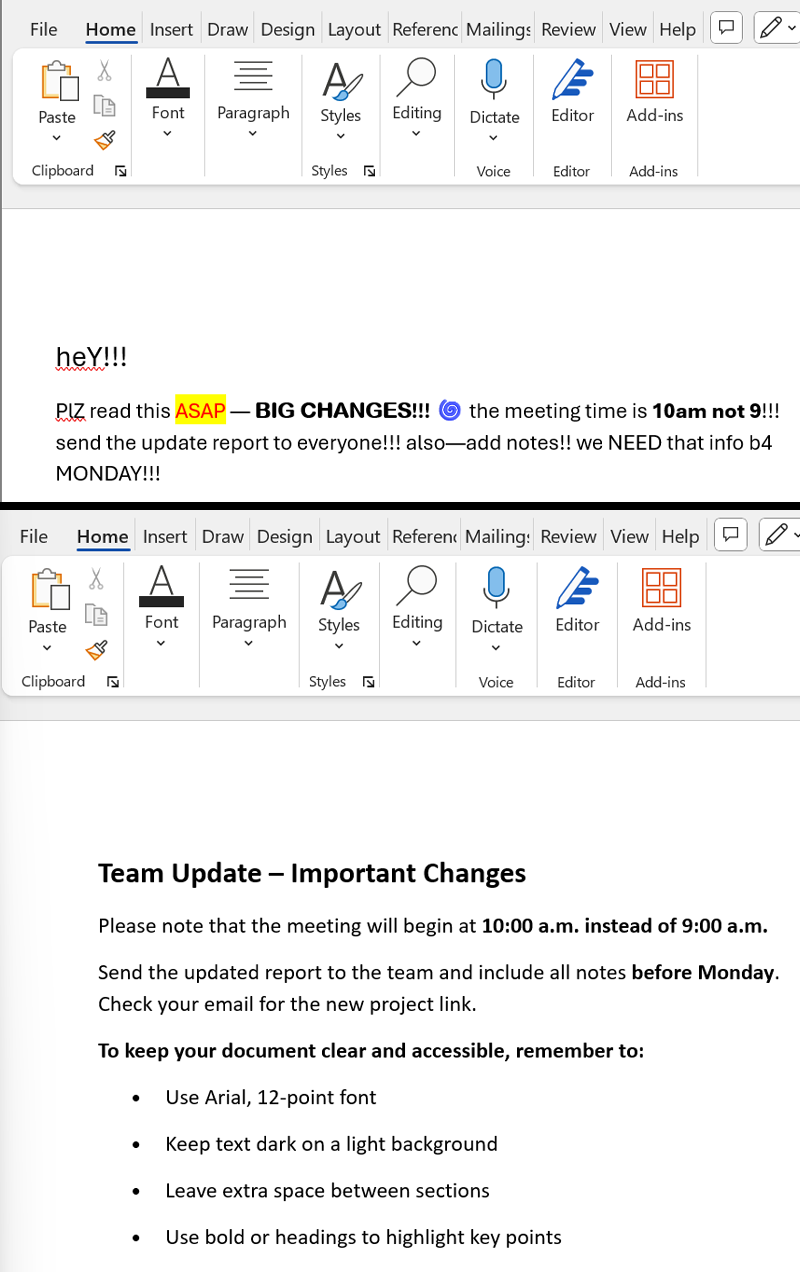
The screenshots below show two versions of the same message:
Source: THIS TUTORIAL HAS BEEN ADAPTED FROM OPENSTAX "WORKPLACE SOFTWARE AND SKILLS." ACCESS FOR FREE AT OPENSTAX.ORG/DETAILS/BOOKS/WORKPLACE-SOFTWARE-SKILLS. LICENSE: CREATIVE COMMONS ATTRIBUTION 4.0 INTERNATIONAL. Accessed by June 2025.
REFERENCES
Google Docs Editors Help. (n.d.). Change how paragraphs & fonts look. support.google.com/docs/answer/1663349
Microsoft. (n.d.). Add and format text. support.microsoft.com/en-us/office/add-and-format-text-2e76a31b-a6d6-4b4e-95c2-fb780e3ac8d3
WebAIM. (2020, April 14). Introduction to web accessibility. webaim.org/intro/