Table of Contents |
User Experience (UX) design focuses on the overall experience a user has when interacting with a product or service, aiming to make it functional, enjoyable, and easy to use. User Interface (UI) design, on the other hand, deals with the visual and interactive aspects, such as layout, color schemes, typography, and interactive elements like buttons and icons. While UX and UI are distinct, they work closely together: UX design lays the foundation by understanding user needs and creating a structure to meet those needs, and UI design builds on this by adding visual and interactive elements. Good UX/UI design is crucial, as it leads to higher user satisfaction, increased engagement, brand loyalty, competitive advantage, and improved efficiency and productivity. Principles of UX/UI design include user-centered design, consistency, feedback, accessibility, and simplicity, all of which contribute to creating intuitive and aesthetically pleasing interfaces. User-centered design (UCD) is an iterative design process that focuses on the needs, preferences, and limitations of end users at every stage of the design and development process.
To understand UX/UI, keep in mind that both processes are user-centric, meaning that they prioritize the needs, preferences, and experiences of end users throughout the design and development process. This methodology goes beyond merely creating a product or service; it involves deeply understanding the target audience to ensure that the final outcome is intuitive, accessible, and highly usable. To better understand this, let’s define what a user is. Typically, we think of a user as someone who interacts with a device, interface, or website. While this is accurate, the concept of a user extends beyond just interactions with technology. Broadly speaking, a user is any person who interacts with a functional design. In actuality, a person shopping in a grocery store or entering a movie theater is a user. In these cases, the designs are the store and the theater themselves, with myriad smaller designs encapsulated within them.
EXAMPLE
You decide to see a movie. As you arrive in the parking lot, you enter the first level of the design, which is the parking area. As you approach the theater, you pass by several movie posters arranged on the outside wall, which is a second level of the design. Next, you buy your ticket, then enter the queue, which passes by the concession stand. Eventually you make it through the lobby and find the screening room. The seating arrangement is another part of the design. Before you’re experiencing the interface, which is the movie screen and the surround sound, you’ve had several design interactions. These are multiplied if you’ve done other things like playing games in the lobby arcade, purchasing popcorn or candy, and interacting with product designs like looking at a novelty popcorn bucket or reading a candy wrapper.
In UX/UI design, touchpoints are any instances where a user interacts with a product, service, or brand. These interactions can occur through various channels, both digital and physical. Examples of digital touchpoints include websites, mobile apps, social media platforms, and email communications. Physical touchpoints might involve in-store experiences, product packaging, or customer service interactions.
EXAMPLE
You’re shopping at a retail store, and you pass by the perfume counter. An employee greets you and asks if you would like to sample a perfume or a cologne. The greeting is a physical touchpoint. If you pause and engage with the employee, the interaction strengthens and leads to a potential sale, or otherwise positive experience, which is essential for customer acquisition. You have a pleasant interaction with the employee, which you remember. The next time you’re shopping, you decide to go to the same store because the experience left you with a positive feeling.It is important for physical touchpoints to lead to positive experiences, especially when people are involved. A negative experience can result in losing customers and risking brand reputation.
EXAMPLE
You’re dining at a restaurant, and your food is undercooked. You ask to speak with a manager. When the manager comes to your table, instead of addressing your concerns, he is rude and confrontational. This ruins your dining experience. You decide to stop going to the restaurant. You’re so upset that you post a negative review, sharing your experience online, and you also let your friends know about it and advise them not to eat at the restaurant.Touchpoints are critical in shaping the overall user journey, as they represent the moments where users engage with a product or service. Each touchpoint offers an opportunity to influence the user’s perception and satisfaction. By carefully designing and optimizing these interactions, designers can create a cohesive and positive user experience.
The user journey is the path a person takes when interacting with a product, service, or brand, from their initial engagement to the final outcome. This journey encompasses all the steps and touchpoints a user encounters, including discovering the product, learning about it, considering it, and making a decision to use or purchase it. The user journey is a critical aspect of user experience design, as it helps designers understand and optimize each interaction to ensure a seamless and satisfying experience for the user. By mapping out the user journey, designers can identify pain points and opportunities for improvement, ultimately enhancing the overall user experience.
Pain points are specific problems or challenges that users encounter when interacting with a product, service, or system. These issues can cause frustration, inconvenience, or dissatisfaction, and they often highlight areas where the user experience can be improved. Identifying and addressing pain points is crucial in UX/UI design, as it helps designers create more intuitive, efficient, and enjoyable experiences for users. By understanding and resolving these pain points, companies can enhance user satisfaction and loyalty.
User research and personas are cornerstones in UX/UI design, ensuring that products meet user needs and expectations. User needs refer to the requirements and desires that users have when interacting with a product or service. These needs can be functional, emotional, or social and are essential for creating a user-centered design. Functional needs are related to the practical aspects of using a product, such as ease of use, efficiency, and reliability. Emotional needs involve how a product makes users feel, including aspects like satisfaction, trust, and enjoyment. Social needs pertain to how a product helps users connect with others or fit into a community. Understanding user needs is crucial for designing products that are not only useful but also engaging and meaningful to users.
User research involves understanding user behaviors, needs, and motivations through methods like interviews, surveys, usability testing, focus groups, and field studies. These methods provide both qualitative and quantitative data, offering insights into user experiences and challenges. Personas, on the other hand, are fictional characters created based on this research to represent different user types. They include detailed profiles with demographics, goals, behaviors, and pain points, helping designers keep the target audience in mind. By using user research and personas, designers can create user-centered designs, make informed decisions, improve communication with stakeholders, and enhance efficiency by addressing user needs early in the design process. This approach leads to higher user satisfaction and more effective, user-friendly products.
Creating personas begins with data collection from various user research methods such as interviews, surveys, and usability tests. This data is analyzed to identify common characteristics and behaviors among users, which are then grouped to form distinct user segments. Each segment is represented by a persona profile that encapsulates the key attributes and needs of that user group. Personas serve multiple purposes in the design process. They help ensure that the product meets the needs of its users by providing a clear picture of who the users are and what they require. They also facilitate better communication among team members and stakeholders by providing a shared understanding of the target audience. Additionally, personas help prioritize features and design decisions, ensuring that the most important user needs are addressed. Overall, user personas are invaluable for creating user-centered designs that are both effective and engaging.
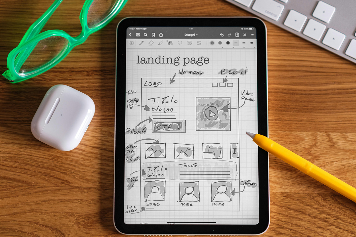
Wireframing is the process of creating a simplified visual guide that represents the skeletal framework of a digital product. It focuses on layout and structure rather than design details like colors and typography. Wireframes are typically created early in the design process to outline the basic elements and their placement on each screen or page. They help designers and stakeholders visualize the content hierarchy, navigation, and functionality of the product. Wireframes can be low-fidelity, mid-fidelity, or high-fidelity. Low-fidelity wireframes consist of sketches that frame the basic layouts of web page and mobile screen designs using simple lines and shapes. Low-fidelity wireframes are most often used for the internal development process, meaning that they are intended for use in the design processes and are usually shared with other members of a design team. However, low-fidelity wireframes can be shared with clients and stakeholders to communicate the basic structure of a design. Low-fidelity wireframes can be very simple, quick sketches done for iteration processes, or more refined documents meant to show the framework of the design to stakeholders. Whenever a low-fidelity wireframe is shared with clients, supervisors, or other stakeholders, the drawings should be clean, use straight lines and evenly drawn shapes, and inked with a black marker, or pen. Some designers will draw in black ink, while others prefer to draw in pencil and then ink the low-fidelity wireframes by tracing over the pencil lines and shapes. Low-fidelity wireframes should always identify the presence of a logo, navigation, images, text, and other components intended for the design.
Mid-fidelity wireframes are created using digital drawing applications or UX/UI design software. They use the same design techniques as low-fidelity wireframes but translate the information into a digital framework. Mid-fidelity wireframes are also meant for the internal development process but may be shown to stakeholders to communicate design plans or demonstrate project progression. Mid-fidelity wireframes should not use color, images, and actual text to avoid confusing readers.
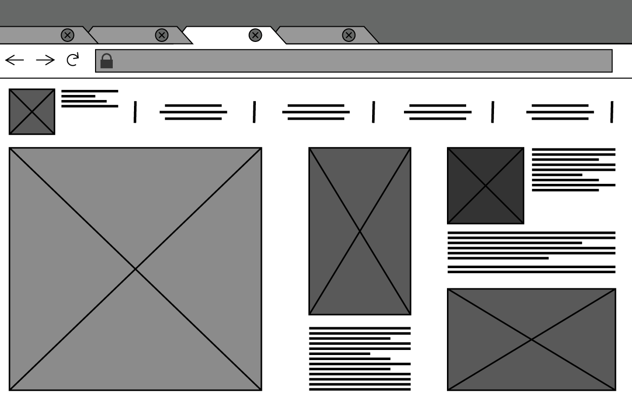
Both low-fidelity and mid-fidelity wireframes should be illustrated in black and white. Applying color to wireframes in the early design process causes confusion and has the potential to mislead viewers with false expectations of emphasis and hierarchy.
High-fidelity wireframes, also called mockups, incorporate more detailed elements and will usually look like the finished design but lack full functionality. High-fidelity wireframes will incorporate color and images in the design but use lorem ipsum text in place of the final body copy. Lorem ipsum is a type of placeholder text commonly used in the publishing and graphic design industries. It consists of scrambled Latin words and phrases, which are used to demonstrate the visual form of a document or a typeface without relying on meaningful content. This allows designers to focus on the layout and design elements rather than the text itself. Lorem ipsum is used for various reasons, such as allowing designers to create layouts without the body copy text for the web page or mobile design, and to apply font styles and sizes to text areas that can be replaced quickly when the final body copy is delivered. Often, designers must wait for body copy text to be generated either by the client or a writer. Lorem ipsum allows designers to continue working and substitute placeholder text for the actual content, finalizing the design and placement before the actual copy is delivered. Lorem ipsum text can be used in both mid- and high-fidelity wireframes.
Prototyping involves creating an interactive model of the product that simulates its functionality and user experience. Prototypes can range from low-fidelity, clickable wireframes to high-fidelity, fully interactive simulations that closely resemble the final product. Prototyping allows designers to test and validate ideas, gather user feedback, and identify usability issues before development begins. It helps in refining the design through iterative testing and ensures that the final product meets user needs and expectations. Prototypes may have the same design appearance as mid- and high-fidelity wireframes but will always have some level of interactivity. The interactivity may be as simple as links or buttons that a user can activate to show page connectivity, or higher functionality such as showcasing hover overs and other interactive states.
Both wireframing and prototyping are essential steps in the UX/UI design process, enabling designers to plan, test, and refine their ideas effectively. They help ensure that the final product is both functional and user-friendly.
Usability testing is a technique used to assess how user-friendly and intuitive a design is by having real users interact with it. During these tests, participants are asked to complete specific tasks while observers watch and take notes. This process helps identify any problems or areas of confusion within the design, providing valuable insights into user behavior and preferences.
Moderated testing is a type of usability testing that involves a facilitator guiding participants through tasks and aiding and asking questions to gather detailed feedback. Moderators take notes on user behavior, logging visual observations and notating user comments and other feedback. Particular attention is paid to the user’s facial expressions and body language, as these are indicators of frustration and the user experiencing pain points within the design. Unmoderated testing takes place in scenarios where participants complete tasks independently, often remotely, without real-time guidance. Feedback can be gathered by recording the interactions, through surveys and questionnaires, and by viewing user reactions through a camera. Remote testing is conducted online, allowing users to participate from their own environment, which can yield more natural feedback. In-person testing is conducted in a controlled setting where observers can closely monitor user interactions. Note that remote and in-person testing can be moderated or unmoderated.

Benefits of usability testing include early issue detection, the process of identifying problems early in the design process, which can save time and resources, enhanced user satisfaction, developing a better user experience yielding higher user satisfaction and loyalty, streamlining tasks and reducing errors to make the product more effective, optimizing tasks and reducing errors for increased efficiency, and providing validated design decisions based on real user feedback.
Source: THIS TUTORIAL WAS AUTHORED BY SOPHIA LEARNING. PLEASE SEE OUR TERMS OF USE.