Table of Contents |
The image below shows two commonly used page sizes in layout and design: A4 and standard U.S. paper. The A4 page size is more of an international standard, especially in Europe. It measures 8.267 by 11.693 inches; however, it is typically rounded off to 8.3 in by 11.7 in.
Paper sizes in the United States, Canada, Mexico, and the Dominican Republic are determined by the American National Standards Institute (ANSI), while European countries use the International Organization for Standardization (ISO) to define page sizes.
The U.S. paper size is what many of us are accustomed to. The U.S. paper size runs 8.5 inches wide by 11 inches tall. You can see the difference in proportions when both pages are compared to each other.
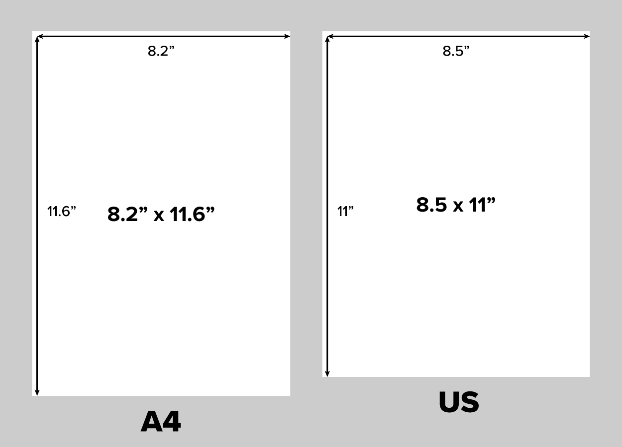
The A4 page is taller and narrower than the U.S. page, which is a bit shorter and wider by comparison.
While A4 and U.S. paper are two commonly used page sizes, they are not the only choices available.
The end goal of a design is also known as its output, sometimes deemed the final output. For example, a newspaper page is called a broadsheet. Broadsheets vary by the specific needs of the publisher, but the final output sizes range in the 15–17 inches x 22.75 inches area. So, output sizes for newspapers differ between publications, but they are larger than A4 and U.S. paper. Tabloids, which are smaller than newspapers, are generally printed on 11-by-17-inch paper. These examples are just a few choices for print design. Advertisements, flyers, invitations, and postcards are design situations that call for different measurements.
Page size is synonymous with screen size when the final output is intended for web and mobile publications. In the United States, page sizes are given in inches when dealing with print. When designing for screens, all measurements are given in pixels.
Now that you know what the common paper sizes are, we can discuss the golden section. This is a geometrically calculated proportion recognized through art and design history as aesthetically pleasing.
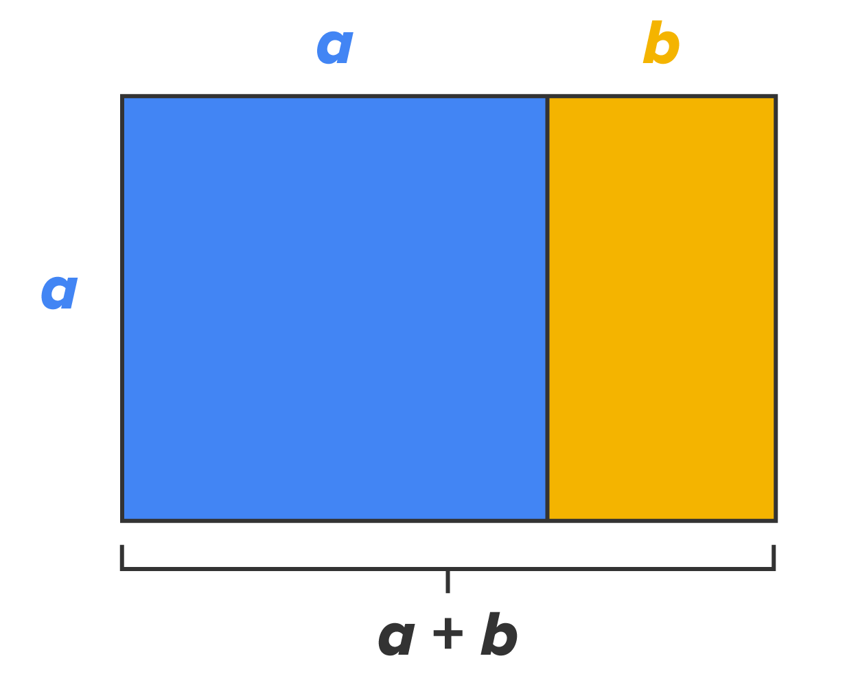
The golden section is also known as the golden ratio and can be found when a line is divided into two parts, such that the longer part (a) divided by the shorter part (b) is equal to the whole length divided by the longer part: a ÷ b = (a + b) ÷ a. In the image below, you can see what is known as the golden section.
It has two simple divisions, and the ratio can be taken further to create square areas that are also proportionate to each other. They get proportionally smaller or larger, depending on the direction. This also creates a flow and sense of direction for the viewer.
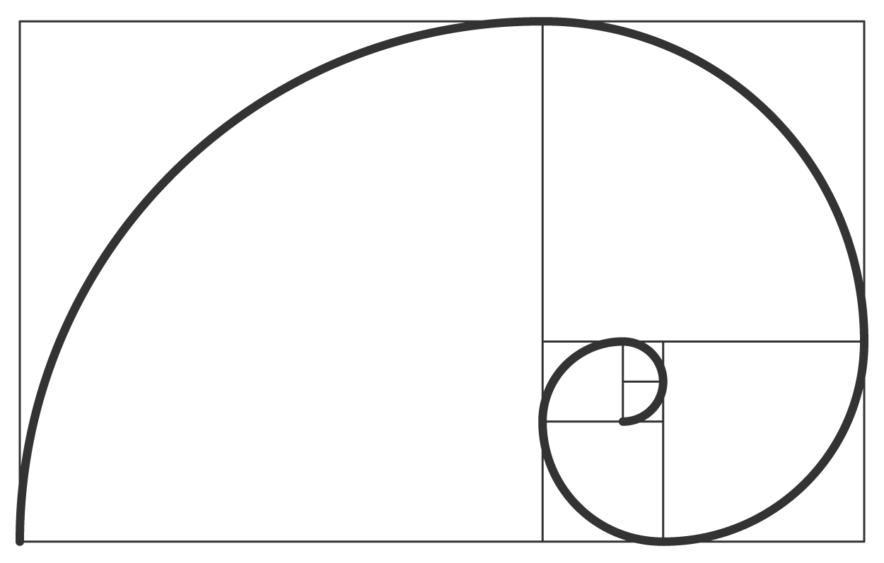
The image below is called the golden spiral, or Fibonacci spiral, because it was developed in the 13th century by the Italian mathematician, Leonardo Fibonacci. It manifests naturally in weather patterns, as well as in all sorts of plant and animal life.
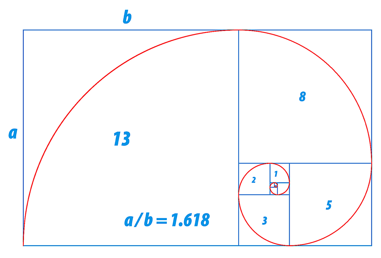
The golden spiral, or Fibonacci spiral, is closely related to the golden sequence, also known as the Fibonacci sequence, which is a series of numbers where each number is the sum of the two preceding numbers. For example, 0, 1, 1, 2, 3, 5, 8, 13, 21, 34, and so on. As these numbers expand, their proportions increase.
The golden ratio is a ratio between two numbers that equals 1.618 and is represented by the Greek letter phi. It is determined by numbers that steadily increase so that each number is equal to the sum of the previous number sets.
The image below illustrates how the golden spiral and golden sequence stand in relation to the golden ratio.
While the concept may be hard to follow without a thorough understanding of the mathematics behind it, the golden spiral is used in art, design, and architecture.
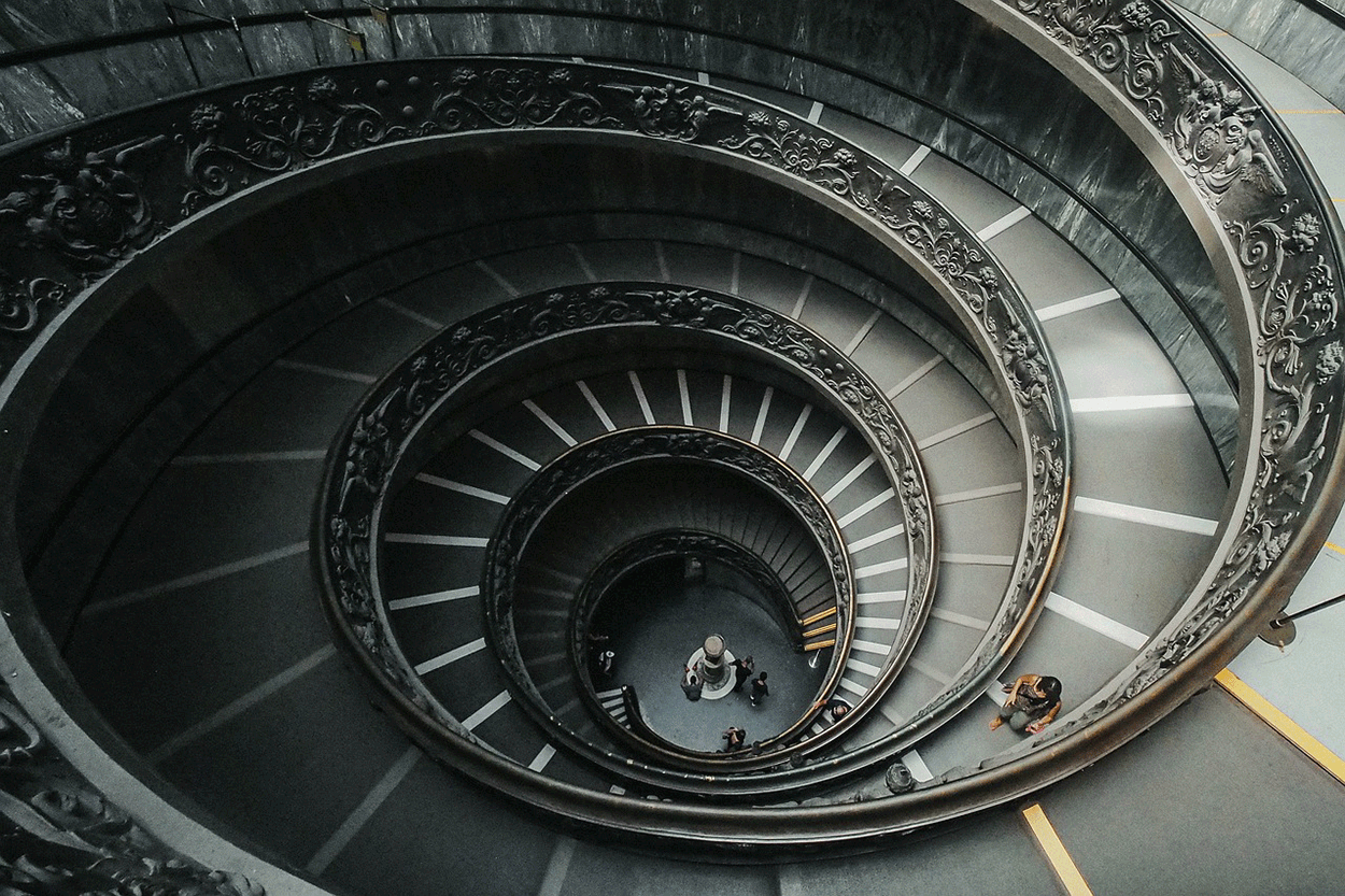
The stairwell pictured below shows the Fibonacci spiral in architectural design. The flow of the spiral mirrors natural design, and as such, we find it visually pleasing.
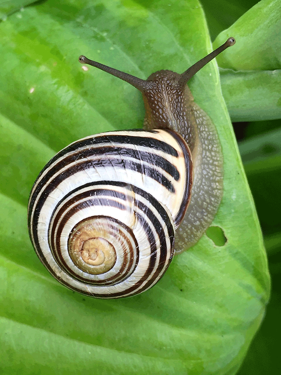
From the imagery of hurricanes spinning cyclones of clouds over the ocean to snail shells, examples of the golden spiral can be seen all around us in the natural world. The images of the curling plant and the snail shell pictured below offer us snapshots of the spiral in living things.

Desktop publishing is the term for the creation of digital documents using page layout software.
The advent of powerful computers equipped with graphics software changed the world of print design. The traditional work of artists and typesetters has been replaced by graphic artists and page designers creating layouts sent electronically to press.
A good example of desktop publishing is the workflow of an editorial department of a newspaper. Stories are generated by reporters and editors and then placed into an electronic queue. Graphic artists gather images from photojournalists and prepare them for print. Graphic artists are also responsible for creating maps and special graphics. Page designers use layout software to place stories and graphics into page templates, which are then sent to a press. The press may be in house, meaning that the newspaper prints the paper on-site, or it can be off-site, meaning that the digital files are sent to another location where the paper is printed and prepared for distribution.
The capabilities of computers, printers, and creative software allow some desktop publishers to work from home or out of small offices.

In the workflow, there is copywriting as well as graphic design and photography, which is another combination of type and image. This is often handled simultaneously by writers, photographers, and Illustrators.
Writers and editors use word processing software, like Microsoft Word. Photographers use digital cameras and image editing software, like Adobe Photoshop. Graphic artists use Adobe Photoshop and Adobe Illustrator to edit and create custom images and digital art, then a page designer combines type and images with page layout software like Adobe InDesign.
And then, the final layout or design can be printed using something like a laser printer or a commercial printer.
With today's processes and technology, desktop publishing is easier than ever before. This is because of a concept called WYSIWYG, which stands for "what you see is what you get."
This is used to describe the ability to see type and image detail on a computer screen that is the equivalent of the printed version.
Designers can put something together in software like Photoshop and know that what they see on-screen is what the design will look like when printed.
WYSIWYGs became popularized by web design software. The popularity of web design and the need for businesses to have a web presence increased the demand for web design software that allows users to make websites without learning to code.
This trend of ease of use has transcended into other graphics software applications. Adobe Stock and other purveyors of stock art offer graphic templates that allow users to easily manipulate colors and text to make custom arrangements.
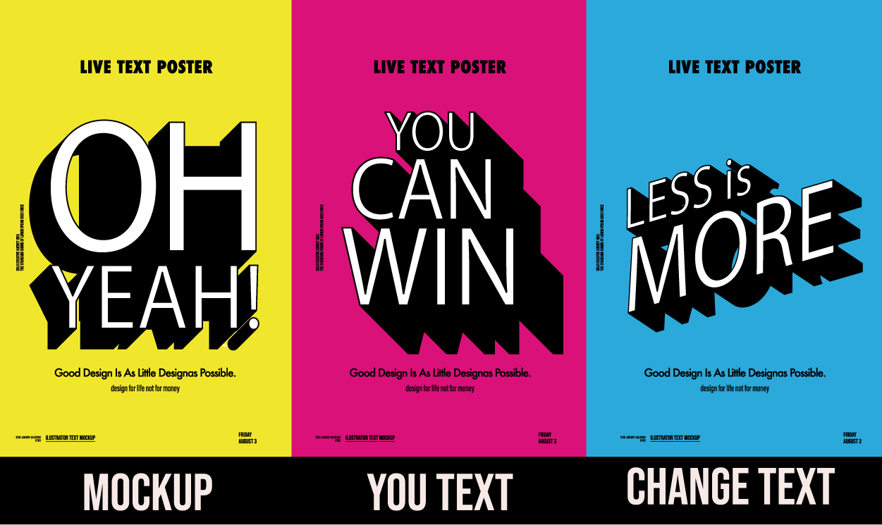
The image below is an example of a template available through Adobe Stock. As you can see, templates like this can be quickly downloaded and edited to create graphics that don’t require a lot of technical knowledge or design training to make effective visual media.
Two popular WYSIWYG software applications are Canva and Adobe Express. Both programs allow users to edit and design media using quick start templates and output designs for print or screens. There is a very low learning curve to both applications, and users can generate designs with quick turnaround times.
While WYSIWYG editors are fast and have the potential to yield eye-catching graphics, there are limitations. Sometimes, graphics need to be adjusted, and web designs need editing that can’t be done within a WYSIWYG program. These situations call for a designer with a deeper understanding of digital media and visual communications. Consider that using a WYSIWYG to design is like buying a car with the hood welded shut. The car may be shiny and new, and everything is fine if the car is running great, but what happens when the car breaks down or needs an oil change? If you’re unable to service the car, eventually it will be undrivable. The same holds true when there’s a problem with a website or a graphic that can’t be edited to correct an issue because it's not within the WYSIWYG’s editing capabilities or because the user lacks the knowledge.
Source: THIS TUTORIAL WAS AUTHORED BY MARIO E. HERNANDEZ FOR SOPHIA LEARNING. PLEASE SEE OUR TERMS OF USE.