Table of Contents |
A grid is an underlying structure upon which a layout can be built, typically comprised of rows, columns, and the gaps between them.
Below is an image of a grid. Notice how the text aligns on rows and columns within the grid. Grids are useful for designers because they are guidelines for visual structure. People crave order and alignment and will tend to respond positively to designs built on grid structures.
A grid is made up of components, namely modules and rows. Within an average spread, there are columns, a gutter, which is the white space between pages, and the alleys, which are the white spaces between the columns. There are margins, or the space surrounding the page, separating the text from the edges of the page.
The example below shows a grid used as an underlying structure for a design.
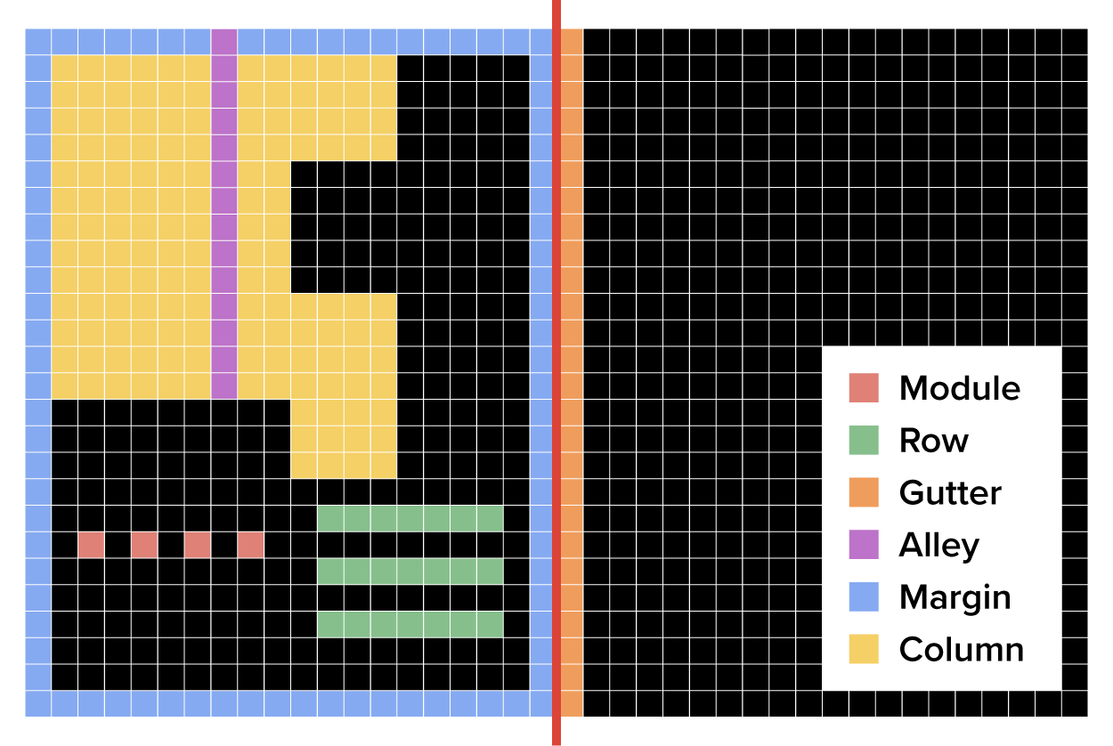
The red line divides the two pages; the gutter, again, is the space between the pages. You can see that the column is the component that spans the page vertically. More columns can be used or added.
Between the columns, there is empty space, which is the alley. Then, the empty space separating the content from the edge of the page is the margin.
The row is a component of a layout grid which spans the page horizontally. Just like with columns, more rows can be added to create a different layout. The module, then, is the name for the basic component of the layout grid which overlays a matrix of columns and rows.
Josef Müller-Brockmann was a Swiss graphic designer, teacher, and key proponent of the International Style movement.
Müller-Brockmann pioneered the use of grid systems in graphic design. The International Style movement, also known as Swiss Style, is characterized by the use of asymmetrically balanced, rigid typographic grids, and the use of sans serif typefaces.
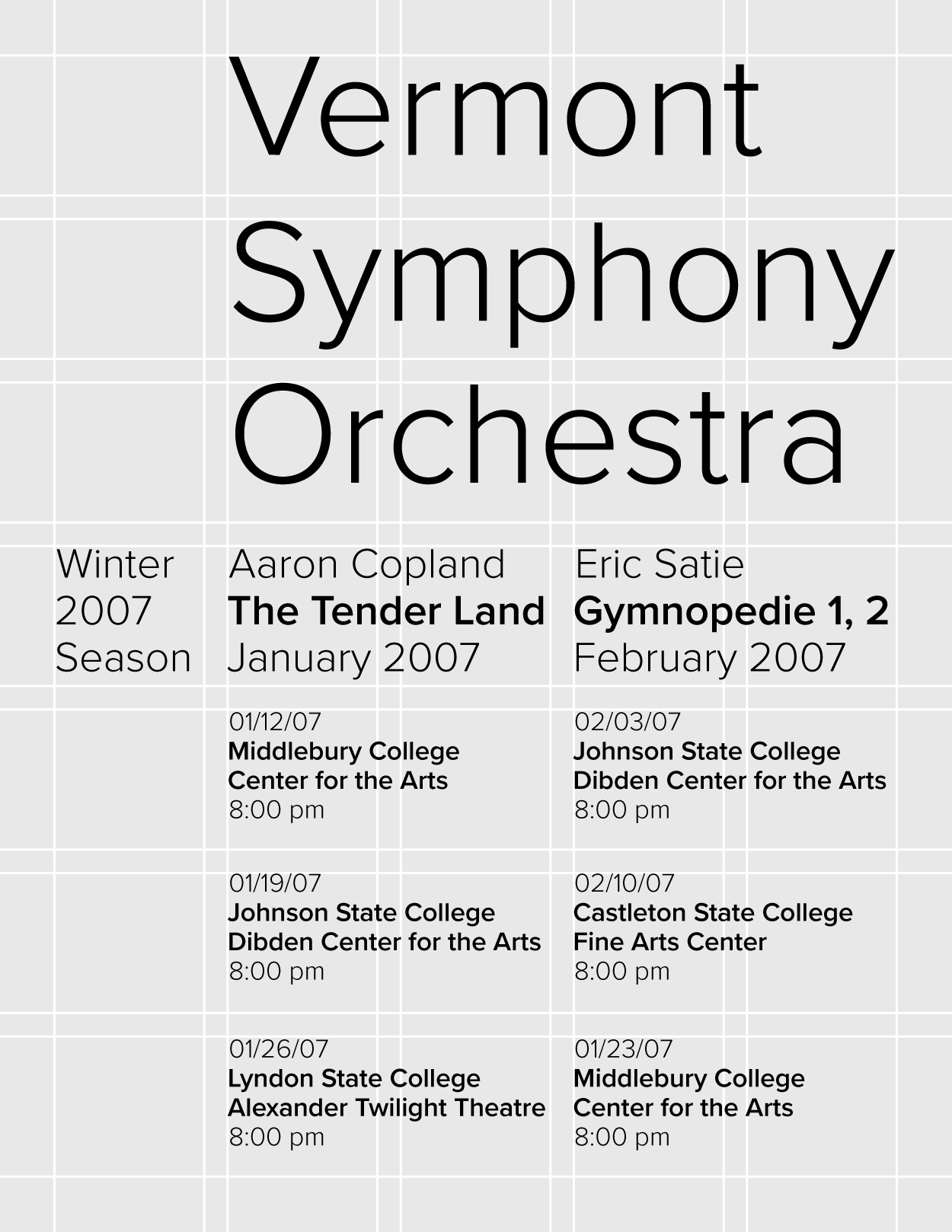
The image below is a poster design created by Josef Müller-Brockmann in 1957. Notice the use of varying column widths and sans serif typography.

Also note in the image that the top of the piece is a lot heavier.
In the image below, there are similar characteristics—the use of sans serif typeface and asymmetrical balance. In this example, the weight is transferred to the bottom of the layout instead of the top.

There is another style called De Stijl, which means "the Style." This was a Dutch art movement focused on the use of simple geometric form and primary colors.
The painter Piet Mondrian was part of this movement. In the following image, you can see the grid quality and structure.

Massimo Vignelli was a designer who did work in a vast range of areas, such as packaging, housewares, and furniture.
Vignelli created multiple designs for the National Park Service based on the Unigrid system which he designed. This system allowed the National Park Service to create brochures in many basic formats while keeping a consistent look.
Source: THIS TUTORIAL WAS AUTHORED BY MARIO E. HERNANDEZ FOR SOPHIA LEARNING. PLEASE SEE OUR TERMS OF USE.