Table of Contents |
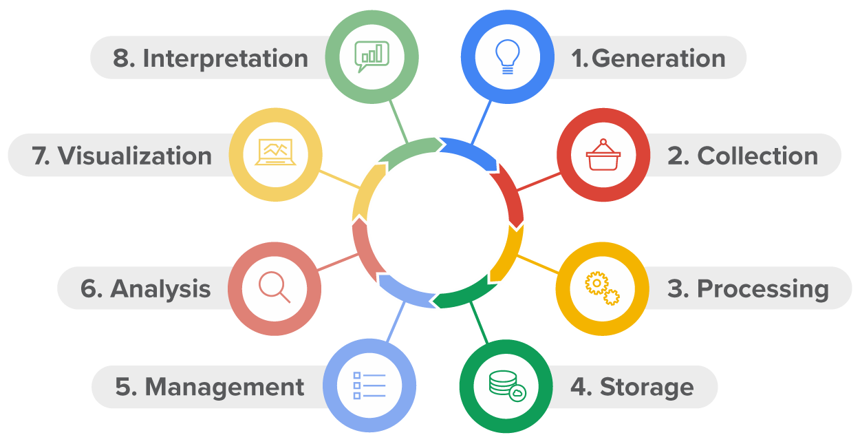
Before data can be used in any meaningful manner, it must be generated. Data generation is the starting point. This can happen through various external activities such as:
EXAMPLE
Social media websites, discussion boards, and chat rooms also generate data related to business products or services. For example, many car companies like Toyota have online groups with chat rooms that discuss new features or problems of a particular make of Toyota vehicle.IN CONTEXT
Measuring Environmental Impact
Businesses are starting to generate data related to the environment and their impact on the environment. Businesses have several compelling reasons to reduce pollution and address climate change. First, there is regulatory pressure from government agencies. Many states have established environmental regulations and emission standards. Businesses must comply with these rules to avoid fines, legal penalties, and reputational damage. Non-compliance can lead to financial losses and hinder business operations.
Another reason businesses are generating environmental data is due to expectations from a variety of business stakeholders. Investors, customers, employees, and communities increasingly expect companies to demonstrate environmental responsibility. Environmental, social, and governance (ESG) scores are gaining in popularity in business. An ESG score is a number from 0 to 100 that measures a business’s sustainability practices and societal impact. The higher the score indicates better performance. Businesses that prioritize sustainability are more attractive to stakeholders and can maintain positive relationships.
IN CONTEXT
Scenario: Data Generation at the EPA
Suppose you are working as a data analyst for the EPA (Environmental Protection Agency). The EPA studies a wide range of economic issues related to climate change. You have been given six months to develop a pollution prevention dashboard. A dashboard is a collection of visualizations that contain interactivity. The dashboard will track pollutants for several food manufacturing sectors.
Pollution prevention is a method used to prevent or eliminate pollutants at their source before the need to recycle or dispose of them. The EPA has conducted a survey and many food manufacturing businesses responded they would share the environmental data they generate for the EPA to provide them with a pollution prevention dashboard.
Not all data that is generated will be used for an analytical project. In this stage, a question must be developed that will be answered using data analytics that address the business problem. To illustrate the importance of asking good questions of your data, consider a quote commonly attributed to Albert Einstein.
Asking questions about the data assists in defining the objective and goals of the analytical project. You will decide on what key metrics to calculate, what type of data analytical technique to employ, and the type and quantity of visualizations necessary. Asking these questions assists in targeting the data that needs to be collected to complete the analytical task. Once the business problem is defined, the problem must be translated into an analytical task. The purpose of the analytical task is to determine what data will be collected.
IN CONTEXT
Scenario: Data Collection at the EPA
After working with the stakeholders and other members of your project team at the EPA, you have decided that one of the main visualizations in the dashboard will be a bubble map of the United States showing the concentration of pollutants for several food manufacturing sectors. Below is an example of what the bubble map might look like.
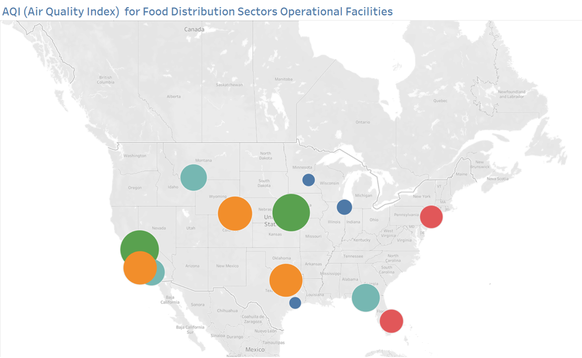
The metric used for the bubble map will be an air quality index (AQI). An AQI index is a number from 0 to 500. The closer the index is to 0, the smaller the number of pollutants in the air. The closer the index is to 500 the more pollutants are present in the air. The components required to calculate AQI are:The size of the circle represents the AQI for a manufacturing plant location while the color represents the particular sector. For example, bakery is denoted by blue while dairy is represented by orange.
- Ground level ozone
- Carbon dioxide
- Sulfur dioxide
- Nitrogen dioxide
- Airborne particles, or aerosols
The food manufacturing plants have on-site sensors at their physical locations that collect these components on a daily, and sometimes hourly, basis. The EPA has reached out to the food manufacturing plants and requested they submit their data to the EPA so the dashboard can be created.
In the top right of the bubble map, there is a drop-down option for the date as shown in the figure below. For any day, the plant will be able to observe how its AQI index is performing. This interactivity allows the plants to monitor their AQI daily.
If you were working as a data analyst for the EPA, your task would be to take the data collected from each plan and calculate the AQI metric and construct the bubble map. You would take the data collected from each plant and calculate the AQI metric, then construct the bubble map.
Once data has been collected, it must be processed. Data processing refers to preparing the data so that a data analytical technique can be applied. Data rarely, if ever, is collected in a manner that is ready for analysis. Processing is one of the most time-consuming and least glamorous parts of completing an analytical project. A data analyst can expect to spend 80% of their time on processing and 20% of their time performing the data analysis.
IN CONTEXT
Scenario: Data Processing at the EPA
You have now received all the data files from the food manufacturers' plants, and the data is a mess! Some plants sent the data in Excel files and some in text files. Some plants put all the components (ground-level ozone, carbon dioxide, etc.) in one file while others sent multiple files with one single component per file.
In addition to the data collected not being properly structured, you notice there are missing values. You will have to decide how you will handle missing values. You can choose to delete them or estimate the values using other metrics like the mean or median values.
You also notice there is a problem with consistency in the files the plants submitted. Some plants reported the different components (ground level ozone, carbon monoxide, etc.) on an hourly basis and some reported the components daily. Some of the components are measured using different scales. For example, one bakery reported carbon monoxide using parts per million and a dairy reported carbon monoxide as a percentage. You will have to ensure that the values of the components are all in the same measurement scale before you calculate AQI.
Data processing means you check for outliers in the data. Outliers are data values outside the range of typical values. Similarly, with missing values, you must decide how you want to handle outliers. It may be a good idea to omit the observation that contains an outlier. If you make this decision, make sure you properly document what data was omitted and why.
You will have to spend a couple of weeks cleaning the data and processing the data to obtain one single data file that can be used to create the bubble map.
All these decisions related to processing the data are left to the business data analyst. It is your responsibility to document all changes made to the data when formally presenting the data. Add footnotes to the report indicating what data was deleted, modified, or manipulated during the processing stage.
Choosing the appropriate type of storage for the data after it has been collected and processed will help secure the data and allow for the data to be reused for another analysis. The data sets can be stored in the cloud or on a server. Many businesses store their data in a relational database. A relational database is a way of storing data sets so that the data sets can be easily related to one another.
IN CONTEXT
Scenario: Data Storage at the EPA
The image below shows how the data collected from the food manufacturing plants might be stored in a relational database.
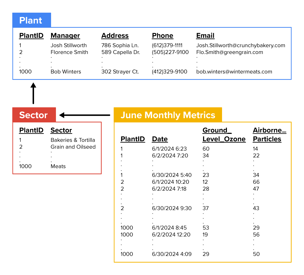
It is common for businesses to store their data across multiple related tables as shown in the image above. The tables are related by the column PlantID. All tables have this variable in common. This method of storing data helps reduce the amount of redundant data. Redundant data is data that appears in multiple places and can lead to inconsistencies. Splitting the data into separate tables ensures each piece of information is only stored once.
Imagine if one of your plant managers’ email changes. If the email address was stored in multiple tables, the Plant and Sector tables, the email address would have to be updated in both tables. This practice could be error-prone and time-consuming. By keeping a particular column of data (such as email) in a single location, the risk of having different data in different places is minimized. Data updates become simpler and less error prone.
Data management is the process of managing and accessing data for a business. The goal of data management is to make sure the data is secure and can be easily accessed by the data analyst and others when needed. Typically, there is an individual, known as a database administrator, whose sole job is to manage the business data. The database administrator designs and creates the relational databases and manages which employees have access to the data tables in the databases. The management of which employees have access to the data tables is part of data security.
People often interchange the terms analysis and analytics. The terms have two different meanings. Analysis refers to the study or critique of some process. For example, a business analysis could be a report that describes how a company has performed compared to what stockholders were expecting. Analytics refers to applying quantitative methods like math and statistical techniques to data to glean insights that will assist a business in making better decisions. Visualization can also be an analytical technique. In this course's context and business data analytics in general, the use of the word "analysis" often refers to "analytics."
Data visualization is a subset of analytics. Visualizations are analytical tools used to graphically display data. Visualizations are powerful tools because they allow you to communicate data insights to a wide audience. When you are communicating data to a non-technical audience, data visualization should be a first consideration. Visualizations make the data more accessible. Visualizations allow you to represent the data in an appealing format that is easier for non-technical audiences to consume.
IN CONTEXT
Scenario: Visualization at the EPA
The bubble map that you are creating for the food manufacturing sectors allows the plants to quickly detect which food manufacturing sector is contributing the most to a poor AQI. This insight is more quickly and easily derived using a bubble map rather than using a table with a list of AQI metrics.
Perhaps the most valuable stage of the data lifecycle is interpretation. Interpreting the analytical results assists the business in making decisions based on data. A gold standard in modern-day businesses that use data to enhance their operations is an individual who understands how data interacts with other parts of the business. Part of analytical interpretation includes how to explain the impact and make recommendations from the analytical results to high-level managers through the lens of the business context.
IN CONTEXT
Scenario: Interpretation at the EPA
The bubble map which is one of the visualizations for the pollution prevention dashboard can significantly impact a manufacturing plant’s decision-making process by providing daily insights related to environmental sustainability. Your job as the data analyst is to assist the plants in interpreting the bubble map. That is, pay attention to the visual cues of the map like the bubble size. You should also provide the plants with context for the bubble map. For example, explain the source of data used to construct the bubble map. In this scenario, the map was constructed using data generated at the plant’s location. However, this data may not tell the entire story. Discuss with the plants how other factors like industrial activity, traffic, weather conditions, and geographical features could also be impacting the AQI. Provide suggestions for how these other factors could be added to the dashboard to further assist with sustainability decision-making.
Source: THIS TUTORIAL WAS AUTHORED BY SOPHIA LEARNING. PLEASE SEE OUR TERMS OF USE.