Table of Contents |
Imagine that you are working on a project and need to add a graphic to an empty portion of a webpage.
EXAMPLE
You have about 200 pixels by 200 pixels of space on the page, so you decide to use an image that is 195 pixels by 195 pixels.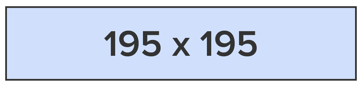
The image fits perfectly . . . but it needs a border in order to match the style of all other images.
EXAMPLE
You apply a 5 pixel border to all four sides of the graphic. When you refresh the page, you see that the image is no longer in the correct position and other elements have been bumped around the page, creating a mess of the layout.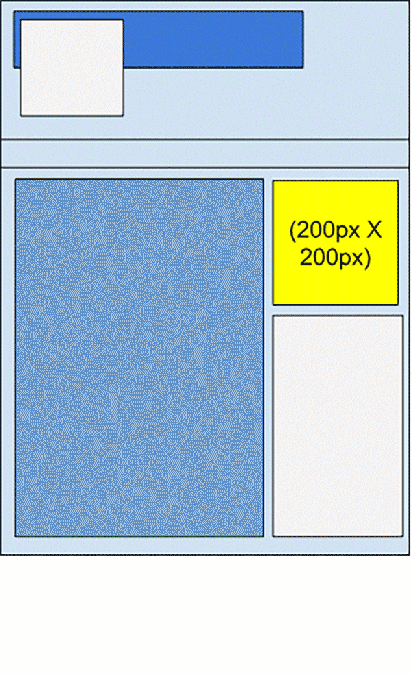
What’s the deal? The image was small enough to fit, so why did it get pushed around as if it were too big? Well, one concept that is helpful to be aware of when it comes to designing and fine-tuning layouts and design elements is the box model. The box model is how elements get sized based on the element’s height and width properties.
EXAMPLE
Multiple parts of the element take up space.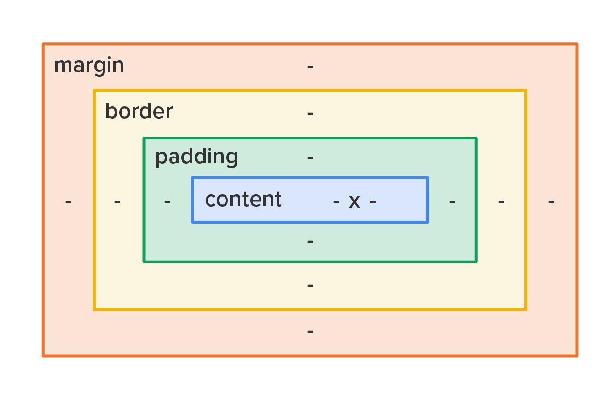
We have the content area in the middle, which represents the actual content being displayed, whether the content is just text, an image, or a combination. Next is the padding area; this is the empty space between the content and the start of the border area and consists of top, right, bottom, and left size values in pixels. Next is the border, which also has top, right, bottom, and left size values. Lastly, there is the margin area, which is the empty space between the outer edge of the border and any other surrounding elements.
Margin and padding widths can be uniform on all four sides or customized for different sizes. The margin area can be set uniform for all sides by using the margin property (margin: 5px). Alternatively, the size of the margin area can also be set by using the margin-top, margin-right, margin-bottom, and margin-left properties.
Similarly, the padding can be set uniformly by using the padding property (padding: 3px) and also by the padding-top, padding-right, padding-bottom, and padding-left properties.
The default setting of the CSS box model is to apply the height and width you assign to the content only, and it does NOT include the padding, border, and margin in those dimensions.
So, the question arises, “If I set the height and width of an element, at what layer in the box model are the height and width attributes applied?” The answer comes from the box-sizing property detailed in the next section.
Box Model
A visual representation of concentric boxes that represent the size and widths of the different parts of an HTML element, including the content, padding, border, and margin.
Content
The space that is taken up by the content contained with an HTML element.
Padding
The space that exists between the content of an HTML element and its border.
Border
The visible outline around an HTML element.
Margin
The empty space between an HTML element’s visible portion (the border, padding, and content) and other HTML elements.
Box-sizing is a CSS setting that determines where the specified height and width values are applied. This property allows you to include the padding and border in an element’s total width and height and has two possible values:
| Value | Description |
|---|---|
| content-box (default) | Height and width values are applied directly to the content section. Anything else (padding, border, and margin) adds to the overall size of the element. |
| border-box | Height and width values are applied to the outer edge of the border. This ensures that the visible portions (the border, padding, and content) receive the specified size, and the padding and content are adjusted down accordingly. |
EXAMPLE
Let’s revisit the previous scenario where you added a 195 pixel by 195 pixel image with a 5 pixel border all the way around to a 200 by 200 pixel space.
The image got bumped around because the image (i.e., the content) was 195 pixels by 195 pixels as set by the height and width properties, but then 5 pixels of the border were added, causing the overall element to be 205 pixels by 205 pixels.
EXAMPLE
Let’s take a closer look at the issue: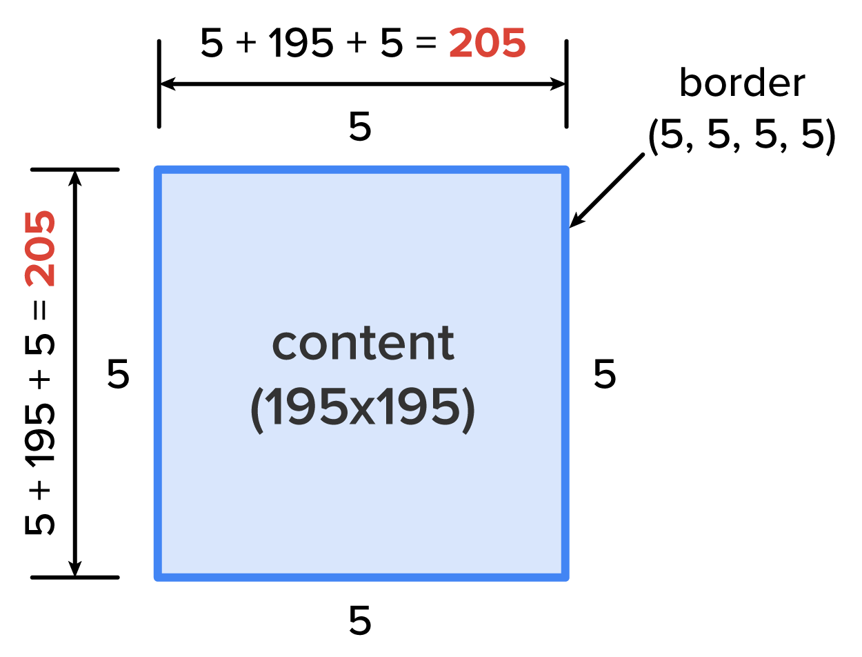
To remedy this, one of two actions needs to be taken. The first option is to use the box model to manually calculate the additional space taken up by the padding and border and subtract that from the content.
EXAMPLE
In the scenario where you added a 195 pixel by 195 pixel image with a 5 pixel border all the way around to a 200 by 200 pixel space, you did not take the padding into account. For simplicity, let’s assume the padding and borders are set to 5 pixels each; then, the content must be set to 190 pixels to fit within a 200 pixel space (content + border + padding = overall element space).EXAMPLE
The box’s area stops at the border and it does not extend into the margin.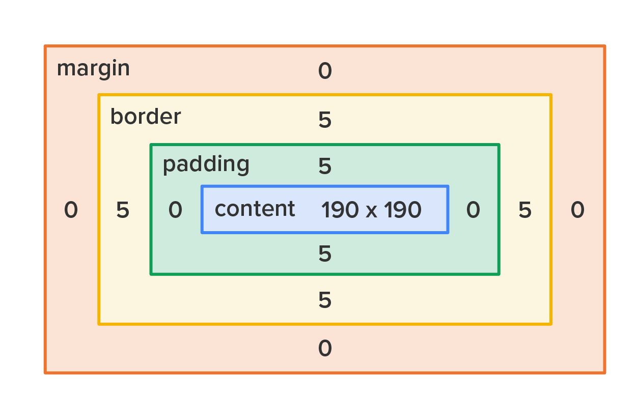
The second, and better option, is to select the element using CSS and change the value of the box-sizing property to border-box.
EXAMPLE
The CSS code
#content {
     box-sizing: border-box;
     height: 195px;
     width: 195px;
}
EXAMPLE
The output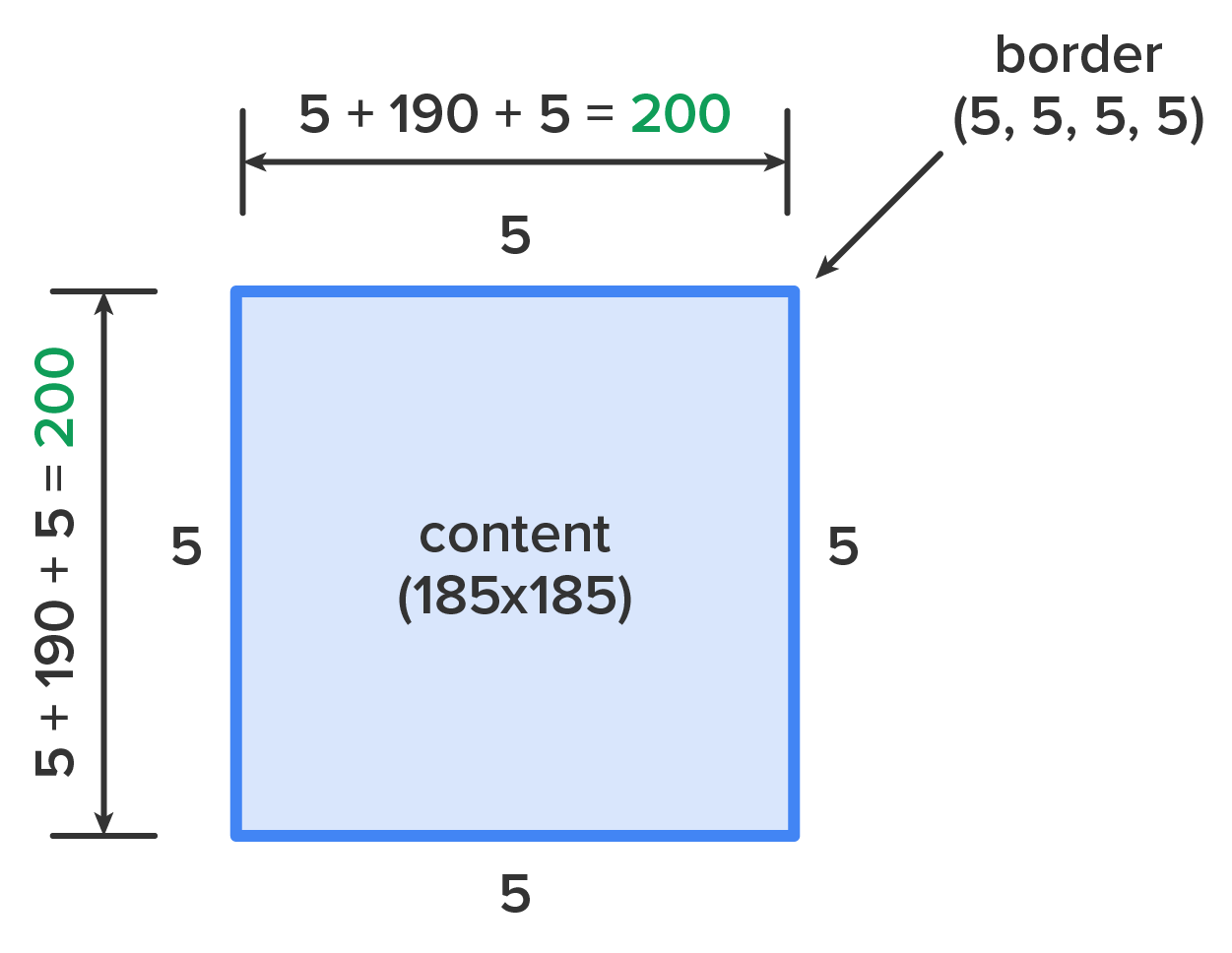
This can be applied to elements on an as-needed basis, but it can also be applied to the entire page by using the universal selector. This ensures that all content, padding, and border are sized to the specified dimensions.
Directions: Now that you have learned about how the box model works, it’s time to see it in action.
Using the Inspect feature of the Google Chrome browser is a great way to see how specific website features were coded by the developers.
Box-Sizing
A CSS property that determines how the width and height properties are applied to an HTML element.
Content-Box
A value of the box-sizing property that calculates an element’s assigned height and width based on the content portion, with all other portions taking up space beyond the specified height and width.
Border-Box
A value of the box-sizing property that calculates an element’s assigned height and width based on the border and including the padding and content.
Source: This Tutorial has been adapted from "The Missing Link: An Introduction to Web Development and Programming " by Michael Mendez. Access for free at https://open.umn.edu/opentextbooks/textbooks/the-missing-link-an-introduction-to-web-development-and-programming. License: Creative Commons attribution: CC BY-NC-SA.