Use Sophia to knock out your gen-ed requirements quickly and affordably. Learn more
×

Table Design Principles

Author: Sophia

what's covered
In this lesson, you will learn about design concepts for when you need to display and present data using tables. Specifically, this lesson will cover:

Table of Contents

1. Data Visualizations versus Tables

There are several scenarios where using a table is more appropriate than a visual representation. A table works best when:

  • Individual values must be looked up
  • Values must be expressed precisely (Few, 2012; Knaflic, 2015).
Let’s look at an example of when you need to use a table to look up individual values.

EXAMPLE

Imagine a sales manager at a retail company. The manager wants to analyze the monthly sales performance of team members. You collect data on sales for each team member, including their names, sales amounts, and dates. This data is stored in a spreadsheet. You need to update this data regularly as new sales occur. A table is ideal for this purpose because it allows you to input precise numerical values (sales amounts) and other relevant information (such as dates and team member names).

Suppose the manager needs to know how much Jasmine sold in February. The table below can be provided to the manager, and the manager can quickly locate Jasmine’s row, look up the value in the February column, and find her exact sales amount.


Tables are perfect for presenting precise numerical values. The manager can see the exact sales figures without any approximation.

A bar graph could be used to visualize these data too, but that is if you were interested in focusing on a comparison or trend of monthly sales over the months for the team members, instead of precise comparisons.

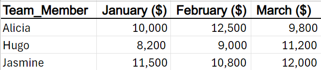
Tables are perfect for data requiring meticulous attention and precise values. If you want to visualize overall trends, compare sales across team members, or identify patterns (for example, which months had the highest sales), charts (such as line graphs or bar charts) would be more suitable.

term to know
Table
A structured arrangement of data organized into rows and columns.


2. Table Design Properties

Let’s dive into the principles of effective table design for presenting raw data in a clear and usable format. Listed below are some best practices for table design1,2.

  • Column Headers Stand Out: Make column headers distinct from the data. Use bold text or a different font size to emphasize them. Clear headers help users quickly understand what each column represents.
  • Light Shading for Separation: Apply light shading to separate rows or columns. This subtle visual cue helps readers distinguish between different data points.
  • Minimal Borders: Borders should be used to improve the legibility of the table. Think about pushing the borders to the background or eliminating them altogether. The data should be what stands out, not the borders.
  • Text Alignment: Left-align text (labels, descriptions) and right-align numbers. This alignment enhances readability by creating a consistent visual flow.
  • Currency Symbols: Use currency symbols sparingly. Too many symbols can clutter the data.
  • Precision: Do not exceed the required level of precision. Too many decimal places can clutter the table and prevent comparisons.
  • Avoid Repetition: Place labels only in the first row to prevent redundancy. Repeating labels for each row can clutter the table.
  • Group and Sort Data: Organize data logically. Group related rows together and sort them based on meaningful patterns (e.g., chronological order, alphabetical order).
  • Use Color Sparingly: Use color judiciously. Highlight key items or outliers with subtle color accents.
try it
The table below shows the breakdown of customers based on their credit rating categories at a financial institution.


You have been told the information must be communicated using a table. Are there any changes that you would make to the way the data is presented or the overall way the table is designed?

Below are the answers to the question above:

1. Remove unnecessary elements that detract from the data. The heavy borders and the black shading behind the column names need to be removed. This shading does not assist the user in understanding the data in the table. This table design property has been implemented in the figure below.


2. Make the column labels bold so that they stand out from the rest of the data. This table design property has been implemented in the figure below.


3. The text in the Credit Category column needs to be left-aligned, and all the numerical values need to be right-aligned. Center-aligned text can lead to hanging text and jagged edges, making the data look messy. When text spans multiple lines, this issue becomes more pronounced. To maintain a cleaner appearance, left-align your text. This table design property has been implemented in the figure below.


4. There are too many formatting symbols used in the table. In the columns that use the % and $ signs, the column labels indicate the symbol. There is no need to repeat the symbols on every row in the table. This overuse of symbols makes the data in the table cluttered. This table design property has been implemented in the figure below.


5. Examine the digits of significance for the % Accounts column. The two decimal places seem like a lot given the context of the data. There is no single right answer to how many decimal places should be used. A good rule of thumb is to ask yourself, “Do the decimal places provide a meaningful difference when interpreting the values?” For example, in this scenario, is there a meaningful difference between 8.7% and 8.72%? If not, you can drop a digit by rounding. In this context, given the differences between the numbers, you can round to whole numbers.

For the Revenue ($ mil) column, it might be important to know that the revenue for the Very Good category of customers is $5,680,000 versus $5,600,000. By rounding to one fewer decimal place, $80,000 is not being represented. This might be significant to the financial institution. So, in this context, it might be practical to round to two decimal places for this column. This table design property has been implemented in the figure below.


6. The Credit Category represents the customers as classified by their credit rating categories. The Excellent category should be listed before the Very Good category to maintain a logical ordering or grouping of the categories. The data in these rows should be switched. The table below implements this design change and provides the final table with all table design elements incorporated.

2a. Heatmap Tables

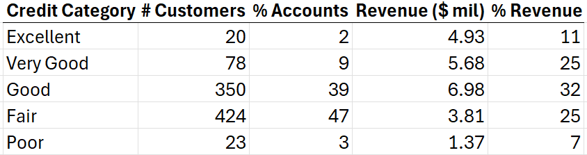
A heatmap is a special type of table. A heatmap enhances a table by visually representing patterns and relationships within the data. Unlike a plain table, a heatmap uses color intensity to highlight variations in values across rows and columns. It allows you to quickly identify trends, clusters, and outliers.

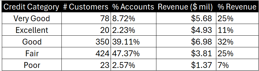
Color is a preattentive attribute and needs to be used judiciously in a table. When color is used intentionally and sparingly, it can be used as a technique to draw the audience’s attention to where you want them to focus. Let’s look at an example where a heatmap can be used to direct attention to a certain aspect of a table.

EXAMPLE

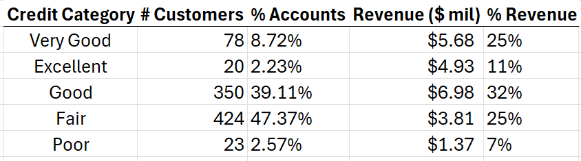
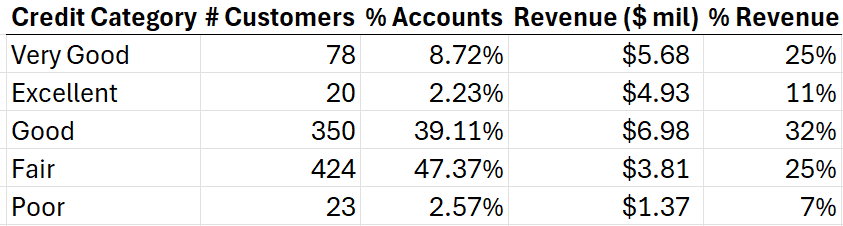
The heatmap below shows the previous table for information related to the credit ratings of customers at a financial institution converted to a heatmap.


Suppose you want the audience to make a comparison between the two columns % Accounts and % Revenue. You can apply heatmapping using a green color gradient for just these two columns. The lighter shade of green indicates relatively lower values, and the darker green indicates higher values. The heatmap enables the audience to compare two columns by visually highlighting the relative intensity of values across both columns.

Color allows you to direct your audience to where you want them to pay attention. When you look at the table, ask yourself the question, “Where are my eyes drawn?” For example, when you look at the heatmap, your eye should be drawn to the number 47% in the % Accounts column, and it should be quite easy to detect that the largest percentage of accounts are made up of customers with Fair credit scores.

try it
Create the heatmap using the customer credit ratings.

1. Open credit_ratings_table.xlsx.

2. Select the two columns % Accounts and % Revenue. You can use the CTRL key to select multiple columns.

3. From the Home menu, select the drop-down arrow to the right of the Conditional Formatting tool --> Color Scales --> Blue-White-Red Color Scale.


4. The table will update with the color scale, showing that the darker blue indicates a higher value and the darker the red indicates a lower value.

In the next section, you will learn that there are some colors, like red, that you should avoid due to design considerations.


5. Check your work by comparing your heatmap to the one in this Try It exercise. 

did you know
A heatmap can indeed function as both a table and a graph.
  • Graphical Representation: A heatmap visually represents data where individual values are represented by colors.
  • Tabular Structure: The underlying structure of a heatmap can be a table, where rows and columns correspond to different categories or variables. Each cell in this table is color-coded based on the value it represents.

2b. Use of Color in Table Design

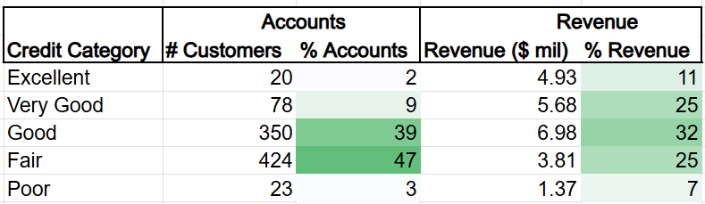
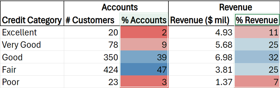
The choice of color in a heatmap plays a crucial role in shaping the audience’s perception of the data. Several color design principles must be considered when selecting a color for a heatmap. The table below provides some best practices for using color.

Color Design Concept Best Practice
Contrast and Intensity Dark colors (dark blue) highlight significant/high values, and lighter colors (light blue) indicate lower values.
Emotional Associations Color invokes emotions. Red signals urgency/problem. Whereas blue conveys calmness/coolness.
Cultural Context Color meanings can vary across cultures. What’s perceived as positive or negative might differ based on cultural backgrounds.
Accessibility Consider using color-blind-friendly colors like orange and blue. Stay away from colors that color-blind individuals have trouble with, like red, green, and yellow.

summary
In this lesson, you learned key principles for designing clear and effective tables, emphasizing the importance of formatting choices such as bold headers, minimal borders, aligned text, and appropriate precision. It also introduced heatmaps as an enhanced table format that uses color to highlight patterns, trends, and key comparisons, making it easier for the audience to interpret data. Heatmaps serve as both tabular and graphical representations, offering a balance between numerical precision and visual insight. By applying these table design and heatmap principles, you can present data in a way that improves clarity, usability, and audience focus.

Source: THIS TUTORIAL WAS AUTHORED BY SOPHIA LEARNING. PLEASE SEE OUR TERMS OF USE.

REFERENCES

Few, S. (2012). Show Me the Numbers: Designing Tables and Graphs to Enlighten (2nd ed.). Burlingame, CA: Analytics Press.

Nussbaumer Knaflic, C. (2015). Storytelling with data (C. N. Knaflic, Ed.). John Wiley & Sons.

Terms to Know
Table

A structured arrangement of data organized into rows and columns.