Use Sophia to knock out your gen-ed requirements quickly and affordably. Learn more
×

Supply and Demand

Author: Sophia

what's covered
This lesson will cover the laws of supply and demand. Specifically, this lesson will cover the following:

Table of Contents

1. Law of Supply

Let’s begin by thinking about supply, which is the idea that there are different quantities of goods and services that producers can make at different prices.

hint
For supply, you have to think like a producer. Supply means “I can produce something, and I am willing to supply it at a certain price.”

EXAMPLE

Let’s look at a farmer’s willingness to supply apples. Here is a chart that outlines the different prices of apples and the quantity that he is willing to supply.

Price of Granny Smith Apples Quantity of Granny Smith Apples Each Week
$2.00 7
$1.75 6
$1.50 5
$1.25 4
$1.00 3
$0.75 2
$0.50 1
$0.25 0

Now, if we chart those numbers, we can see that the supply curve is upward sloping. As the farmer believes he can receive a higher price for his apples, he is willing to supply a greater quantity. As the price falls, he is not willing to supply as much of the quantity.

A graph that depicts the concept of movement along a supply curve. The horizontal x-axis represents the quantity of apples in thousands of bushels. This axis is divided into increments of 1, starting at 0 and ending at 7. The vertical y-axis represents the price per apple in dollars. This axis is divided into increments of 0.25 , starting at 0 and ending at 2 dollars. A line passes through the following points: x equals 0 and y equals 0.25 dollars, x equals 3 and y equals 1 dollar, and x equals 7 and y equals 2 dollars. The supply curve is upward sloping because the farmer is willing to supply a greater quantity for a higher price for their apples.

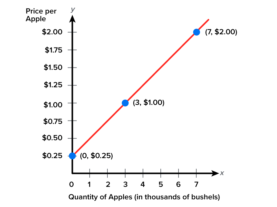
This is basically the law of supply. Notice that the price and the quantity being supplied move in the same direction, so there is a positive relationship between them for supply.

A depiction of the positive relationship between the price of a commodity and the quantity desired or bought. As the price of apples falls, the quantity that the farmer is willing to produce also falls with it. P, which is Price, goes down, as does Q, which is quantity.

This is known as movement along a supply curve or demand curve, as you will see later in the lesson. When the price of a product changes, it impacts the quantity being supplied or the quantity being demanded because we move up and down that curve.

However, this assumes “ceteris paribus,” a Latin phrase that means “holding all other things constant.” The idea here is that as the price of apples falls, we can expect the farmer to produce fewer apples because it is not worth as much of his time.

However, what ceteris paribus assumes is that the price of apples is the only thing that has changed. For instance, it assumes that the price of their resources, or inputs, did not change, nor did their technology. Only the price of the apples changed, which correlates with that movement along the curve.

terms to know
Supply
The amount of a good or service a producer is willing and able to provide at different prices.
Movement Along a Supply Curve or Demand Curve
Demonstrated when the price of a product changes and impacts the quantity supplied (demanded).
Ceteris Paribus
Latin for “holding all other things constant.”


2. Shifts in Supply

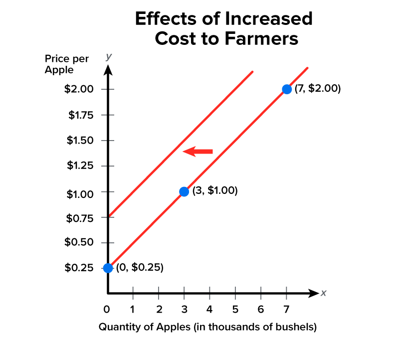
However, we know that things in the world are always changing. For instance, what if fertilizers have suddenly become more expensive, the farmer has to pay his workers more money because the wages have risen, or new technology has been developed that makes apple picking much more efficient?

These things will not just be movements along the supply curve. The farmer will not supply the same amount of apples, yet the price of the product—the apples—does not change. So, now, we need to shift the supply curve and note that the same rules will apply to demand.

When there is a shifting of the supply curve, it means that different quantities are going to be supplied or demanded at all prices. For supply, the shift occurs because of more or less resource access, a decrease or increase in the price of inputs, or changes in regulation like taxes and subsidies.

EXAMPLE

If there is an increased cost to the farmer, like his fertilizers becoming more expensive, he now cannot supply as many apples at every price level.

Price of Granny Smith Apples Quantity of Granny Smith Apples Each Week
$2.00 5
$1.75 4
$1.50 3
$1.25 2
$1.00 1
$0.75 0
$0.50 0
$0.25 0

This is seen as a shift of the supply curve to the left, which is a decrease in supply. This happened because the price of apples did not change, so now there is an entirely new relationship between price and quantity.

A graph that depicts the effects of increased cost to farmers. The horizontal x-axis represents the quantity of apples in thousands of bushels. This axis is divided into increments of 1, starting at 0 and ending at 7. The vertical y-axis represents the price per apple in dollars. This axis is divided into increments of 0.25 dollars, starting at 0 and ending at 2 dollars. A line passes through the following points: x equals 0 and y equals 0.25 dollars, x equals 3 and y equals 1 dollar, and x equals 7 and y equals 2 dollars. A new line passes through x equals 0 and y equals 0.75, which is the new supply curve as required by the increased cost of fertilizer, reflecting the impact of increased costs to farmers and depicting the new relationship between the price and the quantity that the farmer is able and willing to supply. An arrow between the two lines points to the left, indicating a decrease in supply.

As a reference, here is a list of factors that cause a shift in supply:

  1. Changes in input prices
    1. Land
    2. Labor
    3. Capital
  2. Changes in resource access
  3. Technological changes
  4. Government policies (taxes, subsidies, etc.)
big idea
In order for there to be a shift in the supply curve, something has to change the production capabilities of a firm.
  • Anything that makes it easier or less expensive to produce a good or service will cause an increase in supply, or a shift to the right.
  • Anything that makes it more difficult or more expensive will cause a decrease in supply, or a shift to the left.

EXAMPLE

As a reminder, a change in input price, like the increased cost of fertilizers, will cause a decrease in supply and a shift to the left.

 A graph that depicts the effects of increased cost to farmers. The horizontal x-axis represents the quantity of apples in thousands of bushels. This axis is divided into increments of 1, starting at 0 and ending at 7. The vertical y-axis represents the price per apple in dollars. This axis is divided into increments of 0.25 dollars, starting at 0 and ending at 2 dollars. A line passes through the following points: x equals 0 and y equals 0.25 dollars, x equals 3 and y equals 1 dollar, and x equals 7 and y equals 2 dollars. A new line passes through x equals 0 and y equals 0.75 dollars, which is the new supply curve as required by the increased cost of fertilizer, depicting the new relationship between the price and the quantity that the farmer is able and willing to supply.
Price of apples did not change but fertilizer got more expensive. This makes it more expensive for the farmer so he will supply fewer apples at all prices now.

big idea
Increase in Input Price = Decrease in Supply.
Decrease in Input Price = Increase in Supply.

Alternatively, if technology improves and the farmer can be more efficient, he can now supply more apples at all prices, which causes a shift in supply to the right.

A graph that depicts the impact of improved technology on supply. The horizontal x-axis represents the quantity of apples in thousands of bushels. This axis is divided into increments of 1, starting at 0 and ending at 7. The vertical y-axis represents the price per apple in dollars. This axis is divided into increments of 0.25 dollars, starting at 0 and ending at 2 dollars. A line passes through the following points: x equals 0 and y equals 0.25 dollars, x equals 3 and y equals 1 dollar, and x equals 7 and y equals 2 dollars, representing the original supply curve. A second line, shifted to the right, begins at x equals 0 and y equals 0.25 dollars and ends at x equals 7 and y equals 2 dollars, which is the new supply curve due to the effect of the improved technology for apple growing and picking. This second line indicates that the farmers are able to supply apples more efficiently at all prices.
If technology improves for apple growing or apple picking, then this will make farmers able to more efficiently supply apples. They will supply more at all prices now.

big idea
Increase in Technology = Increase in Supply.
Decrease in Technology = Decrease in Supply.

term to know
Shifting of the Supply Curve
Movements that may cause either an increase or decrease in the quantity supplied of a given good or service for a specific price level; the shift occurs because of more or less resource access, a decrease or increase in the price of inputs, or changes in regulation (taxes and subsidies).


3. Law of Demand

Now, let’s shift our focus to demand. Demand is easier for most people to think about because they are consumers who purchase stuff almost every day of their lives.

Demand is the quantity of goods and services that may be purchased at a given time, specific to a set income and range of price levels.

hint
Demand translates to “I want something, I am able to afford it, and I have a willingness to pay for the product.”

EXAMPLE

For the same apple scenario, here is a chart detailing the prices and quantities of Granny Smith apples. Notice, though, that there is a different relationship this time, because even though producers want to sell their products at high prices, we, as consumers, do not want to buy them at these high prices. We do not want to pay $2 for one apple!

Price of Granny Smith Apples Quantity of Granny Smith Apples Each Week
$2.00 0
$1.75 1
$1.50 2
$1.25 3
$1.00 4
$0.75 5
$0.50 6
$0.25 7
$0.00 8

As the price falls, notice how the quantity demanded rises. With demand, there is an inverse relationship between price and quantity, which is the opposite of that with supply.

A graph depicting the inverse relationship between price and quantity, which is the opposite of that with supply. The horizontal x-axis represents the quantity of Granny Smith apples per week. This axis is divided into increments of 1, starting at 0 and ending at 8. The vertical y-axis represents the price per apple in dollars. This axis is divided into increments of 0.25 dollars, starting at 0 and ending at 2 dollars. A line passes through these points: x equals 0 and y equals 2 dollars, x equals 3 and y equals 1.25 dollars, x equals 5 and y equals 0.75 dollars, and x equals 8 and y equals 0 dollars. This line represents a downward-sloping demand curve. As the price falls, the quantity desired increases.

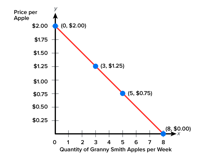
This represents the law of demand. As prices fall, the quantity demanded rises; we want to buy more. As prices rise, we want to buy less.

A depiction of the law of demand. As the prices of apples fall, the quantity demanded rises; people tend to buy more. As prices rise, the quantity demanded decreases. The image uses the symbols P with a downward arrow and Q with an upward arrow to represent that as price, P, decreases, the quantity demanded, Q, increases.

Again, this assumes ceteris paribus. As the price of Granny Smith apples goes up, yes, we want to buy fewer Granny Smith apples, but ceteris paribus assumes that only the price of green apples changed. For instance, the price of Gala apples did not change, the price of oranges or bananas did not change, and our income did not change.

term to know
Demand
The quantity of goods and services that may be purchased at a given time, specific to a set income and range of price levels.


4. Shifts in Demand

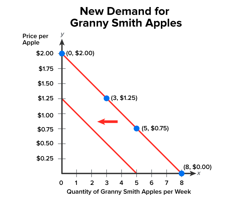
Again, we know that things are always changing. For instance, if you have to take a significant pay cut, or perhaps you read an article saying Granny Smith apples are the least healthy apple, you are not likely to buy the same amount of Granny Smith apples now, even though the price of Granny Smith apples has not changed.

Therefore, we need a new curve.

A shifting of the demand curve occurs because something other than the price has changed, causing a new relationship between price and quantity.

So, if you take that significant pay cut, you will then buy different quantities at all prices.

Price of Granny Smith Apples Quantity of Granny Smith Apples Each Week
$2.00 0
$1.75 0
$1.50 0
$1.25 0
$1.00 1
$0.75 2
$0.50 3
$0.25 4
$0.00 5

Notice how demand, or the quantity being bought, fell at every single price level, which required a new demand curve, shifting to the left, to show the decrease in demand.

A graph depicting the inverse relationship between price and quantity, which is the opposite of that with supply. The horizontal x-axis represents the quantity of Granny Smith apples per week. This axis is divided into increments of 1, starting at 0 and ending at 8. The vertical y-axis represents the price per apple in dollars. This axis is divided into increments of 0.25 dollars, starting at 0 and ending at 2 dollars. A line passes through these points: x equals 0 and y equals 2 dollars, x equals 3 and y equals 1.25 dollars, x equals 5 and y equals 0.75 dollars, and x equals 8 and y equals 0 dollars. A second line runs parallel and to the left of the original, representing a lower quantity demanded at each price point. This new demand curve is caused by a distinct factor that causes a new relationship between price and quantity. The new demand curve has shifted to the left, showing a decrease in demand.

As a reference, the following factors cause a shift in the demand curve:

  1. Changes in income
  2. Changes in the price of related goods
    1. Substitutes
    2. Complements
  3. Changes in tastes/preferences/advertising

EXAMPLE

If you make less money, you cannot afford as many apples. So, the curve shifts to the left to account for the decrease in demand.

A graph depicting the inverse relationship between price and quantity by using two demand curves. The demand curves are represented by lines. The horizontal x-axis represents the quantity of Granny Smith apples per week. This axis is divided into increments of 1, starting at 0 and ending at 8. The vertical y-axis represents the price per apple in dollars. This axis is divided into increments of 0.25 dollars, starting at 0 and ending at 2 dollars. A downward-sloping line passes through these points: x equals 0 and y equals 2, x equals 3 and y equals 1.25, x equals 5 and y equals 0.75, and x equals 8 and y equals 0. Another downward-sloping line starts at x equals 5 and y equals 0 and ends at x equals 0 and y equals 1.25, representing a new demand curve that has shifted to the left, showing a decrease in demand.
Price of Granny Smith Apples did not change. If I make less money, I cannot afford as many. I buy fewer apples at all prices, so we need a new curve.

big idea
Increase in Income = Increase in Demand (most goods).
Decrease in income = Decrease in Demand (most goods).

Alternatively, consider changes in the prices of related goods. If caramel apple dips go on sale, you are going to buy more Granny Smith apples. Even though Granny Smith apples have not changed in price, something else has, causing you to buy more.

The sale price of caramel apple dips causes a change in the quantity demanded, or a movement along the caramel apple dip demand curve. However, you can see below that you will buy more Granny Smith apples even though the price of Granny Smith apples has not gone down. Therefore, there is an increase in demand to the right.

A graph depicting the inverse relationship between price and quantity by using two demand curves. The demand curves are represented by lines. The horizontal x-axis represents the quantity of Granny Smith apples per week. This axis is divided into increments of 1, starting at 0 and ending at 7. The vertical y-axis represents the price per apple in dollars. This axis is divided into increments of 0.25 dollars, starting at 0 and ending at 2 dollars. A downward-sloping line passes through these points: x equals 0, y equals 2, x equals 3, y equals 1.25, x equals 5, y equals 0.75, and x equals 8, y equals 0. Another downward-sloping line to the right has unspecified coordinates, but it is parallel to the first line. This new demand curve indicates an increase in the demand for Granny Smith apples, which is represented by an arrow between the lines pointing to the right.
I buy more apples as all prices because the complement, caramel apple dip, changed in price.

Changes in taste and preferences are huge in the demand world. When the toy Tickle Me Elmo became very popular, there was an increase in demand. Conversely, anytime there are negative news reports, like an E. coli breakout in spinach, people buy less spinach at all prices.

term to know
Shifting of the Demand Curve
Movements that may cause either an increase or decrease in the quantity demanded of a given good or service for a specific price level; the shift occurs because of income or preference changes.


5. Equilibrium

Finally, let’s turn our attention to equilibrium, which is the point at which the quantity supplied at a given quantity–price combination equals the quantity demanded. This is where the supply and demand curves intersect.

Here is a graph that combines the quantity of apples supplied and the quantity of apples demanded.

Price of Apple Quantity of Apples Supplied Quantity of Apples Demanded
$2.00 7,000 0
$1.75 6,000 1,000
$1.50 5,000 1,500
$1.25 4,000 2,000
$1.00 3,000 3,000
$0.75 2,000 4,000
$0.50 1,000 5,000
$0.25 0 6,000

A graph explaining the concept of equilibrium, the point at which the supply and demand curves intersect. The horizontal x-axis represents the quantity of apples in thousands of bushels. This axis is divided into increments of 1, starting at 0 and ending at 7. The vertical y-axis represents the price per apple in dollars. This axis is divided into increments of 0.25 dollars, starting at 0 and ending at 2 dollars. The demand curve starts at x equals 6, y equals 0 and ends at x equals 0, y equals 2. The supply curve starts at x equals 0, y equals 0.25 and ends near x equals 7, y equals 2. These two curves intersect at x equals 3 and y equals 1, indicating that when the price of apples is 1 dollar, the quantity demanded is 3000 and the quantity supplied is 3000. Two dashed lines extend from the intersection point: one toward x equals 3 and another toward y equals 1. All the curves are represented by lines.
At prices above $1.00, Qs > Qd.
At prices at $1.00: Qs = Qd.
At prices below $1.00, Qd > Qs

With this graph, you can see that at any price above $1, the quantity of apples supplied exceeds the quantity of apples demanded, creating an economic surplus.

However, at any price below $1, the quantity of apples demanded is much greater than the quantity of apples supplied.

There is only one price at which the quantity supplied equals the quantity demanded.

In an economic shortage, the quantity demanded by the consumer is greater than the quantity supplied by the producer. So, there would be a demand for apples that the producers can’t meet. The inverse of this is an economic surplus.

hint
Think of this intersection as the place where every buyer has a seller and every seller has a buyer.

It is the only price at which there is no tendency for change. If the price is too high, sellers will recognize this and lower their price, and there will be a downward movement along the supply curve. As prices decrease, the quantity demanded increases. If the prices are too low, suppliers will also recognize this and raise their prices, and the quantity supplied will rise. As prices go up, the quantity demanded falls, and, again, it will meet in the middle at equilibrium.

In this case, equilibrium represents an equilibrium price of $1 and a quantity of 3,000 bushels.

terms to know
Equilibrium
The point at which the quantity supplied at a given quantity–price combination equals the quantity demanded, or where the supply and demand curves intersect.
Shortage
When the quantity demanded by the consumer is greater than the quantity supplied by the producer.

summary
Today, we learned about the laws of supply and demand. We discussed why a supply curve is generally upward sloping and a demand curve is downward sloping. We learned about the movement along a supply or demand curve, demonstrated when the price of a product changes and impacts the quantity supplied (demanded). It is important to note, however, that this assumes ceteris paribus, which means “holding all other things constant”—referring to all other variables remaining unchanged while the price changes.

We learned about shifts in supply and demand, which occur because something other than the price has changed, causing a new relationship between price and quantity. Lastly, we learned about equilibrium, the point at which supply and demand intersect.

Source: THIS TUTORIAL WAS AUTHORED BY KATE ESKRA FOR SOPHIA LEARNING. PLEASE SEE OUR TERMS OF USE.

Terms to Know
Ceteris Paribus

Latin for “holding all other things constant.”

Demand

The quantity of goods and services that may be purchased at a given time, specific to a set income and range of price levels.

Equilibrium

The point at which the quantity supplied at a given quantity–price combination equals the quantity demanded, or where the supply and demand curves intersect.

Movement Along a Supply Curve or Demand Curve

Demonstrated when the price of the product changes and impacts the quantity supplied (demanded).

Shifting of the Demand Curve

Movements that may cause either an increase or decrease in the quantity demanded of a given good or service for a specific price level; the shift occurs because of income or preference changes.

Shifting of the Supply Curve

Movements that may cause either an increase or decrease in the quantity supplied of a given good or service for a specific price level; the shift occurs because of more or less resource access, a decrease or increase in the price of inputs, or changes in regulation (taxes and subsidies).

Shortage

When the quantity demanded by the consumer is greater than the quantity supplied by the producer.

Supply

The fixed quantity of goods and services available for a range of price levels at a set point in time.