Table of Contents |
Text boxes let you add and place text on a slide. Most layouts include them, but you can also add your own and change how the text looks (Microsoft, n.d.).
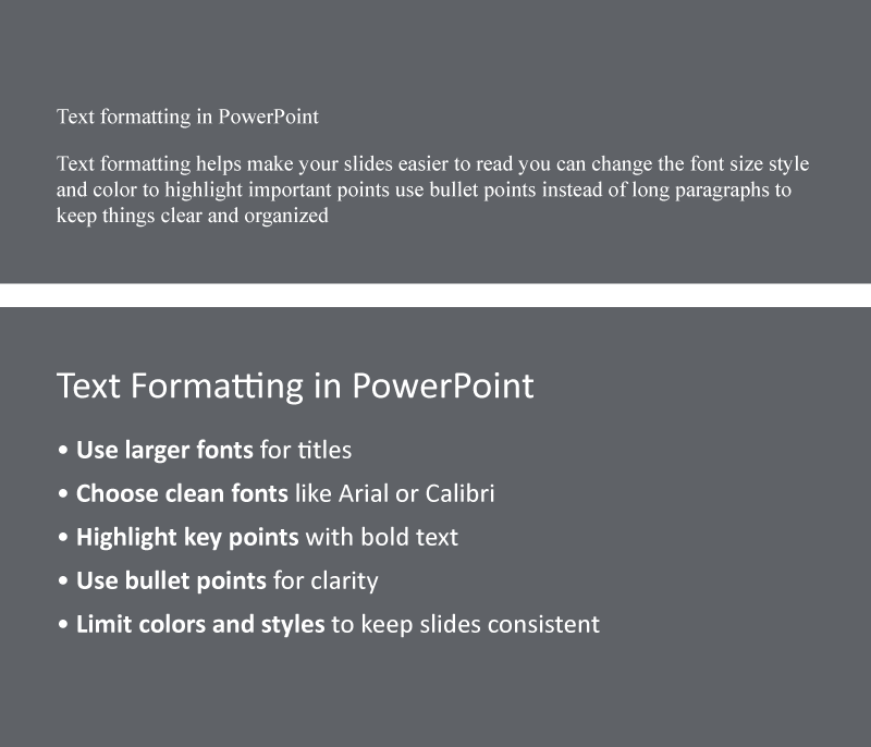
Good text formatting helps your audience quickly read and understand your slides. Let’s review some formatting tips.
| Formatting Tip | Why It Works |
|---|---|
| Large font for titles | Makes it easy to spot main ideas from a distance |
| Smaller font for details | Keeps slides neat and focused |
| Clean fonts (Arial, Calibri) | Makes the presentation easy to read and look professional |
| Bold important words | Helps key points stand out |
| Bullet points | Organizes lists and improves readability |
EXAMPLE
A slide titled “Healthy Habits” uses large, bold text for the title; clean fonts; and bullet points to keep the message clear and easy to read.To keep slides clear and easy to follow, follow these simple rules:
After learning how formatting improves clarity, let’s explore another key tool: images (photos or screenshots) and graphics (charts, diagrams, icons, or illustrations). These types of visuals clarify ideas, make presentations more engaging, and help audiences retain key points.
Choose visuals that support your message—not just for decoration (Duarte, 2008). The table below highlights key guidelines for making effective visual choices in presentations.
| Category | Best Practices | Avoid |
|---|---|---|
| Visual quality: Clarity and resolution |
|
|
| Copyright compliance: Legal usage |
|
Using copyrighted or unapproved visuals |
| Visual placement: Slide position |
|
|
| Graphics usage |
|
Overloading slides with cluttered or complex graphics |
EXAMPLE
A student designs a slide on recycling using a licensed photo, positions it neatly beside the text, and adds a clean flowchart to explain the process.The screenshot below shows a slide that demonstrates effective image use.

You have explored slide layouts in the previous lesson. Now, you will build on that by adding and arranging text and images within those layouts.
A good slide layout helps your audience follow your message by creating a balance between text, images, and empty space.
Let’s review the key principles of effective slide layouts.
| Principles | Why It Matters |
|---|---|
| Use plenty of white space (empty areas around text and images). | Prevents crowding and makes slides easier to read |
| Align text and images consistently across slides. | Creates a clean, professional look and helps guide the eye |
| Choose layouts that match your content type. | Makes complex or visual content easier to understand |
Using the right layout helps you share your message clearly. Here are some common slide types and how to use them:
EXAMPLE
A presenter explains a product feature using a two-column slide with an image on the left and key points on the right.Here are some layout tips you can use.
| Tip | What It Means |
|---|---|
| Be consistent. | Use the same alignment, font styles, and spacing across similar slides for a polished look. |
| Use the right tool. | Use charts or tables for data and images for storytelling or highlighting ideas. |
| Try the rule of thirds. | Divide the slide into thirds and place key elements near the intersections for visual balance. |
| Keep slides focused. | Limit each slide to one main idea to make your message clear and easy to follow. |
EXAMPLE
A student places a chart slightly off-center using the rule of thirds to make the slide more balanced and engaging.To help visualize different slide types, explore the slides in the following slideshow.
Select the right arrow to move forward or the left arrow to go back.


After choosing your slide layout, make sure your text and visuals are clear and easy to read. A good slide helps your audience understand your message quickly.
Start with the right font sizes:
| Text Type | Recommended Size |
|---|---|
| Slide titles | 28–36 pt |
| Section headers | 22–24 pt |
| Body text | 16–18 pt |
Stand at the back of the room to test if your slides are readable (Reynolds, 2019). Also, use strong contrast so the text stands out:
| Use | Avoid |
|---|---|
| Dark text on light background | Light text on light background |
| Light text on dark background | Dark text on dark background |
Consider the 6×6 rule as a starting point: Aim for no more than six bullet points with roughly six words each, adjusting them where required. This helps your message stay focused (Duarte, 2008).
EXAMPLE
During a class presentation, a student uses large, bold white text on a dark-blue background with short bullet points.Choose clean, readable colors:
Once your slides are clear and well designed, you can add simple animations. These are motion effects for text or images that help guide attention and keep your audience engaged.
Here are some simple guidelines to follow:
| Tip | What to Do |
|---|---|
| Type | Use simple effects like “fade” or “appear” to show one point at a time. |
| Timing | Set animations to advance on click so you can control the pace. |
| Purpose | Animate only when it helps explain something clearly (e.g., steps or key ideas). |
| Amount | Use animations sparingly—too many can distract or slow things down. |
| Accessibility | Keep animations simple and provide notes if needed. |
EXAMPLE
A student uses a fade effect to show one bullet point at a time and clicks to reveal each as they explain it during their presentation.The flowchart below shows general steps to add animations in most presentation software.
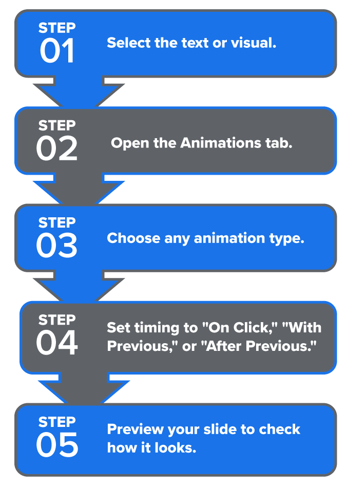
Note: Set timing to “On Click” for manual control, “With Previous” to start simultaneously with the previous item, or “After Previous” to start automatically when the previous animation ends.
You have already explored accessibility in earlier tutorials. Now, you will focus more directly on designing presentations that are clear and usable for everyone.
Here are some simple ways to make your slides more accessible:
| Accessibility Feature | Best Practices | Why It Helps |
|---|---|---|
| Color contrast | Maintain a strong contrast and use labels or icons—not just color. | Improves readability and supports all users |
| Font choice | Stick with simple, uniform fonts throughout. | Supports faster reading and reduces visual strain |
| Alt text for images | Write concise alt text (1–2 sentences) that describes the image’s key information and its relevance to your content. | Enables access for users who rely on screen readers |
| Slide organization | Use clear headings, consistent layouts, and simple language. | Helps audiences stay focused and follow your message |
IN CONTEXT: Making Slides Clear and Accessible
An intern creates a slideshow for a team update. They use black text on a white background so everyone can read it easily. The same easy-to-read font appears on each slide.
For a chart showing that sales increased 15% over 3 weeks, they write: “Bar graph showing that weekly sales grew from $10K to $11.5K over 3 weeks.”
To stay organized, they use short headings and keep one main idea per slide.
These steps help make the slideshow clear and accessible to everyone.
Avoid clutter, flashing effects, and low-contrast text. They can overwhelm viewers with visual, attention, or processing challenges. Clean, calm slides help everyone stay focused.
Source: THIS TUTORIAL HAS BEEN ADAPTED FROM OPENSTAX’S “WORKPLACE SOFTWARE AND SKILLS.” ACCESS FOR FREE AT OPENSTAX.ORG/DETAILS/BOOKS/WORKPLACE-SOFTWARE-SKILLS. LICENSE: LICENSE: CREATIVE COMMONS ATTRIBUTION 4.0 INTERNATIONAL.
REFERENCES
Duarte, N. (2008). Slide:ology: The art and science of creating great presentations (3rd ed.). O’Reilly Media. www.duarte.com/resources/books/slideology/
Microsoft. (n.d.). Add and format text in PowerPoint. support.microsoft.com/en-us/office/add-and-format-text-in-powerpoint-c641613c-435a-4c0e-9e89-2b4cedb6198a
Microsoft Corporation. (n.d.). Stock images of a team presentation, a clean desk, and an organized workspace [Stock images]. Microsoft PowerPoint. powerpoint.office.com/
Presentation Guild. (n.d.). Welcome to the Presentation Guild. www.presentationguild.org
Reynolds, G. (2019). Presentation zen: Simple ideas on presentation design and delivery (3rd ed.). New Riders. www.presentationzen.com