Use Sophia to knock out your gen-ed requirements quickly and affordably. Learn more
×

Slide Decks: Creating a Slideshow From a Template; Slide Layout

Author: Sophia

what's covered
In the previous lesson, you explored the basics of spreadsheets. In this lesson, you will focus on the foundational skills needed to build effective presentations in workplace settings. Specifically, this lesson will cover:

Table of Contents

before you start
Think about a recent presentation you watched. Was it easy to follow? Clear, professional slides help share ideas effectively—an important skill in any workplace.

1. Themes and Templates

When you start a new presentation, you do not have to design it from scratch. Most programs offer a template or theme option when you create a new presentation. You can start with a template for the slide structure, then apply a theme to set colors and fonts consistently across slides.

Let’s review the features of templates and themes in detail.

Template Theme
What it is A ready-made design for your presentation (Microsoft, n.d.); it gives your slideshow a professional look without needing you to have design skills A design setting that controls how your whole presentation looks (Bolling et al., 2024); it applies colors and fonts automatically to all slides
What it includes Matching colors, fonts, and layouts that work together to create a consistent design Color scheme and font style settings that update across all slides to keep the design neat and professional
Customization Can be customized by changing colors, fonts, or layouts to match your organization’s branding—its visual identity and style (Duarte, 2008) Themes can be switched or adjustments can be made without losing consistency across slides
Common uses Have built-in templates for common workplace needs like project reports, training materials, and sales presentations Work well to keep a unified look as you add or change slides in your presentation
When to use Choose a template based on your purpose and audience. For example, formal business proposals need clean, neutral layouts, while creative sessions can use colorful or dynamic designs. Use a theme to make sure your slides all match in style, regardless of the content or number of slides you add.

EXAMPLE

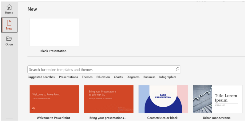
Zayn needs to create a presentation for a class on Economics. Zayn starts using a business template with a linked theme, so all slides automatically match in style.

The screenshot below shows the “New” screen in PowerPoint. From here, you can start with a blank presentation or choose a ready-made template. The search bar and categories help you find designs that match your purpose, such as business, education, or storytelling.

PowerPoint “New” screen with the “New” option selected on the left. The main area displays a blank presentation option and several colorful template thumbnails below, such as “Welcome to PowerPoint” and “Geometric color block.” A search bar and suggested categories like Presentations, Themes, and Business appear above the templates.

try it
Open PowerPoint (desktop or online).

  • Look for “New Presentation” or “Templates.”
  • Click on three different template options.
Notice how each one changes the colors and fonts.

big idea
Templates provide the visual foundation that transforms a basic outline into a professional presentation, allowing you to focus on content rather than design.

terms to know
Template
A predesigned presentation framework that includes coordinated colors, fonts, and layouts.
Theme
A design system that controls the overall visual appearance of a presentation across all slides.
Branding
The consistent use of colors, fonts, and visual elements that represent an organization’s identity.


2. Slide Layouts

After choosing a template and theme, the next step is picking the right layout for each slide. A slide layout shows you how to arrange text and pictures on each slide. Different layouts work better for different types of information (Reynolds, 2019). The right layout helps your audience understand your message.

You can choose from several common layouts:

  • Title slide: Introduces the topic of your presentation or a new section
  • Bullet point, or numbered, layout: Lists key points in an organized way
  • Comparison layout: Helps show the difference between two ideas or items
  • Image layout: Puts pictures and text together to explain something visually (Presentation Guild, n.d.)
Choosing the right slide layout helps organize your message clearly. For instance, note the following examples:

  • A bullet point layout can be used to explain key steps.
  • A comparison layout can be chosen when showing how two options differ.

EXAMPLE

A team creates a training presentation. The members start with a title slide to introduce the topic, use a bullet point layout for key steps, add a comparison layout to show old versus new processes, and include an image layout to explain equipment setup visually.

Most presentation software allows you to change layouts even after adding content. Try different layouts to see what works best. Using consistent layouts keeps your slides easy to follow and helps your audience stay focused.

The screenshot below shows common slide layouts in PowerPoint.

PowerPoint interface with the “Home” tab selected and the “Layout” menu expanded, displaying various slide layout options such as “Title Slide,” “Title and Content,” “Comparison,” and “Picture With Caption.”

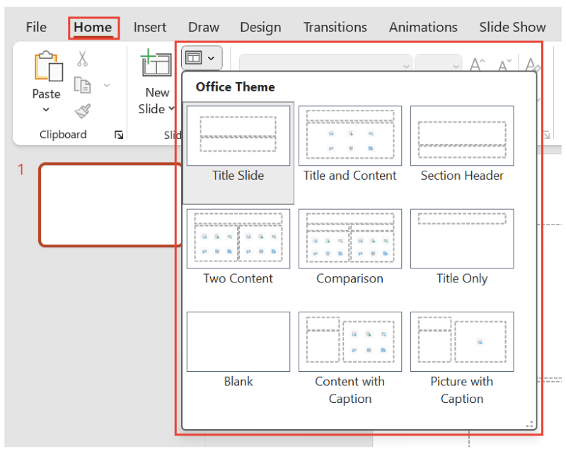
On the Home tab, clicking the New Slide dropdown opens a menu with layout options like “Title Slide,” “Comparison,” and “Picture With Caption.”

try it
Create a new presentation with four slides. Use these specific layouts:

  1. Title slide for “Project Update”
  2. Bullet point slide listing three goals
  3. Two-column slide comparing “Before” and “After”
  4. Image slide with a picture and caption
Try applying a different layout to each slide to see how content shifts.

terms to know
Slide Layout
The arrangement of text, images, and other elements on a presentation slide.
Bullet Point, or Numbered, Layout
A slide format designed for listing information in an organized, sequential manner.
Comparison Layout
A slide format that presents information side by side to highlight differences or similarities.


3. Organizing Slides

Once your slides use the right layouts, it is important to check their order and flow.

Organizing slides helps your presentation make sense from beginning to end. Effective slide organization follows a logical sequence that guides your audience through your ideas systematically. Most workplace presentations benefit from a clear structure:

  1. Introduction
  2. Main content sections
  3. Conclusion
This familiar pattern helps audiences follow your presentation and understand how each piece of information connects to your overall message.

Let’s review the steps to organize slides effectively.

Step What to Do Why It Matters
1. Start with an agenda or overview slide. List the main points you will cover in your presentation. Helps your audience understand the structure and know what to expect
2. Group related content into sections. Use section header slides—these act like chapter titles, signaling the start of a new topic. Makes the presentation easier to follow and keeps ideas organized
3. Sequence slides logically. Present background information first, followed by details, and address questions before solutions. Builds understanding step by step and helps the audience stay engaged
4. End with a summary slide. Highlight key points and add next steps or contact info. Leaves a strong final impression and shows what to do next

IN CONTEXT: Organizing a Client Pitch Presentation

A small business owner is creating their first presentation to attract new clients. They use a professional-looking business template with company colors to give the slides a polished appearance.

They organize their eight slides like this:

  • A title slide with the company name
  • An agenda slide that lists the services
  • Three slides that explain different service packages
  • A slide with a client testimonial
  • A slide that compares pricing
  • A final slide with contact information
To make the presentation easy to follow, they use numbered slides and insert section headers before each main topic to improve navigation.

To help visualize how an organized presentation comes together, explore the slides in the following slideshow.

Select the right arrow to move forward or the left arrow to go back.

Slide 1: Title slide displaying the heading “Understanding PowerPoint Presentations” with a subtitle reading “A Simple Guide to Using Slides.”

Slide 2 titled “What Is a PowerPoint Presentation?” with bullet points explaining that it is a tool to share ideas, organize information, and support speaking points.
Icon courtesy of Microsoft.

Slide 3 titled “Why Use PowerPoint?” featuring a bulleted list with reasons such as visual support, audience engagement, and easy customization.
Icon courtesy of Microsoft.

Slide 4 titled “What Is on a Slide?” showing common slide elements like titles, text boxes, images, and bullet points.

Slide 5 titled “Summary and Final Tip” that recaps key ideas from the presentation and ends with a reminder to keep slides clear and simple.

Slide 6: Closing slide with the message “Thank You!” centered on the screen, signaling the end of the presentation.

try it
Create a presentation about your workday routine. Create six slides:

  • Slide 1: Title slide with your name
  • Slide 2: Agenda slide listing “Morning,” “Afternoon,” and “Evening”
  • Slides 3–5: One slide for each time period, using bullet points
  • Slide 6: Summary slide
Number your slides and add section headers between major topics.

big idea
Logical slide organization creates a clear path through your ideas, making presentations easier to follow and more persuasive.

terms to know
Slide Organization
Arranging the slides in a presentation in a logical, easy-to-follow order.
Section Header Slides
Slides that introduce a new topic or section within a presentation.


4. Transitions

After you organize your slides, it is important to connect them smoothly. Transitions help with this. They are small visual effects that play when you move from one slide to the next.

Let’s look at some ways to use transitions well.

Tip Why It Matters
Use simple effects like fade or push. Keeps your audience focused on your content
Avoid flashy effects with sounds or spins. Can feel distracting and unprofessional
Be consistent across all slides. Showcases a unified look that helps the presentation flow better

Simple transitions—like “fade” or “slide”—make the presentation feel more polished and professional (Reynolds, 2019).

EXAMPLE

In a sales presentation, a team member uses the same simple “fade” effect on each slide.

You can set transitions to happen automatically or manually.

  • Manual transition: Slides move forward only when you click.
    • Good for live presentations
    • Allows for pauses, audience questions, and flexibility
  • Automatic transition: Slides advance on a timer.
    • Good for recorded presentations or digital displays
    • Makes slides move smoothly on their own without clicking

EXAMPLE

At a job fair, a company booth shows slides on a screen that change every few seconds automatically. Later, during a live presentation, a team member uses a clicker to move through slides while answering questions.

The flowchart below shows the steps for adding manual transitions in PowerPoint.

The flowchart shows five steps for adding slide transitions in PowerPoint. Step 1 says to select all slides in the presentation. Step 2 tells you to look for the “Transitions” tab in the toolbar. Step 3 suggests choosing a simple effect like “Fade” or “Push.” Step 4 says to set the timing to “On Click” for manual control. Step 5 reminds you to preview the slideshow to see the effect.

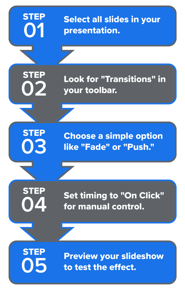
Similarly, to set automatic transitions, go to the “Timing” group and do the following:

  • Uncheck the “On Click” box
  • Check the “After” box and enter the time (e.g., 00:05 for 5 s)
try it
Open a presentation file.

  • Apply the “fade” transition to all slides and preview the slideshow.
  • Change the transition to something flashy like “bounce” or “zoom.”
  • Set slides to manual transitions.
  • Then, try automatic transitions.
Think about the pros and cons of each option.

terms to know
Transitions
Visual effects that occur when moving from one slide to the next in a presentation.
Manual Transition
A transition setting that requires the presenter to click or press a key to move to the next slide.
Automatic Transition
A transition setting that advances slides automatically after a specified time period.

summary
In this lesson, you explored how to create professional presentations by using the right tools and structure.

You learned how themes and templates provide a polished starting point with coordinated colors and fonts.

Then, you examined how slide layouts help organize different types of content like titles, images, and bullet points.

You also explored how organizing slides in a logical sequence—such as an introduction, main points, and a conclusion—makes your message easier to follow.

Finally, you discovered how transitions connect slides smoothly and how to choose simple, consistent effects for a professional look.

In the next lesson, you will explore ways to insert text and graphics to enhance your presentation’s meaning and visual appeal.

Source: THIS TUTORIAL HAS BEEN ADAPTED FROM OPENSTAX’S “WORKPLACE SOFTWARE AND SKILLS.” ACCESS FOR FREE AT OPENSTAX.ORG/DETAILS/BOOKS/WORKPLACE-SOFTWARE-SKILLS. LICENSE: LICENSE: CREATIVE COMMONS ATTRIBUTION 4.0 INTERNATIONAL.

REFERENCES

Bolling, T., Mitchell, A., Scott, T., & Wheeler, N. (2024). Workplace software and skills. OpenStax. openstax.org/details/books/workplace-software-skills

Duarte, N. (2008). Slide:ology: The art and science of creating great presentations (3rd ed.). O’Reilly Media. www.duarte.com/resources/books/slideology/

Microsoft. (n.d.). PowerPoint help & learning. support.microsoft.com/en-us/powerpoint

Microsoft Corporation. (n.d.). Groups of icons representing slideshow, communication, education, lightbulb, audience, and visual tools [Icons]. Microsoft PowerPoint. powerpoint.office.com/

Presentation Guild. (n.d.). Welcome to the Presentation Guild. www.presentationguild.org

Reynolds, G. (2019). Presentation zen: Simple ideas on presentation design and delivery (3rd ed.). New Riders. www.presentationzen.com

Terms to Know
Automatic Transition

A transition setting that advances slides automatically after a specified time period.

Branding

The consistent use of colors, fonts, and visual elements that represent an organization’s identity.

Bullet Point, or Numbered, Layout

A slide format designed for listing information in an organized, sequential manner.

Comparison Layout

A slide format that presents information side by side to highlight differences or similarities.

Manual Transition

A transition setting that requires the presenter to click or press a key to move to the next slide.

Section Header Slides

Slides that introduce a new topic or section within a presentation.

Slide Layout

The arrangement of text, images, and other elements on a presentation slide.

Slide Organization

Arranging the slides in a presentation in a logical, easy-to-follow order.

Template

A predesigned presentation framework that includes coordinated colors, fonts, and layouts.

Theme

A design system that controls the overall visual appearance of a presentation across all slides.

Transitions

Visual effects that occur when moving from one slide to the next in a presentation.