Table of Contents |
Charts and graphs are visual tools that turn numbers into pictures, helping people understand information quickly. In this lesson, we use the terms charts and graphs interchangeably. This keeps the focus on using visual tools effectively.
Some chart types work better than others depending on the data. Picking the right one makes it easier to spot patterns, trends, and comparisons (Reynolds, 2019).
The table below details three common chart types.
| Chart Type | What It Is | When to Use | Best For | Examples |
|---|---|---|---|---|
| Line graph | A chart that connects data points with a line to show changes over time | To show trends, growth, or decline across time | Continuous data that follows a timeline |
|
| Bar chart | A chart that uses horizontal or vertical bars to compare values | To compare different categories or groups side by side | Distinct items that are not related by time |
|
| Pie chart | A circular chart divided into slices to show parts of a whole | To show how individual parts make up a total (100%) | Percentages with 3–7 categories (more categories make pie charts hard to read) |
|
IN CONTEXT: Choosing the Right Chart for the Message
A district manager is creating a report for company leaders. The report includes three types of data:
Using the right chart type helps the team understand the data quickly and make better plans for the next quarter.
- Monthly sales trends: A line graph shows changes over time. It highlights a sales peak in November and December.
- Store comparisons: A bar chart compares sales across locations. It clearly shows which stores performed best.
- Budget breakdown: A pie chart shows how the budget is divided into three parts totaling 100%: 45% for inventory, 30% for staff, and 25% for operations.
To help visualize different chart types, explore the slides in the following slideshow.
Select the right arrow to move forward or the left arrow to go back.
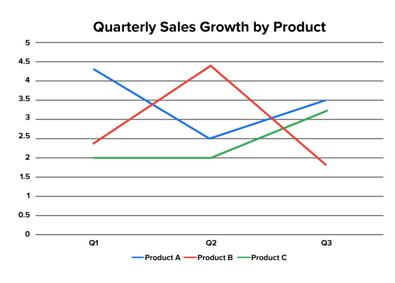
Line Graph
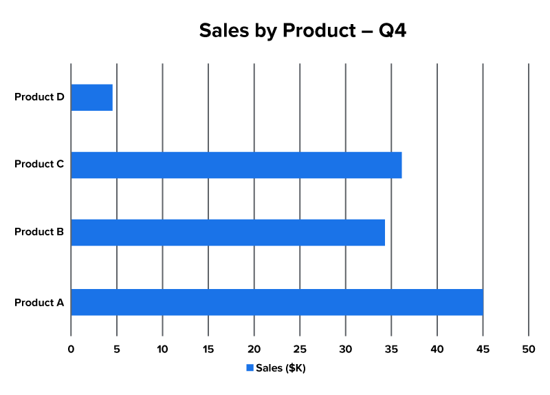
Bar Chart
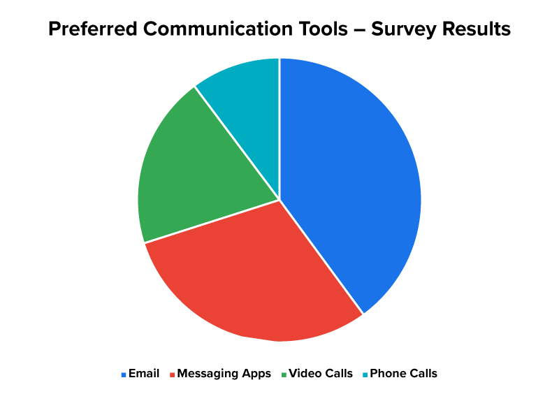
Pie Chart
Choosing the right chart is step one. Next, you will explore how to create a chart using spreadsheet data.
Presentation tools like PowerPoint and Google Slides can create charts directly from spreadsheet data. This makes it easier to turn numbers into visuals that are clear and professional-looking (Microsoft, n.d.).
You can:
| Do’s | Why It Matters |
|---|---|
| Put category labels (names of groups or items) in the first column, such as “January” or “Product A.” | Helps chart tools group data correctly |
| Put numbers in the columns next to the labels. | Keeps data linked to the right category |
| Use clear headers (titles that explain each column). | Describes what each row and column shows |
| Remove extra rows or blank cells. | Helps avoid chart errors or clutter |
| Don'ts | Why It Matters |
| Do not include the TOTAL row in your chart selection. | Distorts the visual accuracy of the data |
| Do not use a pie chart unless you are showing parts of a whole. | Misleads if the values do not add up to 100% |
| Do not mix too many chart features or data in one graph. | Makes the chart confusing and hard to read |
| Do not use vague labels like “Data1,” “Info,” or “Misc.” | Makes it difficult to understand what the chart represents |
Clean and organized data makes charts easier to create and easier to read.
EXAMPLE
A sales manager lists team names in the first column and monthly sales numbers in the second to create a clear bar chart.Include only the data that helps make your point. This keeps your chart clear and easy to understand. The table below shows what to include and what to avoid.
| Good Practice | Avoid |
|---|---|
| Highlight key trends or comparisons. | Too much data that clutters the chart |
| Leave out data that does not support your point. | Too little data that lacks context |
It is also important to think about who will see your chart. Choose a chart style that matches how comfortable your audience is with data. The table below shows how to decide.
| Audience | Chart Style |
|---|---|
| Business executives | Summary charts with clear labels and headings |
| Technical teams | Detailed charts showing all data points, precise values, and multiple variables |
| General staff | Simple visuals with short titles and notes |
Always aim for clarity. A good chart helps your audience see what matters—quickly and confidently.
EXAMPLE
A project lead shares a summary pie chart with executives during a budget meeting. They give the finance team a detailed spreadsheet with line graphs for deeper analysis.Once you have built an easy-to-read chart, you can add simple animations to make key points stand out.
Chart animations—effects that reveal data step by step—can help your audience focus on the right information at the right time and follow your message more easily (Microsoft, n.d.).
The table below shows the reasons to use chart animations.
| What They Do | Why They Help |
|---|---|
| Show data gradually | Keep people from jumping ahead |
| Focus on one point at a time | Help explain each part clearly |
| Match your message flow | Support your storytelling with visuals |
EXAMPLE
In a team update, a presenter shows one sales region at a time on a chart. This helps the team stay focused and understand each part clearly.Use animations to guide your audience through your chart. The examples below show how this can work with different chart types.
Stick to simple, professional animations like “Appear” or “Fade in.” Avoid flashy effects, such as “Bounce,” “Spin,” or “Zoom with sound,” as they can distract from your message instead of supporting it (Reynolds, 2019).
Though simple animations work well, they are not always needed. The type of presentation can help you decide this. The table below shows what works best in different settings.
| Presentation Type | Ideal Animation Choice |
|---|---|
| Business meetings | Minimal or no animation for open discussion |
| Trainings or lessons | Step-by-step reveals to guide learning |
Source: THIS TUTORIAL HAS BEEN ADAPTED FROM OPENSTAX’S “WORKPLACE SOFTWARE AND SKILLS.” ACCESS FOR FREE AT OPENSTAX.ORG/DETAILS/BOOKS/WORKPLACE-SOFTWARE-SKILLS. LICENSE: LICENSE: CREATIVE COMMONS ATTRIBUTION 4.0 INTERNATIONAL.
REFERENCES
Bolling, T., Mitchell, A., Scott, T., & Wheeler, N. (2024). Workplace software and skills. OpenStax. openstax.org/details/books/workplace-software-skills
Microsoft. (n.d.). Create a chart from start to finish. support.microsoft.com/en-us/office/create-a-chart-from-start-to-finish-0baf399e-dd61-4e18-8a73-b3fd5d5680c2
Reynolds, G. (2019). Presentation zen: Simple ideas on presentation design and delivery (3rd ed.). New Riders. www.presentationzen.com