Table of Contents |
Linear regression is a statistical method that models the relationship between two variables by fitting a linear equation to observed data. In simple terms, it helps us understand how one variable (independent variable) affects another variable (dependent variable).
You are going to learn how to build a simple linear regression in Python. You’ll use data from a non-profit organization to predict the amount of donations based on the number of social media shares a donation campaign receives. Each row in the data represents a different fundraising campaign.
In the example for this tutorial:
You will be importing an Excel file that is stored in a Github repository into a pandas DataFrame using the code below. This code installs a necessary library, imports pandas, reads an Excel file from a URL, and prints the data.
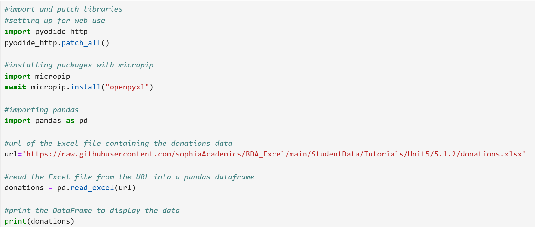
Let’s break down the steps of the code line by line.
Step 1: Setting up using Python on the web.
A scatter plot helps you see if there is a relationship between the two continuous variables you are interested in. The scatter plot helps you visually assess the relationship between the two variables. You can see if there’s a linear trend, or if the relationship is more complex.
The code below creates a scatter plot to show the relationship between the number of shares and the amount of donations. It labels the axes and adds a title to make the plot easier to understand.
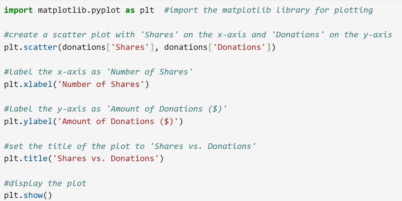
Let’s break down the steps of the code line by line.
Step 1: Import the matplotlib.pyplot Library
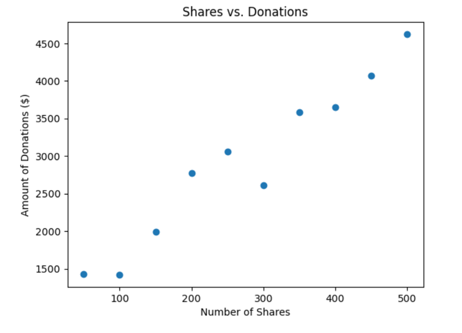
Based on the scatter plot, you can conclude there is a strong positive correlation between the predictor and explanatory variables. Recall a strong positive correlation between two variables in a scatter plot means that as one variable increases, the other variable also tends to increase.
Now, you are ready to build a simple linear regression model for the amount of donations the non-profit will receive based on the number of social media shares a campaign receives.
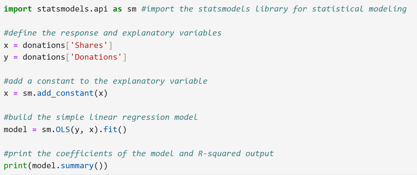
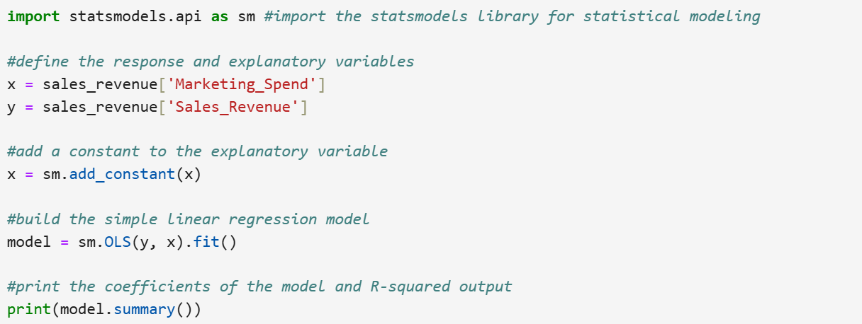
The code below performs a simple linear regression analysis using the statsmodels library. It defines the explanatory variable (number of shares) and the response variable (amount of donations) from a DataFrame, adds a constant to include an intercept, and builds the regression model using the Ordinary Least Squares (OLS) method. Finally, it fits the model and prints a summary, which includes coefficients and the R-squared value, providing insights into the relationship between the number of shares and the amount of donations.
Let’s break down the steps of the code line by line.
Step 1: Import the statsmodels Library
 This step is adding the intercept term,
  to the model.
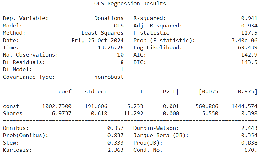
Let's explore the simple linear regression model output below, where key areas have been highlighted to guide your interpretation and understanding of the model's results.
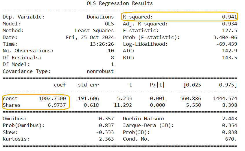
1. R-squared
This value indicates the proportion of the variance in the response variable that is explained by the explanatory variable.  is a statistic that tells us how well one variable explains or predicts another. It measures the proportion of variation in the response variable (e.g., donation amounts) that can be explained by the explanatory variable (e.g., social media shares). An value close to 1 means the explanatory variable is doing an excellent job at prediction. For instance, with an of 94.1%, we can say that 94.1% of the variability in the donation amounts is explained by the number of social media shares a campaign receives. This suggests that social media shares are a strong predictor of donation amounts.
2. coef column has 2 parts:
 in the regression equation
 in the regression equation The slope value, is 6.97.
  is used to interpret the simple linear regression model. The slope value represents the change in the response variable for a one-unit change in the explanatory variable.
For example, the  value of 6.97 means that for every additional share, the predicted amount of donations is expected to increase by $6.97, assuming all other factors remain constant.
This slope value indicates a positive relationship between the number of shares and the amount of donations, suggesting that as the number of shares increases, the donations tend to increase as well.
In most analyses, the primary interest lies in understanding how the explanatory variable (x) influences the response variable (y), which is captured by the slope rather than the intercept. However, the intercept can sometimes have a meaningful interpretation. For example, in healthcare, the intercept might represent the baseline costs of care without considering any additional treatments or factors. Another example would be predicting air quality index (AQI) based on the number of vehicles on the road. If the intercept is 30, it means that with zero vehicles, the AQI is expected to be 30. This represents the baseline air quality without vehicle emissions.
In this example, provides a baseline value. When the number of social media shares (x) is 0, the predicted amount of donations is $1,002.73.
You have successfully applied a simple linear regression model to predict the amount of donations based on the number of social media shares a donation campaign receives using Python. The non-profit can use this model to set realistic fundraising targets and develop effective strategies to achieve them, ultimately enhancing their planning and forecasting capabilities.
Now, it is your turn to build and apply a simple linear regression model in Python!
value. 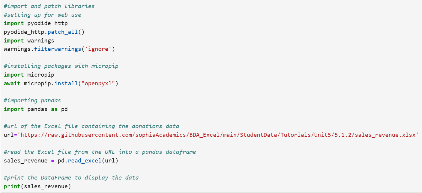
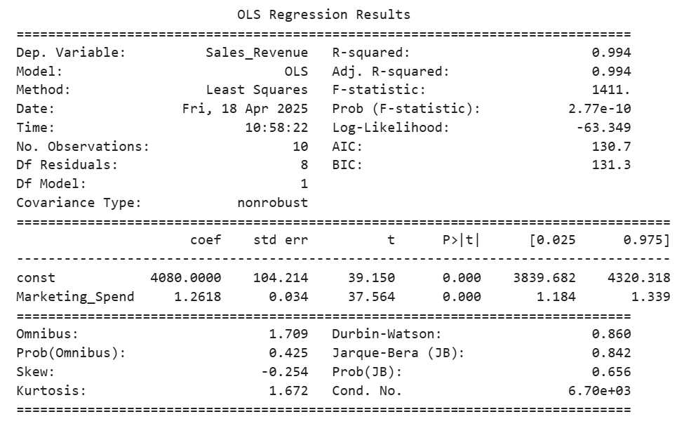 value from the regression output is 99.4%. 99.4% of the variability in sales revenue can be explained using the amount spent on marketing.
Source: THIS TUTORIAL WAS AUTHORED BY SOPHIA LEARNING. PLEASE SEE OUR TERMS OF USE.