Table of Contents |
Scatterplots are ways that you can show more than one quantitative attribute at a time for a particular data set. In the past, you’ve been using something like dot plots, where you have a particular quantitative attribute about a data set. In addition, you've been making dot plots where you stack up dots at a particular value, and you look at it that way.
However, scatterplots allow you not only to see how those values compare along with one attribute but also along with a different attribute.
EXAMPLE
You might put the two variables cigarette consumption and cancer death in a scatterplot. Perhaps certain states or countries have low cigarette consumption and maybe, correspondingly, low cancer deaths. Each dot would correspond to one single state or one single country.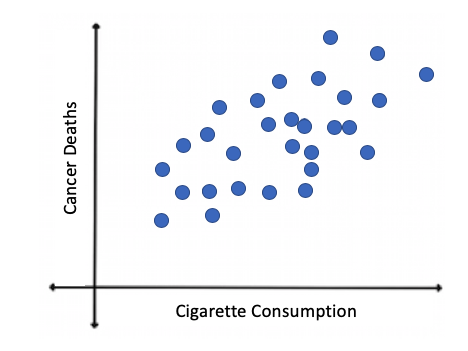
EXAMPLE
If you were going with a sports team, maybe you'd want to know if spending a lot of money on your team payroll causes them to win more. Each dot, in that case, would correspond to a single team.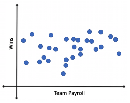
IN CONTEXT
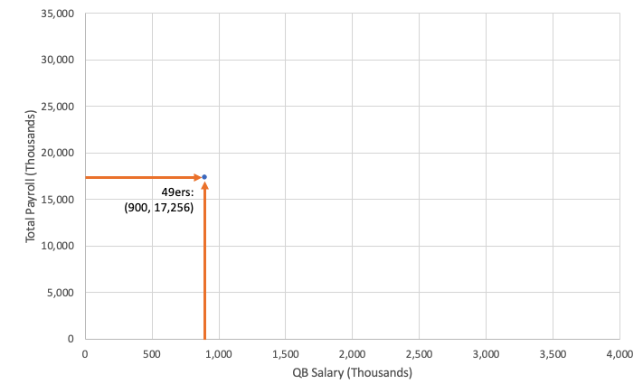
This was the 1992 payrolls for the National Football League for their quarterback, who's usually their most expensive player, and for the entire team. The values are in thousands of dollars.
Team QB Salary Total Payroll
Team QB Salary Total Payroll 49ers 900 17,256
Falcons 2,250 25,642 Bears 3,000 23,074
Giants 1,600 23,258 Bengals 1,050 20,666
Jets 800 19,063 Bills 650 24,249
Lions 1,525 24,644 Broncos 500 21,992
Oilers 1,700 21,399 Browns 967 19,413
Packers 1,500 23,245 Buccaneers 675 19,545
Patriots 2,250 23,294 Cardinals 1,450 20,397
Raiders 1,300 20,390 Chargers 1,200 18,698
Rams 1,500 24,378 Chiefs 1,100 25,859
Redskins 1,450 20,780 Colts 2,000 22,022
Saints 1,200 23,695 Cowboys 1,750 28,349
Seahawks 1,250 25,348 Dolphins 1,400 23,728
Steelers 3,500 30,131 Eagles 425 19,325
Vikings 1,250 23,246
Next, let's put this on a scatterplot. The value that should go on the x-axis, or the horizontal axis, should be the one that you think helps to explain the other variable. It is most likely the quarterback salary that helps to contribute to a high or low team salary.
Start with the first team, the 49ers. Find that $900,000 for the quarterback and $17.2 million for the team payroll and put a dot there. That's one of the many dots that we're going to end up with.
The next team, the Bears, had a quarterback salary of $3 million and a total payroll of about $23 million. As you continue with the rest of the teams, you’re going to end up with one dot for each team. The final version looks like this:
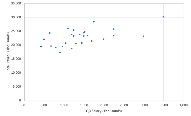
It seems that as the quarterback salary increases, as it moves to the right, the total payroll tends to increase as well.
A great thing about scatterplots is that you can easily show multiple data sets onto one plot. The way this is done is by using different symbols to represent the different data sets.
EXAMPLE
Recall the in-context scenario from the previous section that compared quarterback salary to total team payroll. Suppose that you wanted to add an additional categorical variable. You want to know if the payrolls are different depending on conferences. There are two conferences in the National Football League, the NFC and the AFC.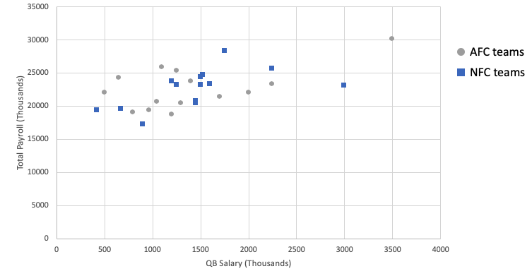
Source: THIS TUTORIAL WAS AUTHORED BY JONATHAN OSTERS FOR SOPHIA LEARNING. PLEASE SEE OUR TERMS OF USE.