Table of Contents |
In a previous challenge, you were introduced to the ways to apply styling to a webpage, including the following:
| Selector Category | Description |
|---|---|
| Simple | Selects an element based on its tag name, id, or class |
| Combination | Selects elements based on a specific relationship, that is, parent–child |
| Pseudo-class | Selects elements based on an element’s specific state |
| Pseudo-element | Selects only part of an element |
| Attribute | Selects elements based on a particular attribute or attribute value |
Combination selectors use multiple selectors or selector types and the element’s relationship to increase specificity as to which element will receive the style.
Your keyboard should be able to produce all of the necessary characters in this section. Keyboards have different layouts. Some characters may require a combination of keystrokes. Research your device or keyboard for specific instructions.
EXAMPLE
If you want to provide a style for the logo image in the header of all pages but only the image in the header, you will use a combination selector starting with the semantic tag name “header,” a space, and then the “img” tag name.
This will only apply the style when there is an <img> tag as a child of the <header> tag.
Comma (,) separated combination selectors apply the same styles to all elements in the list, regardless of relationship.
EXAMPLE
All <div> and <span> tags receive the display inline property, regardless of any parent–child relationship:
Using a greater than sign (>) to separate the selectors creates a rule that applies when there is a parent–child relationship.
EXAMPLE
If you wanted all the paragraphs that are children of a <div> element, the following would be used:
Using a plus sign (+) to separate the selectors applies the style to only the first sibling of the specified element.
EXAMPLE
Only the first <p> paragraph that comes after a <div> element received the style:
Using the tilde (~) symbol to separate the selectors ensures that all the children receive the style when they are preceded by the specified element at any level or generation. Note that the tilde symbol is often located at the top-left corner of the keyboard.
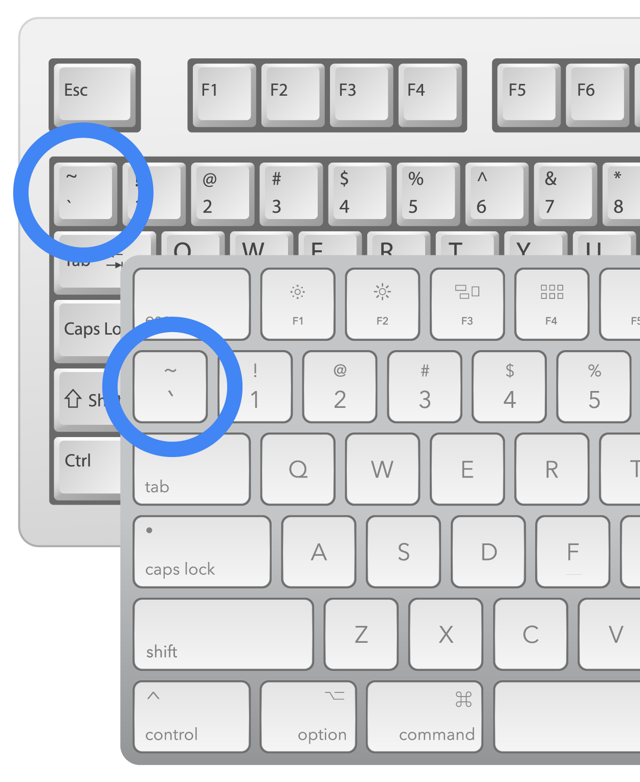
The tilde works similarly to the > operator; the difference is that the > operator refers only to direct parents, while the tilde can be preceded by the parent tag, even if it is multiple levels up from the child.
EXAMPLE
Here, the parent <p> tag paired with a tilde ensures that all of the unordered lists receive the same style when preceded by the paragraph tag.
Combination selectors can have as many combinations as needed. One combination mechanism that can be used is to provide a selector followed by another type of selector, such as a class, pseudo-class, or pseudo-element selector, without any space in between.
EXAMPLE
In these cases, the selector will apply to any paragraph that also possesses the “class” attribute and the value “critical.”
Simply adding a space after the “p” and before the dot will change the selector to select an element that possesses the class value of “critical” that is also a child of a <p> tag.
Directions: Now that you have seen how to create and use combinator selectors, it is time to practice!
Note: At any time if you do not see the change occur, make sure to select the refresh button in the IDE.
EXAMPLE
The expected output is as follows: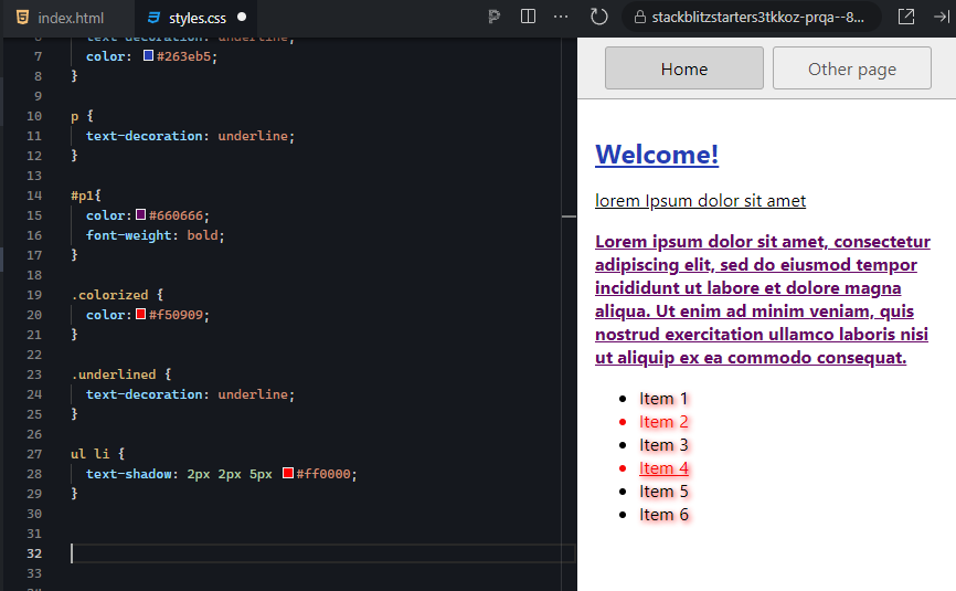
Combinator selectors add much more specificity and control over your content. Furthermore, you can select elements based on their relationships to other elements, which, again, can further increase the CSS specificity value of your style rule.
Combination Selector
CSS rule component that uses multiple selectors and types to increase the selector’s specificity.
Pseudo-class selectors allow you to select elements based on their current state. The “state” of an element refers to its current properties, values, and state of being at any one point in time, such as a hyperlink having been visited or that is currently being hovered over by the user’s mouse cursor. Pseudo-class selectors start with a single colon and the pseudo-class name. The following is a list of the pseudo-class selectors:
|
|
As you can see from the list, there are a lot of different states that we can use to apply different styles. For example, when programming a web form, controls either possess the required attribute or not; thus, when they are required, they can be given their own special style rule. The fields that are required can be stylized with a bold red border using the input:required selector, and the non-required fields can be stylized with a thin green border using the input:optional selector.
To learn more about the individual pseudo-classes, visit the CSS Reference page within the W3schools.com site.
Directions: Now that you have seen how to create and use pseudo-class selectors, it is time to practice! The :nth-child(n) pseudo-class will select the “n”th sibling in a collection of siblings based on the number you put in place of the “n” within the parentheses.
Note: At any time if you do not see the change occur, make sure to select the refresh button in the IDE.
EXAMPLE
All the direct children of the <ul> element in our practice example are siblings.We can apply this pseudo-class to the <li> selector (without a space) and select a specific child based on their sequential order.
EXAMPLE
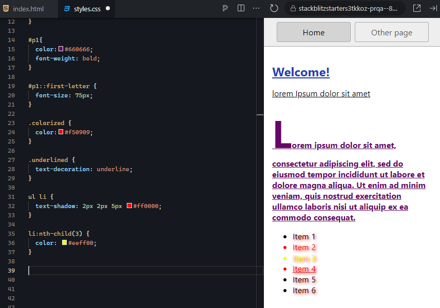
The first <li> in the list would be li:nth-child(1), and the fifth <li> in the list would be li:nth-child(5).1. Return to your project and open the stylesheet. Add a new style rule that uses the pseudo-class selector “:nth-child(),” which we will use on the <li> element to select the third sibling.
2. For your pseudo-class selector, postfix it to the selector for the list item siblings and put a “3” in place of the “n.” Add a color property and put in the hex code #eeff00 (yellow).
EXAMPLE
The expected output is as follows: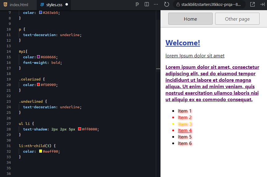
There are a lot of pseudo-classes that can be used in a variety of ways to achieve different styles and techniques. Acting and responding to “state” data is a common method of application programming. Keep this in mind if you ever tackle single-page applications or other application-type projects on the web, as you can use these types of selectors to implement a lot of the common, convenient, and advanced styling features of computer application interfaces.
IN CONTEXT
Remember that in the example above, the CSS selector we used will apply to all collections of list items where this rule is applied. Currently, this rule is located in the external stylesheet, and any pages that are linked to this stylesheet will apply this style. Formatting methods that are as specific and unique as this are likely to only be applied to one list in the entire site (although not in all cases).
EXAMPLE
In such cases, you will want to add specificity to your selector by giving the list an id attribute and prefixing an id to the selector, separated with a space:
#listid li:nth-child(3) { color: #eeff00; }
Pseudo-Class Selector
CSS rule component that applies style rules based on the different values of an element’s state of existence.
State
The values of a software object that indicate its current status.
Pseudo-element selectors allow you to select only part of an element, such as the first line of a paragraph or the first letter. Pseudo-element selectors start with a double colon and the pseudo-element name. The following is a list of the pseudo-element selectors:
Directions: Now that you have seen how to create and use pseudo-element selectors, it is time to practice! In this example, we will stylize the first letter of the second paragraph. Since pseudo-element selectors can select a portion or part of an element, we can use one to change the format of a letter in a paragraph. The second paragraph should already have an id value, so let us reuse that to apply a drop letter to the first letter.
This “Try It” discusses two ways of implementing a drop caps letter. The first option uses a CSS property designed specifically for this operation. However, this option is not widely compatible with all browsers. The second method manually adjusts various properties of the first letter and thus requires more CSS code but is compatible with all browsers.
Note: At any time if you do not see the change occur, make sure to select the refresh button in the IDE.
1. Return to your project and open the stylesheet. Locate the original id selector “#p1” for the paragraph you stylized earlier.
2. Add a new style rule below it, which uses the same “#p1” id and append the pseudo-element “::firstletter.”
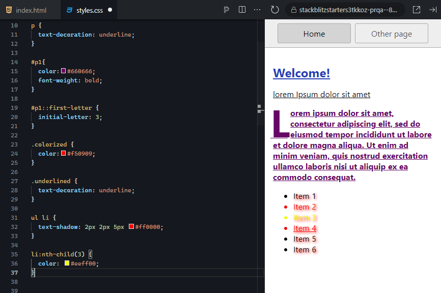
Setting the line-height to 60px fixed the position of the first line by adding space above the text.
EXAMPLE
The expected output is as follows: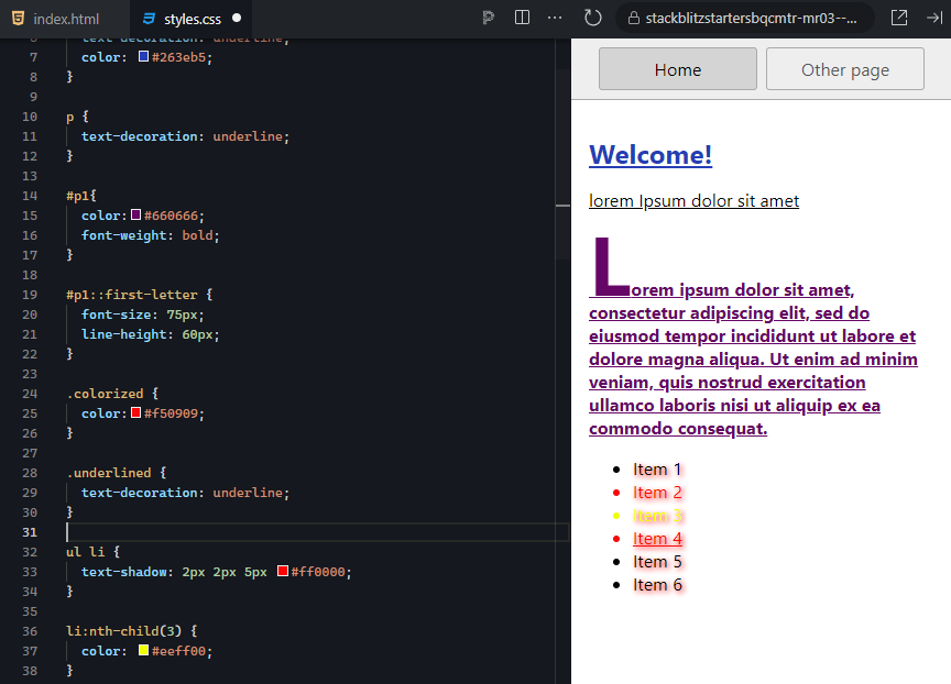
The letter is still not quite there; we need to allow it to use the original starting coordinates of the paragraph. In this unique case, we can do this by using the float property and telling it to float to the “left.” You will learn about the float property in a later unit.
EXAMPLE
The expected output is as follows: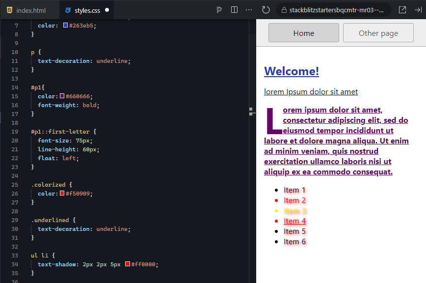
Almost! But we still have some extra spacing below and to the right of the letter. To finish this off, we can override the default padding around the letter to fine-tune its fit within the paragraph. For this, we adjust the padding-right, padding-left, and padding-top.
EXAMPLE
The expected output is as follows: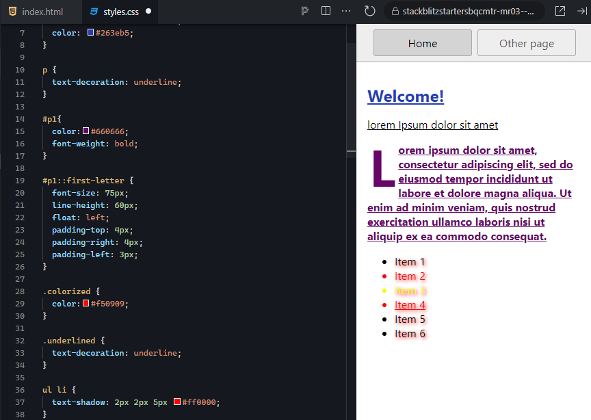
Here's a good time to save your project if you haven't already done so.
Pseudo-element selectors, while rather limited in their scope, do provide the ability to perform some advanced styling of elements that are already pre-built, such as the bullets of an unordered or ordered list or even the placeholder text of a form control.
Pseudo-Element Selector
CSS rule component that applies style properties to only specific parts of an element.
The last category of selector types is the attribute selector. Attribute selectors allow you to select an element based on whether it has a particular attribute or not. Additionally, attribute selectors can also select elements that possess a particular attribute with a specific value.
EXAMPLE
These selectors are encased in square brackets, and a value, if provided, is without quotes.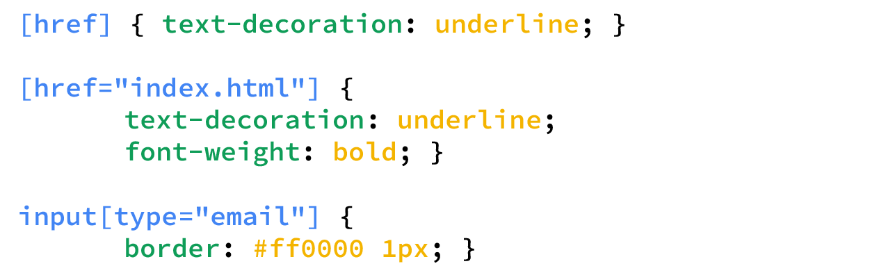
Let us take a closer look at each of these attribute selector examples.
EXAMPLE
First, we selected any and all tags that contain the “href” attribute and added an underline to any text:
EXAMPLE
Next, we specified that any and all tags with the “href” attribute that point to the index.html homepage file will receive an underline and have the font bolded.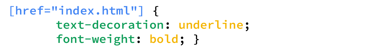
EXAMPLE
Finally, any <input> tag that has itstype attribute set to email is selected. The email type is a textbox dedicated to email addresses.

Note that there is no space between the “input” and the [. Recall that spaces are used to create a combination selector, which would have the browser looking for any element with [type="email"] that is a descendent of an <input> tag.
Attribute Selector
CSS rule component that applies style properties based on an element possessing a specific attribute or a particular attribute with a specific value.
The last selector to mention is the universal selector. The universal selector is simply the asterisk character (*), and any style properties added will be applied to each and every element on the page.
EXAMPLE
Universal selector* { box-sizing: border-box }
This is helpful when setting certain CSS settings, such as the box-sizing property discussed in the next tutorial.
Universal Selector
A CSS selector, consisting of an asterisk, used to apply a style rule to all elements on the page.
The order of precedence, when it comes to which elements will receive overlapping style rules, is referred to as selector specificity. Every selector and selector type possesses a different specificity value. When you use combination selectors, the values get added together to increase the specificity. When there are conflicting styles, such as one rule that tries to set the background color of a division to red while another tries to set its background color to blue, the selector with a higher specificity will be applied to the element regardless of whether the style rule is located in the external stylesheet or the embedded stylesheet.
If two conflicting styles have the same selector specificity value (e.g., they both use an id selector “#container”), then the style that gets applied last is the style that sticks. Recall from a previous lesson that you learned that the external stylesheet gets read and applied first, and then the embedded stylesheet gets read and applied second. Since the embedded stylesheet gets read and applied after the external stylesheet, the embedded styles will take precedence. However, even if a style rule exists in the external stylesheet but has a higher selector specificity value, then it will take precedence over the embedded styles due to the higher specificity.
EXAMPLE
If the embedded stylesheet used the “#container” selector, but the external stylesheet used “div#container,” the div adds to the specificity and will override the embedded stylesheet.| Selector | Example | Value |
|---|---|---|
| universal selector | * | 0 (overridden by anything) |
| tagname | p | 1 |
| class | .special | 10 |
| id | #table1 | 100 |
| inline | <p style="color: pink”> | 1000 |
| tagname with class | p.special | 11 |
| tagname with id | p#table1 | 101 |
| tagname with an id that is child of another id | #navbar p#demo | 201 |
There are, of course, two exceptions to this rule: inline styles and the “!important” rule. Inline styles, per the example below, automatically start with a selector specificity of 1000, whereas the other types have lower values. It does take a lot of specificity to override an inline style, but it is possible.
One method of ensuring that certain style properties are never overridden by inline styles is to apply the !important keyword operator just after the property value pair that needs to be enforced.
EXAMPLE
Any element with the .button class will receive these properties..button {
background-color: #8c8c8c !important;
color: white !important;
padding: 5px !important;
border: 1px solid black !important;
}
Furthermore, while embedded and inline styles may be able to change other properties, they will have no effect on the four properties marked with “!important.” While this is a great way to enforce specific style properties throughout a website, it should be used with caution, as its overuse can lead to a very rigid design and possible unexpected results.
One additional use case for the “!important” rule is in the use of a CMS, wherein access to the CMS styles is restricted. They can be overridden by using an internal stylesheet and applying the “!important” rule.
Selector Specificity
A value calculated based on the type, number of, and combination of selectors that determine the conflicting rule’s order of precedence.
!important
A special keyword operator appended to the end of an individual CSS property value pair that ensures the style property has the highest precedence and cannot be overridden by other CSS.
Due to the simple fact that different web browsers have been developed by different organizations, we can expect that browsers will not interpret the HTML and CSS exactly the same. In fact, each browser uses a different rendering engine for different technologies. For example, Safari uses WebKit to render HTML and CSS, while Google Chrome uses a newer version of WebKit called Blink. Firefox uses a completely different engine called Gecko.
As such, a mechanism for targeting the correct engine was created called the vendor prefix. Different vendor prefixes have been designed to respond to different CSS property prefixes in order to help with compatibility and ensure a consistent style across different browsers. The prefixes include the following:
EXAMPLE
The idea is that when we want to set a CSS property that has compatibility issues, we can repeat the same property value pair but with different vendor prefixes to help target the correct rendering engine.-webkit-transition: all 4s ease;
-moz-transition: all 4s ease;
-ms-transition: all 4s ease;
-o-transition: all 4s ease;
transition: all 4s ease;
The example above shows one property, “transition,” using all four vendor prefixes plus the last one without a prefix. With that being stated, browser developers are continuing to move towards a standardized implementation of CSS within their engines, which is slowly removing the need to use vendor prefixes.
There are tools available to help with this rather tedious process. The first is a site called shouldiprefix.com, which allows you to search for a CSS property, and the site will tell you if you need to include a prefix and what prefixes are needed.
Another option is to use a tool such as Autoprefixer, which is software that will automatically prefix your CSS code as needed. Autoprefixer uses the shouldiprefix.com site as its knowledge base, so it will always use the most up-to-date information.
View the following video for more on all three ways to add CSS to a website.
Vendor Prefix
A special prefix that is added to a CSS property to improve consistency across different browsers.
Source: This Tutorial has been adapted from "The Missing Link: An Introduction to Web Development and Programming " by Michael Mendez. Access for free at https://open.umn.edu/opentextbooks/textbooks/the-missing-link-an-introduction-to-web-development-and-programming. License: Creative Commons attribution: CC BY-NC-SA.