Use Sophia to knock out your gen-ed requirements quickly and affordably. Learn more
×

Responsive Styling

Author: Sophia

what's covered
In this lesson, you will learn about the importance of responsive web design. Additionally, some techniques regarding responsive web design will be covered, including a discussion about the viewport attribute. You will learn how to rearrange content using media queries and flexbox. Lastly, you will learn how to implement a hamburger menu for mobile design and layouts.

Specifically, this lesson will cover the following:

Table of Contents

1. The Importance of Responsive Design

As we discussed in a previous challenge, prior to the proliferation of cell phones equipped with web browsers, all websites were designed with the standard desktop computer screen in mind. Most HTML content was configured with fixed sizes set in pixels—not percentages—and the content was not rearranged when the browser window’s size was reduced. Once cell phones started coming equipped with web browsers, site administrators needed a solution to make their site function properly on smaller screens.

Initially, the solution was to design a separate website for mobile devices, then use JavaScript to detect the browser type as mobile versus desktop, and then redirect the user to a subdomain that contains the mobile version.

EXAMPLE

Attempting to access mywebsite.com using a mobile phone would redirect you to the subdomain m.mywebsite.com.

Today, CSS3 and HTML5 provide all of the necessary tools for making a website responsive. That is to say, a website will respond to the screen’s size and rearrange its content to best fit the device’s aspect ratio and orientation.

Media queries, as discussed previously, are powerful mechanisms that can react based on the user’s screen size and either activate or deactivate blocks of CSS that override default CSS properties. The overriding CSS is what changes properties to rearrange the content, such as overriding flex-direction from “row” to “column” to allow sections of content to stack vertically rather than side by side. Another property that may be overridden by a media query is font size. Smaller screens with higher DPI may render text that is too small for the user to read. Instead, the font size may be increased for smaller screens.

In the next sections, we will look at the viewport setting, how to rearrange content based on screen size, as well as how to implement a content swap and deploy a hamburger menu for smaller screens.

term to know

Viewport
The area of a computer program that is currently shown on the screen and an important setting for making a website responsive.


2. The Viewport

The first step in making a website responsive is to set the viewport value. The viewport value allows the browser to determine how to control the page’s dimensions and scaling.

EXAMPLE

We do this using a meta tag within the head section and give it the following HTML attributes:


<meta name="viewport" content="width=device-width, initial-scale=1.0">

Once this has been set, the browser will be able to automatically adjust elements to better fit on the screen, but this also gives it the ability to better handle media queries. In general, the reason this works is that all elements that use relative units of measurement, such as percentage and rem, need to have a parent with some sort of fixed size.


3. Rearranging Content

Returning to the page structure example wherein we used flexbox to make the main and aside sections sit side by side, we will prepare this page to adapt to narrower screen sizes by changing the flex-direction when the screen becomes too narrow.

The first step is to set the arrangement according to the initial design, that is, mobile first.

EXAMPLE

We will set the mobile as the default CSS and make the media query adapt to a larger size.

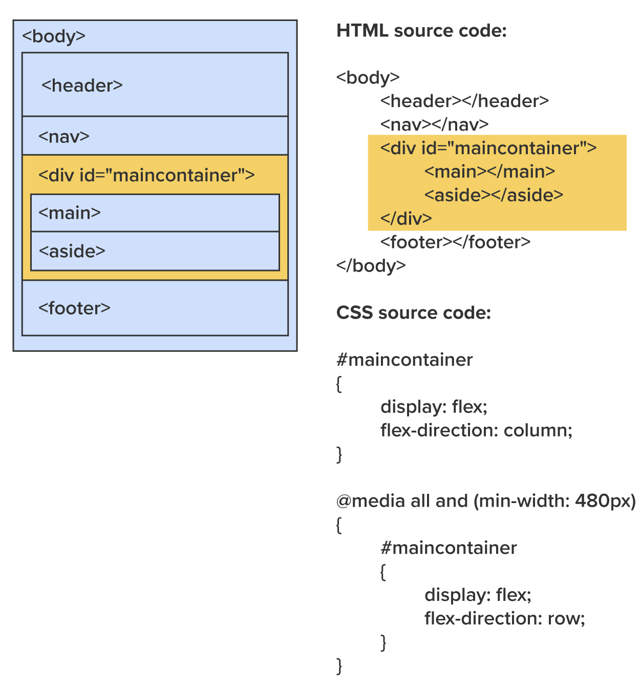
In the example, we set the #maincontainer as the flex container using “display:flex” and set the flex-direction to “column.” This allows the sections to stack vertically and allows for all content to fit on the screen and avoid forcing the user to scroll horizontally. Then, whenever the screen width reaches 480 pixels or more, the media query will activate its block of style rules and override the flex-direction with “row.” This allows both the main and aside sections to be displayed on screen and take advantage of the wider viewport.

try it

Directions: Now that you have learned about how content can be rearranged with flexbox and media queries, it is time to try it yourself.

Note: At any time if you do not see the change occur, make sure to select the refresh button in the IDE.

1. Return to your StackBlitz account and open the project you were working on in the Forms lesson. We will be adding background colors to the main and aside sections, setting their widths to 70% and 30%, respectively, and preparing them to respond to the width of the screen and change their orientation.

2. In the head section of the index.html, create a style element and add the following properties to the main and aside sections:

EXAMPLE

The expected output is as follows:

The right output window displays a webpage preview. At the top, there is an image of three pastry buns. Below the image, the text "Header" and "Nav" are shown as placeholders. A yellow navigation bar contains three buttons labeled "Home," "About," and "Menu," with "Home" highlighted in yellow. Beneath the navigation bar, the words "Section" and "Main" are shown as placeholders. In the "Main" section, there is a table labeled "Hours of Operations." The table has three columns labeled "Days," "Open," and "Close," with borders around each cell. The rows display the operating hours: Monday to Friday from 8 am to 8 pm, Saturday from 8 am to 2 pm, and Sunday as closed. The background of the "Main" section is light yellow, while the "Aside" section below it has a dark gray background. The layout is neatly organized, using color to differentiate the sections.

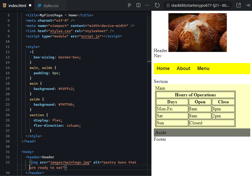
Remember, we are going to assume a mobile-first approach, so the default styles should be set up for a narrow screen. In this case, we stack them in a column and give them widths of 100%.

a. Using the universal selector “*,” set the box-sizing to border-box.
b. Add a 5-pixel border to both the main and aside.
c. Give the main the background color of #FDFFC2.
d. Give the aside the background color of #74776B.
e. Give the section the display value of “flex” and set flex direction to “column.”

At this point, you should see that your main and aside sections sit on top of each other and take up the full width.

3. Next, we will finish by adding the media query and overriding the flex-direction and the main and aside widths.

a. Add the following media query at the bottom of the style element. NOTE: Do not include a semi-colon after the 480px:
@media all and (min-width: 480px) { }

b. Next, within the media query’s curly brackets, override the section’s flex-direction.
c. Set the main to a width of 70%.
d. Set the aside to a width of 30%.

4. If everything was coded correctly, you should be able to click and drag the panel divider and see the results of your media query switching between the main and aside orientations.

EXAMPLE

The expected output is as follows:

The right output window displays a webpage preview. At the top, there is an image of three pastry buns. Below the image, the text "Header" and "Nav" are displayed. A yellow navigation bar contains three buttons labeled "Home," "About," and "Menu," with "Home" highlighted in yellow. An arrow icon is positioned between the navigation bar and the main content, suggesting interactive functionality (e.g., horizontal scrolling or expanding the content). In the "Main" section, there is a table labeled "Hours of Operations." The table has three columns labeled "Days," "Open," and "Close," with borders around each cell. The rows display the operating hours: Monday to Friday from 8 am to 8 pm, Saturday from 8 am to 2 pm, and Sunday as closed. The background of the "Main" section is light yellow, while the "Aside" section below has a dark gray background. The media query at the bottom suggests a layout adjustment at a minimum width of 480px, which would change the "section" layout to a row format from its default column layout.

The right output window displays a webpage preview. At the top, there is an image of three pastry buns. Below the image, the text "Header" and "Nav" are shown. A yellow navigation bar contains three buttons labeled "Home," "About," and "Menu," with "Home" highlighted in yellow. An arrow icon is positioned between the navigation bar and the main content, suggesting interactive functionality, such as horizontal scrolling or expanding the content. In the "Main" section, the content layout has been adjusted, likely due to the media query triggered at a minimum width of 480px. The "Main" and "Aside" sections are now displayed side by side, with "Main" on the left and "Aside" on the right. The "Main" section contains a table labeled "Hours of Operations," with three columns labeled "Days," "Open," and "Close." The table rows show the operating hours: Monday to Friday from 8 am to 8 pm, Saturday from 8 am to 2 pm, and Sunday as closed. The background of the "Main" section is light yellow, while the "Aside" section has a dark gray background. The "Footer" is displayed below, keeping the layout simple and structured.

reflect

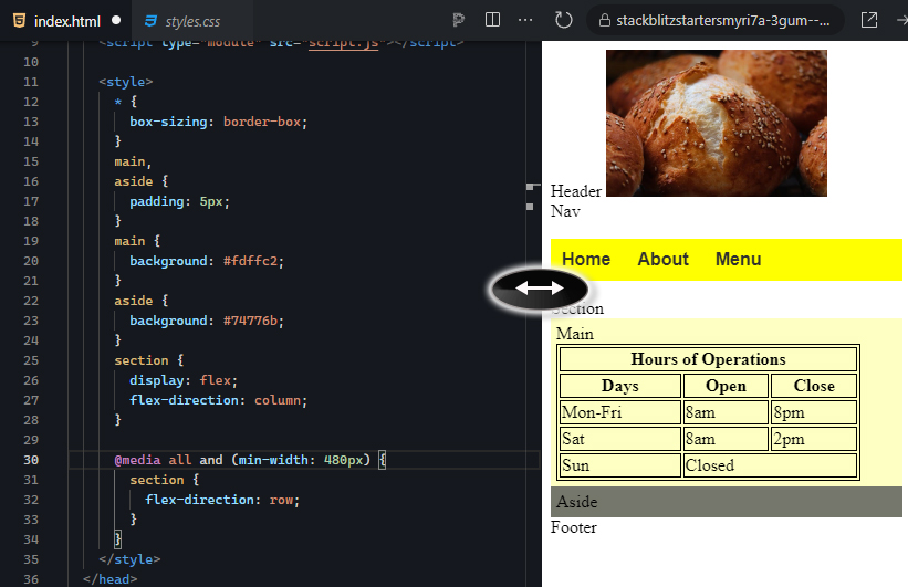
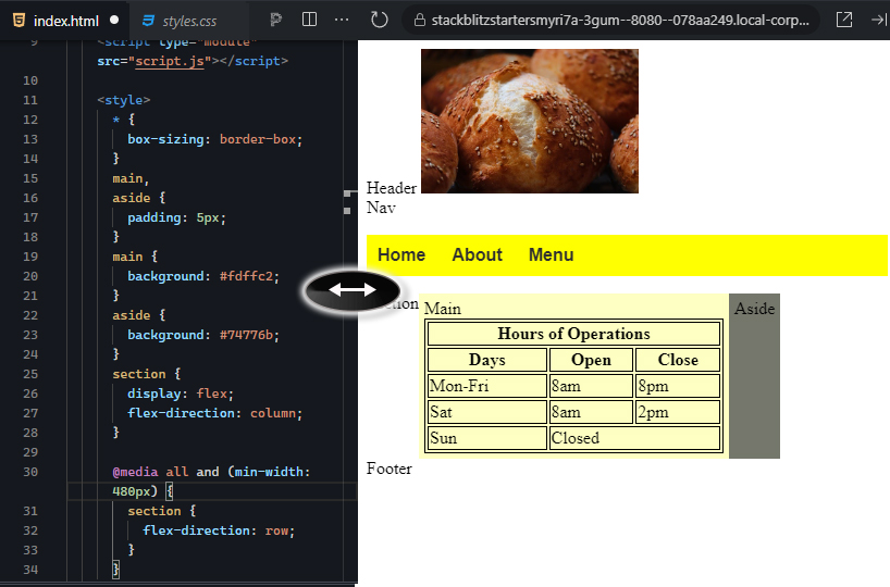
Congratulations! You successfully set up your main and aside sections to be responsive to the width of the viewport. Think about how this may be useful in other areas of your website. Other content sections, such as the footer, galleries of images, and the navigation menu, which we will explore next.


4. Implementing a Hamburger Menu

Remember that the hamburger menu is a menu that saves screenspace while it is not in use, which is particularly helpful for mobile users. The technique for allowing a full-size menu to switch into a hidden popup menu requires creating two complete menus and always having one hidden. Then, when the media query affects the page, it swaps the visibility of the two menus.

step by step

The process for preparing a page with a responsive navigation menu is as follows:

1. Prepare the hamburger menu using the CSS tooltip technique.

2. Prepare the standard navigation menu.

3. Surround both in their own division container, each with a unique id, that is, “burgermenu” and “fullmenu.” (NOTE: Keep in mind that class and id names cannot contain spaces. Follow the names as they are written in the tutorial.)

4. Within the site’s stylesheet, use the default CSS to hide the full menu using the id selector and set display to “none.” Set the hamburger menu using its id selector and set its display property to “block.”

5. Create a media query that reacts when the viewport width reaches at least 480 pixels. Use this media query to swap the display values, setting the burger menu to display “none” and the full menu to display “block.”


try it

Directions: Now that you have learned about the process of creating a responsive navigation menu using media queries, let us start by creating the hamburger menu below the regular navigation menu so that both are on the screen. We will then make them responsive by hiding one and using the media query to swap their visibility using the display property.

Note: At any time if you do not see the change occur, make sure to select the refresh button in the IDE.

1. Let us make some changes to the original menu (full menu). In the index.html, locate the unordered list of your full navigation menu, and surround it in a division. Give the division an id of “fullmenu.”

2. Go to your stylesheet, and at the bottom of the stylesheet, create a new style rule with the #fullmenu selector and set the display to “none.” This will make your full menu disappear as the default style (it will be made to reappear when the screen meets the media query requirements).

EXAMPLE

The expected output is as follows:

The right output window displays a webpage preview. At the top, there is an image of three pastry buns. Below the image, the text "Header" and "Nav" are displayed as placeholders. The navigation menu, which typically contains links for "Home," "About," and "Menu," is hidden due to the #fullmenu element being set to display: none; in the CSS. In the "Main" section, there is a table labeled "Hours of Operations." The table has three columns labeled "Days," "Open," and "Close," with borders around each cell. The rows display the operating hours: Monday to Friday from 8 am to 8 pm, Saturday from 8 am to 2 pm, and Sunday as closed. The background of the "Main" section is light yellow, while the "Aside" section below it has a dark gray background. The "Footer" is displayed at the bottom of the page, keeping the layout clean and well-structured. The layout suggests that the navigation is either collapsed or set to be displayed under specific conditions.

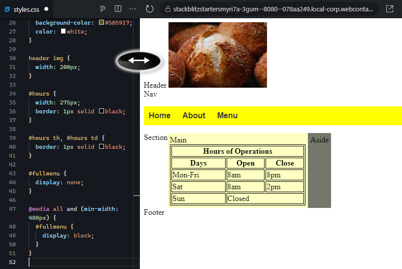
3. Now, add the same media query as we did before:

@media all and (min-width: 480px) { }

4. Within the curly brackets, add the same style rule for the #fullmenu and set its display to “block.” You should now be able to resize the viewport and see that your menu appears when the screen becomes wider than 480 pixels and disappears when it is less than 480 pixels.

EXAMPLE

The expected output is as follows:

The right output window displays a webpage preview. At the top, there is an image of three pastry buns. Below the image, the text "Header" and "Nav" are shown as placeholders. The navigation menu is not visible due to the #fullmenu element being set to display: none; in the CSS. An arrow icon is displayed between the navigation bar and the main content, indicating potential interactive functionality, such as horizontal scrolling or content expansion. In the "Main" section, there is a table labeled "Hours of Operations." The table has three columns labeled "Days," "Open," and "Close," with borders around each cell. The rows display the operating hours: Monday to Friday from 8 am to 8 pm, Saturday from 8 am to 2 pm, and Sunday as closed. The background of the "Main" section is light yellow, while the "Aside" section below it has a dark gray background. The "Footer" is displayed at the bottom of the page. A media query in the CSS indicates that the #fullmenu navigation would become visible (set to display: block;) at a minimum screen width of 480px, but in the current view, the navigation remains hidden. The layout is clean, structured, and responsive to screen size changes.

The right output window displays a webpage preview. At the top, there is an image of three pastry buns. Below the image, the text "Header" and "Nav" are shown. A yellow navigation bar contains three buttons labeled "Home," "About," and "Menu," with "Home" highlighted in yellow. An arrow icon is displayed between the navigation bar and the main content, indicating potential interactive functionality (e.g., horizontal scrolling or content expansion). In the "Main" section, a table labeled "Hours of Operations" is displayed. The table has three columns labeled "Days," "Open," and "Close," with borders around each cell. The rows show the operating hours: Monday to Friday from 8 am to 8 pm, Saturday from 8 am to 2 pm, and Sunday as closed. The background of the "Main" section is light yellow, while the "Aside" section has a dark gray background. The CSS includes a media query that displays the #fullmenu navigation when the screen width is at least 480px, making the full navigation bar visible in this layout. The overall structure is clean and responsive to different screen sizes.

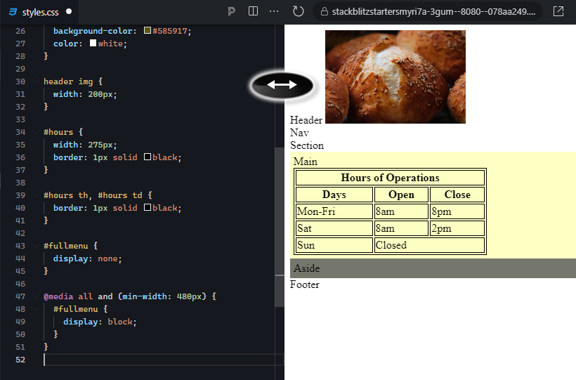
5. Next, we will create the burger menu. Copy and paste the entire full menu structure, including the entire division container, and paste the copy below the full menu division container.

6. Change the id value of the new menu to “burgermenu,” and give the unordered list within an id of “burgermenulinks.”

7. Surround the unordered list with a division element. Give the division element an id of “burgermenu.”

8. Give the unordered list tag an id of “burgermenulinks.”

9. Just below the burgermenu division and before the burgermenulinks, paste the following SVG code from Font Awesome. This is a burger menu icon and will be the hover target that will show the burger menu:

<svg xmlns="http://www.w3.org/2000/svg" height="2.0em" viewBox="0 0 448 512"><path d="M0 96C0 78.3 14.3 64 32 64H416c17.7 0 32 14.3 32 32s-14.3 32-32 32H32C14.3 128 0 113.7 0 96zM0 256c0-17.7 14.3-32 32-32H416c17.7 0 32 14.3 32 32s-14.3 32-32 32H32c-17.7 0-32-14.3-32-32zM448 416c0 17.7-14.3 32-32 32H32c-17.7 0-32-14.3-32-32s14.3-32 32-32H416c17.7 0 32 14.3 32 32z"/></svg>

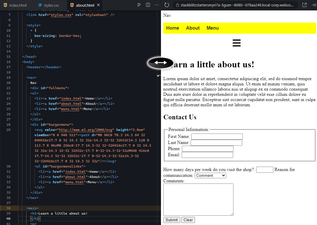
If your viewport is wide enough, you will see two copies of your original full menu and the hamburger icon between them. The upper menu should disappear when you reduce the width of the viewport:

EXAMPLE

The expected output is as follows:

The right output window displays a webpage preview. At the top, there is an image of three pastry buns. Below the image, the text "Header" and "Nav" are shown as placeholders. The navigation menu is duplicated: one is a standard horizontal menu with "Home," "About," and "Menu" buttons displayed in a yellow bar, and another is a collapsible "burger menu" displayed below, represented by three horizontal lines (an SVG icon). The burger menu also contains links for "Home," "About," and "Menu," displayed when the menu is expanded. In the "Main" section, there is a table labeled "Hours of Operations." The table has three columns labeled "Days," "Open," and "Close," with borders around each cell. The rows display the operating hours: Monday to Friday from 8 am to 8 pm, Saturday from 8 am to 2 pm, and Sunday as closed. The background of the "Main" section is light yellow, while the "Aside" section below it has a dark gray background. The page layout includes both a traditional horizontal navigation bar and a responsive burger menu for mobile or smaller screens. The media query in the CSS controls the visibility of these elements based on screen size or user interaction.

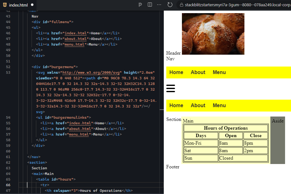
However, we need to separate the two menus for styling purposes. To do this, we need to make the selectors for the original full menu more specific. Everywhere you see a selector that starts with “nav,” replace the “nav” with “#fullmenu.” If you refresh, you will see that the burger menu will appear as an unstyled unordered list.

10. Now, let us make the hamburger menu function properly using the CSS tooltip technique. In the external stylesheet in the default styles (before the media query), set the burgermenu with the following properties:

a. position: relative;
b. display: block;
c. height: 50px;
d. width: 50px;
e. margin: 0 auto;

This will set the hover area of the burger menu to 50 by 50 pixels and center it using “margin: 0 auto;”.

11. Next, create another default style rule with the selector #burgermenu #burgermenulinks.

This is where you get to stylize your burger menu:
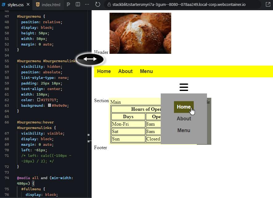
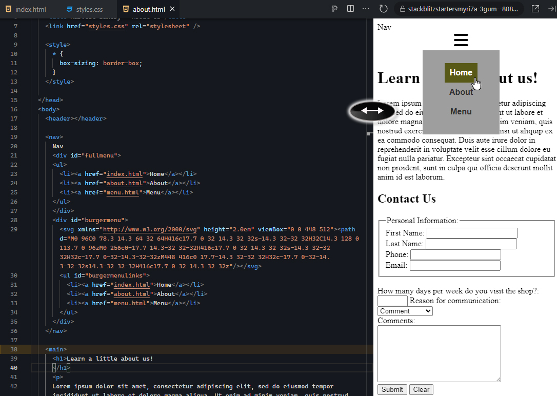
a. Set visibility to “none.”
b. Set position to “absolute.”
c. Set list-style-type to “none.”
d. Set text-align to “center.”
e. Give it a padding of 25px 10px (25 pixels on the top and bottom; 10 pixels on the left and right).
f. Set the width to 150px.
g. Set the color to #171717.
h. Set the background color to #9e9e9e.

These values can be adjusted after the next step in order to fine-tune the style of the menu.

12. Next, we will set up the burger menu to respond to a mouse hover, display the menu, and control the menu’s position. Create a new style rule below the previous one with the following selector: #burgermenu:hover #burgermenulinks.

a. Set visibility to “visible.”
b. Set display to “block.”
c. Set margin to “0 auto.”
d. Set left to -61px. (This will position the menu centered under the burger menu icon. The -61 was calculated by taking the width of the menu (150px), subtracting the width of the icon (28px), and then dividing by 2. If you used a different menu width or icon size, you may need to adjust the values.)

EXAMPLE

The expected output is as follows:

The right output window displays a webpage preview. At the top, there is an image of three pastry buns. Below the image, the text "Header" is displayed as a placeholder. The navigation area features a "burger menu" icon, represented by three horizontal lines. The menu is currently collapsed, and the links inside it are not visible because of the CSS rule setting #burgermenulinks to visibility: hidden;. This menu would expand when hovered over, revealing the "Home," "About," and "Menu" options as specified in the code. In the "Main" section, a table labeled "Hours of Operations" is displayed. The table has three columns labeled "Days," "Open," and "Close," with borders around each cell. The rows show the operating hours: Monday to Friday from 8 am to 8 pm, Saturday from 8 am to 2 pm, and Sunday as closed. The background of the "Main" section is light yellow, while the "Aside" section has a dark gray background. An arrow icon is placed between the navigation and main content, suggesting interactivity such as scrolling or expanding content. The page layout is responsive, adjusting the visibility and positioning of elements based on screen size or user interaction.

The right output window displays a webpage preview. At the top, there is an image of three pastry buns. Below the image, the text "Header" is displayed as a placeholder. A yellow navigation bar contains three buttons labeled "Home," "About," and "Menu," with "Home" highlighted in yellow. Under the navigation bar, there is a "burger menu" icon represented by three horizontal lines. When hovered over, the burger menu expands, revealing a dropdown with links labeled "Home," "About," and "Menu." The "Home" link is highlighted in a darker yellow, and a cursor is hovering over it. In the "Main" section, a table labeled "Hours of Operations" is displayed. The table has three columns labeled "Days," "Open," and "Close," with borders around each cell. The rows show the operating hours: Monday to Friday from 8 am to 8 pm, Saturday from 8 am to 2 pm, and Sunday as closed. The background of the "Main" section is light yellow, while the "Aside" section has a dark gray background. An arrow icon is displayed between the burger menu and the main content, suggesting potential interactivity (e.g., content expansion or scrolling). The page layout is clean and responsive, with a hover-activated burger menu providing an alternative navigation option.

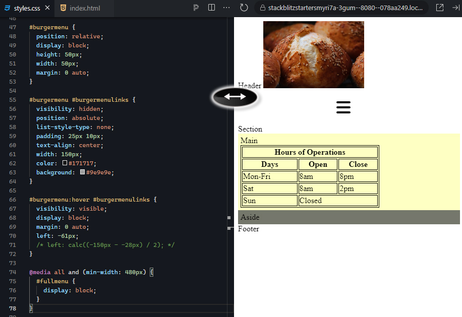
13. The second to last step is to hide the burger menu when the full menu is visible. Go to the media query section, and below the #fullmenu style rule, add a new rule for #burgermenu and set its display to “none.” Your navigation menu is now responsive.

14. Finally, copy and paste the entire nav section from the index.html and paste it into the about.html, overwriting the old nav section. Now, your about.html page’s navigation menu is also responsive. Remember to refresh your project.

EXAMPLE

The expected output is as follows:

The right side of the image displays a webpage preview. At the top, there is an image of three pastry buns. Below the image, the text "Header" and "Nav" are shown as placeholders. The navigation section contains both a standard menu and a collapsible burger menu. The burger menu icon is represented by three horizontal lines, indicating that the menu can be expanded to show links for "Home," "About," and "Menu." In the "Main" section, there is a table labeled "Hours of Operations," with three columns labeled "Days," "Open," and "Close." The rows display the operating hours as Monday to Friday from 8 am to 8 pm, Saturday from 8 am to 2 pm, and Sunday as closed. The background of the "Main" section is light yellow, while the "Aside" section below it is dark gray. An arrow icon is placed between the navigation and the main content, suggesting potential interactivity such as horizontal scrolling or content expansion. The webpage layout is clean and simple, with the navigation and table components clearly visible. On the left side, the code for the webpage is shown. It includes the structure for the navigation (<nav>), with both the full menu (#fullmenu) and burger menu (#burgermenu) sections. The burger menu uses an SVG graphic to display the three horizontal lines, and when expanded, it reveals the same "Home," "About," and "Menu" links as the full menu.

The right side of the image shows a webpage preview. At the top, there is an image of three pastry buns. Below the image, the text "Header" and "Nav" are displayed as placeholders. A yellow navigation bar contains three buttons labeled "Home," "About," and "Menu," with "About" highlighted in yellow. Below the navigation bar, there is a burger menu icon represented by three horizontal lines. The burger menu is expanded, showing links for "Home," "About," and "Menu." The "About" link is highlighted, and a cursor is hovering over it. In the "Main" section, a table labeled "Hours of Operations" is displayed. The table has three columns labeled "Days," "Open," and "Close," with borders around each cell. The rows show the operating hours as Monday to Friday from 8 am to 8 pm, Saturday from 8 am to 2 pm, and Sunday as closed. The background of the "Main" section is light yellow, while the "Aside" section has a dark gray background. The "Footer" is displayed at the bottom of the page. An arrow icon is placed between the navigation and the main content, suggesting interactive functionality such as scrolling or expanding content. On the left side, the HTML code structure for the webpage is visible. It shows the nav section with both the full menu (#fullmenu) and burger menu (#burgermenu), which uses an SVG graphic for the burger icon and links for "Home," "About," and "Menu." The code controls the layout and navigation options displayed on the right side of the image.

The right side of the image shows a webpage preview. At the top, a yellow navigation bar is displayed with three buttons labeled "Home," "About," and "Menu," with "About" highlighted in yellow. Below the navigation bar, a burger menu icon with three horizontal lines is visible, though not expanded. The main content of the page is titled "Learn a little about us!" in bold black text. Below the heading is a paragraph of placeholder lorem ipsum text, which provides filler content for a typical "About Us" section. Further down the page, there is a "Contact Us" section featuring a form for personal information. The form includes fields for "First Name," "Last Name," "Phone," "Email," and additional fields asking how often the visitor comes to the shop, the reason for communication, and a large text area for comments. At the bottom of the form are two buttons labeled "Submit" and "Clear." On the left side of the image, the HTML code for the page is displayed. The code includes a <nav> section that defines both the full menu and the burger menu. Below the navigation, the <main> section contains the heading "Learn a little about us!" and the structure for the contact form. The page layout is simple and functional, providing information about the business and a contact form for users to fill out.

The right side of the image displays a webpage preview. At the top, a burger menu icon with three horizontal lines is visible, and it has been expanded to show links for "Home," "About," and "Menu." The "Home" link is highlighted, and a cursor is hovering over it. Below the burger menu, the main content is titled "Learn a little about us!" in bold black text, followed by a paragraph of lorem ipsum placeholder text for the "About Us" section. Further down, there is a "Contact Us" section that includes a form for personal information. The form fields include "First Name," "Last Name," "Phone," "Email," and additional fields asking how often the visitor comes to the shop, the reason for communication, and a large text box for comments. At the bottom of the form are two buttons labeled "Submit" and "Clear." On the left side, the HTML code for the page is visible, showing the structure for the navigation (<nav>) section with both the full menu and burger menu. The burger menu is created using an SVG graphic to represent the three lines, with links for "Home," "About," and "Menu" underneath. The <main> section contains the heading "Learn a little about us!" along with the contact form that appears in the preview. The page layout is simple and functional, combining navigational options and a contact form for user interaction.

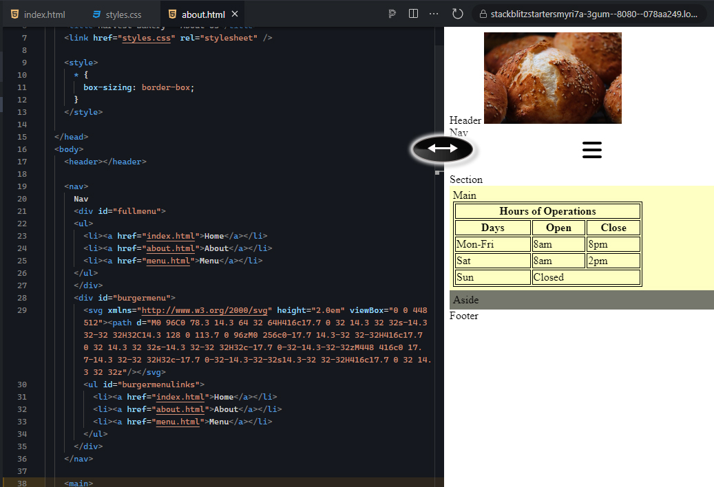
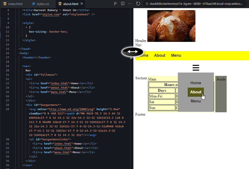
Note: In the about.html page, if your #burgermenulinks in the hover state are not vertically aligned, add the same style element that you added in the head section of the index.html. As in the index.html, use the universal selector “*,” set the box-sizing to border-box.

15. Make sure to save your project.

reflect

Congratulations! You have successfully set up a navigation menu to be responsive and convert into a compact hamburger menu. The popup menu itself is just a hidden section of HTML content that is positioned relative to its parent and is only visible when the mouse hovers over the icon. This is a valuable skill set to have, as all websites today really should be built using responsive web design.

At this point, you would want to stylize the popup menu according to the design of the website.

watch

View the following video for more on how you can create content for all screen sizes with responsive design.


summary
In this lesson, you learned about the importance of responsive web design. You learned about the viewport attribute and its importance in building a responsive webpage. Lastly, you learned about two common techniques, including rearranging content using media queries and flexbox, as well as how to perform a content swap to implement the hamburger menu, which is a more compact version of the navigation menu for mobile users.

Source: This Tutorial has been adapted from "The Missing Link: An Introduction to Web Development and Programming " by Michael Mendez. Access for free at https://open.umn.edu/opentextbooks/textbooks/the-missing-link-an-introduction-to-web-development-and-programming. License: Creative Commons attribution: CC BY-NC-SA.

Terms to Know
Viewport

The area of a computer program that is currently shown on the screen and an important setting for making a website responsive.