Table of Contents |
Responsive web design (RWD) is an approach to designing and coding a website to not only look good but also function well on as many different types of devices and screen sizes as possible. It has become increasingly important that websites are designed to look and function well on both mobile devices as well as the traditional desktop.
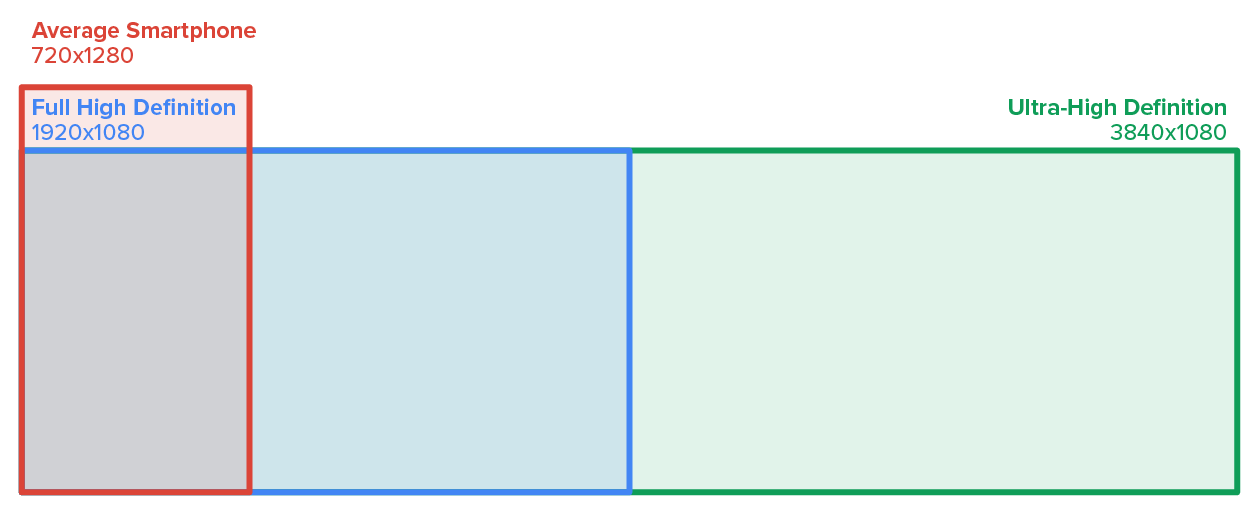
The typical desktop computer screen today is around 1,600 up to 3,840 pixels wide, usually about 1,080 pixels high. Smartphones, which are typically handled in portrait mode with the phone standing tall in the user’s hands, are commonly around 720 pixels wide, up to 1,440.
What about screen height? The height of a screen is not an important consideration in RWD as it is expected that users will scroll down to see more content. However, avoiding the appearance of the dreaded horizontal scrollbar is at the forefront of RWD and one of the goals behind RWD.
The width of typical desktop screens allows for more items and content to be arranged horizontally from left to right. Navigation menus can be easily displayed in full text on the screen. Sidebar sections can be positioned along the left or right side of the screen without forcing the user to use a horizontal scrollbar. However, when you try to view such a layout on a mobile device, you will see that much of the content that would otherwise be visible on the screen is cut off, forcing the user to have to scroll to the right to see the full page.
To solve this problem, RWD incorporates several coding techniques provided by Cascading Style Sheets (CSS) to dynamically detect the size of a screen and reposition and rearrange content as needed.
Responsive Design
The same as responsive web design; an approach to web development that enables a website to automatically adapt to different device screen sizes.
Pixels
Short for “picture elements”; the smallest addressable elements in a raster image or digital display screen.
The first RWD tool CSS provides to developers is the media query. Most of CSS is relatively passive.
EXAMPLE
You write CSS style rules, and those rules get applied whenever an element in the page meets the rule.
Media queries are active CSS tools that take action based on the width of the visible area and activate or deactivate entire blocks of style rules.
EXAMPLE
Media queries allow us to completely adjust the CSS related to the layout and page organization whenever the visible area reduces below a specified width or within a specific range.
Media queries include the “@media” keyword followed by a media type, a //CSS style block or condition, and, lastly, a style block of CSS rules to be applied.
EXAMPLE
@media [not|only] [screen|print|all] (feature: value)
{
//CSS style block
}
The media type values include “screen,” “print,” and “all” and are optional as the value of “all” is the default value. This value refers to the type of device being used. Today, only the “screen” and “print” specific values can be applied whether the device uses a screen to render the content or a printer to print the content.
IN CONTEXT
When media queries were introduced in CSS version 2 (CSS2), the plan was to be able to control the CSS styling based on many more device types, including computer screens, printers, handheld devices, and televisions. However, in practice, only screen and print were actually used and thus became the focus of media queries in our current version of CSS version 3 (CSS3).
The media feature rule allows the developer to set conditions that must be satisfied in order for the style block to be applied. Most commonly, this is used to set a minimum or maximum screen width threshold, but additional features can also be used such as orientation, preferred-contrast setting, resolution, and more.
EXAMPLE
@media (max-width: 480px)
{
//CSS style block
}
In the example above, when the screen width is between 0 and up to 480 pixels wide, the style block will be active. Once the screen width grows beyond the threshold of 480, the style block will deactivate. Depending on the original design, whether you started by designing the site for mobile screens or for a full desktop screen, you can adjust your condition to use either max-width or min-width.
The following diagram helps illustrate the use of min-width versus max-width.
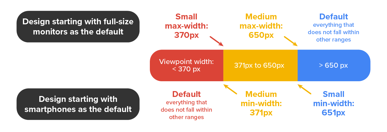
When you design a site for full-size screens, your default CSS will be everything beyond the maximum width of the next size down. Setting a media query threshold as max-width 650px means that anything larger than 650 pixels wide will assume the default styling. Once the screen width shrinks to 650 pixels or less, the medium CSS styling will be applied. When the width shrinks down further to 370 or less, the small CSS styling will be applied.
On the flip side, if you start with your site designed for mobile devices, you will instead use min-width. For example, setting the media query to min-width 371 means that a screen that is 370 pixels wide or smaller assumes the default small CSS style. Once the screen grows beyond 370, the medium CSS styles are applied. When the screen grows beyond 650, the large CSS style will be applied.
With the mechanism for detecting screen sizes and activating the associated set of CSS styles, we can now focus on the CSS properties and features that allow us to rearrange the content based on the activation and deactivation of media query style blocks.
Media Query
A CSS feature that can be configured to activate or deactivate CSS style rules based on set conditions.
Media Type
The condition of a media query that specifies what type of device should receive the CSS style rules.
Media Feature Rule
A media query condition that tests a given feature of a device to determine if and when a set of CSS style rules should be activated or deactivated.
The first and easiest method of changing content arrangement is to use the CSS flexbox feature. Flexbox is used to designate a container as a flexbox container, and its children (the items directly inside the container) become the flex items.
EXAMPLE
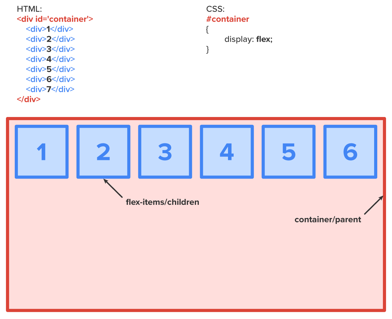
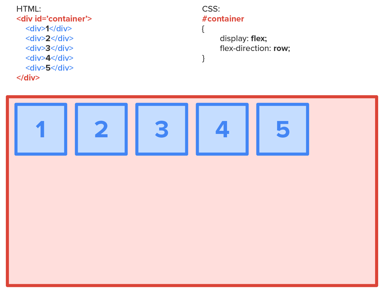
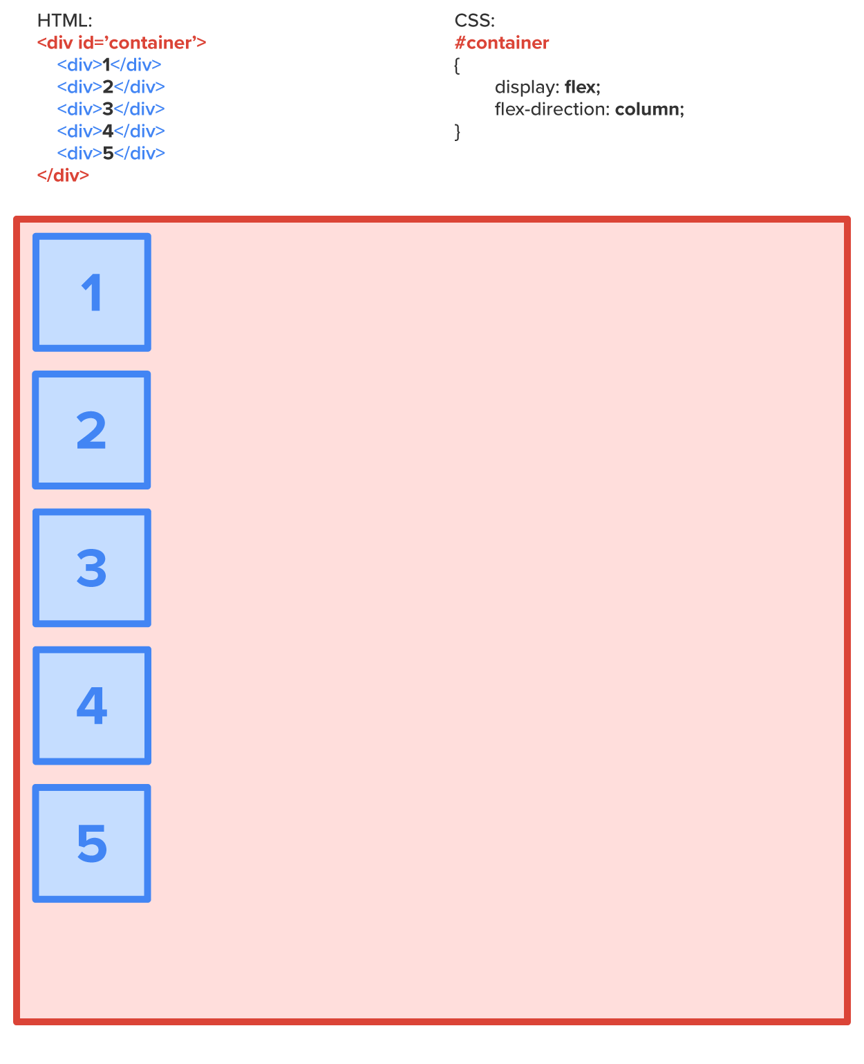
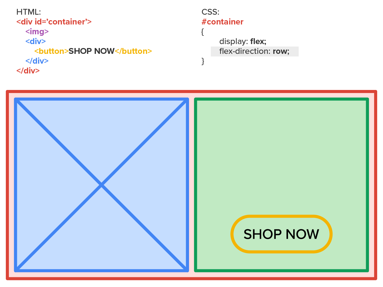
Regardless of what HTML element the flex items actually are, their behavior is overridden to make them behave like a flex item and automatically arrange themselves to make the most of the space available. Flexbox contains a number of additional CSS properties that can be configured to change how the flex items arrange themselves. One property relevant to responsive design is the flex-direction. Flex-direction is a property of a flex container that determines if its flex items will line up horizontally across the screen as a row or if they will stack on top of each other as a column.
The flex items line up horizontally in the following design:
EXAMPLE
The flex items line up vertically in the following design:
EXAMPLE
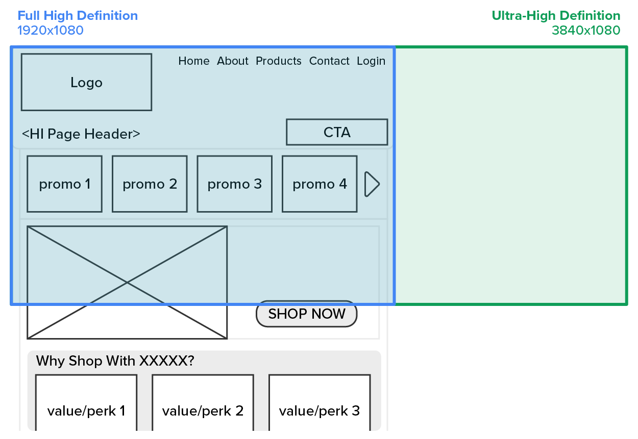
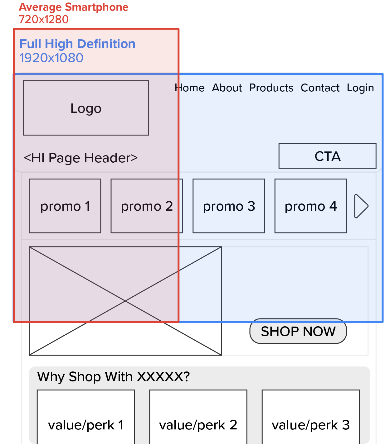
In the following sample wireframe, the screen sizes for average smartphones and full high-definition screens are overlaid over the content. In this case, there would not be enough space to show the entire call-to-action area on a smaller device.
EXAMPLE
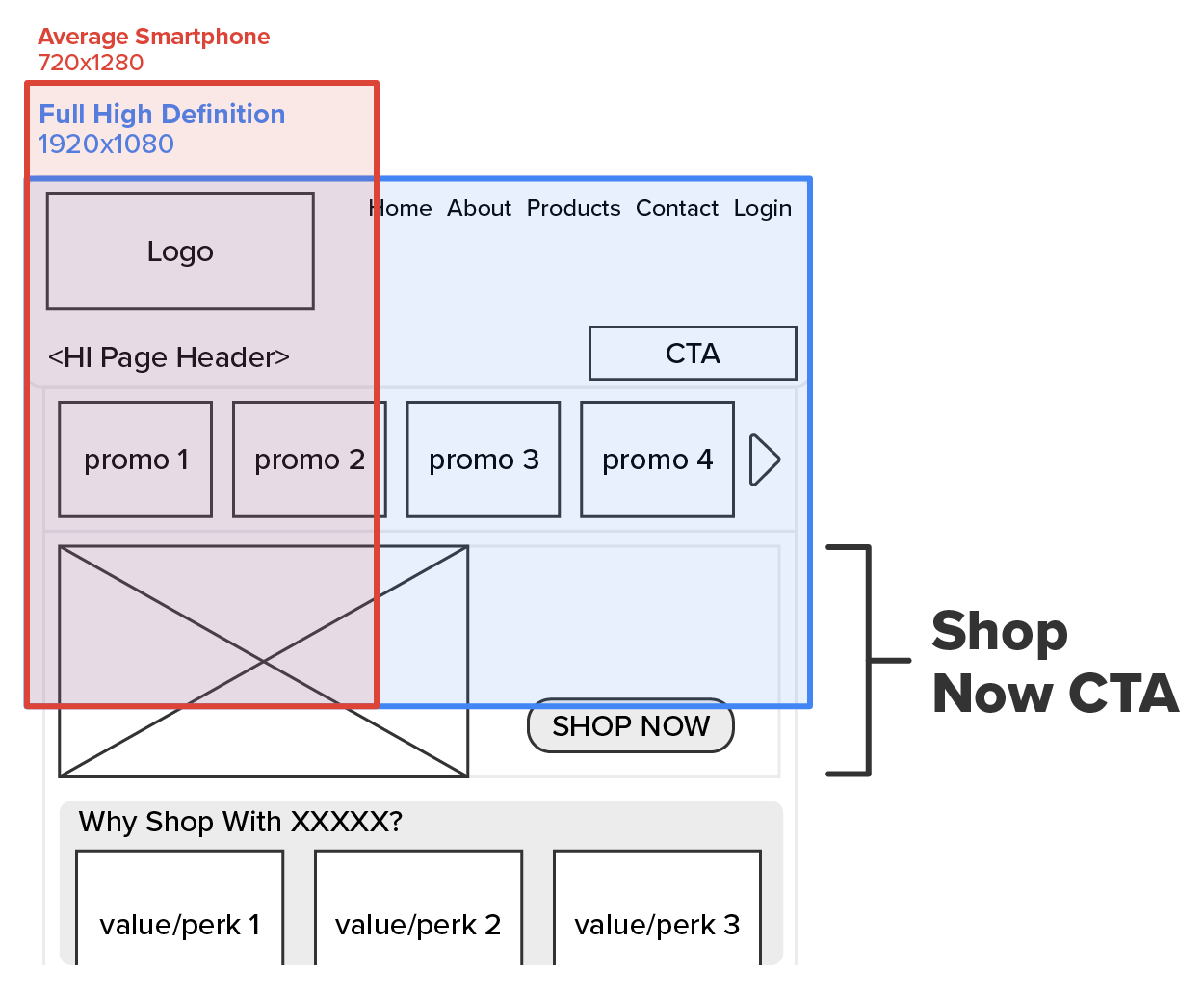
One easy approach to handle this issue for smaller screens is to make a container around the entire element (or set of elements) and have its only children being the image and the box containing the “Shop Now” button. The container will use the flex-direction set to “row” as the default for larger screens.
EXAMPLE
The container will change the flex-direction value to “column” when the screen width is too narrow. This will allow both the image and the “Shop Now” buttons to be visible without scrolling to the left or right.
EXAMPLE
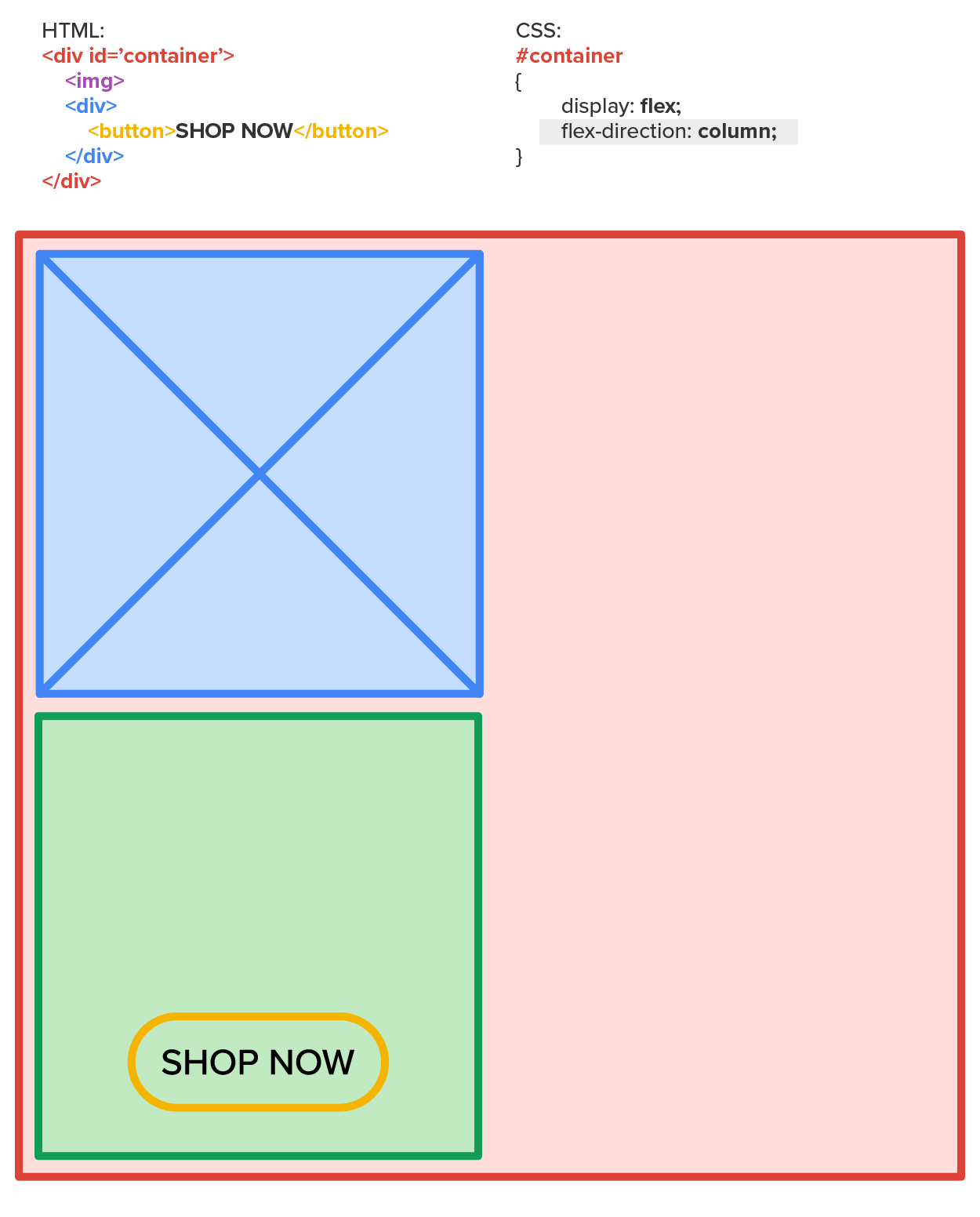
Changing the flex-direction value from row to column will stack the two elements within the container, allowing them to fit on a narrow device screen.
But how can we do this dynamically? We employ the use of media queries to activate a CSS style rule that overrides the flex-direction with the column value when the screen is below a specific width.
To do this, we start with the default design and style. If we are starting with mobile-first, we begin by setting the default CSS to use flex-direction as a “column.” Then, we set up a media query to detect larger screens and activate a set of CSS that overrides the default CSS values. In this case, the media query would detect that the screen is wide enough and thus would activate the CSS block to override the default CSS, changing the flex-direction from “column” to “row.”
This is just one way that CSS media queries can be used with flexbox to provide effective RWD. The other method of adjusting content based on screen width is to use the content swap method.
CSS Flexbox
A CSS layout management model that allows responsive elements within a container to be automatically arranged based on screen sizes. Also called flexbox.
Flex-Direction
A property of flexbox that determines whether flex items within a container stack horizontally (row) or vertically (column).
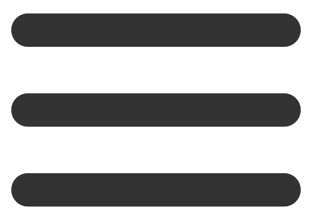
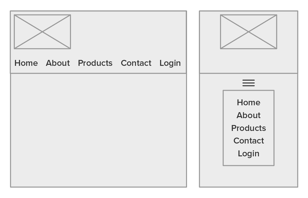
Next, let’s take a look at how to accomplish content swapping using CSS. No code will be introduced yet so that you have the opportunity to explore the concept without getting distracted by programming details. The content swap method uses two copies of the same content: one copy is designed for larger screens, and one copy is designed for smaller screens. The trick is that only one of the two copies is visible at one time. This technique is commonly used to implement the hamburger navigation menu for mobile devices. In a hamburger menu, an entire menu is created as a popup or dropdown from the hamburger icon, which is an icon consisting of three horizontal bars.
EXAMPLE
On most websites, the navigation menu runs horizontally across the top of the page. When the screen becomes too narrow and the menu won’t fit, instead of just changing the direction of the menu items (as it would likely take up the entire vertical screenspace), the menu is replaced by the hamburger icon. Users can then access the navigation menu by hovering over or clicking on the hamburger icon.
To accomplish this, we build the navigation menu twice on the same page. One version assumes a full-size screen and lists the menu items horizontally. The second version uses the CSS tooltip technique to add a popup menu when the user hovers over or taps on the hamburger icon.
The following page has both menu versions visible.
EXAMPLE
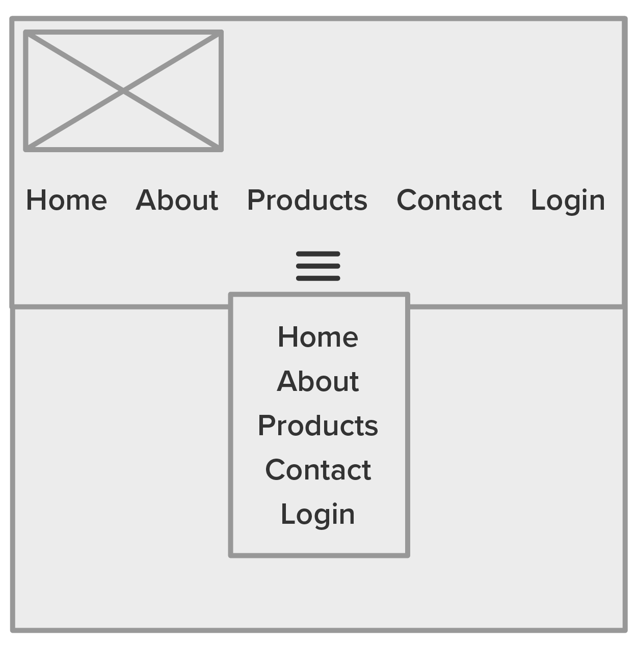
By default, both menus are visible and confusing. One of these two menus needs to be hidden, while the other is visible. We accomplish this with the CSS visibility property. The media query is then used to swap the visibility of both items when the screen becomes too narrow, making the default disappear and the alternative version appear.
EXAMPLE
Additional RWD considerations are as follows:
Content Swap Method
A responsive web design technique that replaces entire sections of content with another by swapping the visibility of the two sections.
Hamburger Navigation Menu
An icon consisting of three stacked lines that indicate a hidden menu.
Rem
A unit of measurement for fonts in web development that sizes fonts relative to the font-size value of the root HTML element.
With over half of the web traffic today coming from mobile devices, it has become a common practice to start a web design project from the perspective of mobile devices. As a result, many developers have adopted the “mobile-first” approach to designing the layout and responsiveness of a website. There are a number of long-term benefits to this approach.
One tool that has become a popular choice for many web developers, particularly front-end developers, is the Bootstrap framework. Bootstrap is a framework that simplifies the process of building responsive webpages by abstracting away the details of implementing responsiveness. Developers instead just need to focus on understanding how to apply specific attribute values to HTML elements to make them responsive.
Bootstrap has released version 5, which provides a wide range of features and utilities for doing more than just resizing elements. Bootstrap includes tools to easily implement well-designed tables, grid layouts, progress bars, loading spinners, pagination, dropdowns, and much more.
Take a quick look at all the features listed for Bootstrap in the left navigation menu of w3schools.com.
Bootstrap was originally designed and developed at Twitter in mid-2010 and was originally known as Twitter Blueprint prior to being released as open source (Bootstrap, n.d.).
Additionally, Bootstrap is not the only option for RWD frameworks. The w3schools.com organization has developed an effective and more robust alternative to Bootstrap called W3.CSS.
Regardless of which framework you choose, the main idea is simple: first, every row of elements on a page uses a 12-column grid; second, they come with lots of pre-built and pre-formatted elements that can easily be implemented by simply creating an HTML element and assigning it the correct class attributes.
The 12-column grid concept is shared among Bootstrap and W3.CSS and is used to provide proportional width values to elements. Each element can accept a portion of the 12 columns, and the portions can be adjusted based on different screen sizes. In other words, think of the width of a webpage being divided equally into 12 parts or units. Each element can be assigned to take up and maintain a portion of the 12 units.
EXAMPLE
<div class="row">
<div class="col-lg-3 col-sm-6">1</div>
<div class="col-lg-3 col-sm-6">2</div>
<div class="col-lg-3 col-sm-6">3</div>
<div class="col-lg-3 col-sm-6">4</div>
</div>
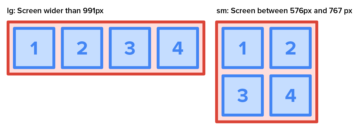
In the example above, you see that the four inner <div> elements have a class attribute that contains two values.
The first is “col-lg-3.” “Col” means that this element will take up horizontal space. “Lg” means that this rule will be applied for larger screens, that is, screen sizes between 992 pixels and 1,199 pixels. The “3” at the end means that it will occupy 3 units of the available 12. The result is that, on larger screens, the four green squares will each occupy 3 of the 12 units, instructing the four squares to occupy ¼ of the available width.
The second value is “col-sm-4.” “Col” means the same in this case. However, the “sm” means this will be applied when screens are between 576 pixels and 767 pixels. Finally, the “6” means that each element will occupy 6 of the 12 units of width. As a result, only two elements occupy the width of the screen, as 6 units equal half of the 12 units and thus half of the available width.
Bootstrap contains eight pre-formatted buttons and two standard buttons that can easily be deployed by applying the “btn” class along with the format modifier class as shown in the following example.
EXAMPLE
The first option is solid buttons:
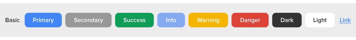
Solid buttons are created using the following code:
<button type="button" class="btn">Basic</button>
<button type="button" class="btn btn-primary">Primary</button>
<button type="button" class="btn btn-secondary">Secondary</button>
<button type="button" class="btn btn-success">Success</button>
<button type="button" class="btn btn-info">Info</button>
<button type="button" class="btn btn-warning">Warning</button>
<button type="button" class="btn btn-danger">Danger</button>
<button type="button" class="btn btn-dark">Dark</button>
<button type="button" class="btn btn-light">Light</button>
<button type="button" class="btn btn-link">Link</button>
Outlined buttons are created using the following code:
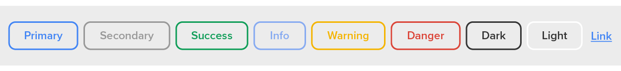
Outlined buttons are created using the following code:
<button type="button" class="btn btn-outline-primary">Primary</button>
<button type="button" class="btn btn-outline-secondary">Secondary</button>
<button type="button" class="btn btn-outline-success">Success</button>
<button type="button" class="btn btn-outline-info">Info</button>
<button type="button" class="btn btn-outline-warning">Warning</button>
<button type="button" class="btn btn-outline-danger">Danger</button>
<button type="button" class="btn btn-outline-dark">Dark</button>
<button type="button" class="btn btn-outline-light text-dark">Light</button>
While everything provided by Bootstrap and W3.CSS frameworks can be recreated manually, there is a lot of value to be gained by utilizing these features. Using Bootstrap or W3.CSS saves a developer time, costs little to no money, and improves the consistency and quality of the work produced.
Bootstrap
A free and open-source CSS framework designed for creating responsive, mobile-first front-end interfaces.
Pagination
The process of dividing content up into discrete pages.
W3.CSS
A small robust free CSS framework designed for creating responsive, mobile-first front-end interfaces.
RWD begins with creating webpage wireframes. A wireframe is a simple layout sketch showing where key elements (like the header, menu, content, and footer) will go on different screen sizes.
Drawing wireframes by hand helps you focus on layout and hierarchy without worrying about exact colors or pixel measurements.
You will create a wireframe for your client in Touchstone Task 1: Selecting Your Client and Planning Your Website Design. Now is a great time to start building your wireframe design skills. You can practice with the bakery example if you have not already defined your own client.
Directions: Take a blank sheet of paper and draw a rectangle to represent a smartphone screen. Inside the rectangle:
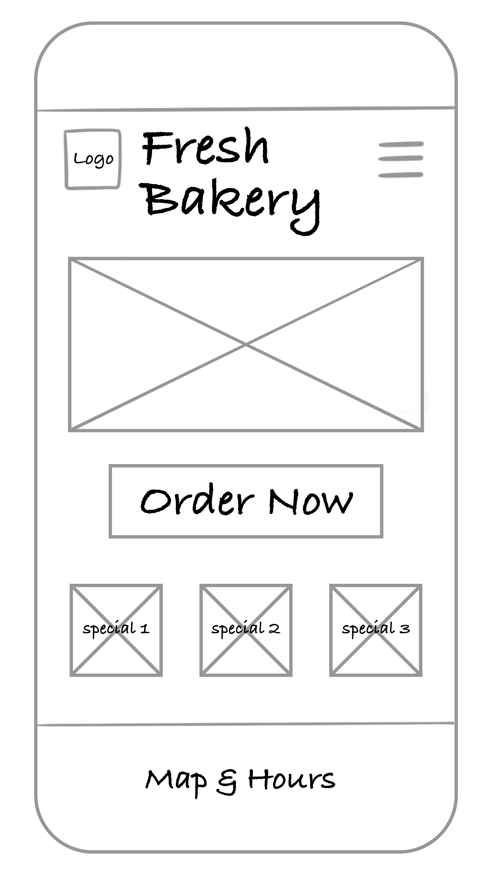
Which elements deserve to be above the fold? Why? Vertical scrolling is expected. Anything else added to the page should have a lower priority. Only the highest priority elements and content should be placed before or above the fold.
Directions: Next to your smartphone sketch, draw a wider rectangle for a tablet screen. Rearrange the same elements to take advantage of the extra space.
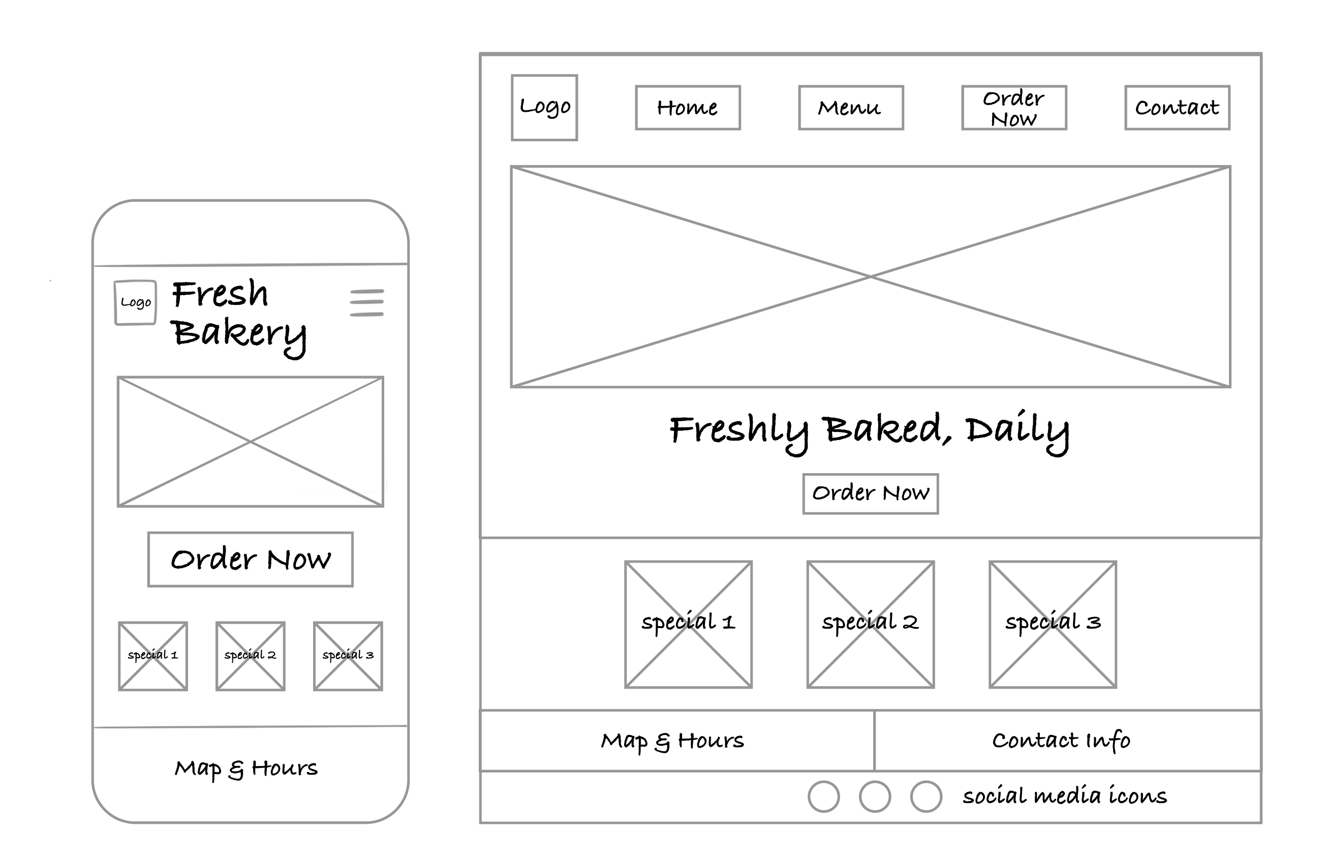
How did your layout decisions change once you had more space? Remember that with additional screen space, you can employ different design styles and layouts that work with your mobile design and take advantage of the space.
Finally, sketch a wide rectangle for a desktop screen. Try out a new arrangement—maybe include sidebars, additional images, or a larger main banner.
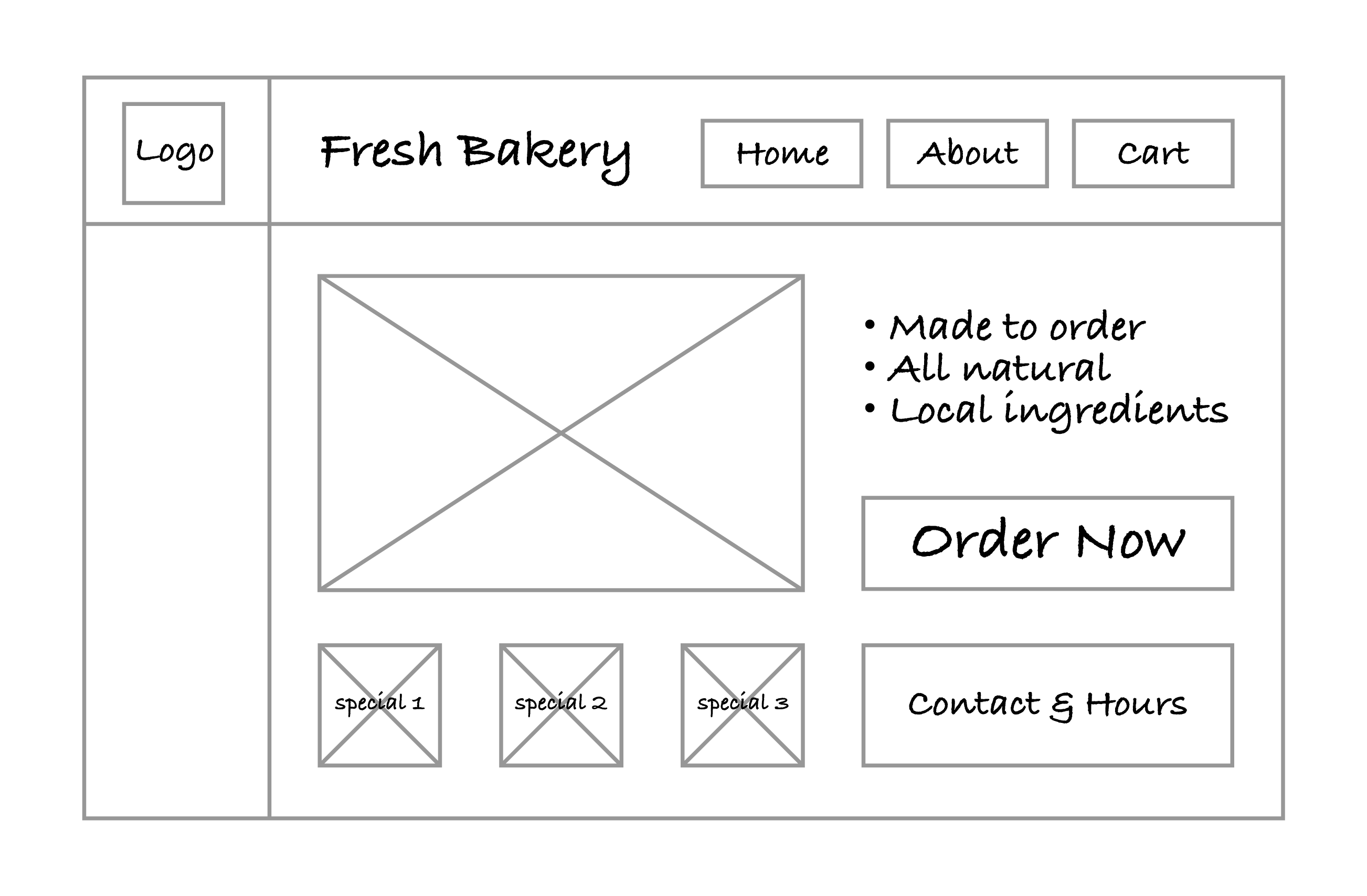
Did your design stay consistent across devices while still improving the layout for larger screens?
If you practiced with the bakery website, you’ll need to repeat the steps with the details specific to your client for the final project.
Regardless of what direction the project takes, wireframes are an ideal tool for playing with different layout styles, designs, and organizational approaches. Wireframes allow developers and designers to be given a set of required elements and to be able to not only include all elements but also experiment with layouts and designs in an effort to maximize their impact.
Wireframes also help with the design process when addressing RWD. Taking the time to think about how elements will be reorganized based on the available horizontal screenspace goes a long way in making the implementation of the layouts easier.
Source: This Tutorial has been adapted from "The Missing Link: An Introduction to Web Development and Programming " by Michael Mendez. Access for free at https://open.umn.edu/opentextbooks/textbooks/the-missing-link-an-introduction-to-web-development-and-programming. License: Creative Commons attribution: CC BY-NC-SA.
REFERENCES
Bootstrap. (n.d.). About · Bootstrap v5.3. getbootstrap.com/docs/5.3/about/overview/#history