Table of Contents |
When you create a best-fit line, typically it doesn't pass through all the points. The only way it would pass through all the points is if the correlation was exactly 1, which means that all the points lie exactly on a line.
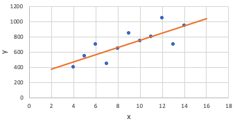
Most of the time, they don't lie exactly on a line. In that case, most of the points are going to have some difference between what the line predicts and the value that they actually are. Because the line shows predictions, they'll be off a little bit from the actual values, even if only by a little.
A residual is the amount by which the predictions are off from the actual amount.
EXAMPLE
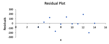
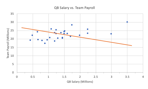
The scatterplot below shows the 1992 payrolls for the National Football League for their quarterback, who's usually their most expensive player, and for the entire team.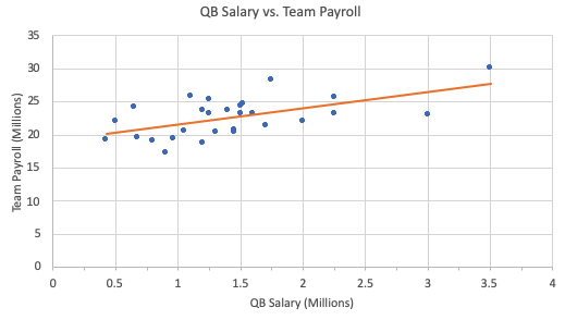


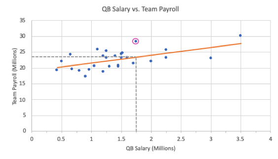

In the payroll example outlined above, the residual for the Dallas Cowboys is calculated by taking the actual team payroll minus the predicted team payroll:

In this particular problem, the residual for the Dallas Cowboys ends up being $4.344 million. This is a positive number.
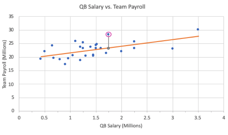
Every point has a residual value:
Since every point has a residual value, you can actually plot the explanatory variable vs. the residual value, as opposed to the explanatory variable vs. the response variable.
|
Scatterplot Explanatory vs. Response |

|
|
Residual Plot Explanatory vs. Residual |
|
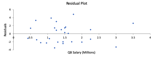
The second graph, where you see how far off the predictions are, is called a residual plot. A residual plot is quite useful because it can help you evaluate whether or not a line is actually a useful predictor for the data.
A good linear model will have:
| Good Example of Linear Model |
|---|
|
|
This is a good choice for a best-fit line. The points above and below the line are in random scatters, there is no curved pattern in the residual plot, and there is equal variability throughout the entire residual plot. |
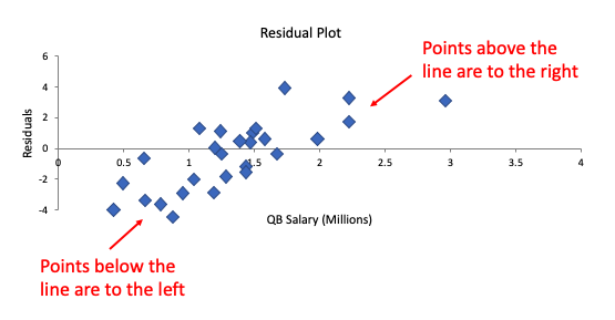
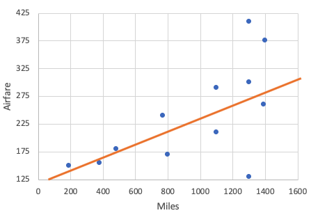
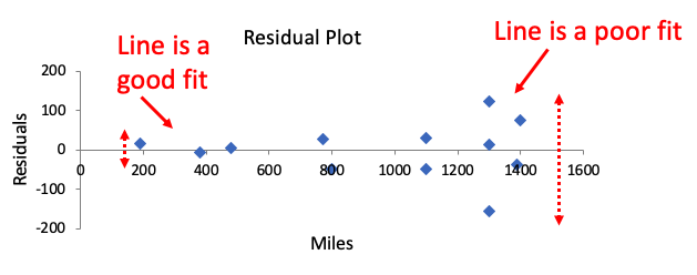
| Bad Example: Does Not Have Random Scatter |
|
|
This is a bad choice for a best-fit line. Although it has points above and below as residuals, it is not randomly scattered like the original one was. There is a clear pattern that is shown on the residual. This one has points that are below only on the left, and points that are above only on the right. That's what makes this line a poor choice for a line of best fit. |
| Bad Example: Has a Curved Pattern in Residual |
|
|
This is a bad choice for a best-fit line. Actually, a line doesn't make sense to predict this at all. You can verify that from the residual plot. What you see is a curved pattern in the residual plot. Also, it means that the scatter is not very random. What a curved pattern in the residual plot implies is that there is a better fit than a line for your data. |
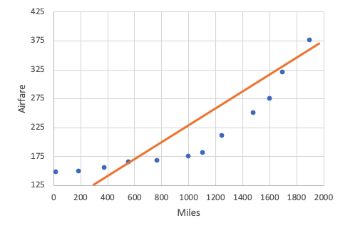
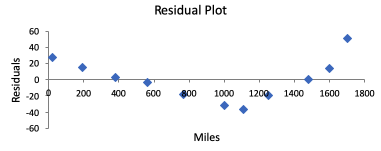
| Bad Example: Unequal Variability |
|
|
This is a bad choice for a best-fit line. This residual plot shows sort of a trumpet pattern where the variability gets wider. The line is a good fit at the beginning because the residuals are small, but it's a poor fit at the end, where the residuals are getting larger. You can also see this in the scatterplot. They're close to the line; some are fitting the line well, and others are not fitting the line. |
Source: THIS TUTORIAL WAS AUTHORED BY JONATHAN OSTERS FOR SOPHIA LEARNING. PLEASE SEE OUR TERMS OF USE.
