RWD begins with creating webpage wireframes. A wireframe is a simple layout sketch showing where key elements (like the header, menu, content, and footer) will go on different screen sizes.
Drawing wireframes by hand helps you focus on layout and hierarchy without worrying about exact colors or pixel measurements.
You will create a wireframe for your client in Touchstone Task 1: Selecting Your Client and Planning Your Website Design. Now is a great time to start building your wireframe design skills. You can practice with the bakery example if you have not already defined your own client.
Directions: Take a blank sheet of paper and draw a rectangle to represent a smartphone screen. Inside the rectangle:
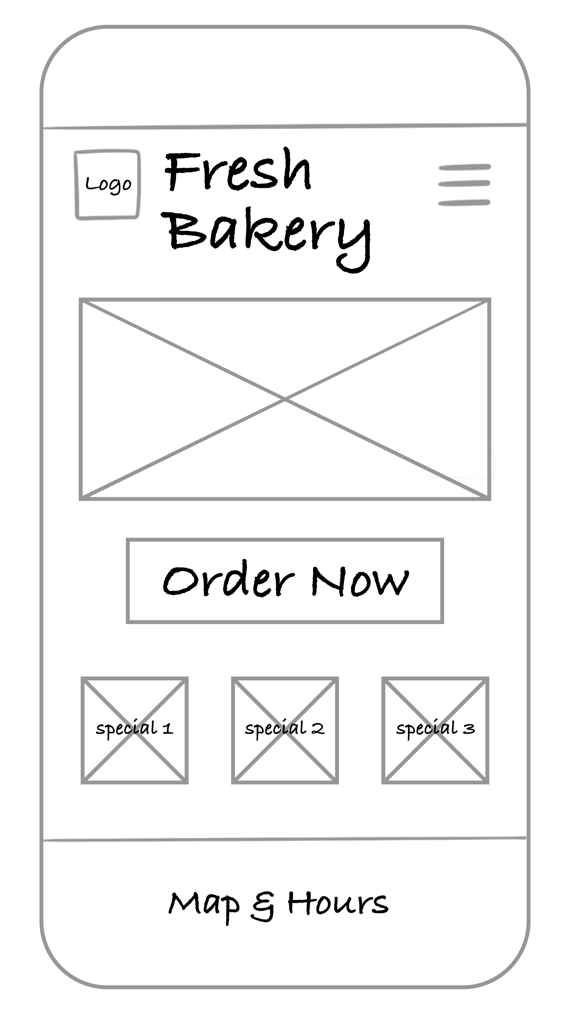
Which elements deserve to be above the fold? Why? Vertical scrolling is expected. Anything else added to the page should have a lower priority. Only the highest priority elements and content should be placed before or above the fold.
Directions: Next to your smartphone sketch, draw a wider rectangle for a tablet screen. Rearrange the same elements to take advantage of the extra space.
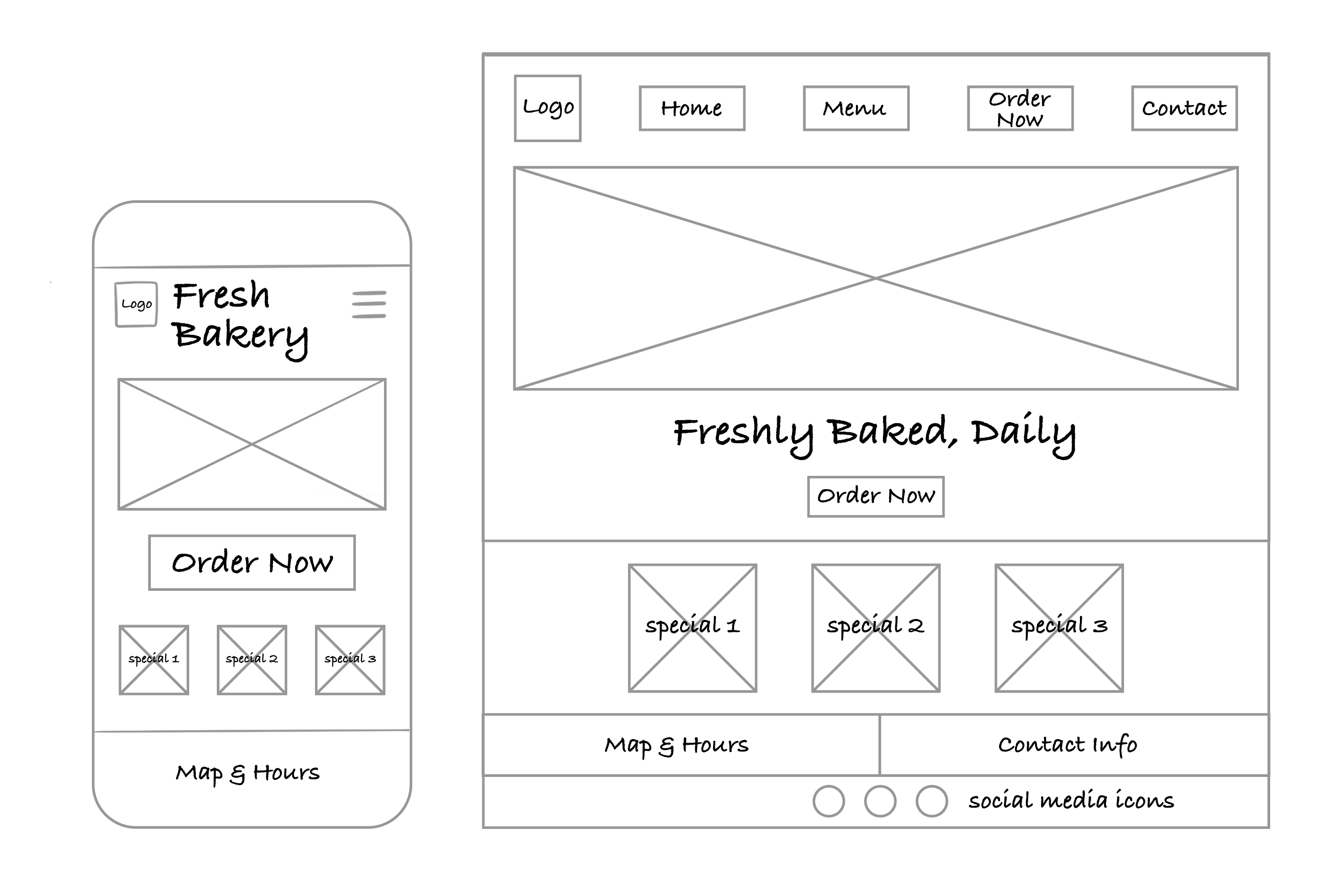
How did your layout decisions change once you had more space? Remember that with additional screen space, you can employ different design styles and layouts that work with your mobile design and take advantage of the space.
Finally, sketch a wide rectangle for a desktop screen. Try out a new arrangement—maybe include sidebars, additional images, or a larger main banner.
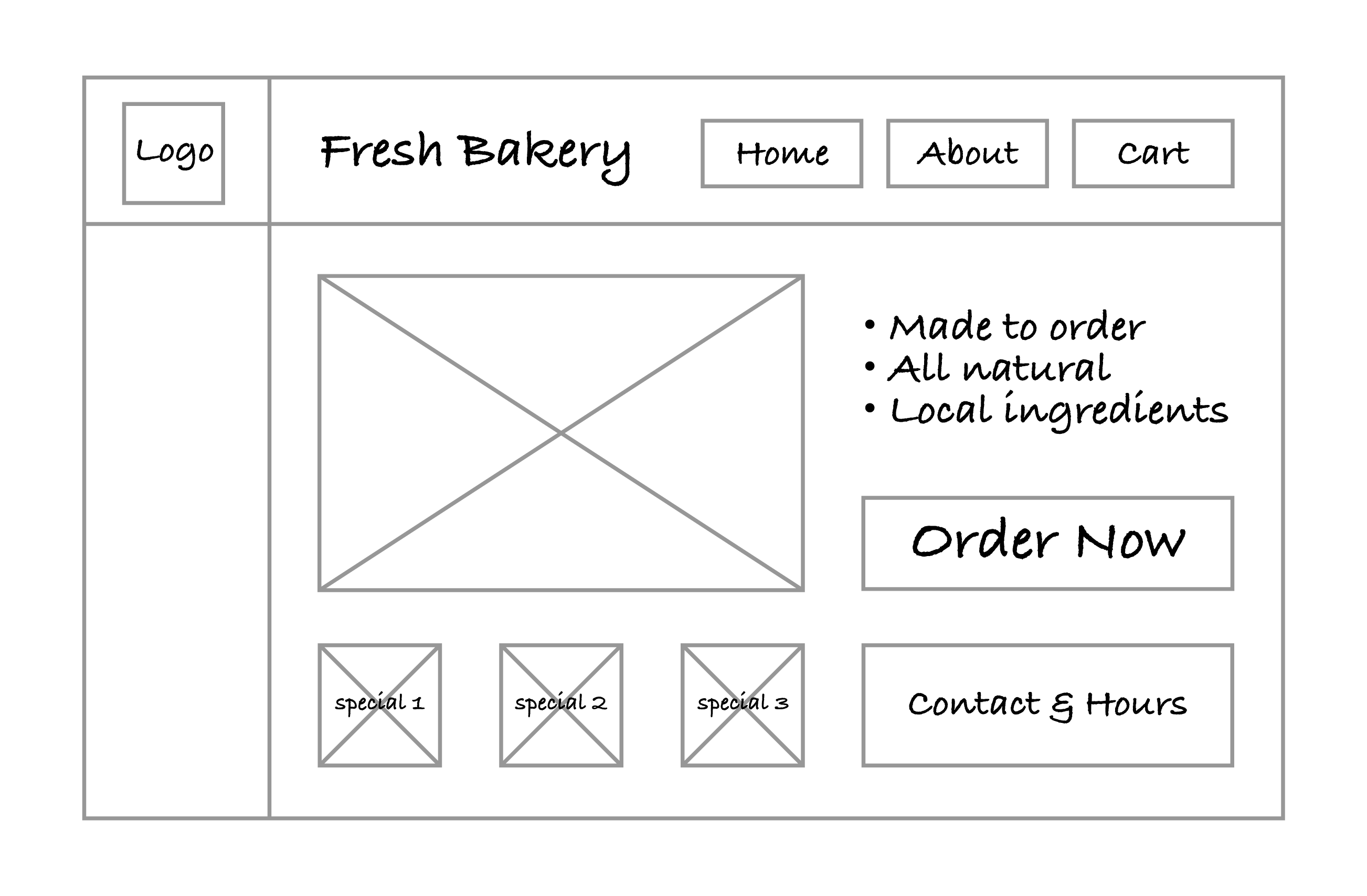
Did your design stay consistent across devices while still improving the layout for larger screens?
If you practiced with the bakery website, you’ll need to repeat the steps with the details specific to your client for the final project.
Regardless of what direction the project takes, wireframes are an ideal tool for playing with different layout styles, designs, and organizational approaches. Wireframes allow developers and designers to be given a set of required elements and to be able to not only include all elements but also experiment with layouts and designs in an effort to maximize their impact.
Wireframes also help with the design process when addressing RWD. Taking the time to think about how elements will be reorganized based on the available horizontal screenspace goes a long way in making the implementation of the layouts easier.