Table of Contents |
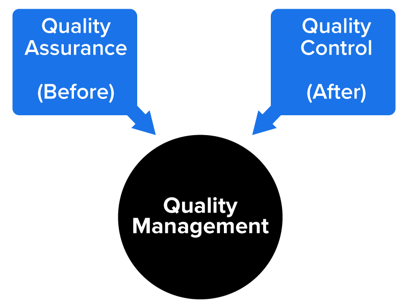
QA and QC are both components of the project quality process, each playing a distinct but complementary role in ensuring successful project outcomes. If you recall, we discussed metrics and KPIs in our last tutorial. Once the metrics and KPIs are set, QA and QC are the processes used to make sure the metrics, KPIs, and company goals are met.
Quality assurance (QA) is important because it focuses on the processes used to create deliverables, aiming to prevent defects before they occur. By establishing standards, conducting audits, and promoting continuous improvement, QA helps teams maintain consistency, reduce risks, and build quality into every phase of the project. This proactive approach not only improves efficiency but also enhances stakeholder confidence in the project’s ability to meet expectations.
On the other hand, quality control (QC) is important because it ensures that the final deliverables meet the defined quality standards and are free from defects. QC involves inspecting, testing, and validating outputs to detect and correct any issues before they reach the customer or end user. This reactive approach helps safeguard the integrity of the product and ensures that it is fit for use.
Together, QA and QC create a comprehensive quality management system that supports both process excellence and product reliability, ultimately contributing to project success and customer satisfaction.
Let’s look at each in more detail.
The purpose of QA is to provide confidence to stakeholders that the project will deliver outputs that are fit for its purpose. It involves activities such as process checklists, quality audits, and performance reviews to verify that the project is following established procedures and best practices. By maintaining consistent standards and identifying areas for improvement, QA helps reduce rework, increase efficiency, and ensure customer satisfaction.
Below is a list of common QA tools and techniques used in project management and product development:
| Tool | Purpose | Example |
|---|---|---|
| Checklists | To ensure all required steps or standards are followed during processes | A retail store uses a daily opening checklist to ensure all required tasks are completed, such as turning on the lights, checking the cash drawers, restocking the front displays, and verifying that the POS system is working before customers arrive. |
| Flowcharts | To visualize processes to identify inefficiencies or potential quality issues | A clothing retailer creates a flowchart showing the return and refund process. The chart helps visualize each step, including receiving the returned item, inspecting it for damage, issuing a refund, and updating the inventory, so bottlenecks or redundant steps can be identified and improved. |
| Control charts | To monitor process stability and detect variations over time | A coffee shop tracks the temperature of brewed coffee throughout the day using a control chart. If the temperature starts to drift outside the acceptable range, it signals that the coffee machines may need calibration or maintenance. |
| Pareto analysis (also known as the 80/20 rule) | To identify the most significant causes of defects or problems since most of the effects come from 20% of the causes | A shoe retailer discovers that 80% of customer complaints come from 20% of their product lines. By focusing on improving the quality or fit of those specific shoes, they can significantly reduce overall complaints. |
| Fishbone diagrams (also called cause-and-effect diagrams) | To analyze the root causes of quality issues | A bakery uses a fishbone diagram to find out why cakes are frequently overbaked. Causes are grouped into categories, like equipment (oven thermostat issues), methods (inconsistent baking times), people (staff training), and materials (flour moisture levels). |
| Histograms | To display the frequency distribution of data to spot trends or anomalies | A call center creates a histogram showing the number of customer calls handled per hour. The chart reveals that call volume spikes between 9 and 11 AM, prompting managers to adjust staffing schedules. |
| Scatter diagrams | To show the relationships between two variables to identify correlations | A furniture company plots a scatter diagram comparing customer satisfaction scores with delivery times. The diagram shows a clear, negative correlation—longer delivery times tend to reduce satisfaction. |
| Benchmarking | To compare performance against industry standards or best practices | A hotel compares its guest satisfaction ratings and check-in times against a top-performing competitor. By studying the competitor’s streamlined digital check-in system, the hotel identifies opportunities to enhance its own process. |
| Statistical sampling | To select representative samples for inspection or testing | A cosmetics manufacturer takes a sample of 50 lipsticks from every production batch to inspect the color consistency and packaging quality rather than testing all 10,000 units produced that day. |
| Quality audits | To independently review processes and compliance with standards | A restaurant chain conducts an internal quality audit of food safety practices. An independent auditor reviews sanitation logs, employee hygiene practices, and temperature control records to ensure compliance with health standards. |
IN CONTEXT
Pareto Analysis
Imagine you manage a retail clothing store and review 2 months’ worth of customer complaints. After categorizing them, you find the following correlation between the complaints and their causes:Applying Pareto analysis, you’d focus on improving checkout efficiency, inventory management, and staff training first since those top three issues make up 80% of the total complaints.
- 40% due to long checkout lines
- 24% due to out-of-stock items
- 16% due to unhelpful staff
- 8% due to messy fitting rooms
- 6% due to incorrect pricing
- 6% due to poor store layout
In project management, QA is about building systems and processes that prevent issues and mistakes before they happen to deliver a product or service that meets the needs of the stakeholders. QC is what happens after something is produced. Let’s address that next.
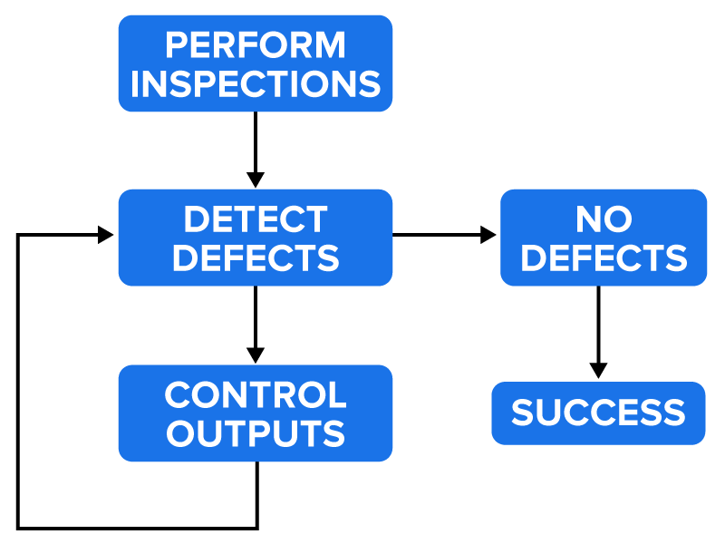
QC involves comparing the actual results against the expected outcomes and taking corrective actions when discrepancies are found. Effective QC helps reduce rework, improve customer satisfaction, and ensure that the final product is reliable, functional, and fit for purpose.
Below is a table summarizing key QC activities commonly used in project management, including testing, inspections, reviews, and statistical analysis:
| Activity | Description | Purpose | Example |
|---|---|---|---|
| Testing | Execution of a product or component to identify defects or verify functionality | To ensure the product works as intended | Running unit tests on software features |
| Inspections | Formal examination of deliverables or processes to detect errors or nonconformities | To catch defects early and ensure compliance | Inspecting construction materials for cracks |
| Reviews | Systematic evaluation of documents, code, or designs by peers or experts | To identify issues and improve quality early | Conducting a design review for a new product |
| Statistical analysis | Use of data-driven techniques to monitor and control quality performance | To detect trends, variations, and root causes | Applying control charts to monitor defect rates |
Think of QC as the safety net for the project. Defects and mistakes are found so that the quality meets the needs of the stakeholders and users.
Finally, let’s look at two of these tools in action.
Let’s look at two examples of quality tools used in actual scenarios.
EXAMPLE
Our first example is that of a Pareto chart. In this scenario, our store manager has performed an analysis of problems impacting the store over the past quarter and prepared this Pareto chart, highlighting the most frequent issues affecting store performance: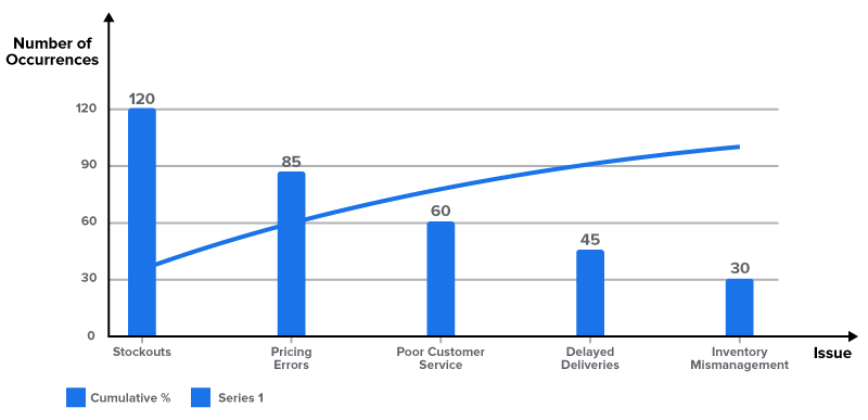
Insights from the chart:
EXAMPLE
Our next example is a small manufacturing firm trying to identify the assignable causes of variations in its manufacturing line. They decided to use a fishbone diagram (or cause-and-effect diagram) because it can provide them with various causes of an issue and help them get to the root causes. They assemble a team that identifies six possibilities that may be causing the variation issues: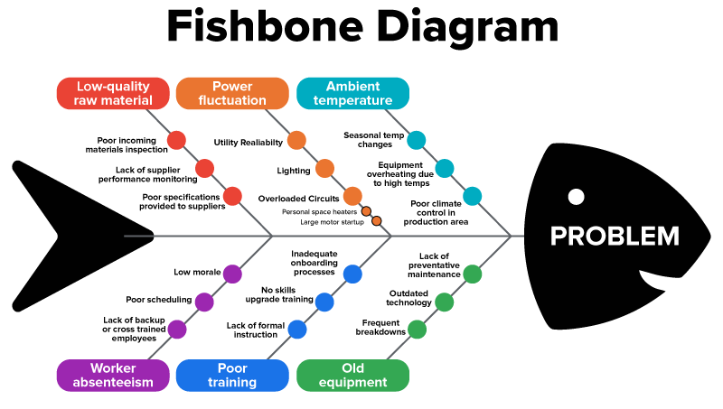
To use a fishbone diagram, first you’d write the potential causes of the variation issue, as we’ve done here. Then, you’d look at the subcauses for each, as we did with power fluctuation. This helps us to see the potential root causes of an issue, so we can resolve the issue.
SOURCE: THIS WORK IS ADAPTED FROM (1) PRESSBOOKS "NSCC PROJECT MANAGEMENT” BY ADRIENNE WATT. ACCESS FOR FREE AT WWW.PRESSBOOKS.ATLANTICOER-RELATLANTIQUE.CA/PROJECTMANAGEMENT/ AND FROM (2) SASKOER "PROJECT MANAGEMENT: A STRATEGIC APPROACH" by CARMEN REAICHE. ACCESS FOR FREE AT WWW.SASKOER.CA/STRATEGICPROJECTMANAGEMENT/. LICENSING (1 & 2): CREATIVE COMMONS ATTRIBUTION 4.0 INTERNATIONAL