Table of Contents |
Color psychology studies how colors affect human emotions and behaviors. Different colors can evoke various psychological responses, influencing how we perceive and interact with our environment. Color psychology explores how different hues influence human emotions and behaviors. For instance, red can evoke feelings of excitement and urgency, often used in marketing to stimulate appetite and attract attention. Blue, on the other hand, is associated with calmness and trust, making it a popular choice for corporate and healthcare designs. Yellow brings about feelings of happiness and warmth but can cause eye strain if overused. Green symbolizes nature and tranquility, frequently used in health and wellness contexts. Purple is linked to luxury and creativity, while black conveys sophistication and power. White represents purity and simplicity, commonly seen in minimalist designs. Understanding these associations helps designers create environments and products that elicit desired emotional responses from their audience.

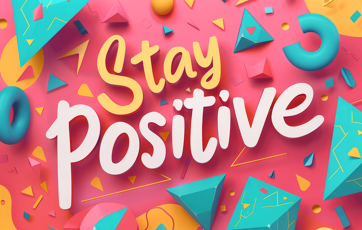
Colors can evoke a wide range of emotional and psychological responses. It is important to note that these responses can be both positive and negative, depending on the parameters in which the color is presented to the user. The goal of any design is to communicate a message. The information in the message will change depending on the design's purpose. Color is an important component because of the psychological reactions we have to it. When creating brands and logos, color is often decided on last because our reactions to it have the ability to overpower other factors of the design. Most designs are intended to make a user feel good, the logic being that if a design stimulates positive reactions, users will engage with it longer, allowing more time for the design’s message to be delivered. Take a look at the image below. Do the colors impact your mood in any way? Pink is often associated with love, compassion, and calmness. It can create a soothing and nurturing environment, reducing feelings of anger and aggression. Blue is known for its calming and serene qualities. Yellow symbolizes happiness, optimism, and energy. It can uplift moods and stimulate mental activity. You will often see yellow in spaces where creativity and positivity are encouraged, such as kitchens, playrooms, and creative studios.
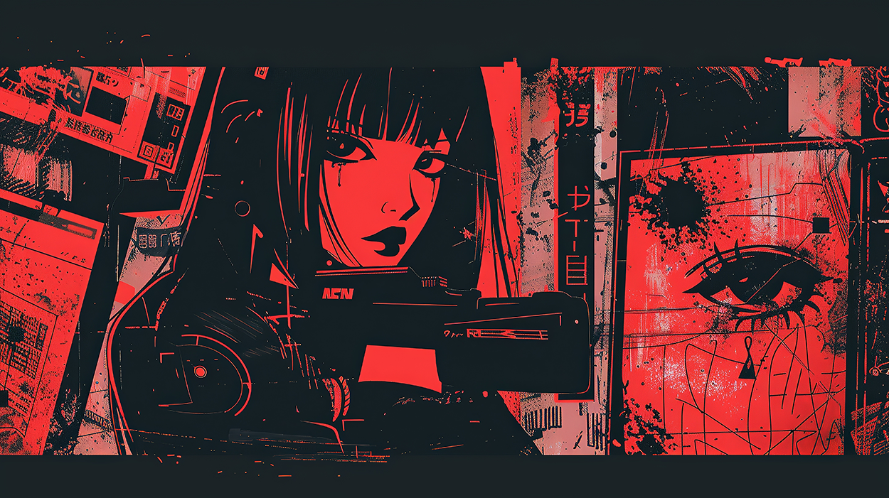
Now look at the image below. This is an example of a duotone design, meaning there are only two colors used. Here, red creates a sense of urgency, energy, and passion. Black is used for large fills and outlines, providing depth and contrast. The black elements help define the shapes and add a sense of mystery and sophistication to the overall design. In Western society, black represents darkness, mourning, death, and night. The combination of red and black results in a bold and intense visual impact, which is effective for themes related to energy, passion, or even danger. This color scheme is often used in designs targeting audiences interested in horror films, gaming, comic books, and cyberpunk aesthetics.
Understanding these reactions can help in various fields such as marketing, design, and personal interactions to evoke the desired emotional response.
Imagery in design plays a crucial role in shaping perceptions, emotions, and behaviors.
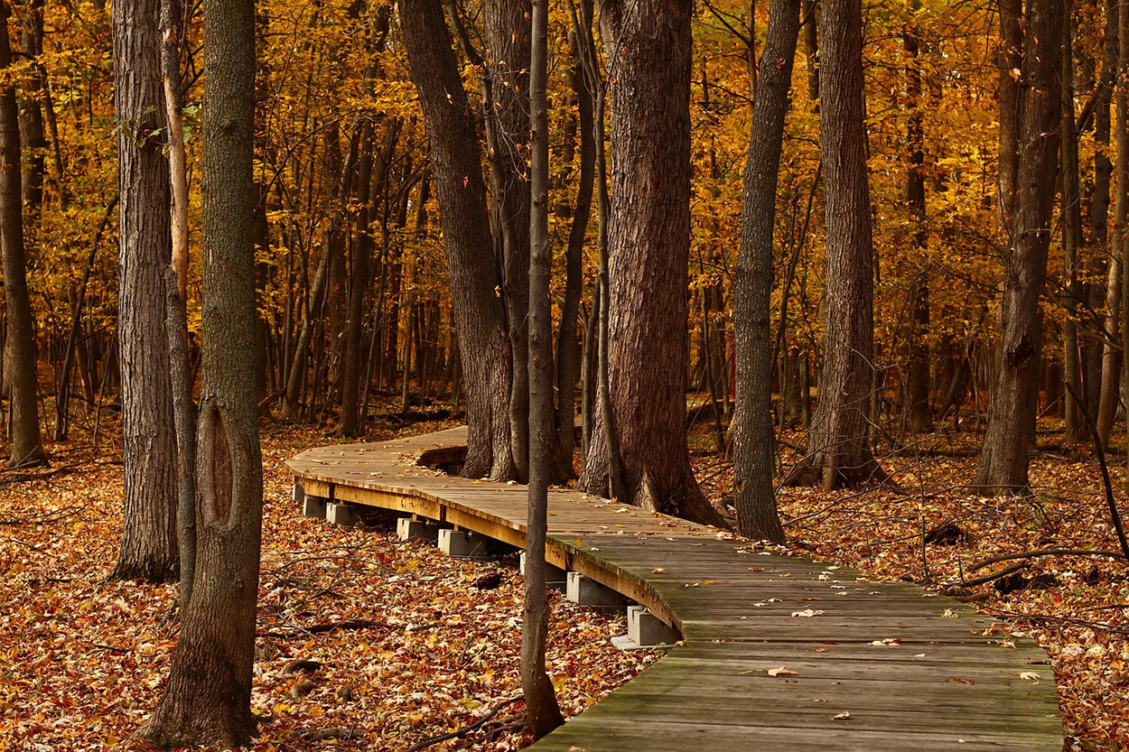
Emotional connections, or bonds formed between individuals and objects, brands, or experiences through shared feelings and emotions, are often stimulated by imagery. Images can evoke strong emotions, creating a deeper connection with the user. For instance, a serene landscape can induce feelings of calm and relaxation, while a chaotic scene might evoke stress or anxiety. Look at the image below. This serene image of a walkway leading through an autumn forest may give you a sense of peace, or spark a memory associated with the season or a similar location.
Now look at the following image. Take note of any emotional reaction you may feel. Even slight levels of discomfort will often make a user turn away or disengage with a design. In the image, a lineman is working on a utility pole. The number of interconnected lines on the pole creates a sense of frenetic energy in the image, stimulating sensations of chaos and disorder.

Memory retention is the process of committing something to one’s long-term memory. Visuals are processed faster and remembered longer than text. This makes imagery a powerful tool for reinforcing messages and ensuring they stick with the audience. Cultural significance, or the importance of an image in one’s culture, has significance because images can convey cultural symbols and meanings, making them effective in communicating with diverse audiences. However, misinterpretation can lead to negative responses if cultural sensitivities are not considered.
High-quality, relevant images can capture attention quickly, making the design more engaging and effective in conveying its message. Bright colors, smiling faces, and positive scenes can uplift moods and create a sense of happiness. Professional and high-quality images can also enhance the perceived credibility and trustworthiness of a brand or message. Imagery, such as success stories or aspirational visuals, can motivate and encourage positive actions. Conversely, disturbing or violent images can induce fear, anxiety, or discomfort. Images depicting loss or tragedy can evoke feelings of sadness and grief. Unpleasant or graphic images can trigger disgust and aversion, leading to a negative perception of the associated message or brand.
Understanding the psychological impact of imagery helps designers create more effective and emotionally resonant designs, ensuring that the intended message is communicated clearly and positively.
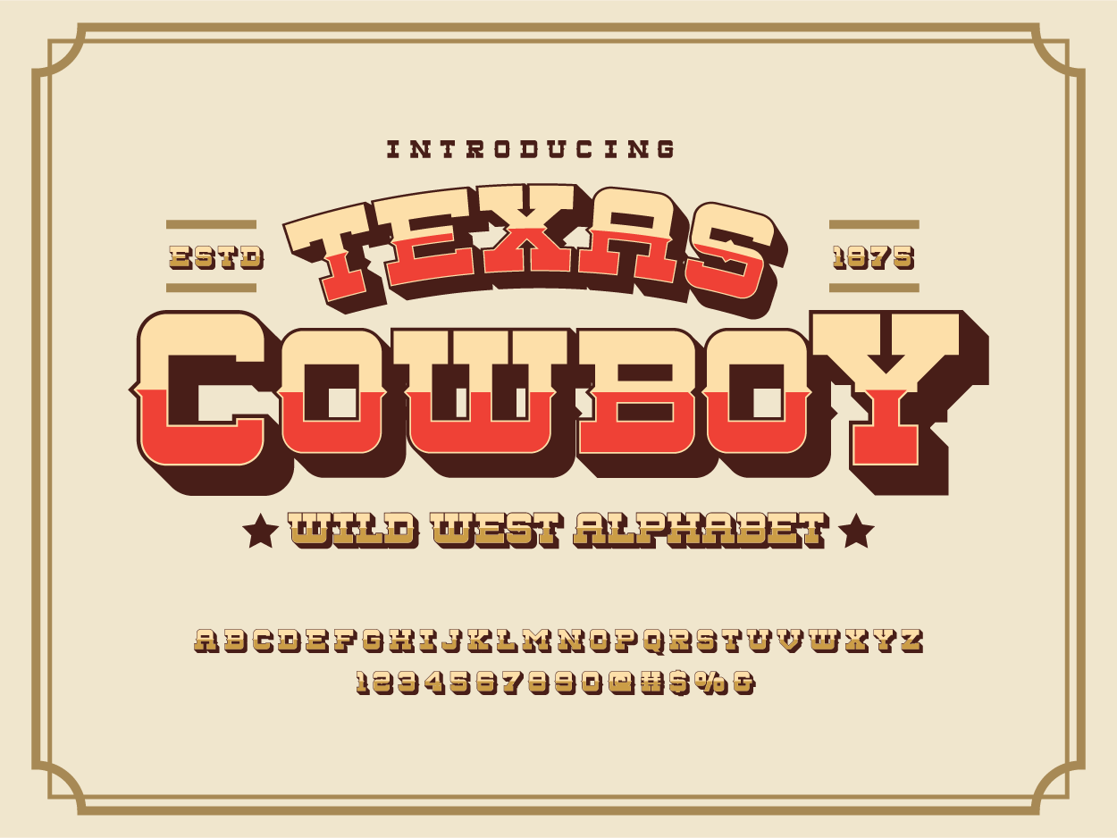
Typefaces and typography are also important to establishing a design’s theme and mood. A theme is the main subject or motif in a design. Standard fonts like Times New Roman are used so commonly that they lack the ability to trigger inspiration when used in design. Decorative and novelty fonts are best used to establish moods and themes. Certain typefaces are so closely linked with themes that it is difficult to apply them to different scenarios. The example typeface below has such a specific style it is hard to imagine it applied to anything other than a Western motif. However, the style communicates that theme and would be effective in a design for a Western novel, movie poster, rodeo, or other similar media and merchandise.
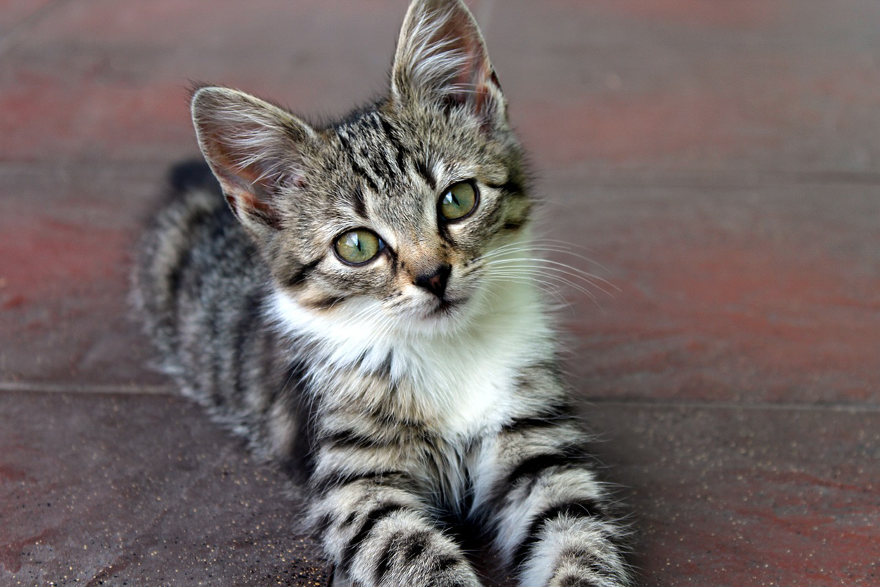
Design elements significantly influence moods and decision-making processes. Emotional design is the process of creating designs intended to trigger an emotional response. For example, an image of a child playing with a puppy may conjure childhood memories and make the user feel happy or nostalgic. Look at the image below. To some, this is simply a photograph of a cat. To others, this picture captures the essence of an adorable kitten, which may trigger a response strong enough to make the user ooh and aah. An image like this can trigger decisions in people who respond positively or emotionally to it. Imagine this picture used in packaging design for cat food, or on merchandise sold at a pet store. What if the user viewing the design has a cat that looks like the one in the picture, or if they lost a beloved pet resembling the kitten in the image? The user’s emotional response to the design will be heightened from their memories and learned experiences.
Visceral design focuses on the initial impact of a design. Attractive designs can create positive emotions and a sense of pleasure. On the other hand, disturbing designs can inspire feelings of fear, sadness, and even guilt. Visceral design can be thought of as the gut reaction felt by the user experiencing the design. Visceral designs often target very specific user demographics. For instance, advertisements often show average-looking men surrounded by beautiful women. This was a common technique used by brewing companies and myriad marketing agencies for decades, the idea being that the average male could see and identify with his counterpart in the advertisement and imagine himself in the same scenario if he used the product. This fantasy, or projection, is subliminal, meaning that the stimuli affect the user below their level of conscious thought. This also works for perceived negative emotions.
EXAMPLE
A person wants to read a horror novel or watch a scary movie. If the book jacket or the movie poster employs the correct colors, typefaces, and imagery to suggest fear or mystery, the sensations will be conveyed to the user. This suggestion will create an expectation within the user, inspiring them to read the book or watch the movie.The manipulation of negative emotions such as fear and guilt are often used in anti-smoking campaigns, advertisements against drunk driving, substance abuse, and life insurance commercials. Understanding how to use the correct colors, typefaces, and imagery to catch and control the attention of users, make them engage longer with a design, remember a design, and trigger emotional responses will make you a stronger designer with the ability to create memorable, effective layouts.
Source: THIS TUTORIAL WAS AUTHORED BY SOPHIA LEARNING. PLEASE SEE OUR TERMS OF USE.