Table of Contents |
Proximity is the distance between elements in a given space.
The principle of proximity not only refers to when (or when not) to group elements together, but how to group them as well.
Proximity is a gestalt principle and one of principles of design, known as the core principles or by the acronym C.R.A.P. (contrast, repetition, alignment, proximity). Proximity shows the user what objects belong together by arranging them close to each other. For example, in a newspaper, headlines go above news stories, and photographs go with the stories and the headlines.
Things that go together, belong together. In design, this is often seen by grouping objects and text together. The closer objects are to each other, the more profound the implied connection between them becomes. Imagine a man and woman strolling through a park. If the woman is walking several yards ahead of the man, the people around them won’t assume that they are together. If the man and woman are walking close together, then the assumption will be that they are a couple. The closer they are, the clearer this connection becomes. The clearest form of close proximity exists when objects overlap. A couple holding hands in the park or hugging are automatically perceived as belonging together because they are physically connecting. In design, the same effect is achieved when objects touch or are layered together.
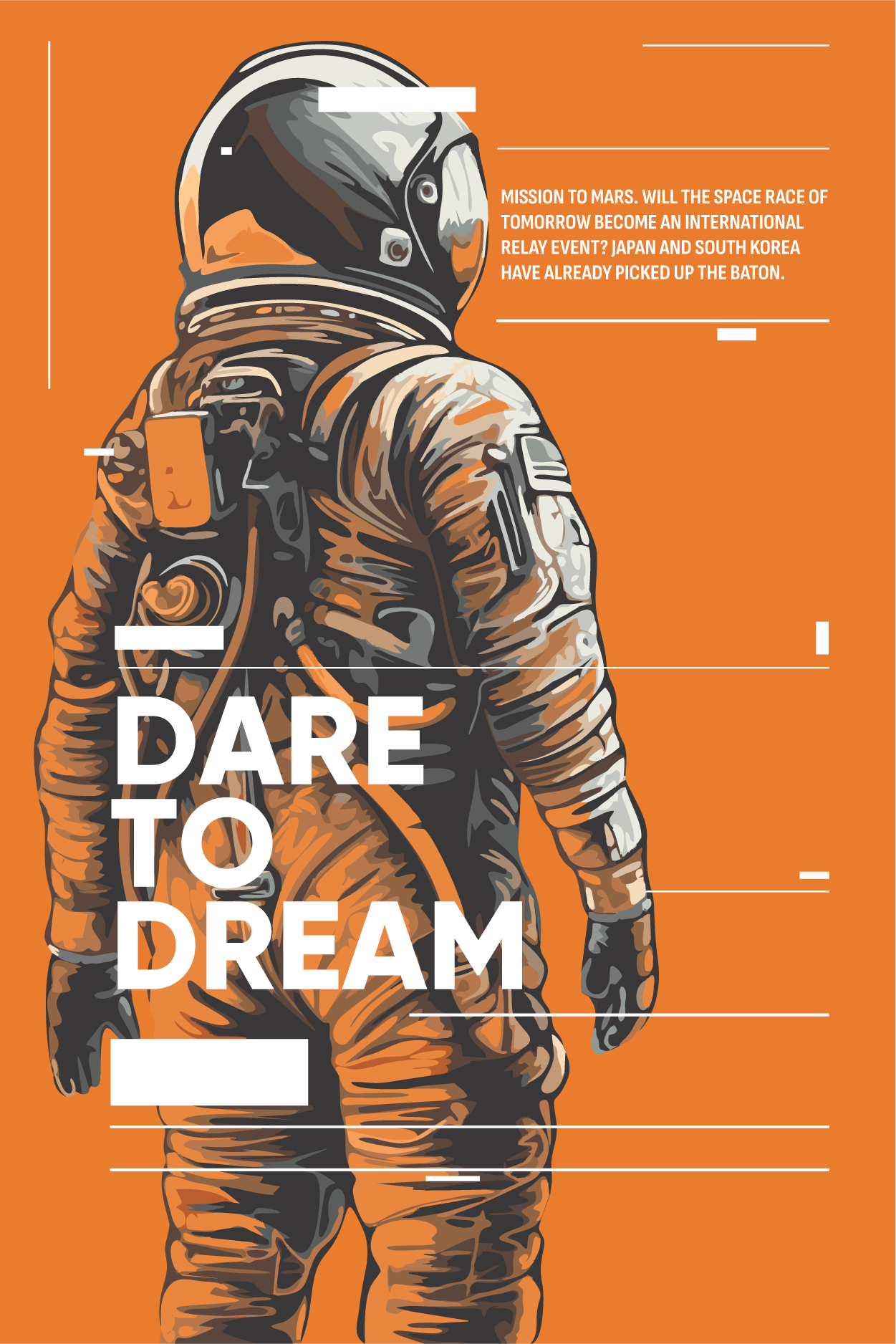
In the following image, an astronaut looks off the page. Text reading "Dare to Dream" is layered over the astronaut’s body. Smaller text is positioned in close proximity to his helmet. The text in close proximity with the astronaut communicates to the reader that the words and images belong together and are telling the same story.
Below is an image of a group of Christmas tree worms. The objects that look like small, colorful Christmas trees are actually the tails of worms that live inside rocks in some coral reefs.

This close proximity shows that they belong together; they're part of some community. Without providing any background knowledge about these marine organisms, the image communicates to the viewer that the visible tails of the worms are unified and organized, showing that they belong together. Notice that some of the Christmas tree worms actually touch as their tails protrude from the rock.
Proximity may sound like a basic idea, but it's an important design principle because the logical arrangement of objects dictates how the viewer perceives a message or idea within the design. Proximity establishes relationships and helps users identify regions of a design and what information belongs together. Understanding what information belongs together is important for multiple factors. For example, a website will have navigational elements grouped together to allow the user a central location to find hyperlinks to navigate through all of the pages, whereas a magazine cover may have a photograph of a car near a headline about new automobiles or how to rebuild an engine.
Proximity is also used to suggest different pairings and groups.
Look at the simple blue dots below. They are arranged in a fashion that might lead the viewer to perceive them as unified.

Likewise, the image of red dots below might be perceived as orderly due to the dots’ arrangement in rows and columns. Because proximity equates to grouping information, we can recognize certain patterns or determine meaning from arrangements. The red dots below have a similar grouping pattern as those used on dice to represent numbers, and therefore the arrangement below also communicates the number nine.

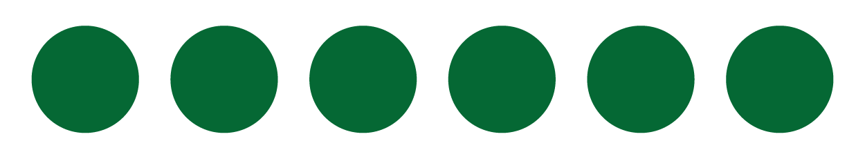
The image below of green dots may also be perceived as equal or uniform. The continuous line has no contrast in the arrangement of the dots, which creates repetition and continuity.
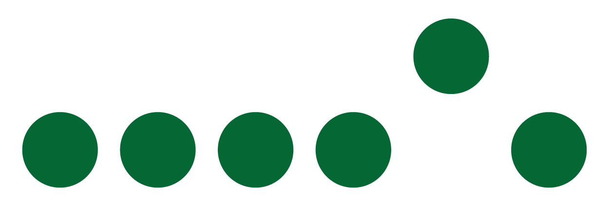
However, if you change all the elements around and group them in different places, you suddenly have fragmentation, chaos, or inequality.
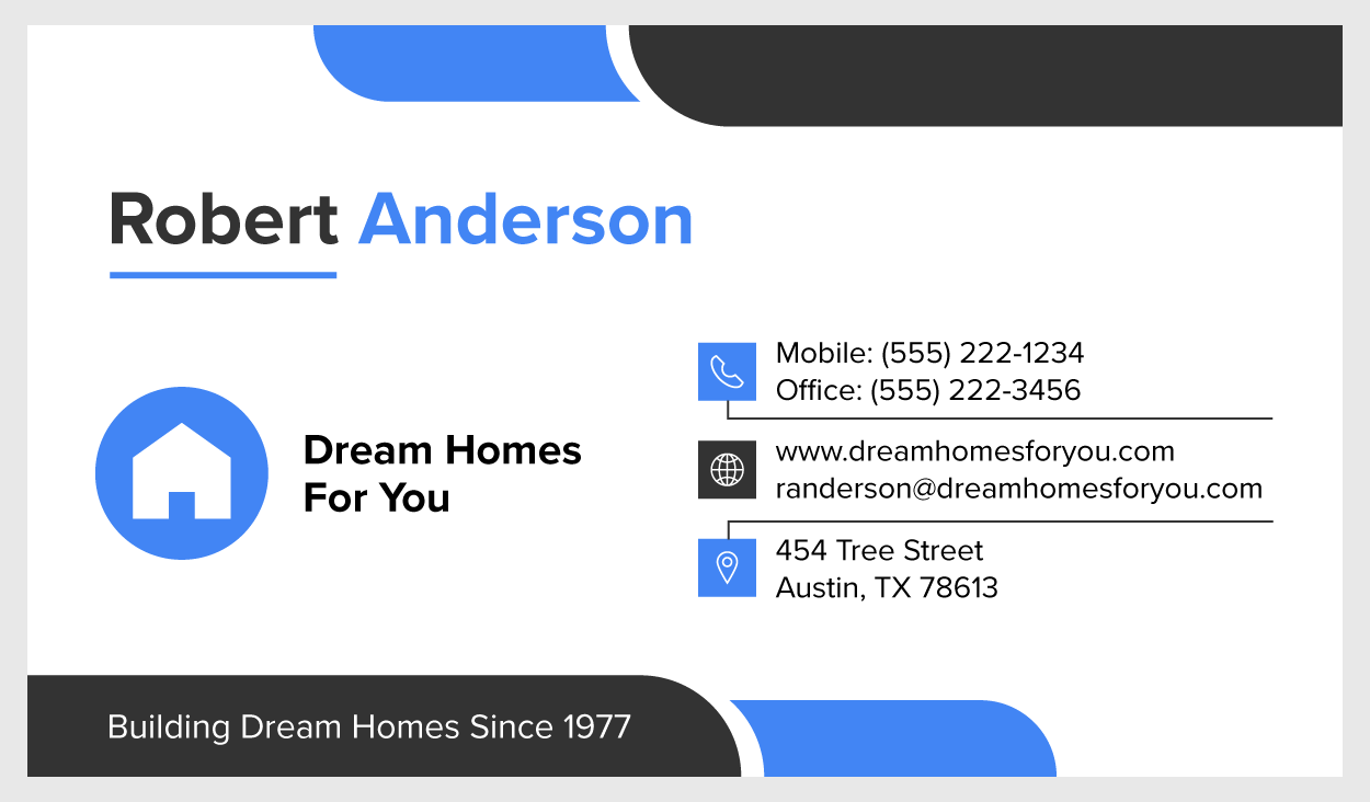
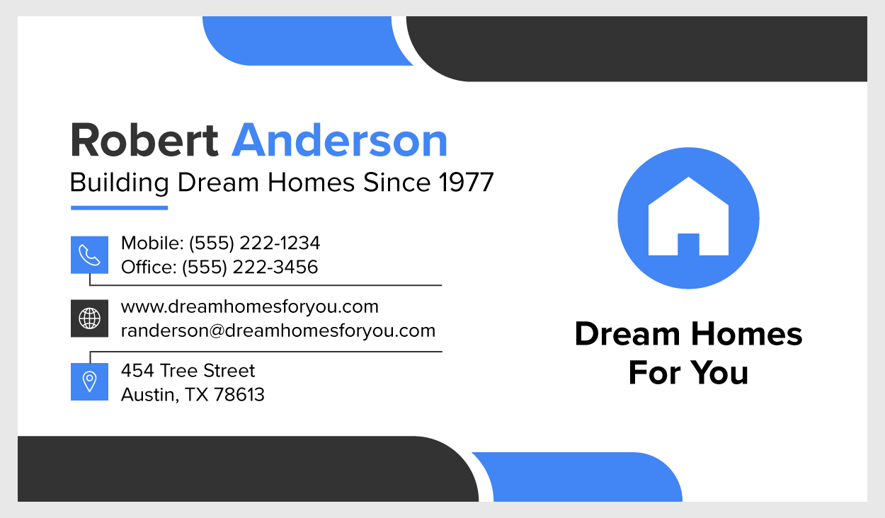
A very common example of proximity in action is a business card.
You'll notice in the card above that nothing is grouped together and there is no connection between the information. The most logical place to start would be in the top left corner. In Western society, we read from left to right, top to bottom, so if there is no clear starting point, the user will likely enter the design from the top left corner. This is why logos are often placed at the top left corner of websites and other media designs.
In contrast, when everything is grouped together in closer proximity by elements, there is a logical progression and placement of those elements.
Now the message that's being conveyed on the business card is easier to follow.
Source: THIS TUTORIAL WAS AUTHORED BY MARIO E. HERNANDEZ FOR SOPHIA LEARNING. PLEASE SEE OUR TERMS OF USE.