Table of Contents |
Most notable for his experiments with gravity and purportedly being struck by an apple falling from a tree, Sir Isaac Newton was an English physicist, mathematician, and color theorist who decomposed light into the colors of the visible spectrum, devised the particle theory of light, and created the first color circle.
Newton discovered the color spectrum, which is made up of the seven hues of visible light: red, orange, yellow, green, blue, indigo, and violet. He demonstrated this by passing light through a prism, splitting the beam of light into the seven colors of the spectrum.

From these experiments, Newton created the first color circle (color wheel). The circle had the letters R-O-Y-G-B-I-V written around it, which correspond to the colors red, orange, yellow, green, blue, indigo, and violet. The term ROY G BIV has developed into a popular mnemonic device to teach children the color spectrum, or the colors of the rainbow. As rainbows are created by light dividing through water vapor in the air, they are natural validations of Newton’s experiments.
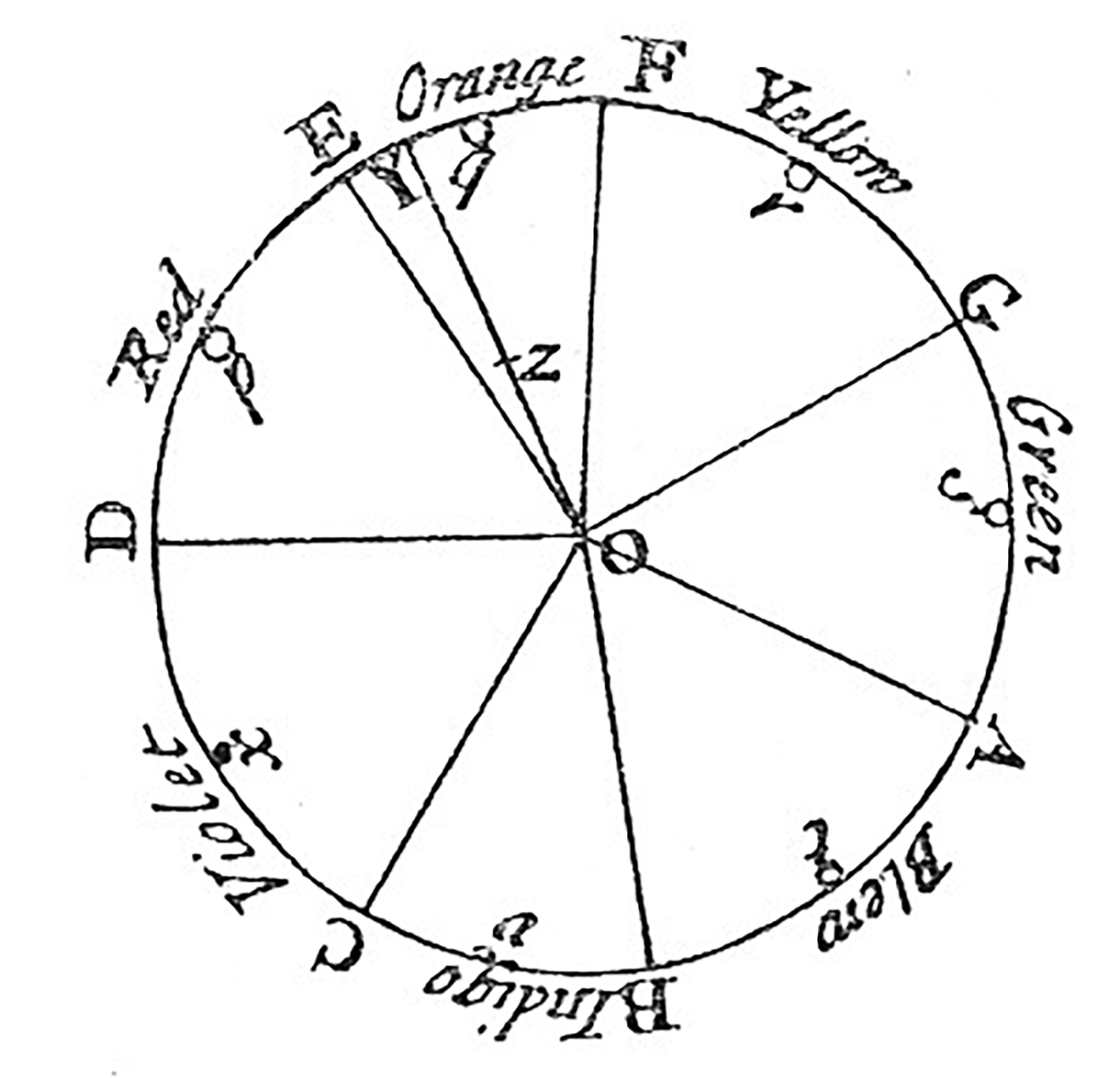
As stated above, Newton developed the first color wheel. A color wheel is a chart used to show color relationships. Newton derived that there are three primary colors: red, yellow, and blue. If these colors are blended, then a subset of secondary colors is produced. For example, red and yellow make orange, red and blue make purple (violet), and yellow and blue make green. Therefore, orange, purple (or violet), and green are deemed secondary colors.
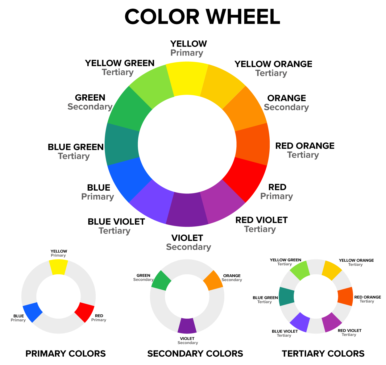
When a primary color is then mixed with a secondary color, a tertiary (meaning third in order) color is created. Tertiary colors are identified by pairing the name of the primary color and the secondary color, such as red-violet and blue-green.
Each one of the colors in a color wheel is a hue, which is quite simply the name of a color. So, red is a hue, red-orange is a hue, orange is a hue, etc.
Johann Wolfgang von Goethe was a German writer and artist who studied the physiological effects of color.
Goethe opposed Newton's analytical data and created another color circle, or color wheel, based on his own observations. While Newton opined that darkness is the absence of light, Goethe viewed darkness as an active component in the production of color. Goethe was interested in the perception of colors. His writings on color explored the psychological effects of colors on the mind, and how colors affect moods and human emotion.

Goethe developed his own color wheel, which was published together with his writing in the book, Theory of Colors (1810).
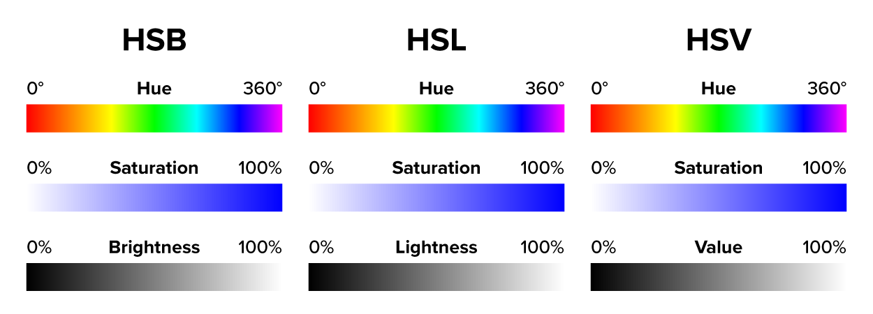
While hues and colors are in many ways synonymous, colors have characteristics that define them in more detail. These characteristics include value, saturation, and color temperature. Characteristics of color can be thought of as nuances, subtle differentiations that affect changes in a color’s appearance.
Value is another term for lightness or darkness and is sometimes referred to as brightness.
There are three color models generally used to adjust value; they are: HSV (Hue, Saturation, Value), HSB (Hue, Saturation, Brightness), and HSL (Hue, Saturation, Lightness). It is important to know that these color models are essentially the same. Brightness and lightness both mean value in regard to color.
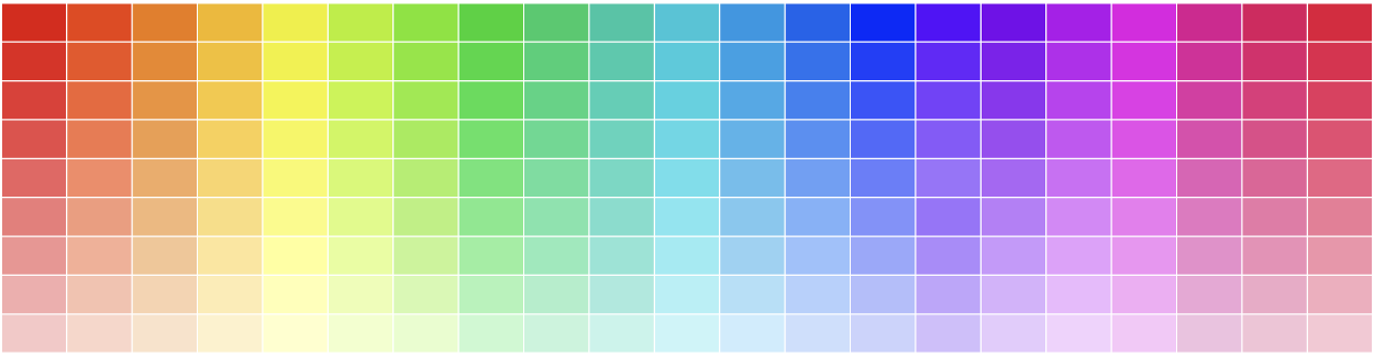
In the image below, you can see the various hues changing as values go from dark to light.
Saturation is another term for the intensity of color, and it refers to the purity or vividness of a color. In the circles below, the middle hue is the base color.
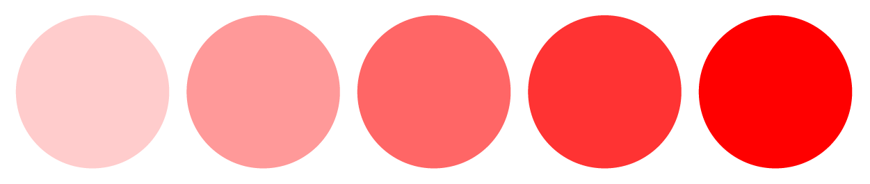
Moving from the center circle to the left, the color becomes less saturated, eventually turning to a pale pink as the intensity of the red fades. Moving to the right of the base color, the opposite effect is visible as the higher concentration of red makes the color become crisper and more visible.
Saturation is important in printing, commercial design, and photography. In newspaper design, saturation adjustments are often needed to avoid images from being too dark or requiring too much ink during the printing process. When the saturation of a photograph is lowered, the image will lose color depending on the level of the adjustment. Conversely, if you increase saturation, images become more vibrant and colorful. However, too much saturation creates an unnaturally vivid look and can oftentimes result in visual noise.
Color temperature is a measure in the Kelvin (K) scale used to describe lighting conditions when viewing color. The Kelvin scale is used to measure thermodynamic temperature. The Kelvin scale has no below zero measurements as compared to Celsius and Fahrenheit. Instead, it uses 0 as absolute 0, also referred to as infinite cold. The measurement 0 kelvin is equivalent to -273.15 degrees Celsius or -459.67 degrees Fahrenheit.
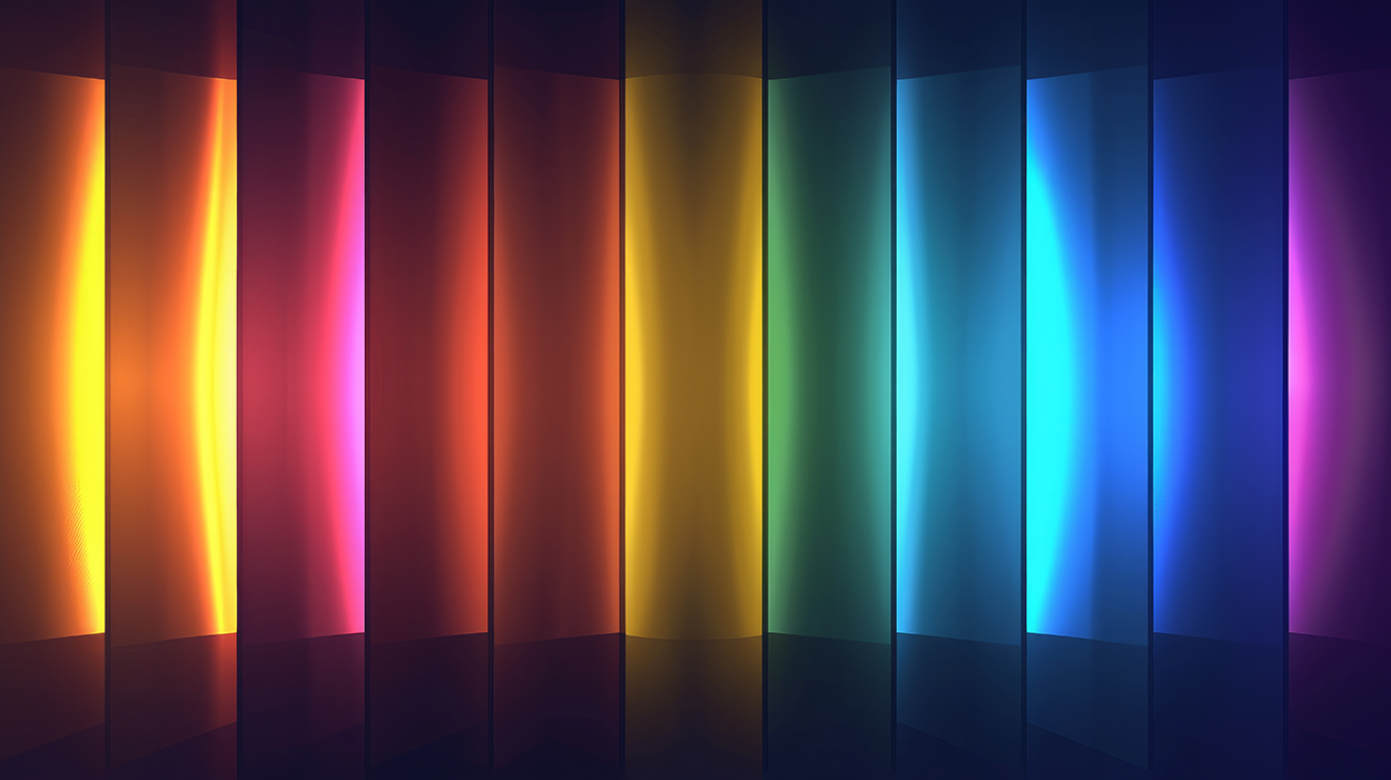
In the image below, color temperature is shown by both warm and cool light emanating from each color bar. Warm light is brighter than cool, or colder, light within the color bars. The areas that are brighter are the hotter areas.
Color temperature is used in photography, film, and video to balance colors against natural daylight. Color temperature is used to correct lighting issues in compositions, to make lighting appear realistic, or to create unique color and visual effects.
In the color temperature chart below, white is shown as neutral with warm and cold measurements on either side. As color temperature increases, moving from yellow to red, the measurements lower. Natural light, which is the closest to pure white light, has a measurement of 5000 K, whereas the coldest light on the chart has a measurement of 10,000 K.
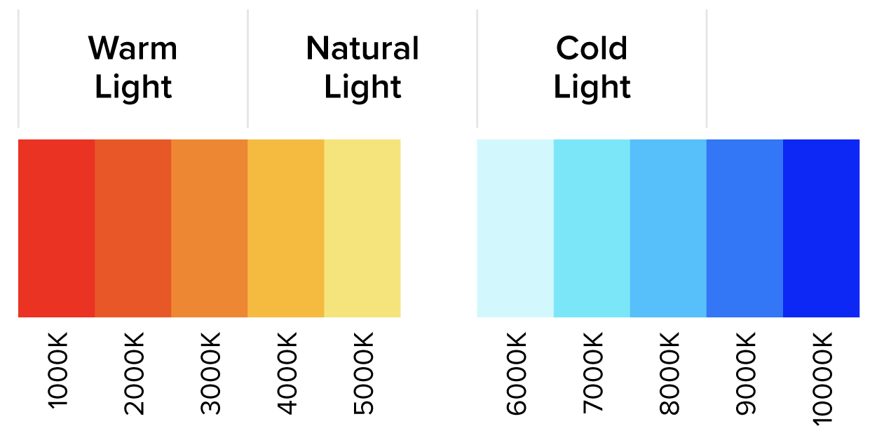
The color temperature chart provides a breakdown of color temperature in relation to natural, warm, and cold light.
EXAMPLE
Light bulbs are rated in wattage and oftentimes color temperature. While differences in the ratings seem minor, there is often a difference when you put the bulbs in your home.Source: THIS TUTORIAL WAS AUTHORED BY MARIO E. HERNANDEZ FOR SOPHIA LEARNING. PLEASE SEE OUR TERMS OF USE.