Table of Contents |
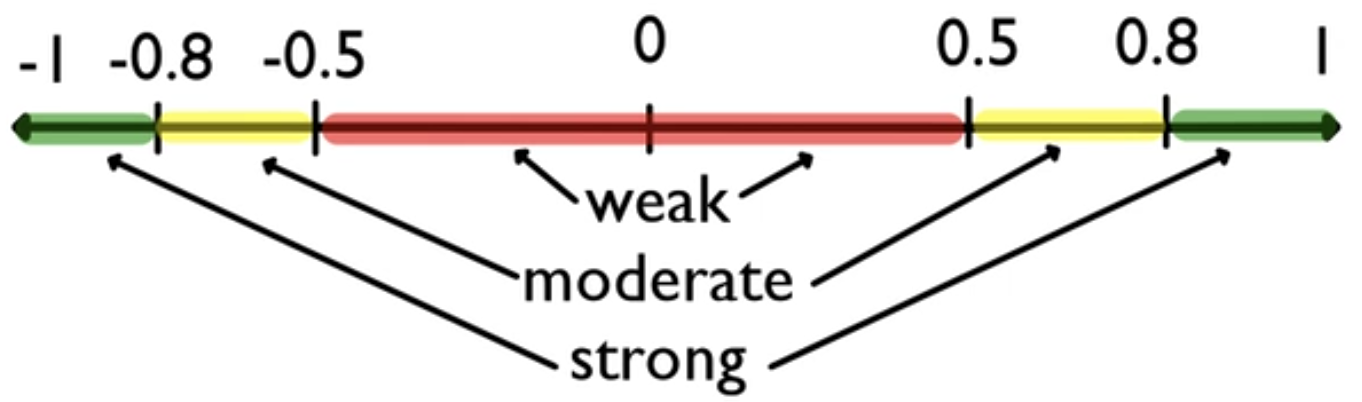
Correlation is going to allow you to observe the strength and direction of a linear association between two quantitative variables. Recall that it is a number between negative 1 and positive 1.
A positive correlation is going to be a tendency of the response variable to increase in response to an increase in the explanatory variable.
EXAMPLE
Below is a visual representation with a correlation coefficient, r, of positive 0.7. Even though the direction is positive, the association is not terribly strong.
EXAMPLE
Below is a visual representation with a correlation coefficient, r, of negative 0.99. This means it's almost a perfectly straight linear relationship. It is a negative correlation because as the explanatory variable on the x-axis increases, the response variable on the y-axis has a tendency to decrease.
Some graphs will appear to be a cloud. In this case, the relationship will have a relative zero correlation. There's no discernible association between the explanatory variable and the response variable.
EXAMPLE
Below is a visual representation with a correlation coefficient, r, of zero.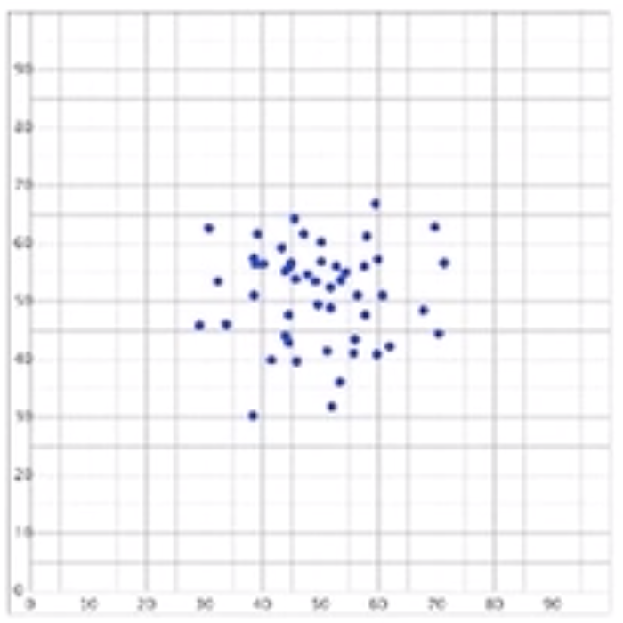
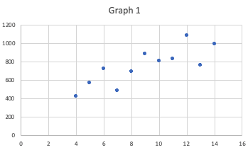
One thing that's worth noting is that the numbers, like correlation, very rarely tell the entire story.
EXAMPLE
Consider the two tables below.| Table 1 | Table 2 | |||
| x | y | x | y | |
|---|---|---|---|---|
| 10 | 804 | 10 | 914 | |
| 8 | 695 | 8 | 814 | |
| 13 | 758 | 13 | 874 | |
| 9 | 881 | 9 | 877 | |
| 11 | 833 | 11 | 926 | |
| 14 | 996 | 14 | 810 | |
| 6 | 724 | 6 | 613 | |
| 4 | 426 | 4 | 310 | |
| 12 | 1,084 | 12 | 913 | |
| 7 | 482 | 7 | 726 | |
| 5 | 568 | 5 | 474 | |
| r = 0.82 | r = 0.82 | |||
|
|
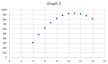
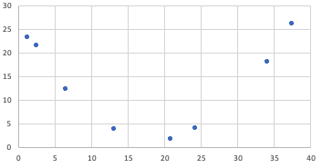
EXAMPLE
Consider this data set.| x | y |
|---|---|
| 1.2 | 23.3 |
| 2.5 | 21.5 |
| 6.5 | 12.2 |
| 13.1 | 3.9 |
| 24.2 | 4 |
| 34.1 | 18 |
| 20.8 | 1.7 |
| 37.5 | 26.1 |
| r = 0.00099 | |
Source: THIS TUTORIAL WAS AUTHORED BY JONATHAN OSTERS FOR SOPHIA LEARNING. PLEASE SEE OUR TERMS OF USE.