In this lesson, you will learn more about PivotTables and be introduced to PivotCharts. Specifically, this lesson will cover:
1. PivotTables
PivotTables are a powerful feature in Excel that allow you to summarize, analyze, explore, and present your data, making it easier to extract meaningful insights. Think of PivotTables as tools that transform rows and columns of data into more meaningful and concise formats. Once you learn the basics, PivotTables are straightforward to understand. They instantly analyze data, replace manual calculations, and reduce thousands of cells into a compact table for easier analysis. PivotTables are engaging and interactive. They help identify trends and patterns and are more accurate than performing manual calculations. In general, the rows and columns of a PivotTable are categorical variables, and the frequencies or counts being displayed in the body of the PivotTable are quantitative variables. The next several sections of this tutorial will guide you through how you can build and use PivotTables in Excel.
2. Description of Project Management Data Set
The concepts for constructing and using PivotTables in Excel will be illustrated with a modified version of a project management data set, project_magangement.xlsx.
The data contains information about employees who have been assigned several work tasks at a company. The data set includes variables such as Project Name, Task Name, Assigned To, Start Date, Days Required, End Date, and Cost. The data consists of 43 rows and eight columns.
In the next several sections, you are going to use a project management data set to determine the overall costs of the projects in the company, determine the overall progress of projects in the company, identify top performers, explore lagging projects, and determine where additional support is needed.
2a. Creating and Sorting a PivotTable
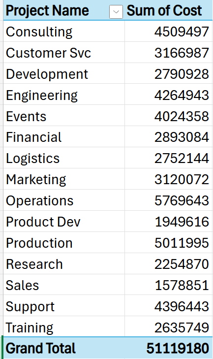
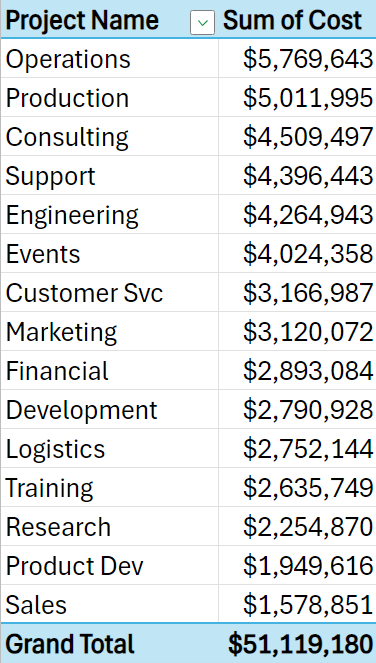
Suppose you want to analyze the cost of the different projects to identify which projects are the most costly for a company. You can use a PivotTable and then sort the PivotTable values in descending order. Let’s look at an example of how to accomplish this analytical task.
-
EXAMPLE
Imagine you work for a large multinational company that manages multiple projects across different departments. Each project has associated costs, including labor, materials, and overhead expenses. The CFO (Chief Financial Officer) wants to identify the most expensive project to allocate resources more effectively.
The PivotTable below displays that the projects related to Operations are the costliest for the company.
-
2b. Filtering a PivotTable
There are several reasons why you would need to filter the results of a PivotTable. Thinking about the project management data you have been working on, being able to filter the PivotTable could be useful for project managers. Filtering would allow project managers to assess how much work each team member is handling, identify team members who are overworked or underutilized, and allocate resources more effectively based on progress and workload.
Let’s see if we can provide the project manager with some useful insights by filtering a PivotTable.
-
EXAMPLE
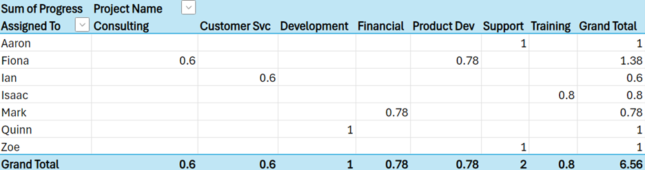
Let's continue with the example of you working for a large multinational company that manages multiple projects across different departments. The table below provides a filtered data table for team members who have completed more than 50% of their assigned projects. This PivotTable would be useful for a project manager because the project manager could use this information to start planning upcoming tasks for team members that are nearing completion or are completed.

From the filtered PivotTable above, you can see that Fiona is working on two projects, and she is almost 80% completed with her Product Development project.
-
Create a PivotTable that displays the team members who have completed more than 50% of their assigned projects.
- Open the project_management_data.xlsx file.
- Select all the data in the worksheet (cells A1 to H44).
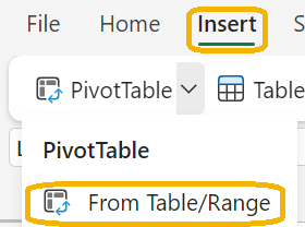
- From the Insert menu, select PivotTable --> From Table/Range.
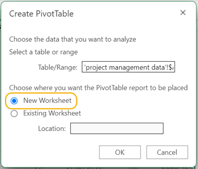
- The Insert PivotTable dialog box opens. Select + New Worksheet to place the PivotTable in a separate sheet from the data.
- Drag the column Assign To to the Rows box, drag Project Name to the Columns box, drag Progress to the ∑ Values box, and drag Progress to the Filter box.
- The filter for Progress is placed in the top left of the worksheet. Select the drop-down arrow for the filter. Click the Select All to deselect all the values of Progress and then select all the values greater than 50%. Select Apply.
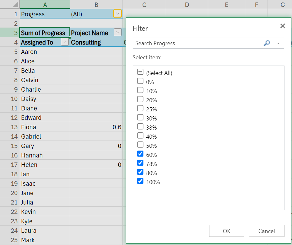
The PivotTable will be updated to show all the team members who have more than 50% completed their projects.
- Check your work by comparing your PivotTable to the one in the example.
-
-
You might be looking at PivotTables and thinking they are like crosstabulations. While they do have some similarities, there are some differences. The table below compares a crosstabulation with a PivotTable.
|
Differences
|
Crosstabulations
|
PivotTables
|
|
Data type
|
Analyze relationships between two categorical variables
|
Can analyze relationships among multiple variables, both categorical and quantitative
|
|
Aggregation
|
Display frequencies/counts
|
Can display frequencies, averages, or sums
|
3. PivotCharts
PivotTables are a great way to summarize raw data into a summary table so that it is easier to see the big picture. Sometimes, you cannot look at numbers in a table to see what is going on or if there is anything interesting you want to highlight or explore further. PivotCharts are a great way to add visualizations to your PivotTable. PivotCharts complement PivotTables by providing a graphical representation of the data in the PivotTable. PivotCharts assist in exploring and presenting summarized data in an interactive and visual format.
-
PivotCharts are directly linked to a PivotTable. When you update your PivotTable (change filters, add new data), the PivotChart automatically reflects those changes. Regular charts require manual adjustments to the graphs when the data changes.
-
- PivotChart
- A visual display of the summarized data contained in a PivotTable.
3a. Creating a PivotChart
Imagine you want to visualize the duration of different projects. The visualization via a PivotChart will allow you to easily see which projects are shorter or longer, helping prioritize resources and deadlines. Let’s look at an example of how to accomplish this analytical task.
-
EXAMPLE
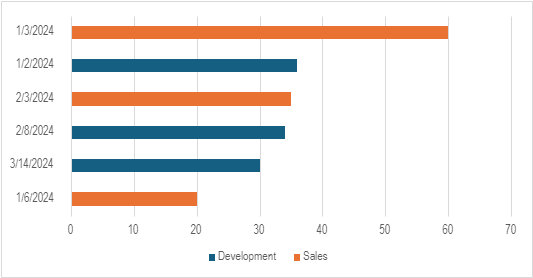
Let's continue with the example of you working for a large multinational company that manages multiple projects across different departments. You are working with the project manager for the company, and the manager knows from past historical projects that projects related to the Sales and Development Departments typically take the longest time. It is close to the end of the year, and the project manager wants to look ahead to next year, starting in January, and see what the days required are for the projects related to the Sales and Development Departments. You construct the following horizontal bar chart via a PivotChart to share with the project manager.
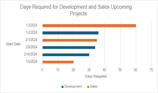
This bar chart will help the project manager allocate resources to an upcoming Sales project expected to take close to two months to complete. This chart can be constructed using the PivotChart functionality in Excel.
-
Construct a PivotChart in a horizontal bar chart that shows the start dates on the vertical axis and the days required for the Development and Sales projects.
1. Open the
project_management_data.xlsx file.
2. Select all the data in the worksheet (cells A1 to H44).
3. From the
Insert menu, select
PivotTable -->
From Table/Range.
4. The
Insert PivotTable dialog box opens. Select +
New WorkSheet to place the PivotTable in a separate sheet from the data.
5. Drag the column
Start Date to the
Rows box, drag
Project Name to the
Columns box, and drag
Days Required to the ∑
Values box.
6. Sort the
Grand Total column in the PivotChart in ascending order (this will ensure that the bars in the final bar chart are sorted in descending order). Select a cell in the
Grand Total column and on the
Home menu, select
Sort and Filter -->
Sort Ascending.
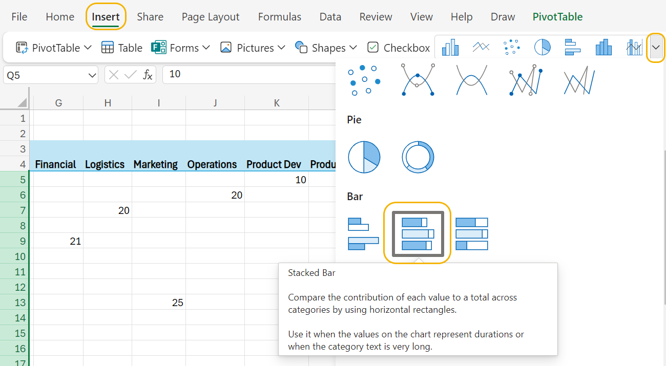
7. From the
Insert menu, select the drop-down arrow by the pictures of charts as shown in the image below. Select the
Stacked Bar option.
You will see a
stacked bar chart overlaid on the PivotTable. A stacked bar chart displays two categorical variables (in this case
Project Name and
Start Date). Each bar is divided into sub-bars, where the sub-bar represents the proportion of the quantity being displayed for one of the categories. For example, below is a partial snapshot of the stacked bar chart that you just created for 1/1/2024.
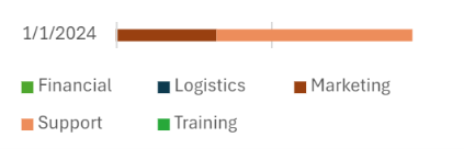
The bar for 1/1/2024 shows you that for the projects that start on January 1, 2024, the number of days required for the Support projects is larger than the number of days required for the Marketing projects.
The stacked bar chart that you created is way too cluttered for you to make any sense of. Let’s filter the PivotTable to only examine projects related to Sales and Development.
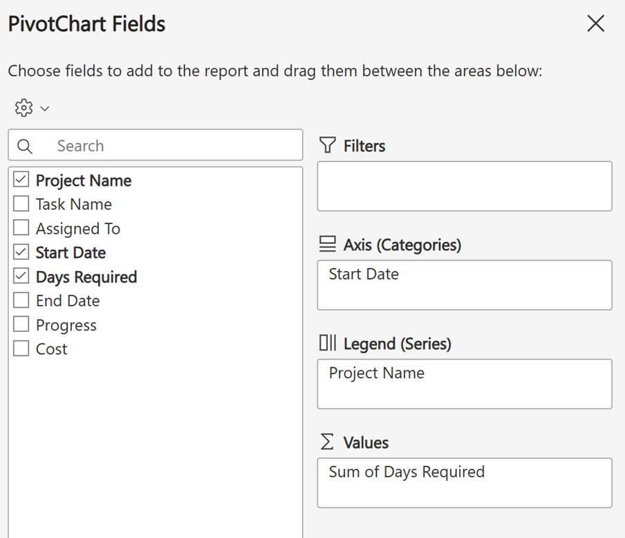
When you create the PivotChart, the right-hand side of Excel 365 updates to the
PivotChart Fields dialog box. As you modify the PivotTable using these options, the PivotChart updates automatically.
8. Drag
Project Name to the
Filters box. The filter for
Project Name is placed in the top left of the worksheet. Select the drop-down arrow for the filter. Click the
Select All to deselect all the values of
Project Name and then select the
Sales and
Development departments.
9. Drag
Project Name from the
Filters box to the
Legend (Series) box in the
PivotChart Fields dialog box.
10. The PivotChart should update to look like the following:
11. Label the axes and provide a title for the PivotChart using Excel techniques from a previous tutorial so that the PivotChart looks like the following:

12. Check your work by comparing your PivotChart to the one in the example.
-
Follow along with this video to create a PivotChart.
-
- Stacked Bar Chart
- An extension of the standard bar chart by displaying numeric values across two categorical variables.
In this lesson, you learned how to construct PivotTables and PivotCharts. You extended what you learned from a previous lesson that used PivotTables by performing more advanced functionality with PivotTables like sorting and filtering. A PivotChart is an extension of a PivotTable that allows you to visualize the data in a PivotChart. The concepts and applications of these two topics were illustrated using a project management data set.