Table of Contents |
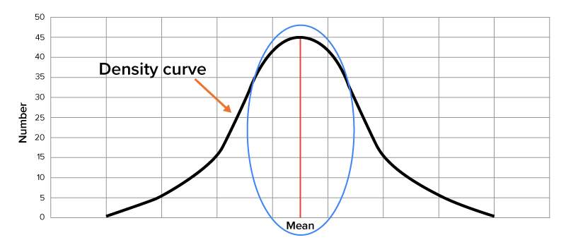
Remember from previous lessons that a density curve in a normal distribution has a bell-shaped curve with the mean located in the middle of the curve.
The idea behind using experimental probability is to determine the likelihood of an event occurring. Normal distributions help you do this since they represent a wide variety of real-world situations for which you may be interested in determining such likelihoods. Typically, when large enough samples are drawn from a population that you are interested in, such data takes on a normal distribution.
IN CONTEXT
Consider the distribution of a volume of bottled water. While a bottling company may attempt to put 500 milliliters of water in each bottle, the equipment, people, and processes used to bottle the water are not perfect. As a result, it is possible that some bottles will contain more or less than the stated 500 milliliters. If enough random samples of bottles are taken, you will start to get a sense for how much the volumes vary from 500 milliliters. You’ll likely see a pattern of distribution that resembles a normal distribution, in the sense that most values are clustered around the mean, with very few values being far from it.
Another distribution that resembles a normal distribution when a large number of random samples are drawn is intelligence quotient, or IQ, scores. A small random sample of individuals would not provide us with a very representative distribution of the population as a whole, but with enough samples, you will start to recognize a normal distribution.
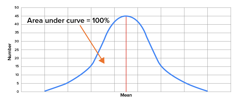
When looking at a normal distribution, the total area under the bell-shaped curve is equal to 1, or 100%, since all possible outcomes of an event are going to fall somewhere along this curve. Generally speaking, the area that you see under the curve that exists between two points that represent specific outcomes is equivalent to the probability of any value falling between those two values.
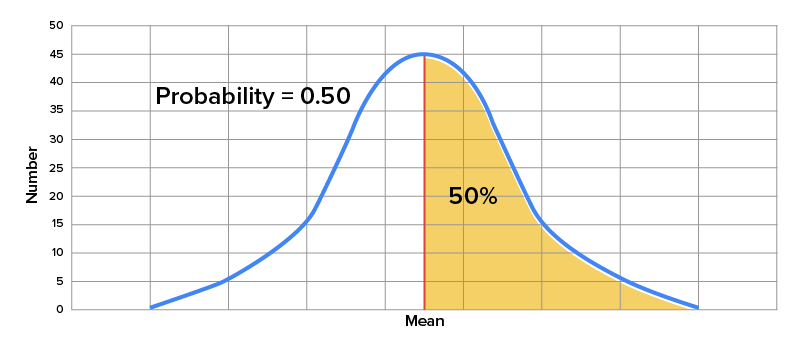
Consider the average rainfall for New York City over the course of a year. Suppose that you are interested in the probability that a given year has above average rainfall, and you want to use a graph of a normal distribution to estimate that probability. As you can see here, since the mean or average rainfall is indicated by the midpoint of the normal distribution curve, the probability that a given year would have a greater than average amount of rainfall is indicated by the area of the graph under the curve and to the right of the mean. Since this represents 50% of the area under the curve, the probability is equal to 0.50.
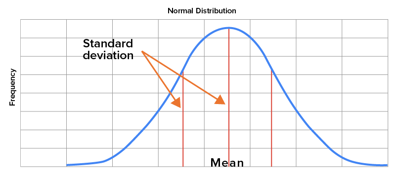
The probability of a certain range of outcomes equals the area under the normal curve located between those outcomes. As you may recall, a standard deviation provides a sense of how closely data happens to be centered around the mean of a data set. For normal distributions, the mean is the center of the distribution, while the standard deviation is represented by how far away from the mean it falls on the horizontal axis.
Consider the speed of drivers on a particular section of a major highway, assuming that it follows a normal distribution. Let’s further assume that the mean speed of all drivers over a given period is 74 miles per hour with a standard deviation of 5 miles per hour. On a graph, the mean of 74 miles per hour will be located in the middle of the distribution, with a number of standard deviations away from the mean indicated on the horizontal axis.
Suppose that we are interested in determining the probability that a given driver is driving between 75 and 80 miles per hour. By looking at the area indicated here on the graph, we can see that the probability of a given driver driving between these two speeds is approximately 0.306.

Now, what if you were interested in the probability of a driver going faster than 84 miles per hour? Well, in this case, you can see the area highlighted on the graph, which translates to a probability of approximately 0.023.

Or suppose you wanted to know the probability that someone was driving slower than 70 miles per hour. As you can see on the graph here, the area highlighted suggests that this probability is roughly 0.212.

Source: THIS TUTORIAL WAS AUTHORED BY DAN LAUB FOR SOPHIA LEARNING. PLEASE SEE OUR TERMS OF USE.