In this lesson, you will learn how to detect multicollinearity in multiple linear regression models. Specifically, this lesson will cover:
1. Introduction to Multicollinearity
Remember throughout the previous tutorials, you are working on a project to predict how much money a non-profit will receive in donations. You decide to use a multiple linear regression model to see how different explanatory variables affect the amount of donations. These explanatory variables have included the number of social media shares a fundraising campaign receives, the amount of money spent on marketing, and the number of email subscribers for each campaign.
But what if some of these explanatory variables are closely related to each other? For example, more marketing spend might lead to more social media shares. When the explanatory variables are too closely related, it can make it hard to see their individual effects on the response variable. This is called multicollinearity.
In business data analytics, multicollinearity occurs when two or more explanatory variables in a regression model are highly correlated. This means they move together in a similar pattern. When this happens, it can cause problems in understanding which explanatory variable is actually influencing the response.
-
- Multicollinearity
- Occurs when explanatory variables in a regression model are highly correlated, making it difficult to determine their individual effects on the response variable.
1a. Identifying Multicollinearity
Identifying multicollinearity is an important step in building a reliable regression model. Here are some ways to spot it:
Visual Inspection of Data
-
Scatter Plots: Create scatter plots to see how each pair of independent variables relates to each other. If the points form a clear pattern, it means the variables are correlated.
The three scatter plots below show the relationships between different business variables, highlighting multicollinearity and non-multicollinearity. The three graphs are described below.
-
Advertising Spend vs Sales Revenue: This plot shows a strong positive correlation (as one variable increases so does the other), indicating as the amount spent on advertising increases, so does sales revenue. Multicollinearity is present.
-
Number of Employees vs Sales Revenue: This plot shows a strong negative correlation (as one variable increases the other decreases (or vice versa)), indicating that as the number of employees increases, sales revenue decreases. Multicollinearity is present.
-
Office Space vs Sales Revenue: This plot shows no clear correlation, indicating non-multicollinearity.
Statistical Metrics
-
Correlation: If the scatter plot shows a pattern, compute the correlation coefficient among the two variables. You learned about correlation in a previous tutorial. The correlation coefficient ranges from -1 to 1. Values close to 1 or -1 indicate a strong positive or negative relationship. For example, if the correlation between marketing spend and social media shares is 0.9, they have a strong positive correlation, which indicates a multicollinearity problem.
-
Variance Inflation Factor (VIF): VIF measures how much the variance of a regression coefficient is inflated due to multicollinearity. To calculate VIF, you can use a programming language like Python.
-
- Variance Inflation Factor (VIF)
- A measure that indicates how much the variance of a regression coefficient is increased due to the correlation among the explanatory variables.
1b. Visualizing Multicollinearity with Scatter Plots
You are going to use scatter plots to aid in detecting multicollinearity among explanatory variables.
-
This portion of the tutorial will require the installation of a new package. Like we previously did to install pandas, openpyxl, and mathplotlib, we will need to install seaborn. To install seaborn, include the following command along with the other installation commands:
await micropip.install(“seaborn”)
You will be returning to the donation prediction scenario that you have used previously. Now you have information from the last 100 fundraising campaigns from the non-profit organization and you want to detect if there is any multicollinearity among the explanatory variables.
As always, you need to import the data into a pandas DataFrame using the code below and the GitHub Link:
https://raw.githubusercontent.com/sophiaAcademics/BDA_Excel/main/StudentData/Tutorials/Unit5/5.1.6/donations_multicollinearity.xlsx
The code below imports pandas, imports an Excel file from a URL, creates a pandas DataFrame, and displays the first five rows of the DataFrame.
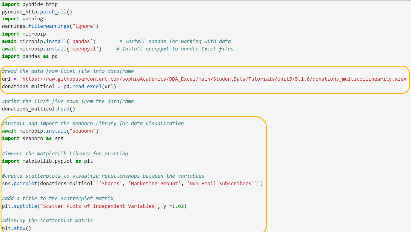
The first yellow circle shows the new GitHub url. The second yellow circle shows the new code. Let’s break down the steps of the code line by line.
Step 1: Install and Import the seaborn Python library.
await micropip.install("seaborn")
import seaborn as sns
- This line imports the seaborn library and gives it the nickname sns. Seaborn is used for creating attractive and informative statistical graphics.
Step 2: Import the matplotlib library for plotting.
import matplotlib.pyplot as plt
- This line imports the pyplot module from the matplotlib library and gives it the nickname plt. Matplotlib is used for creating static, interactive, and animated visualizations in Python.
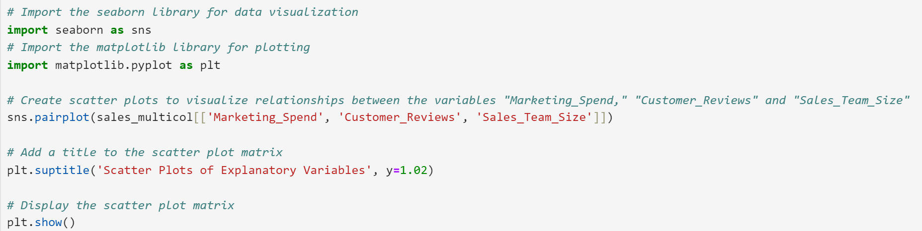
Step 3: Create scatter plots to visualize relationships between the explanatory variables Shares, Marketing_Amount, and Num_Email_Subscribers.
sns.pairplot(donations_multicol[['Shares', 'Marketing_Amount', 'Num_Email_Subscribers']])
- This line uses the pairplot function from seaborn to create a matrix of scatter plots. Each scatter plot shows the relationship between a pair of variables from the DataFrame donations_multicol.
Step 4: Add a title to the scatter plot matrix.
plt.suptitle('Scatter Plots of Independent Variables', y=1.02)
- This line adds a title to the entire scatter plot matrix using the suptitle function from matplotlib. The y=1.02 argument adjusts the vertical position of the title to ensure it is placed above the plots.
Step 5: Display the scatter plot matrix.
plt.show()
- This line displays the scatter plot matrix on the screen using the show function from matplotlib.
The matrix of scatter plots is shown below.
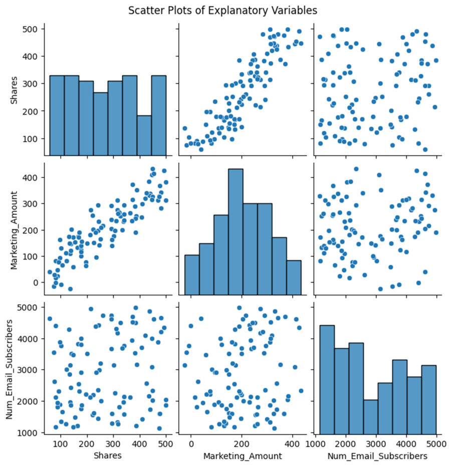
A scatter plot matrix is a powerful tool for visualizing relationships between multiple variables. In this specific case, it helps you understand how the explanatory variables Shares, Marketing_Amount, and Num_Email_Subscribers are related to each other.
The histograms on the diagonal provide a visual summary of the distribution of each individual explanatory variable.
The off-diagonal plots are the scatter plots themselves. They show the relationship between pairs of variables:
-
Positive Correlation: As one variable increases, the other also tends to increase. This is indicated by a positive slope in the scatter plot.
-
Negative Correlation: As one variable increases, the other tends to decrease. This is indicated by a negative slope in the scatter plot.
-
No Correlation: There is no apparent relationship between the two variables. The points on the scatter plot are scattered randomly.
The scatter plot matrix reveals potential multicollinearity between the explanatory variables Shares and Marketing_Amount. The strong positive correlation (linear trend) between these two explanatory variables suggests that they are correlated, which could lead to multicollinearity issues.
-
You are going to return to a similar example you have worked with previously, in which you built a multiple linear regression model to predict sales revenue. You suspect there may be multicollinearity among some of the explanatory variables. You want to visually inspect your suspicion using scatter plots.
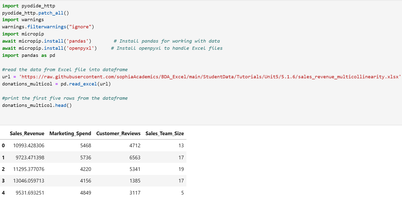
The Excel file contains the historical data of sales revenue based on marketing spend, the number of customer reviews left on a website, and the sales team size for 50 observations. The data is located here:
https://raw.githubusercontent.com/sophiaAcademics/BDA_Excel/main/StudentData/Tutorials/Unit5/5.1.6/sales_revenue_multicollinearity.xlsx
Each row in the data represents the sales revenue, amount spent on marketing, number of customer reviews, and team size for each month for the last 50 months. The columns are described below:
-
Sales_Revenue: The revenue generated from sales (in dollars) each month.
-
Marketing_Spend: The amount of money spent on marketing (in dollars) each month.
-
Customer_Reviews: Number of customer reviews left on a website like Google reviews each month.
-
Sales_Team_Size: Number of sales team members for each month.
Perform the following.
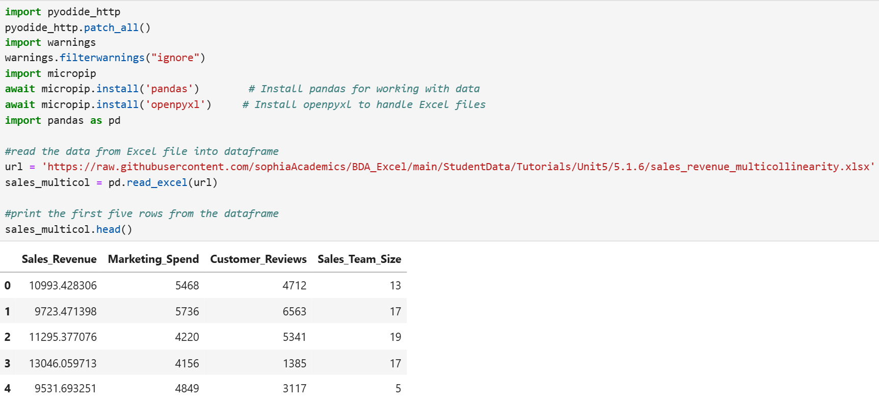
- Import the Excel file, create a pandas DataFrame named sales_multicol, and look at the first five rows of the DataFrame.
- Construct a matrix of scatter plots for the explanatory variables and determine if any of the variables are correlated.
- Do any of the pairs of explanatory variables look correlated with each other?
Solution:
1. The code below will create a pandas DataFrame named sales_multicol and display the first five rows of the data.
2. The code below constructs a matrix of scatter plots.
The matrix of scatter plots is provided below.
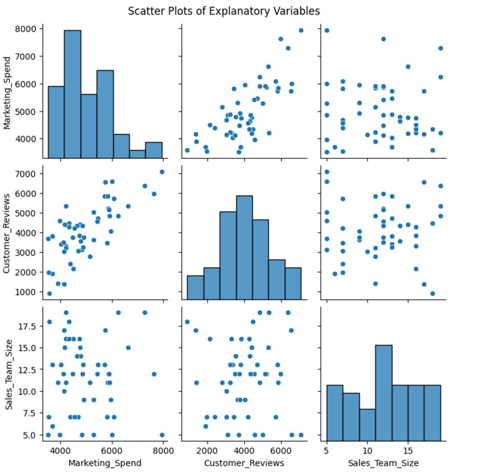
3. The scatter plot matrix reveals a slight upward trend between Marketing_Spend and Cusotmer_Reviews, which shows they have a moderate positive correlation. There could be a potential multicollinearity issue between these two variables.
The moderate positive between Marketing_Spend and Cusotmer_Reviews makes business sense for several reasons:
-
Marketing Effectiveness: Increased marketing spend often leads to higher visibility and awareness of a product or service. This can result in more customer interactions and reviews, as more people are exposed to the marketing efforts.
-
Customer Engagement: Effective marketing campaigns can engage customers more deeply, encouraging them to leave reviews. For instance, promotional offers, engaging content, and interactive campaigns can motivate customers to share their experiences.
-
Check out this video on determining multicollinearity in a multiple linear regression model with a scatter plot matrix.
1c. Detecting Multicollinearity with the Variance Inflation Factor (VIF)
Variance Inflation Factor, or VIF, is a measure used to detect multicollinearity in a set of multiple regression explanatory variables. Multicollinearity occurs when two or more explanatory variables in a regression model are highly correlated, meaning they provide redundant information.
VIF is calculated for each explanatory variable in the model. The formula for VIF is  Here,
Here,  represents the coefficient of determination for the regression model that predicts the explanatory variable of interest using all the other variables. In simpler terms, tells you how well the variable can be predicted by the other variables.
By using VIF, you can identify which explanatory variables are causing multicollinearity and understand how much the variance of each regression coefficient is being inflated. This helps improve the reliability of your regression analysis.
There are some general rules for interpreting VIF. They are:
-
VIF = 1: No correlation between the variable and the others
-
1 < VIF ≤ 5: Moderate correlation, usually acceptable
-
5 < VIF ≤ 10: High correlation, problematic and may need correction
-
VIF > 10: Very high correlation, indicates serious multicollinearity issue
If you find that some variables have high VIF values, you can:
-
Remove one of the correlated variables: This reduces redundancy.
-
Combine the correlated variables: Create a new variable that represents both.
Let’s now examine how to compute the VIF factor for each explanatory variable in a multiple linear regression model.
You will be returning to the donation prediction scenario that you have used previously. With information from the last 100 fundraising campaigns from the non-profit organization, you want to detect if there is any multicollinearity among the explanatory variables.
Let’s break down the steps of the new code line by line.
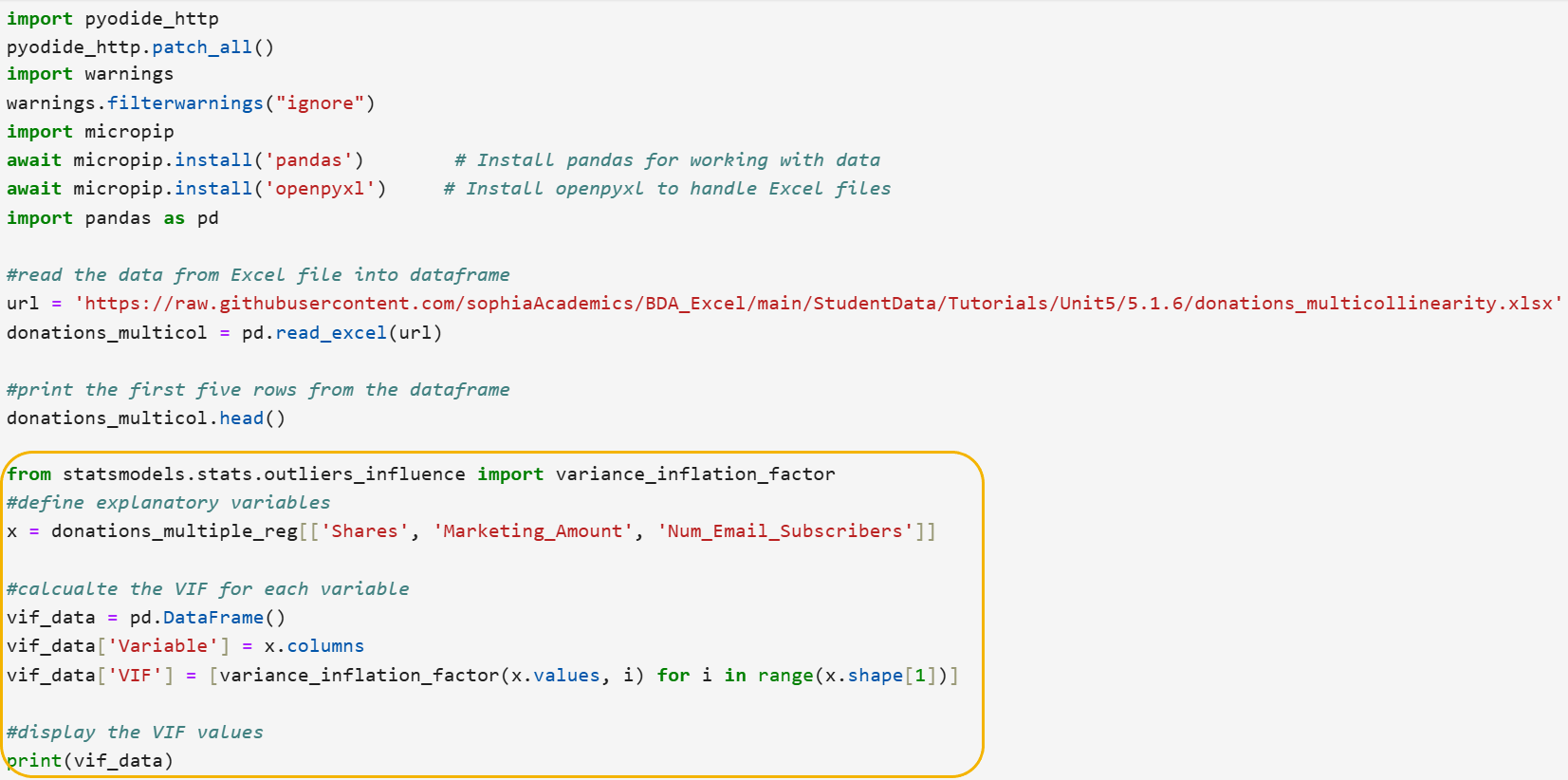
Step 1: Import the variance_inflation_factor function from statsmodels.
from statsmodels.stats.outliers_influence import variance_inflation_factor
- This line imports the variance_inflation_factor function from the statsmodels library, which is used to calculate the Variance Inflation Factor (VIF) for each feature in a dataset.
Step 2: Define the explanatory variables.
x = donations_multicol[['Shares', 'Marketing_Amount', 'Num_Email_Subscribers']]
- This line selects the columns Shares, Marketing_Amount, and Num_Email_Subscribers from the donations_multicol DataFrame and assigns them to the variable x. These columns represent the explanatory variables for which you want to calculate the VIF.
Step 3: Initialize a DataFrame to store VIF values.
vif_data = pd.DataFrame()
- This line creates an empty DataFrame called vif_data, which will be used to store the VIF values for each explanatory variable.
Step 4: Add the explanatory variable names to the DataFrame.
vif_data['Variable'] = x.columns
- This line adds a column named Variable to the vif_data DataFrame, containing the names of the explanatory variables from x.
Step 5: Calculate VIF for each variable.
vif_data['VIF'] = [variance_inflation_factor(x.values, i) for i in range(x.shape[1])]
- This line calculates the VIF for each explanatory variable in x using a list comprehension. The variance_inflation_factor function is applied to the values of x for each column index i. The resulting VIF values are stored in a new column named VIF in the vif_data DataFrame.
Step 6: Display the VIF values.
print(vif_data)
- This line prints the vif_data DataFrame, showing the VIF values for each explanatory variable.
The VIF factors for the explanatory variables are displayed below.
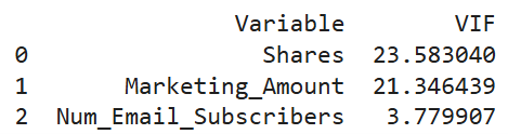
Interpretation of VIF Values
- Shares (VIF = 23.58): This is a high VIF value, indicating multicollinearity. This means that the variable Shares is highly correlated with one or more of the other explanatory variables in the model. Such a high VIF suggests that Shares is predictable from the other explanatory variables, which can cause significant problems in your regression analysis.
- Marketing_Amount (VIF = 21.35): Like Shares, this is also a high VIF value, indicating a multicollinearity problem. The variable Marketing_Amount is highly correlated with other variables in the model.
- Num_Email_Subscribers (VIF = 3.8): This VIF value indicates moderate multicollinearity. It is generally considered acceptable and not problematic. However, in the context of the other two variables having such high VIF values, it suggests that Num_Email_Subscribers is not as strongly correlated with Shares and Marketing_Amount.
Given the extremely high VIF values for Shares and Marketing_Amount, you should take steps to address the multicollinearity:
-
Remove one of the correlated variables: Since Shares and Marketing_Amount are highly correlated, you might consider removing one of them from the model. This can help reduce redundancy.
-
Combine the correlated variables: If it makes sense for your analysis, you could create a new variable that represents both Shares and Marketing_Amount. For example, you might create a new variable that is the sum or average of these two variables.
-
You are going to return to a similar example you have worked with previously, in which you built a multiple linear regression model to predict sales revenue using several explanatory variables. You suspect there may be multicollinearity among some of the explanatory variables. You want to visually inspect your suspicion using scatter plots.
The Excel file contains the historical data of sales revenue based on marketing spend, the number of customer reviews left on a website, and the sales team size for 50 observations. The data is located here:
https://raw.githubusercontent.com/sophiaAcademics/BDA_Excel/main/StudentData/Tutorials/Unit5/5.1.6/sales_revenue_multicollinearity.xlsx
Each row in the data represents the sales revenue, amount spent on marketing, number of customer reviews, and team size for each month for the last 50 months. The columns are described below:
-
Sales_Revenue: The revenue generated from sales (in dollars) each month.
-
Marketing_Spend: The amount of money spent on marketing (in dollars) each month.
-
Customer_Reviews: Number of customer reviews left on a website like Google reviews each month.
-
Sales_Team_Size: Number of sales team members for each month.
Perform the following.
- Import the Excel file, create a pandas DataFrame named sales_multicol, and look at the first five rows of the DataFrame.
- Compute the VIF factor for each of the explanatory variables.
- What do the VIF values tell you about any multicollinearity that may be present among the explanatory variables?
Solution:
1. The code below will create a pandas DataFrame named sales_multicol and display the first five rows of the data.
2. The code below computes the VIF factor for each explanatory variable.
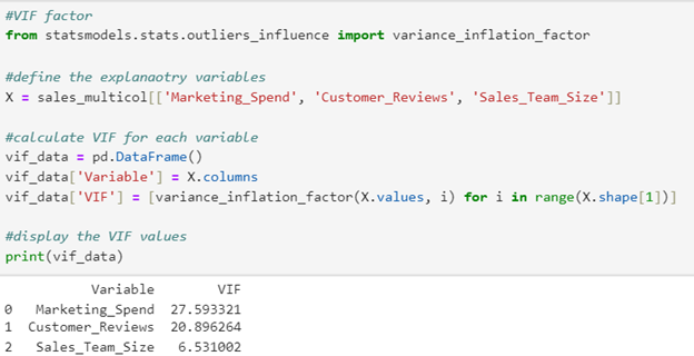
Notice the only code modification that needs to be made from the code provided in the tutorial is the name of the DataFrame and the names of the explanatory variables in the second line of the code.
3. Both Marketing_Spend and Customer_Reviews have high VIF values, indicating they are both highly correlated with another variable or each other. You know from your previous scatter plot analysis that both of these variables are highly positively correlated with each other. The VIF factors confirm the scatter plot analysis.
-
Check out this video on determining multicollinearity in a multiple linear regression model with VIF values.
In this lesson, you learned how to detect multicollinearity and understand its impact on multiple linear regression models. You explored various methods to identify multicollinearity, such as visual inspections using scatter plots and calculating statistical metrics like the correlation coefficient and the Variance Inflation Factor (VIF). Guidelines were provided to help you assess the severity of multicollinearity by using specific thresholds for the VIF. Using a real-world example of predicting donations for a non-profit organization, you practiced detecting multicollinearity by constructing scatter plot matrices and calculating the VIF for each explanatory variable using Python. By mastering these techniques for addressing and detecting multicollinearity, you can ensure the reliability of your regression model.