Use Sophia to knock out your gen-ed requirements quickly and affordably. Learn more
×

Misleading Graphical Displays

Author: Sophia

what's covered
This tutorial will cover how graphics can be used in misleading ways. Our discussion breaks down as follows:

Table of Contents

1. Misleading Graphics

Sometimes people create graphics that make you want to think a certain way. They're essentially trying to sway you to believe something, so they'll distort information or create misleading graphics to try to persuade you to think that way.

Graphs can be distorted or misleading in a variety of ways.

EXAMPLE

Suppose three friends—Paul, Hector, and Juan—were looking at the number baseball cards they had and created the graph below. Do you notice anything misleading about this graph?
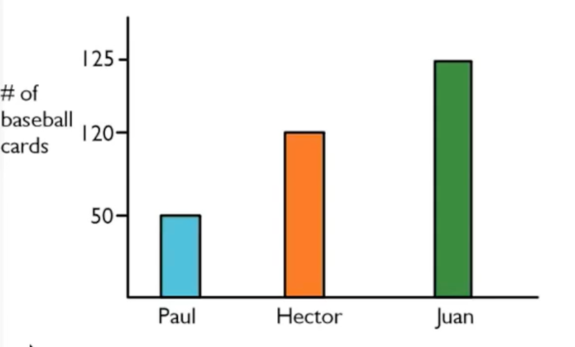
A bar graph showing the number of baseball cards owned by three individuals. The vertical y-axis is labeled ‘hashtag of baseball cards’, with a range from 0 to 125 and marked at 50, 120, and 125. The horizontal x-axis lists three names: Paul, Hector, and Juan. The graph contains three bars representing the number of cards for each person. Paul has 50 baseball cards, Hector has 120 baseball cards, and Juan has 125 baseball cards.
Well, this graph has fairly obvious visual distortion. Notice that the y-axis has unequal scaling. In this graph, one point on the y-axis represents a 50-point increase (between 0 and 50), whereas another represents a 70-point increase (between 50 and 120). However, the visual size gap between the two is the same, even though 70 is larger than 50.

Even more misleading, there’s another spot on the y-axis that represents a 5-point increase (between 120 and 125). But again, the visual size gap is the same!

Therefore, some graphs are drawn with unequal scales to represent things disproportionately.

think about it
Who do you think created this graph? Because the distortion of the data makes Juan appear to have more cards than his friends, it was probably drawn by Juan.

EXAMPLE

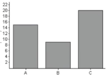
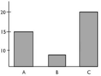
Consider this presentation of data about the preferred brand of dish soap. The data states that 15 people selected Brand A, 8 people selected B, and 20 people selected C. Both of these graphs can show us that.
Graph 1 Graph 2
A bar graph showing values for three categories labeled A, B, and C. The vertical axis ranges from 0 to about 22 with intervals of 2. The horizontal axis lists the categories A, B, and C. The graph contains three bars of varying heights. The bar for category A is approximately 15 units, the bar for category B is approximately 8 units, and the bar for category C is approximately 20 units. A bar graph showing values for three categories labeled A, B, and C. The vertical axis ranges from 0 to about 20 with intervals of 5. The horizontal axis lists the categories A, B, and C. The graph contains three bars of varying heights. The bar for category A is approximately 15 units, the bar for category B is approximately 8 units, and the bar for category C is approximately 20 units.

Which graph is more accurate?

As it turns out, Graph 1 is more accurate. Graph 2 is clearly used to exaggerate the difference between B and C. Notice how much taller C is than B in Graph 2 as opposed to Graph 1. It appears to be twice as tall as B in Graph 1, whereas it seems to be about five times taller than B in Graph 2.

Another consideration if you use a bar graph or a histogram is that it is a good idea to start the vertical axis at zero unless there's a good reason not to start there.

EXAMPLE

If you were tracking the change in home prices starting from zero and going all the way up to $300,000, the graph won't show a big difference between $300,000 and $280,000. However, to the homeowner, that drop in $20,000 is significant.

Graphs beginning anywhere besides zero tend to exaggerate differences. But graphs starting at zero sometimes can minimize very real differences.

terms to know
Misleading Graphic
A graph meant to mislead a reader or make a reader feel or believe a certain way.
Scales
The way an axis on a graph is measured. Inappropriate scaling can lead to a misleading graph.

2. Misleading Pictographs

Pictographs are plots that use pictures instead of dots or bars. Pictographs show up in newspapers a lot because they're very visually appealing.

EXAMPLE

Suppose that a class of 17 students is asked to name their favorite sport. One student might have drawn this graph to illustrate the results:
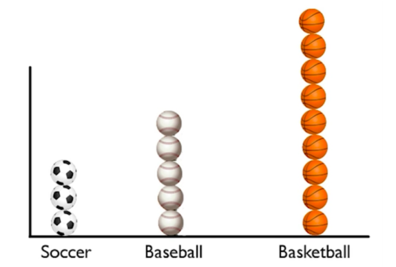
A pictograph comparing the popularity of three different sports: Soccer, Baseball, and Basketball. The data is presented using vertical stacks of the mentioned sports balls on a simple L-shaped axis, where the horizontal x-axis is labeled with the sport names Soccer, Baseball, and Basketball from left to right. The Soccer category is represented by a stack of three soccer balls, while Baseball shows a slightly higher count with five baseballs. The Basketball category is significantly larger than the others, featuring a tall stack of nine basketballs.
The three soccer balls mean that three students said that soccer was their favorite sport. The five baseballs mean that five students said baseball, and the nine basketballs mean that nine students said basketball. This is a completely valid graph. It's very analogous to a dot plot, except pictures are used instead of dots.

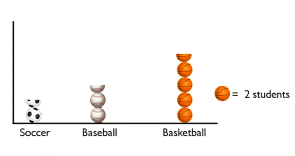
Another student might have created this dot plot:
A pictograph representing students’ favorite sports, categorized into Soccer, Baseball, and Basketball. The graph includes a key, where one full basketball icon is equal to two students. The data is presented using vertical stacks of the mentioned sports balls on a simple L-shaped axis, where the horizontal x-axis is labeled with the sport names Soccer, Baseball, and Basketball from left to right. The Soccer category is demonstrated by a stack of one and a half soccer balls, representing three students, while Baseball shows a slightly higher count with two and a half baseballs, representing five students. The Basketball category is significantly larger than the others, featuring a tall stack of four and a half basketballs, representing nine students.
This looks a little odd because you can see half of a soccer ball, half of a baseball, and half of a basketball. However, notice that this student went on to say that every basketball, soccer ball, or baseball actually counts as two students. Therefore, one ball—which is two students—and another half a ball, which equates to one student, represents a total of three students. This is the same as the data that was presented by the other student.

big idea
A pictograph is going to use pictures instead of a scale or dots.

The only problem with pictographs is that sometimes they can be misleading. In the figure below, the USA had the most medals, and Russia had the next highest amount.
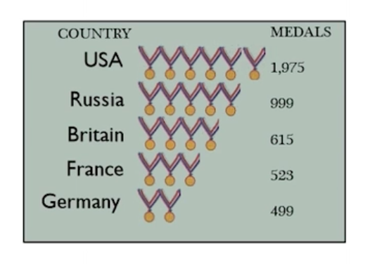
A pictograph representing the total medals earned by a set of countries, using medal icons. USA earned 1,975 medals and is represented by 6 medal icons, Russia earned 999 medals and is represented by 5 medal icons, Britain earned 615 medals and is represented by 4 medal icons, France earned 523 medals and is represented by 3 medal icons, and Germany earned 499 medals and is represented by 2 medal icons.

However, it's not really clear what one medal icon actually means in terms of relative size. What we see is that if you divide 1,975 by six medal icons, one medal icon counts for about 329 medals for the USA.

But if you divide 999 by 5 medal icons for Russia, one medal icon actually counts for about 200 medals for Russia.

In fact, none of these are very consistent.
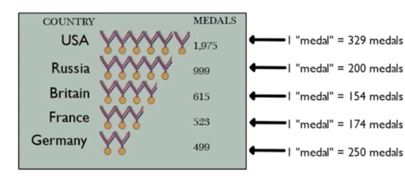
A pictograph representing the total medals earned by a set of countries, using medal icons. USA earned 1,975 medals and is represented by 6 medal icons, where each icon is equal to 329 actual medals. Russia earned 999 medals and is represented by 5 medal icons, where each icon is equal to 200 actual medals. Britain earned 615 medals and is represented by 4 medal icons, where each icon is equal to 154 actual medals. France earned 523 medals and is represented by 3 medal icons, where each icon is equal to 174 actual medals. Germany earned 499 medals and is represented by 2 medal icons, where each icon is equal to 250 actual medals.

What we should have done is chosen a medal icon to represent a certain, defined number of medals and then extended the ribbon out that far. A better-looking pictograph would be something like this:
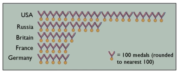
A pictograph representing the total medals earned by a set of countries, using medal icons. Each medal icon equals 100 medals (rounded to the nearest 100). USA has 20, Russia has 10, Britain has 6, France has 5, and Germany has 5 medal icons.

Here, the medal icon represents 100 medals and the results will be rounded to the nearest 100. This lines up 20 medals for the USA because the nearest 100 would be 2,000. Russia would have half as many medal icons to represent their 999 medals. This shows much more accurately how many more Olympic medals the USA has than the other countries.

term to know
Pictograph
A graphical display that uses pictures of physical objects rather than dots or bars to indicate the relative size of numbers.

3. Misleading Areas

It's important to know what you're trying to emphasize and not create perceptual distortion. The images you use to represent bins in your graphs can also distort meaning.

EXAMPLE

Suppose a class of 18 students was asked their favorite sport. Three kids said soccer, five said baseball, and the remaining said basketball. A student drew this graph based on the results:
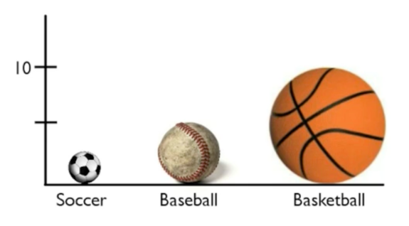
A pictograph comparing three sports using differently sized ball images above the labels 'Soccer,' 'Baseball,' and 'Basketball' on the x-axis. The y-axis has two tick marks, with the upper tick labeled 10. The soccer ball image is small and positioned near the bottom of the graph, the baseball image is larger and reaches about halfway up the graph near the unlabeled tick mark, and the basketball image is much larger in both height and width and reaches the tick mark labeled 10.
According to this graph, twice as many students chose basketball than baseball. So, what's the problem? Well, the problem is that while the height of the basketball is twice the height of the baseball, it's also twice the width. If you compare the areas taken up by the basketball and the baseball, the basketball takes up about four times as much area as the baseball.
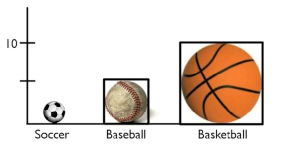
A pictograph comparing three sports using differently sized ball images above the labels 'Soccer,' 'Baseball,' and 'Basketball' on the x-axis. The y-axis has two tick marks, with the upper tick labeled 10. The soccer ball image is small and positioned near the bottom of the graph. The baseball image is larger and is enclosed within a square that reaches the first tick mark on the y-axis. The basketball image is much larger in both height and width and is enclosed within a larger square that reaches the tick mark labeled 10.

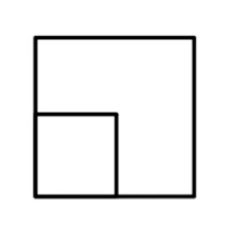
In fact, you can see this even more clearly by putting the box that represents the baseball inside the box that represents the basketball. It's clearly only about ¼ the size.
A square with a smaller square inside it positioned at the bottom-left corner, occupying one fourth of its space.

term to know
Perceptual Distortion
Using area or three-dimensional visual tricks to make certain values appear bigger or smaller than they are.

4. Technological Distortions

To make matters worse, technology has introduced us to lots of different misleading graphs, like the one below:
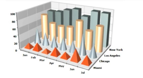
A three-dimensional chart comparing data across four cities and seven months. The vertical axis ranges from 0 to 100 in intervals of 20. The horizontal axis is labeled 'Jan,' 'Feb,' 'Mar,' 'Apr,' 'May,' 'Jun,' and 'Jul.' The depth axis lists the cities 'Miami,' 'Chicago,' 'Los Angeles,' and 'New York.' Different three-dimensional shapes are used for the cities, including orange pyramids, silver cones, yellow cylinders, and blue rectangular prisms. The shapes vary in height across the months, with several shapes reaching close to the 100 mark.

While it is clear that this graph is meant to show data across four different cities, it’s unclear what it's supposed to be measuring because there is no label. Even if we know that this graph is supposed to show how these different markets are doing across time—maybe one of these shapes is meant to represent a store?—it's still unclear what this is supposed to be measuring or what the numbers 0 through 100 actually mean.

The additional problem comes from the lack of clarity about what the graph is comparing. Is it comparing the height of these things or the volume of these things? For instance, a cone only has about 1/3 the volume of a cylinder with the same base and height. Therefore, it doesn't really make sense to be comparing cones and pyramids to cylinders and boxes.

Because the previous graph is three-dimensional, there's no way to easily compare heights. Is the cone supposed to be taller, shorter, or the same height as the cylinder behind it? It's going to be very hard for anyone to tell, which makes this is an incredibly misleading graphic.

Technology, like certain spreadsheet programs, has allowed you to easily create many different graphs. Using so many technological tricks, like three-dimensional cones and cylinders, can distort your data.

The best choice, if you're going to use bar graphs, would be the simple ones, like the simple two-dimensional ones at the top. For the data above comparing the four cities, a better choice would be something like a time-series diagram, since this graph is meant to compare across time.
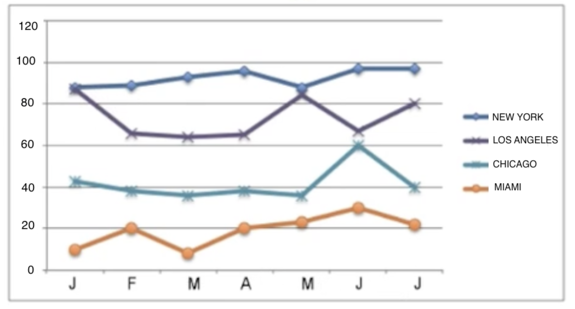
A line graph with the vertical axis ranging from 0 to 120 in increments of 20 and the horizontal axis labeled J, F, M, A, M, J, and J. Four lines are drawn on the graph with different colors and shapes marking the data points. The dark blue line with diamond-shaped points represents New York. New York’s line stays high, starting around the high 80s and rising to the mid to upper 90s by the last 2 months. The purple line with cross-shaped points represents Los Angeles. Los Angeles starts near the high 80s, drops to the low 60s in the next few months, rises back near the mid-80s, dips again, and ends around 80. The blue line with star-shaped points represents Chicago. Chicago stays between the mid-30s and low 40s for most months, with a noticeable peak near 60 in the second-to-last month before dropping back to around 40. The orange line with circular points represents Miami. Miami remains the lowest, beginning near 10, rising to around 20, dipping below 10, and reaching about 30 before ending near 20.

This is a lot more useful to anyone reading it than the previous example. It isn’t as flashy, but none of the information is hidden or distorted.

summary
Graphical displays can be manipulated in many different ways, creating misleading graphics. If you use a picture that does not represent the same amount in each category, you could be creating a misleading pictograph. Similarly, if you use an inappropriate scale, you can exaggerate the differences or use misleading areas to make differences seem larger than they actually are. You can also use three-dimensional displays that aren't really clear at all. These are all ways that misleading shapes can create misleading graphics; technological distortions are ways to create these misleading graphs. As a statistician, your goal is to make the complicated simple and to make the data easy to understand. The goal is clarity—and all these misleading graphics don't do that!

Good luck!

Source: THIS TUTORIAL WAS AUTHORED BY SOPHIA LEARNING. PLEASE SEE OUR TERMS OF USE.

Terms to Know
Misleading Graphic

A graph meant to mislead a reader or make a reader feel or believe a certain way.

Perceptual Distortion

Using area or three-dimensional visual tricks to make certain values appear bigger or smaller than they are.

Pictograph

A graphical display that uses pictures of physical objects rather than dots or bars to indicate the relative size of numbers.

Scales

The way an axis on a graph is measured. Inappropriate scaling can lead to a misleading graph.