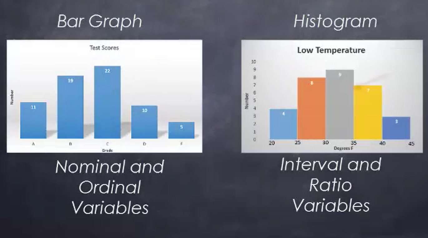
Bar graphs show the data for nominal or ordinal variables, while histograms show the data for interval or ratio variables. Remember that nominal variables indicate categories, such as gender. Ordinal variables indicate order, such as first, second, third, and so forth.
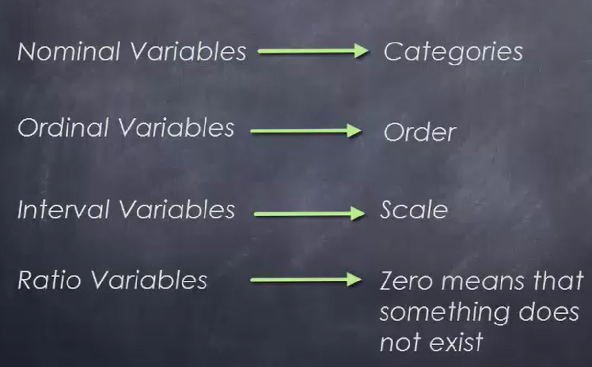
Interval variables provide numbers so that the difference between the two values can be measured. Ratio variables are interval variables, where the only difference is that a value of 0 does mean that something does not exist.
This bar graph represents test scores in a particular class:
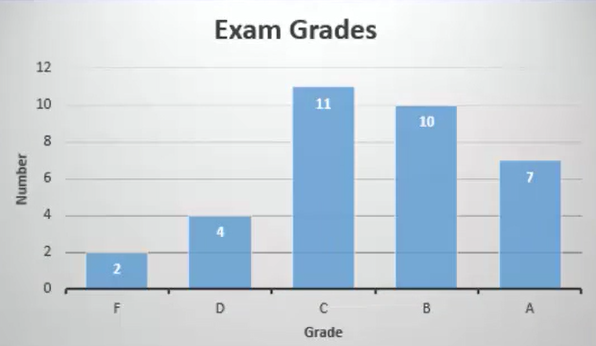 The common values, A, B, C, D, and F, go from left to right. Each bar indicates how many of this particular grade there were in this particular class for this exam.
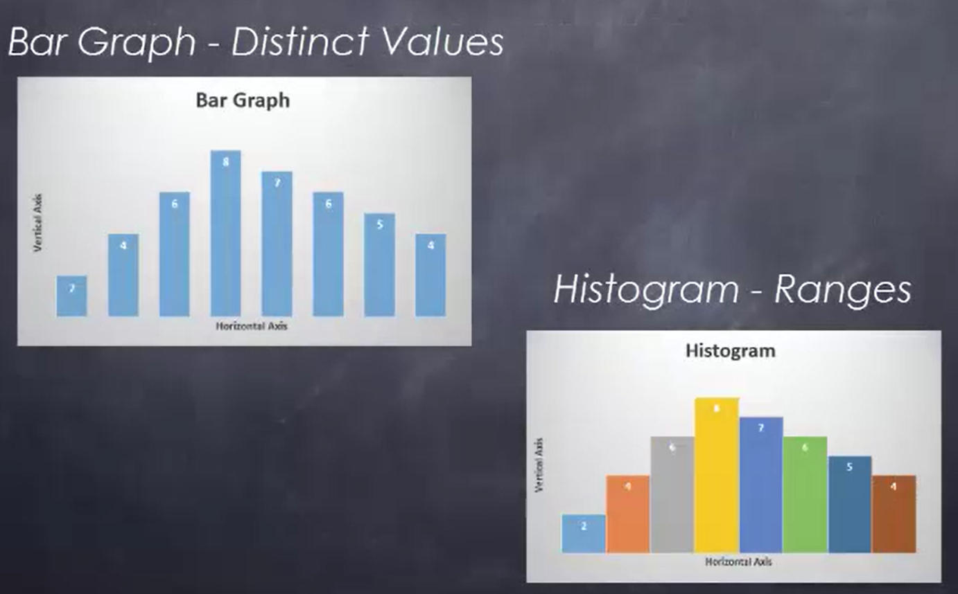
In step eight of the experimental method, process data must be represented so that it can be shared with others. There are many different ways to represent data, and one of these is to use a bar graph. Bar graphs are made from nominal and ordinal variables.
With nominal variables, the categories are listed on the horizontal axis in any order. For ordinal variables, the categories are listed on the horizontal axis in order from smallest to largest.
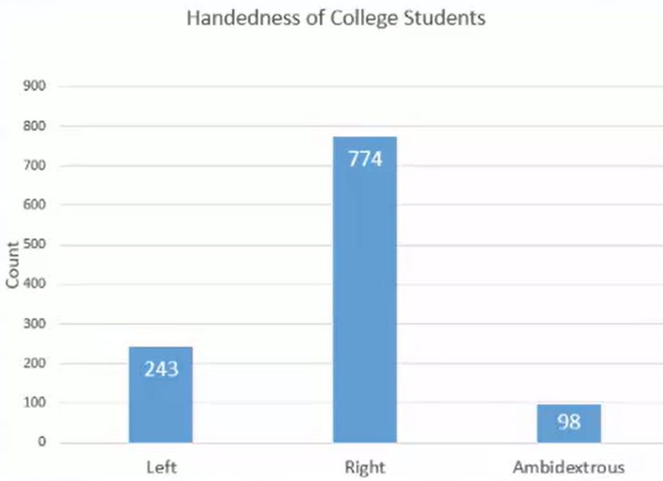 You see that the bar graph above represents the handedness of college students. In a hypothetical survey of 1,200 college students, it turns out that 243 are left handed, 774 are right handed, and the remaining 98 are ambidextrous, with no hand preference.
What you’re seeing here are individual bars that represent the height of those particular values. The number of observations of each one of these nominal variables (left handed, right handed, ambidextrous) determine how high the bar actually is.
Another method used to represent the range of data is a histogram. The histogram below represents the high temperature in Orlando, Florida, for the month of November 2015. It is broken down into specific ranges. The legend at the bottom of the graph indicates what the ranges are. The vertical axis shows the number of days in the month of November that had temperatures in these ranges. The majority of the observations fell within the range of 80 to 90 degrees Fahrenheit.
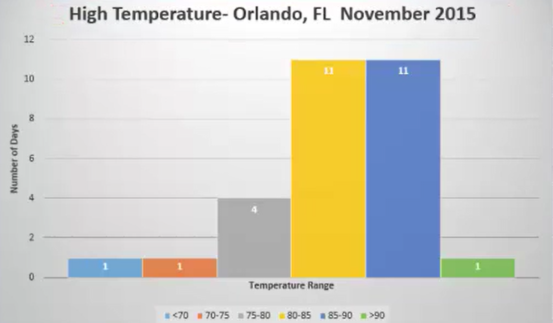
Histograms are used for interval and ratio variables. While they also have bars, the bars do touch, since the horizontal axis shows values that can be subtracted to find the difference between two sets of variables or intervals.
Typically with a histogram, the endpoints are defined as the boundaries between the two ranges. With a hypothetical range of 80 to 85, as you see highlighted in yellow, that would include the 80-degree mark and everything up to the point just short of 85. Once you reach 85, it would be in the next range. The endpoints, we typically look at the bottom value as being included in the range, whereas the top value would not.
Source: This work is adapted from Sophia author Dan Laub.