Since we will be discussing short run and long run average cost curves, here is a reminder as to how we calculate any kind of average cost.
Here is a chart that calculates average total cost by taking the total cost column and dividing by the quantity.
| Quantity | Fixed Costs | Variable Costs | Total Cost | Average Total Cost |
|---|---|---|---|---|
| 0 | $100 | $0 | $100 | -- |
| 1 | $100 | $30 | $130 | $130 |
| 2 | $100 | $50 | $150 | $75 |
| 3 | $100 | $60 | $160 | $53.30 |
| 4 | $100 | $72 | $172 | $43 |
| 5 | $100 | $85 | $185 | $37 |
| 6 | $100 | $110 | $210 | $35 |
| 7 | $100 | $140 | $240 | $34.30 |
| 8 | $100 | $180 | $280 | $35 |
| 9 | $100 | $230 | $330 | $36.70 |
| 10 | $100 | $290 | $390 | $39 |
Notice how the average total cost falls at first, then eventually rises.
Average cost curves will be this shape, which you will see graphically, but this represents just one short run scenario.
In the short run, a firm will be operating on a fixed scale, because there is at least one fixed input.
Now, they can certainly vary some things, like the number of workers they hire or machines they purchase, but there is at least one input that is fixed, like the size of their factory.
As shown above in the chart, where average cost is falling at first and then rising, this results in a u-shaped short run average cost curve.
Average costs fall at first because of economies of scale and factors such as specialization of the workers, but they eventually rise because of the law of diminishing marginal returns.
The law of diminishing returns shows that at some point regarding our inputs, when we hire too many workers, while they are likely helping to increase total production, the next worker isn't quite as good as the one before in terms of what they add to total production.
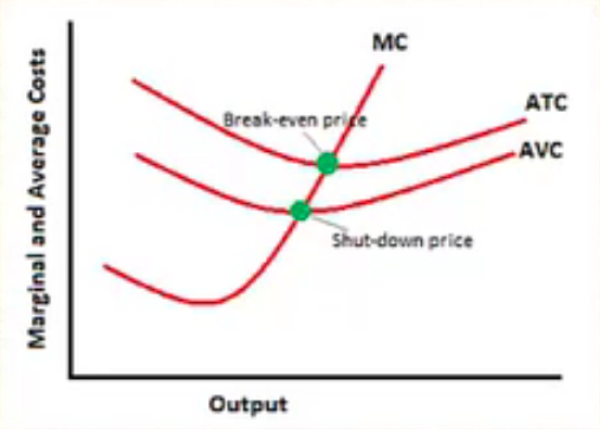
In the short run, the firm will maximize profit or minimize loss.
You've likely seen a graph like this before. Here is a reminder of the various situation represented on this graph:

This graph shows us that everything on the marginal cost curve above the shutdown price makes up our short run supply curve.
Now let's turn to the actual topic of this tutorial--the long run.
In the long run, all inputs and costs become variable.
Now the firm can alter its factory size and therefore really affect their scale of operation, which simply refers to how big they are going to get.
EXAMPLE
For example, a local business might decide to open up more locations across a region and operate on a much bigger scale, which would only be possible for a business in the long run.Again, the long run average cost curve will be u-shaped.
Now we will be looking at economies of scale and diseconomies of scale, and what happens to our average costs as we increase the scale of production.
SRAC stands for short run average cost.
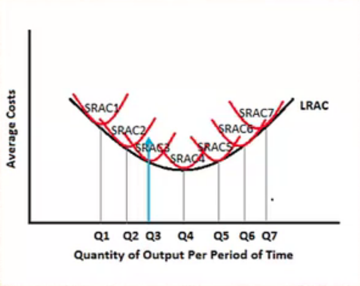
If you look at the graph below, each SRAC curve represents a potential scale of operation.

EXAMPLE
For example, SRAC curve 1 might be when that local business first opened up and had one store. As you progress to SRAC curve 2, perhaps they open up a couple more stores in the region. When you get all the way to SRAC curve 7, this might represent an operation like McDonald's, once they've gone national.Basically, they each represent a different scale of operation, and as you move to the right, you can see they are producing a much greater quantity. The business is getting bigger as we move along these short run average cost curves.
The long run average cost (LRAC) is derived from all of these short run scenarios. We find the lowest point of every short run average cost curve and draw our long run average cost curve.
Now, if a firm wanted to produce at output level quantity 3, for instance, they would see which SRAC size would minimize their costs.
As you can see, if they want to produce this quantity, average cost curve 2 that would place them too far up the curve in terms of average cost, such as over-utilizing a particular size of a factory.
However, they're not big enough to justify moving over to short run average cost curve 4.
Short run average cost scenario 3 would be best choice, if they wanted to produce quantity 3.
The long run will always be equal to or lie below any short run curve, because in the long run, we would never operate at higher average costs than in the short run.
All inputs are variable, so there are no constraints to minimizing costs.
Ultimately, the goal is to find which scale of operation will minimize average costs in the long run.
Should this firm stay small or get big? As you can see in this picture, the fourth SRAC minimizes their costs in the long run.
We will notice that this firm will experience economies of scale up to the point of SRAC4.
Past this point of SRAC4, average costs begin to rise again, and the firm will experience diseconomies of scale, where it is no longer economical to grow the business any bigger.
Therefore, SRAC4 would be the optimal size.
Source: Adapted from Sophia instructor Kate Eskra.