This tutorial will cover how to identify quantitative data with line charts and time-series diagrams. Our discussion breaks down as follows:
1. Line Charts
Line charts are a kind of display that can be used to represent quantitative data, using construction that is very similar to a histogram (refer to the tutorial on how to construct histograms for more about those graphs).
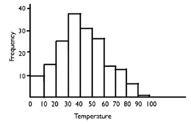
Suppose that there is an elementary school class in Muncie, Indiana, keeping track of the high temperature for each school day. In Indiana, it might get down to, for example, 0℉ in the winter, or as high as 90℉ at the beginning of the school year in September or at the end of the school year in May.
That frequency table and histogram for this distribution could look something like this:
|
Temperature
|
Frequency
|
Histogram
|
|
0s
|
10
|
|
|
10s
|
16
|
|
20s
|
25
|
|
30s
|
38
|
|
40s
|
31
|
|
50s
|
27
|
|
60s
|
13
|
|
70s
|
12
|
|
80s
|
7
|
|
90s
|
1
|
There were 10 days where the temperature fell between 0℉ and 10℉, 16 days that were between 10℉ and 20℉, etc.
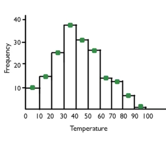
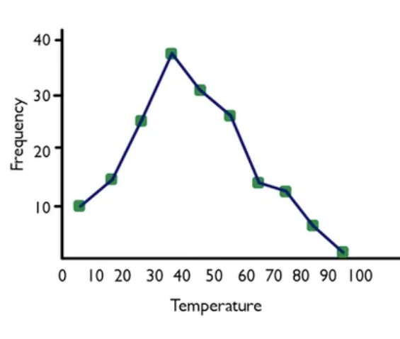
So, how do we transform the data in this histogram into a line chart?
-
Step 1: To create a line chart, take the heights of the bars, and instead of creating them as heights of bars, create dots instead.
 Step 2:
 Next, get rid of the boxes and connect the dots instead. This is the line graph, and it's virtually the same visual display as shown in the histogram.
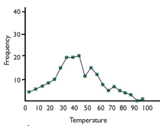
As with histograms, binning makes a difference. Suppose you bin differently, such as by fives instead of by tens, and you end up with a graph that looks this:
-
- Line Chart
- A distribution of quantitative data that shows the frequency of different intervals of data. The frequencies are indicated by heights of dots, which are connected to each other.
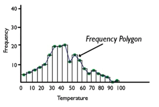
2. Frequency Polygon
If you put the histogram and the line chart on the same set of axes, you can create something called a frequency polygon.
When you have the histogram and the line chart together, you can connect the tops of the midpoints, which would look like this:
-
- Frequency Polygon
- A distribution of data that shows both a histogram and its line chart on the same set of axes.
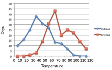
3. Multiple Line Charts
It's also possible to do multiple line charts on the same set of axes. This can be helpful because it is difficult to plot multiple sets of data with a histogram.
-
EXAMPLE
Suppose that a school in Tucson, Arizona, did the same project as the kids in Muncie, Indiana, and then the two schools shared their information.
|
Temperature
|
Indiana
|
Arizona
|
|
|
0s
|
10
|
0
|
|
|
10s
|
16
|
0
|
|
20s
|
25
|
1
|
|
30s
|
38
|
3
|
|
40s
|
31
|
14
|
|
50s
|
27
|
31
|
|
60s
|
13
|
43
|
|
70s
|
12
|
20
|
|
80s
|
7
|
25
|
|
90s
|
1
|
22
|
|
100s
|
0
|
14
|
|
110s
|
0
|
7
|
- The line charts can be compared, showing the similarities and differences between the two data sets. Days in the 60s, 70s, 80s, 90s, and even 100s are very common in Arizona, whereas in Indiana, the most common days are days in the 30s, 40s, and 50s.
-
- Multiple Line Charts
- A distribution that shows more than one data set's values in line charts. This is advantageous because it is clearer than trying to compare multiple histograms on the same set of axes.
4. Time-Series Diagrams
Time-series diagrams are among the most common graphs that you will see in everyday life. Time-series graphs are particularly useful for showing how information changes over time.
IN CONTEXT
You have probably seen time-series graphs almost every day in the stock market report in the business section of the newspaper. This is a graph of the price of a stock over several months—October, November, December, January.
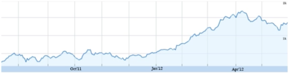
This graph shows that the stock price has been going up and down, but then during the first couple of months of 2012, it started getting high again. The graph demonstrates the different value that a variable—in this case, stock price—takes over time. The time-series graph allows you to see certain values that you might not be able to see in some other kind of graphical display.
-
EXAMPLE
Take a look at this histogram of high temperatures for the year. There are 365 different values from the National Weather Service for Chanhassen, Minnesota, binned by 10s.
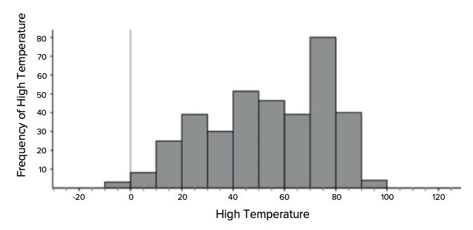
- Now compare the histogram with a time-series diagram of the same data, below. Both graphs contain the same information, but in the time-series graph, you can see this data over time.
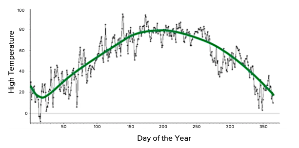
- The histogram shows you that the most common temperature throughout the year in Chanhassen, Minnesota, was between 70 and 80 degrees, and it occurred about 80 times. You can also see that on the time-series diagram. You'd need to look horizontally between 70 and 80 on the vertical axis and make horizontal lines over to see how many points were within that band. Doing so would show that there were lots and lots of points within that band.
- Additionally, this shows how the temperature tends to change over the course of the year. It gets high in the middle of the year, which is unsurprising because it's summer. Conversely, it gets low at both the beginning and the end of the year, bottoming out in early January. This additional trend is something that you don't see on the histogram.
-
- Time-Series Diagram
- A graphical display that shows the values a variable takes over time.
Line charts are a nice way to visualize quantitative data. They use much the same construction as a histogram, but the heights are determined by dots and set of boxes. When both a line chart and a histogram are shown on the same set of axes, you can create a frequency polygon. The best use of a line chart is when you can compare a couple of different line charts on the same set of axes, creating multiple line charts. A time-series diagram illustrates the change of a value over time. Time-series diagrams are not only useful in showing you what the data values are, but also when they occurred.
Good luck!