Line charts are a kind of display that can be used to represent quantitative data, using construction that is very similar to a histogram (refer to the tutorial on how to construct histograms for more about those graphs).
Suppose that there is an elementary school class in Muncie, Indiana, keeping track of the high temperature for each school day. In Indiana, it might get down to, for example, 0℉ in the winter, or as high as 90℉ at the beginning of the school year in September or at the end of the school year in May.
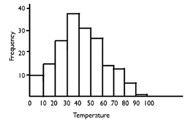
That frequecy table and histogram for this distribution could look something like this:
| Temperature | Frequency | Histogram |
|---|---|---|
| 0's | 10 |
|
| 10's | 16 | |
| 20's | 25 | |
| 30's | 38 | |
| 40's | 31 | |
| 50's | 27 | |
| 60's | 13 | |
| 70's | 12 | |
| 80's | 7 | |
| 90's | 1 |
There were ten days where the temperature fell between 0℉ and 10℉, 16 days that were between 10℉ and 20℉, etc.
So how do we transform the data in this histogram into a line chart?
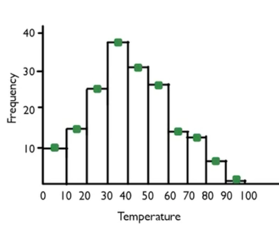
Step 1: To create a line chart, take the heights of the bars, and instead of creating them as heights of bars, create dots instead.
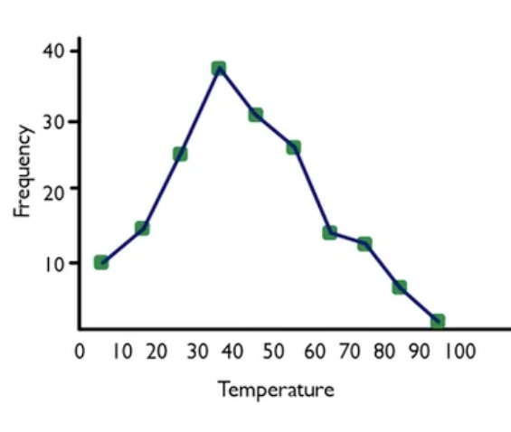
Step 2: Next, get rid of the boxes and connect the dots instead. This is the line graph, and it's virtually the same visual display as shown in the histogram.
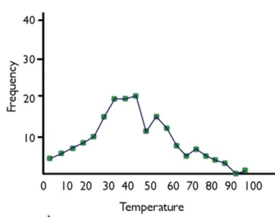
As with histograms, binning makes a difference. Suppose you bin differently, such as by fives instead of by tens, you end up with a graph that looks this:
If you put the histogram and the line chart on the same set of axes, you can create something called a frequency polygon.
When you have the histogram and the line chart together, you can connect the tops of the midpoints, which would look like this:
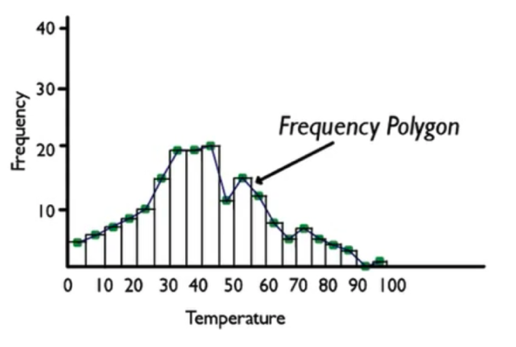
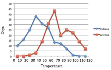
It's also possible to do multiple line charts on the same set of axes. This can be helpful because it is difficult to plot multiple sets of data with a histogram.
EXAMPLE
Suppose that a school in Tucson, Arizona did the same project as the kids in Muncie, Indiana, and then the two schools shared their information.| Temperature | Indiana | Arizona | |
|---|---|---|---|
| 0's | 10 | 0 |
|
| 10's | 16 | 0 | |
| 20's | 25 | 1 | |
| 30's | 38 | 3 | |
| 40's | 31 | 14 | |
| 50's | 27 | 31 | |
| 60's | 13 | 43 | |
| 70's | 12 | 20 | |
| 80's | 7 | 25 | |
| 90's | 1 | 22 | |
| 100's | 0 | 14 | |
| 110's | 0 | 7 |
Time-series diagrams are among the most common graphs that you will see in everyday life. Time-series graphs are particularly useful for showing how information changes over time.
IN CONTEXT
You have probably seen time-series graphs almost every day in the stock market report in the business section of the newspaper. This is a graph of the price of a stock over several months--October, November, December, January.

This graph shows that the stock price has been going up and down, but then during the first couple of months of 2012, it started getting high again. The graph demonstrates the different value that a variable--in this case, stock price--takes over time. The time-series graph allows you to see certain values that you might not be able to see in some other kind of graphical display.
EXAMPLE
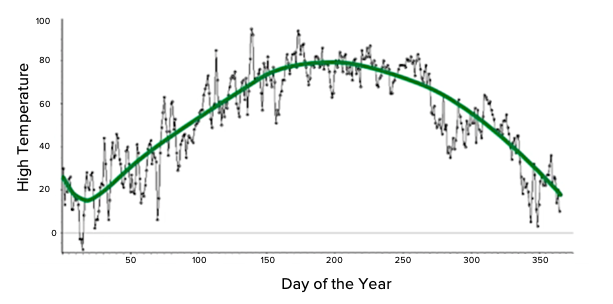
Take a look at this histogram of high temperatures for the year. There are 365 different values from the National Weather Service for Chanhassen, Minnesota, binned by 10's.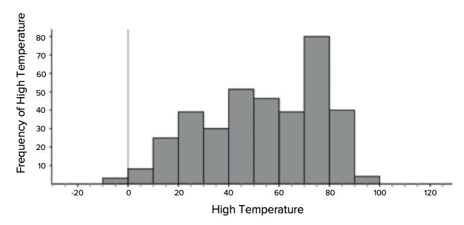
Source: Adapted from Sophia tutorial by Jonathan Osters.