Table of Contents |
A toggle is a user interface pattern that switches between two states, such as on and off or visible and hidden. Toggles form the foundation for more complex interactive patterns like accordions and tabs.
These components build on skills you have already learned, including selecting DOM elements, modifying content and attributes, managing classes with the classList API, and responding to user actions with event listeners. In this lesson, you will combine those skills to create complete interactive components.
The simplest interactive component is a toggle that shows or hides content when a user clicks a button. This pattern is common in mobile navigation menus, dropdown panels, and content reveal sections.
A show and hide toggle works by coordinating three parts: HTML provides a trigger and a content area, CSS defines how the content looks in each state, and JavaScript switches between those states when the user interacts with the page.
EXAMPLE
A simple toggle that reveals and hides a content panel:In this code:<button id="toggle-btn">Show Details</button>
<div id="content-panel" class="hidden">
<p>This content can be toggled on and off.</p></div>
.hidden {
display: none;}
const toggleBtn = document.getElementById('toggle-btn');
const contentPanel = document.getElementById('content-panel');
toggleBtn.addEventListener('click', function() {
contentPanel.classList.toggle('hidden');});
hidden class applied.display: none to hide any element with the hidden class.classList.toggle('hidden') to add or remove the class with each click.classList.toggle() method is the most efficient way to switch between two states. It removes the class if it is present and adds it if it is absent, eliminating the need for conditional logic.
index.html in your Codespace.
toggle.js and link it before the closing </body> tag in your HTML using the following:
.hidden rule that sets display: none. toggle.js, select the button and paragraph, then add a click event listener to the button that toggles the hidden class on the paragraph. classList.toggle() call can switch between visible and hidden states, creating a simple interactive component.
Effective toggle components manage state, or the current condition of a component, through CSS classes rather than inline styles. For example, a component might be in a visible or hidden state, and that state determines how it appears on the page.
Using classes to manage state keeps JavaScript focused on behavior while CSS handles presentation. It also makes your code easier to maintain because all visual changes are defined in your stylesheet. You can think of a toggle as a simple two-state system that switches between hidden and visible states.
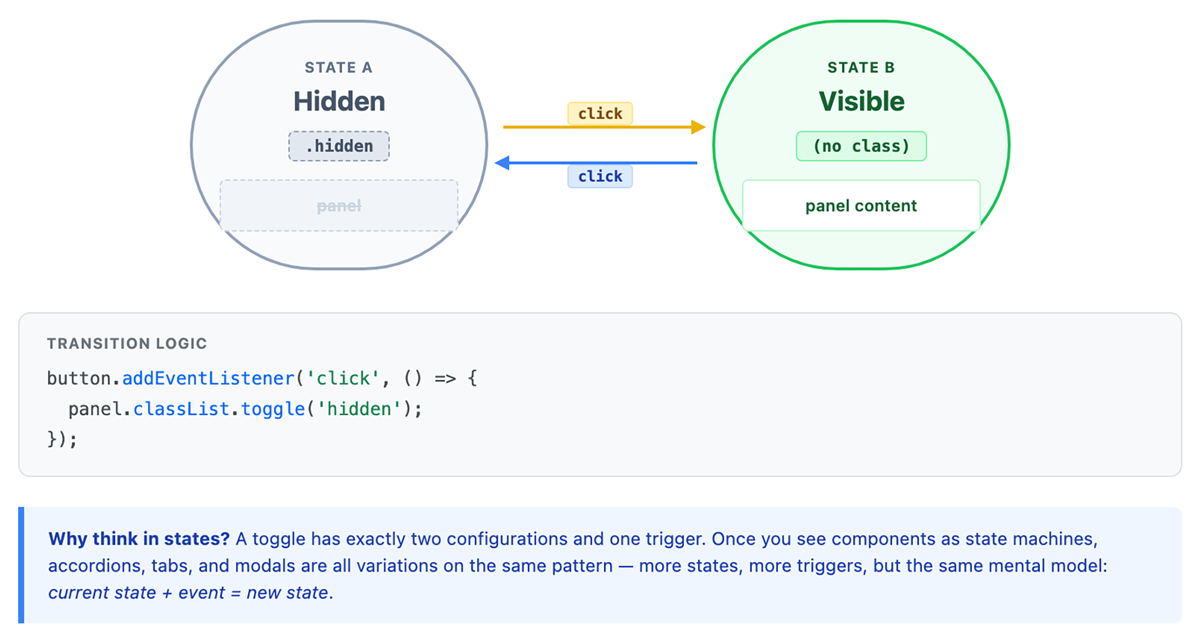
When a toggle switches between these states, you often need to update several parts of the interface at the same time. This can include showing or hiding content, changing the button text, and updating visual cues such as icons or colors. Using CSS classes allows you to coordinate all of these changes in one place.
EXAMPLE
A menu toggle that updates both the menu visibility and the button label:In this code:<button id="menu-toggle">
<span class="toggle-text">Open Menu</span></button>
<nav id="menu">
<ul>
<li><a href="#home">Home</a></li><li><a href="#about">About</a></li><li><a href="#contact">Contact</a></li></ul></nav>
#menu {
max-height: 0;overflow: hidden;transition: max-height 0.3s ease;}
#menu.active {
max-height: 200px;}
#menu-toggle.active {
background-color: #333;color: #fff;}
const menuToggle = document.getElementById('menu-toggle');
const menu = document.getElementById('menu');
const toggleText = menuToggle.querySelector('.toggle-text');
menuToggle.addEventListener('click', function() {
menu.classList.toggle('active');menuToggle.classList.toggle('active');
if (menu.classList.contains('active')) {
toggleText.textContent = 'Close Menu';} else {
toggleText.textContent = 'Open Menu';}});
active state for both the menu and the button, with a smooth transition for the menu height.active class on both elements at once.classList.contains('active') checks the new state so the button label can be updated to match.classList API provides add(), remove(), toggle(), and contains() methods for complete state control.
An accordion is a vertically stacked set of expandable panels. Users click a header to expand its content, and the design typically collapses other open panels at the same time. Accordions work well for FAQs, product specifications, and any content that benefits from progressive disclosure.
Each accordion is built from repeating sections. Every section includes a clickable header and a content panel that expands or collapses. The header is typically a <button> for accessibility, and the content is controlled using a CSS class that determines whether it is visible or hidden.
EXAMPLE
The HTML and CSS for an accordion with two items:In this code:<div class="accordion">
<div class="accordion-item">
<button class="accordion-header">What is HTML?</button><div class="accordion-content">
<p>HTML is the standard language for creating web pages.</p></div></div><div class="accordion-item">
<button class="accordion-header">What is CSS?</button><div class="accordion-content">
<p>CSS controls the visual presentation of HTML elements.</p></div></div></div>
.accordion-content {
max-height: 0;overflow: hidden;transition: max-height 0.3s ease;padding: 0 16px;}
.accordion-item.active .accordion-content {
max-height: 200px;padding: 16px;}
.accordion-header {
width: 100%;padding: 16px;text-align: left;background-color: #e9e9e9;border: none;cursor: pointer;}
.accordion-item pairs a header with a content panel. max-height: 0 keeps content collapsed..accordion-item has the active class, the content expands.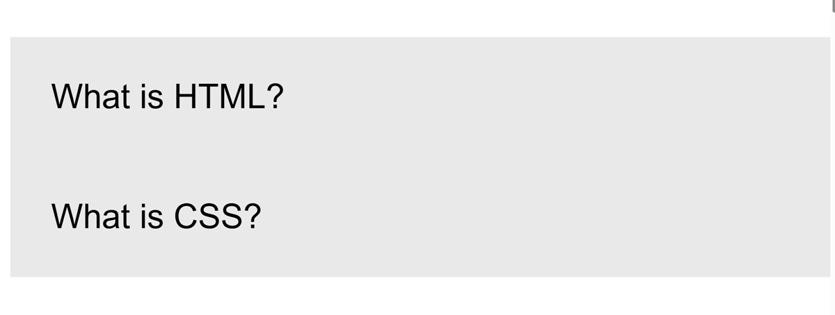
To make the accordion interactive, JavaScript responds to user clicks and updates which panel is open. Rather than directly changing styles, the code adds or removes a class, allowing CSS to control how the panel appears.
EXAMPLE
JavaScript that allows only one panel to be open at a time:In this code:const headers = document.querySelectorAll('.accordion-header');
const items = document.querySelectorAll('.accordion-item');
const header1 = headers[0];
const header2 = headers[1];
const item1 = items[0];
const item2 = items[1];
header1.addEventListener('click', function() {
const isActive = item1.classList.contains('active');
// Close all panelsitem1.classList.remove('active');item2.classList.remove('active');
// Open this panel if it was previously closedif (!isActive) {
item1.classList.add('active');}});
header2.addEventListener('click', function() {
const isActive = item2.classList.contains('active');
// Close all panelsitem1.classList.remove('active');item2.classList.remove('active');
// Open this panel if it was previously closedif (!isActive) {
item2.classList.add('active');}});
querySelectorAll() selects all headers and accordion items. active class from both items ensures that only one panel is open at a time. This pattern is called a single-open accordion, where opening one panel closes the others. This helps users focus on one section at a time and keeps the interface organized. In some cases, you may want to allow multiple panels to remain open, depending on how users need to interact with the content.
accordion.html in your Codespace, or create a new file and add the HTML and CSS examples from above.
index.html file and add a link so you can access your accordion page in the browser. Here is an example:
index.html, and click the link to open your accordion page.
accordion.js and link it in your HTML using the following:
accordion.js in your Codespace.
document.querySelectorAll('.accordion-header'). document.querySelectorAll('.accordion-item').[0] and [1].active class. active class from both items. active class back to the selected item only if it was previously closed. A tab component displays multiple content panels in the same space, with only one panel visible at a time. Like an accordion, tabs organize content into sections and allow users to control what is shown. However, instead of expanding panels vertically, tabs switch content within a fixed area. Users click tab buttons to move between panels, making tabs useful for comparing related content such as product details, settings categories, or content filters.
A tab component has two main parts: a set of tab buttons and a set of content panels. Each button is connected to a specific panel so that the correct content can be displayed when the user interacts with it. This connection is often created using data attributes, which store a reference to the panel that should be shown.
EXAMPLE
The HTML structure for a tab component:In this code:<div class="tabs">
<div class="tab-list">
<button class="tab-button active" data-tab="html">HTML</button><button class="tab-button" data-tab="css">CSS</button><button class="tab-button" data-tab="js">JavaScript</button></div><div class="tab-panels">
<div class="tab-panel active" id="html">
<h3>HTML Basics</h3><p>HTML provides the structure for web content.</p></div><div class="tab-panel" id="css">
<h3>CSS Styling</h3><p>CSS controls colors, layouts, and visual design.</p></div><div class="tab-panel" id="js">
<h3>JavaScript Interactivity</h3><p>JavaScript adds dynamic behavior to web pages.</p></div></div></div>
data-tab attribute on each button stores the id of the panel it controls. active class on one button and one panel sets the initial visible tab. Each tab button is connected to a panel using matching values. This connection allows JavaScript to determine which panel to display when a button is clicked.
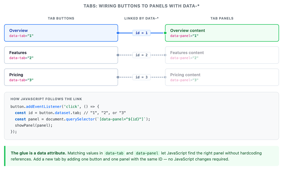
To make the tabs interactive, JavaScript must update both the selected button and the visible panel. When a user clicks a tab, the interface needs to reset the previous state and apply a new one so only the selected content is visible.
EXAMPLE
The CSS and JavaScript that make the tab structure functional:.tab-button.active {
background-color: #fff;border-bottom: 2px solid #007bff;}
.tab-panel {
display: none;}
.tab-panel.active {
display: block;}
In this code:const btnHTML = document.querySelector('[data-tab="html"]');
const btnCSS = document.querySelector('[data-tab="css"]');
const btnJS = document.querySelector('[data-tab="js"]');
const panelHTML = document.getElementById('html');
const panelCSS = document.getElementById('css');
const panelJS = document.getElementById('js');
function clearTabs() {
btnHTML.classList.remove('active');btnCSS.classList.remove('active');btnJS.classList.remove('active');
panelHTML.classList.remove('active');panelCSS.classList.remove('active');panelJS.classList.remove('active');}
btnHTML.addEventListener('click', function() {
clearTabs();btnHTML.classList.add('active');panelHTML.classList.add('active');});
btnCSS.addEventListener('click', function() {
clearTabs();btnCSS.classList.add('active');panelCSS.classList.add('active');});
btnJS.addEventListener('click', function() {
clearTabs();btnJS.classList.add('active');panelJS.classList.add('active');});
data-tab attribute. clearTabs() function removes the active class from all buttons and panels. clearTabs() to reset the interface. active class.This pattern ensures that only one tab is active at a time. Resetting all elements before activating the selected ones keeps the interface predictable and prevents multiple panels from appearing at once.
tabs.html in your Codespace and add the following starter HTML:
<!DOCTYPE html><html lang="en"><head>
<meta charset="UTF-8"> <title>Tabs Example</title> <style> .tab-button.active { background-color: #fff; border-bottom: 2px solid #007bff; } .tab-panel { display: none; } .tab-panel.active { display: block; } </style> </head><body>
<h1>Tabs Example</h1> <div class="tabs"> <div class="tab-list"> <button class="tab-button active" data-tab="html">HTML</button> <button class="tab-button" data-tab="css">CSS</button> <button class="tab-button" data-tab="js">JavaScript</button> </div> <div class="tab-panels"> <div class="tab-panel active" id="html"> <p>HTML provides structure.</p> </div> <div class="tab-panel" id="css"> <p>CSS controls appearance.</p> </div> <div class="tab-panel" id="js"> <p>JavaScript adds behavior.</p> </div> </div> </div> <script src="tabs.js" defer></script>
</body></html>
tabs.js in the same folder.
index.html file and add a link so that you can access this page:
index.html, and click the link to open your tabs page.
tabs.html in your Codespace, or create a new file and add the starter HTML provided above.
index.html file and add a link so that you can access your tabs page in the browser:
index.html, and click the link to open your tabs page.
tabs.js and link it in your HTML using the following:
tabs.js in your Codespace.
data-tab attribute. document.getElementById(). clearTabs() that removes the active class from all buttons and panels. clearTabs(). active class to the clicked button. active class to the matching panel. After building interactive components like toggles, accordions, and tabs, it is important to organize your code so that it is easy to maintain and reuse. Reusable components follow consistent patterns that separate responsibilities and ensure they work in different environments.
One key principle is separation of concerns, which means keeping structure (HTML), presentation (CSS), and behavior (JavaScript) in their appropriate roles. In practice, JavaScript should control when something changes, while CSS controls how it looks.
EXAMPLE
The same toggle written with poor separation and good separation:In this code:// Poor separation -- JavaScript controls styles directly
button.addEventListener('click', function() {
panel.style.display = 'block';panel.style.backgroundColor = '#f5f5f5';panel.style.padding = '20px';});
// Good separation -- JavaScript only manages classes
button.addEventListener('click', function() {
panel.classList.add('visible');});
Another important principle is progressive enhancement, which ensures that content remains usable even if JavaScript is not available. Instead of relying entirely on scripts, you start with a functional HTML structure and then add interactivity.
Progressive enhancement builds functionality in layers, starting with a basic experience and adding more features as support becomes available.
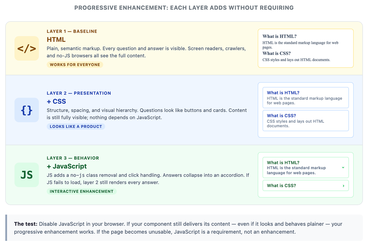
Each layer builds on the previous one, ensuring that content remains accessible even if styling or JavaScript is unavailable.
EXAMPLE
An accordion can display all content by default and only hide panels when JavaScript is available:In this code:<html class="no-js">
<head>
<style>
/* Content visible when JavaScript is unavailable */.no-js .accordion-content {
max-height: none;}
/* Content collapsed when JavaScript is available */.accordion-content {
max-height: 0;overflow: hidden;}</style></head>
<body>
<script>
// Remove no-js class as soon as the script runsdocument.documentElement.classList.remove('no-js');</script><!-- Accordion HTML here --></body>
</html>
<html> element starts with a no-js class, so the page assumes JavaScript is unavailable. no-js class immediately before the rest of the page renders. no-js to decide whether content is visible or collapsed.Source: THIS TUTORIAL WAS AUTHORED BY SOPHIA LEARNING. PLEASE SEE OUR TERMS OF USE.
REFERENCES
Mozilla Developer Network. (n.d.). How the web works. developer.mozilla.org/en-US/docs/Learn/Getting_started_with_the_web/How_the_Web_works