Table of Contents |
This section will demonstrate the creation of a well-organized webpage using common HTML elements and structures. We will use the following process:
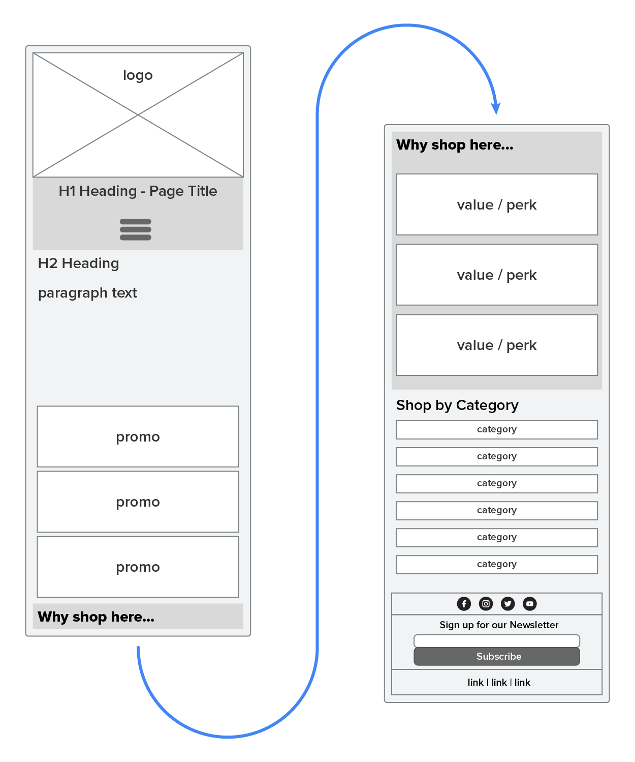
NOTE: The following wireframe diagram represents one continuous homepage wireframe.
Next, we can take the wireframes and overlay our semantic tag sections on top of the image, as demonstrated in the following diagram.
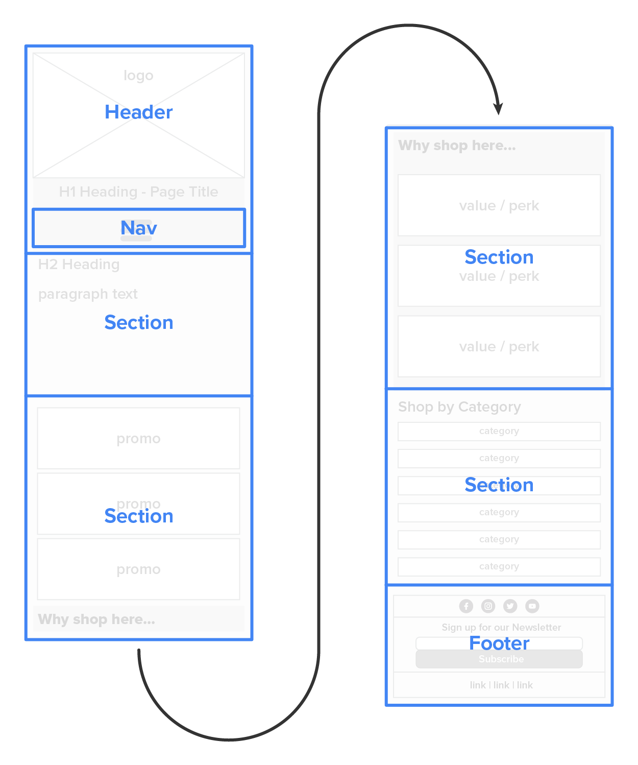
This will give us a good starting point for structuring the HTML code for our page. We can then further structure the internal elements of each semantic area using our wireframe as a guide, as well as keeping responsiveness in mind.
We want to structure the internal HTML so that it will work well with flexbox, grid-view, or any other responsive layout mechanism. We will be using flexbox in this example, and, as a result, groups of items that will need to change their orientation from stacked to side by side for larger screens will need a container around just those items. For example, look at the “Why shop here…” section. The title for the section needs to be left aligned regardless of the screen size. However, the value/perk blocks need to change their orientation, so they will need to have some sort of HTML container element, such as a division tag.
Before we begin, we need to add some elements to the head of the document, which will be added to all pages moving forward. We need to add the following to the head section of the document:
| Element | Definition | Code |
|---|---|---|
| Title | This defines the title of the page in the window or tab header. | <title>Good Harvest Bakery :: Homepage</title> |
| Metadata | This defines the character encoding and configures the viewport for responsive design. |
<meta charset="UTF-8"> <meta name="viewport" content="width=device-width, initial-scale=1"> |
| External Stylesheet | This defines the external stylesheet for the site. | <link rel="stylesheet" href="styles.css"> |
| Font Awesome | We will be using icons from Font Awesome for social media and the hamburger menu. |
<script src=" " crossorigin="anonymous"></script> " crossorigin="anonymous"></script>
|
These elements are going to be needed in the header of all pages on the site. The title text will be adjusted for each page, and the Font Awesome will need to point to your own Font Awesome kit. Remember that you will need to create a Font Awesome account and prepare your kit. With these elements in place, we can begin organizing the content in the body.
As you can see from the following diagram, only the value/perk elements need to flex.
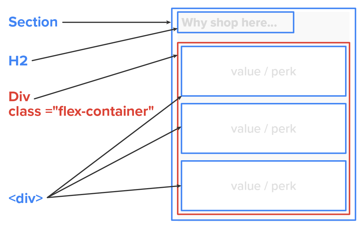
Instead of making the entire section element a flex-container, we surrounded only the value/perk elements with a new <div> and gave it a class attribute of “flex-container,” which we will use later to apply the CSS styling and make this an actual flex-container.
Let us take a quick look at the code for this section.
EXAMPLE
HTML code for flex-container
<section class="shop-here-section">
    <h2>Why shop here…</h2>
    <div class="flex-container">
        <div class="perk">value / perk</div>
        <div class="perk">value / perk</div>
        <div class="perk">value / perk</div>
    </div>
</section>
From here, writing the majority of the remaining code will be fairly straightforward, such as adding additional tags like heading tags, paragraph tags, and lists to help structure the content. Keep in mind that you will need to use some imagination, as the HTML code without CSS styling will not reflect the final look and design of the page. Instead, we focus more on the structure and mechanics of the content. Additionally, keep in mind the need to classify elements using class names, such as all flex-containers should use the “flex-container” class value for items that will share the same or similar CSS styles. Additionally, identify elements that will need unique id values in order to properly apply CSS styling to those unique elements. Other content to include may be “lorem ipsum” or written copy if you have it available.
Source: This Tutorial has been adapted from "The Missing Link: An Introduction to Web Development and Programming " by Michael Mendez. Access for free at https://open.umn.edu/opentextbooks/textbooks/the-missing-link-an-introduction-to-web-development-and-programming. License: Creative Commons attribution: CC BY-NC-SA