Table of Contents |
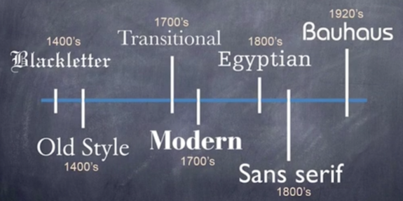
The Old Style type class was developed in the 1400s when scribes used quills to create letter forms. As a result, the relation to calligraphy is apparent in the moderate contrast between thick and thin strokes, the slanted serifs on the lowercase letters, and the diagonal stress that's visible if you draw a line through the thinnest part of the letters.
If you look closely at the image below, you'll also notice that the serifs are bracketed, which is to say that they have a curved or wedge-like connection between the stem and the actual serif.
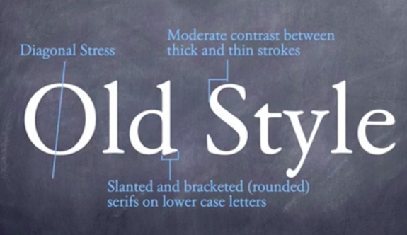
Old Style is considered best for large bodies of text. Therefore, you'll find it used heavily in magazines, books, newspapers, etc. Garamond and Caslon are two examples of typefaces in this classification.
Garamond was originally designed by Claude Garamond in the 1540s; the typeface was revisited in 1975 by Tony Stan, with revisions that were associated with the International Typeface Corporation, or ITC.
The revisions included an increase in x-height, wider weight, and slightly more condensed width. In 1984, Apple added its own variant, opting for narrower and taller x-height.
Thus, there have been very minor, subtle refinements made to suit different purposes.
The blackletter class is a script style of calligraphy popular from the 1400s throughout the 1900s. It was popularized in Germany and used in Europe through the Renaissance.
Most people think of this classification as Medieval or Gothic, relating to Old English lettering. You'll often see this type class with ornate capitals, like the letter B below, as well as with almost diamond-shaped serifs and thick and thin lines.
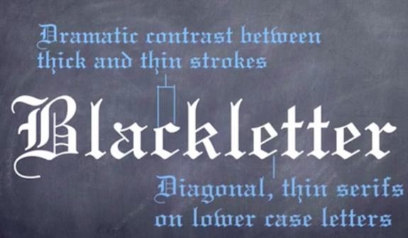
Note the overall weight and the contrast between thick and thin strokes, with the very thin serifs in the lowercase letters. Because this type classification is difficult to read in large bodies of text, it's typically best suited for headings, logos, posters, signs, and, of course, certificates and diplomas. Member type families include Fraktur and Rotunda.
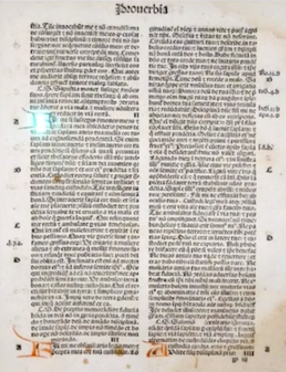
Here is an example of a Bible page written in blackletter.
Transitional type is named for its intermediate position bridging the gap between Old Style and what is considered modern..
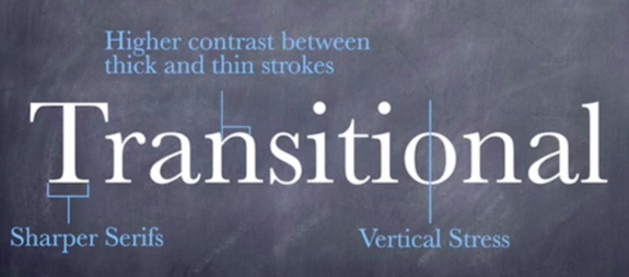
As you can see in the image above, distinguishing features of this class include wider characters and more vertical stress, sharper serifs, and slightly higher contrast between strokes.
Members of this type class have a more accentuated contrast and flatter serifs, which will be even more pronounced in the modern type class. Baskerville and Bookman are members of the transitional classification.
The modern classification was a radical shift from the traditional typography that we've seen up until this point in time.
It was developed in the late 18th to early 19th century, and the change reflected cultural influences and advances in technology.
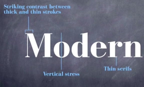
As you can see in the image above, members of this classification have a striking appearance with their very bold contrast between thick and thin strokes, the vertical stress, and the very thin serifs.
As striking as this classification may be, it's not very suitable for extensive text work like books or magazines. Member type families include Bodoni and Didot.
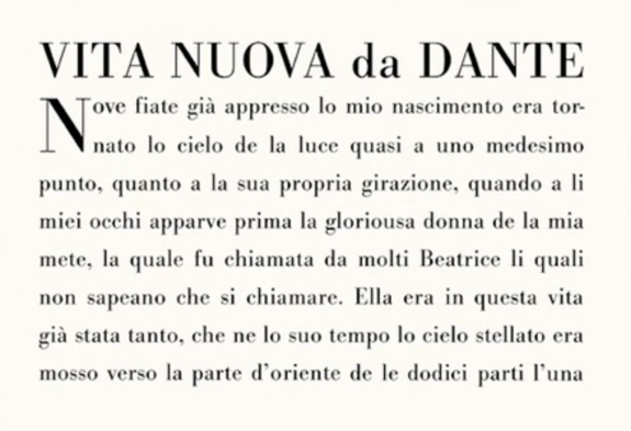
Here is an example of the modern typeface in Dante's La Vita Nuova.
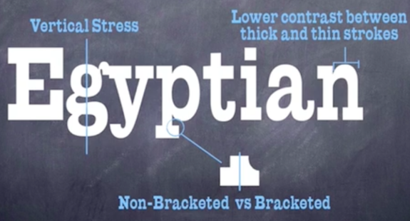
As time progressed in the early 1800s, there was a greater need for typefaces to be used for advertising. Boosting visibility thus became a focus, which is indicated in the vertical stress, thick horizontal non-bracketed serifs, and lower contrast between strokes that created a clearer, darker appearance.
This led to the Egyptian type. As you can see in the image below, type families in this class are a lot bolder in appearance. Make note again of the bracketed versus non-bracketed serifs.
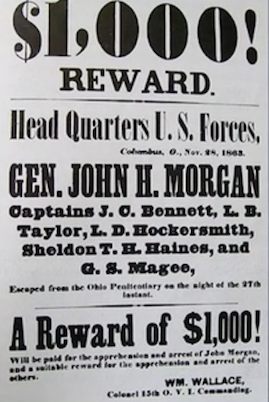
You may also recognize the Egyptian type in this poster.
Sans-serif is a typeface without serifs that was also developed in the early 1800s. Sans, meaning "without" in French, is a simple distinction for this classification.
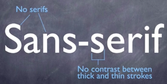
As seen in the image above, the sans-serif class is almost always mono-weight, which is another way of saying it has no stress due to a lack of transitions between thick and thin strokes; there is an even distribution of weight.
Although this classification was developed before the age of computers, it remains one of the most legible on computer monitors, so it's fairly popular as a result.
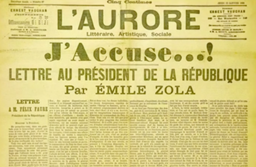
Here is a Dutch newspaper showing sans-serif type in practice.
This style was later popularized by the Bauhaus movement, which emerged from a time of great traumatic change between two world wars.
An academy of art called Bauhaus, promoting modernism, was established in the 1920s. It had a profound influence on 20th century design, as the movement emphasized the functional aspects of design.

As you can see in the image above, Bauhaus is characterized by the use of simple, geometric shapes, sans-serif type, and lack of adornment. Member type families in this class often use modest curves and mirrored aesthetics, no contrast between strokes, no serifs, and very simplistic designs altogether.
Type families in the Bauhaus class retain their progressive design today, and are very visible in advertising, publications, branding, and digital media.
Source: SOURCE: THIS WORK IS ADAPTED FROM SOPHIA AUTHOR MARIO E. HERNANDEZ