In this lesson, you will explore how to apply histograms, frequency polygons, and cumulative distributions to aid in finding insights from data. Specifically, this lesson will cover:
1. Interpreting Histograms, Frequency Polygons, and Cumulative Distributions
Interpreting histograms, frequency polygons, and cumulative distributions is crucial for analyzing data in business analytics. These graphical representations help us visualize data distributions, identify patterns, and make informed decisions. Let’s dive into each of these concepts in detail.
1a. Histograms
A histogram is a graphical representation of the distribution of a quantitative variable. It is like a bar chart but represents continuous data. Histograms are used to show the frequency of data points within specified intervals, called bins.
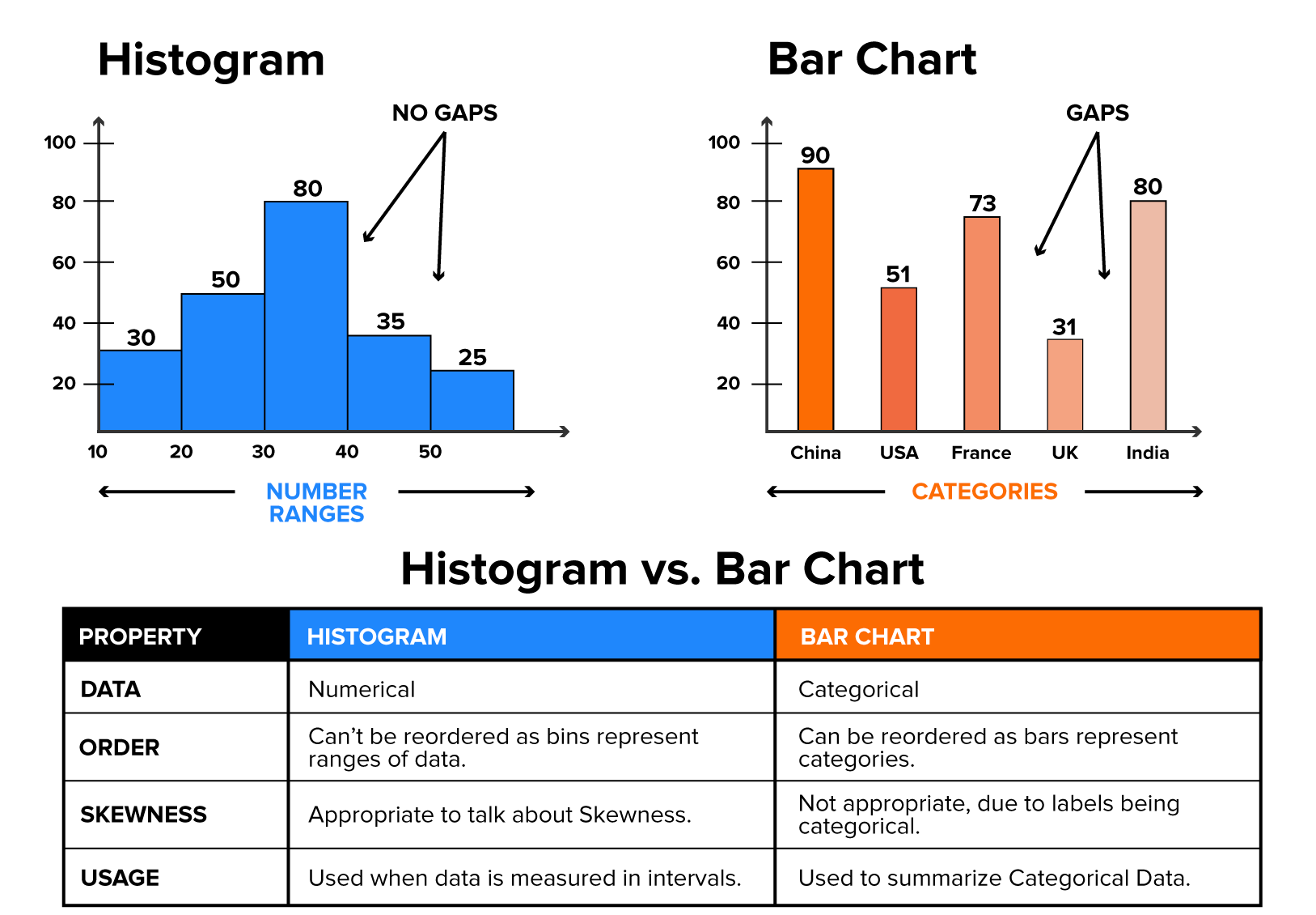
In histograms, the bars touch each other, whereas in bar charts, the bars do not touch each other. The bars in a histogram touch each other because the data is continuous, meaning there are no gaps between the intervals (bins). Each bar represents a range of values, and the touching bars indicate that the ranges are adjacent and continuous. The bars in a bar chart do not touch because the data is categorical, meaning each bar represents a distinct category. The gaps between the bars emphasize that the categories are separate and not part of a continuous range.
To remind you of the basic ideas of a histogram, below is a summary of what you learned about in a previous tutorial:
Key Components of a Histogram:
-
Bins: These are the ranges into which the data is divided. Each bin has a specific width.
-
Frequency: The height of each bar represents the number of data points within that bin.
Steps to Create a Histogram:
-
Collect Data: Gather the quantitative data you want to analyze. If in Excel, have one column that contains the quantitative variable.
-
Determine the Number of Bins: Decide how many bins to use. Too few bins can oversimplify the data, while too many bins can overcomplicate it. In a previous tutorial, specific guidelines were provided for how to determine the number of bins.
-
Calculate Bin Width: Divide the range of the data by the number of bins.
-
Count Frequencies: Count the number of data points that fall into each bin.
-
Construct the Histogram: Plot the bins on the x-axis and the frequencies on the y-axis.
Interpreting Histograms:
-
Shape: Look at the overall shape of the histogram. Common shapes include:
-
Symmetrical: The left and right sides are mirror images.
-
Skewed Right (Positive Skew): The tail is on the right side.
-
Skewed Left (Negative Skew): The tail is on the left side.
Now that we have reviewed the key elements of a histogram, let's see how we can use a histogram in a real-world scenario to assist in business decision-making.
-
EXAMPLE
A local bank has been receiving complaints about long wait times. The bank manager, Lucia, has decided to analyze the wait times to improve customer satisfaction. Lucia collects data on the wait times of 200 customers over a month. The wait times are recorded in minutes. Lucia organizes the wait times into intervals (bins), such as 0–2 minutes, 2–4 minutes, 4–6 minutes, etc. She creates a histogram to visualize the frequency of wait times within each interval, as shown below.
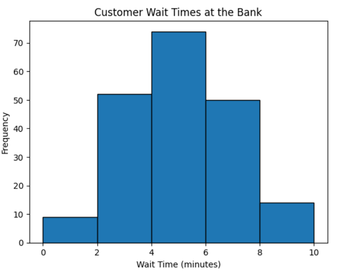
The histogram shows that most customers wait between 4–6 minutes, with a significant number waiting even longer. The bank has an internal goal set that it does not want to have customers waiting more than five minutes. So, using the information from the histogram, Lucia decides to implement a new queue management system to streamline the process and reduce wait times.
-
A digital marketing agency wants to analyze the engagement levels of their latest social media campaign across different platforms. They collect data on the number of likes, comments, and shares for 200 posts across Instagram, TikTok, and Twitter. Below is a histogram that the marketing department created. The data includes the total engagement (likes + comments + shares) for each post. The engagement data is organized into intervals (bins), such as 0–100, 100–200, 200–300, etc. The histogram is shown below.
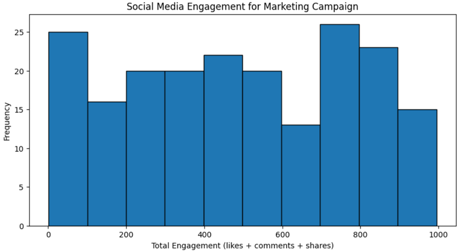
The marketing department needs your assistance in interpreting the histogram. They ask you the following questions.
1b. Frequency Polygons
A frequency polygon is a line graph that represents the frequencies of data points within different intervals. It is like a histogram but uses points connected by straight lines instead of bars.
The components of a frequency polygon are described below.
Key Components of a Frequency Polygon:
-
Midpoints: The midpoints of the bins used in the histogram.
-
Frequencies: The number of data points within each bin.
Steps to Create a Frequency Polygon:
-
Create a Histogram: Start by creating a histogram of the data.
-
Calculate Midpoints: Find the midpoint of each bin.
-
Plot Points: Plot the midpoints on the x-axis and the corresponding frequencies on the y-axis.
-
Connect Points: Connect the points with straight lines.
Interpreting Frequency Polygons:
-
Shape: Like histograms, look at the overall shape of the frequency polygon.
-
Trends: Frequency polygons make it easier to see trends and patterns over intervals.
Below is an example of a frequency polygon for the number of products sold for a particular product. The frequency polygon has been overlaid on the outline of the histogram so you can compare the two different visuals and understand how they visually represent the data in two different ways.
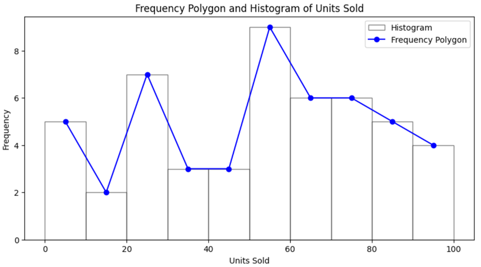
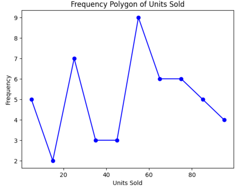
You do not include the outline of the histogram in a frequency polygon. The final frequency polygon for the product data would look like the following:
-
Why would you use a frequency polygon instead of a histogram?
Choosing between a frequency polygon and a histogram depends on the specific needs of your data analysis and visualization goals. Frequency polygons are particularly useful when you need to compare multiple data distributions on the same graph. The lines can overlap without cluttering the visualization, making it easier to see differences and similarities between distributions.
The continuous line of a frequency polygon provides a smoother representation of the data, which can help in identifying trends and patterns more clearly than the discrete bars of a histogram. Frequency polygons can make it easier to highlight trends over time or across different categories, as the lines naturally guide the eye along the data points.
The table below provides guidance on when to use a histogram versus a frequency polygon.
|
Visualization Type
|
When to Use
|
|
Histogram
|
- Clear and straightforward visualization of a single data distribution
- Large data set with a frequency of data points within specific intervals
- Interest in exact frequency counts within each interval
|
|
Frequency polygon
|
- Comparing multiple distributions on the same graph
- Smoother, less cluttered representation of the data
- Highlighting trends and patterns more effectively
|
-
EXAMPLE
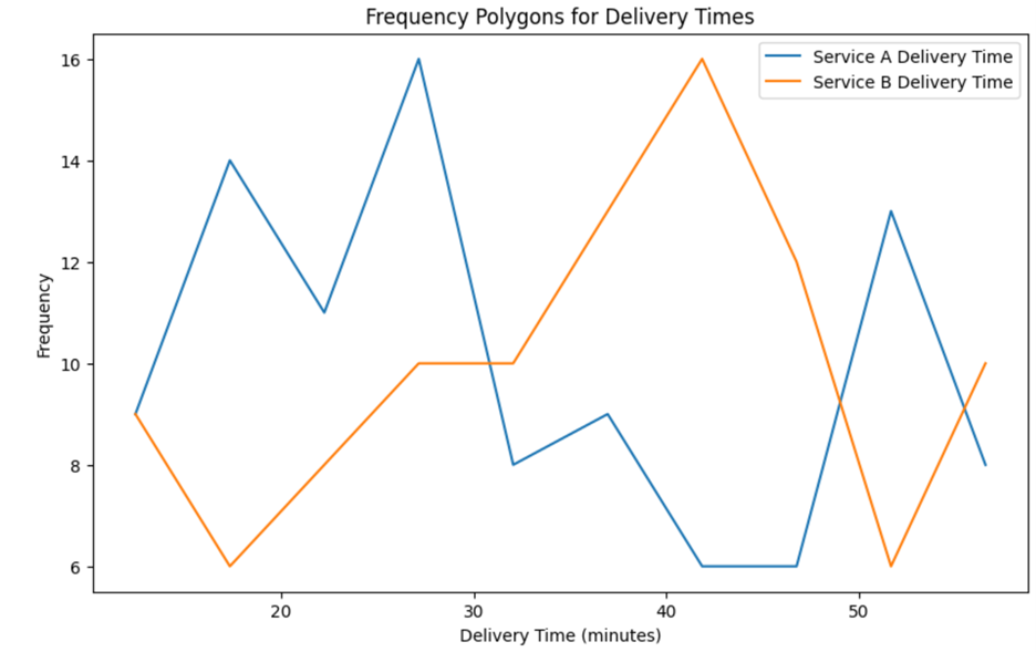
Suppose you are analyzing delivery times for two different services over a year. Using a frequency polygon allows you to overlay the distributions of delivery times for both services on the same graph, making it easier to compare their performance and identify any significant differences. The frequency polygon for this scenario is shown below.
-
- Frequency Polygon
- Type of line graph that is like a histogram but uses points connected by straight lines instead of bars to represent the distribution of data.
1c. Cumulative Frequency Distribution
A cumulative distribution (or cumulative frequency distribution) shows the cumulative frequency of data points up to a certain value. It helps us understand the proportion of data points that fall below a specific value.
One of the most popular types of cumulative distributions to visualize is a cumulative histogram. A cumulative histogram uses a cumulative frequency distribution for its construction.
Key Components of a Cumulative Distribution:
-
Cumulative Frequency: The cumulative total of frequencies up to each bin.
-
Cumulative Percentage: The cumulative frequency expressed as a percentage of the total number of data points.
Steps to Create a Cumulative Distribution:
-
Create a Histogram: Start with a histogram of the data.
-
Calculate Cumulative Frequencies: Add the frequencies of each bin to the sum of the previous bins.
-
Plot the Cumulative Frequencies: Plot the cumulative frequencies on the y-axis against the bin values on the x-axis.
Interpreting Cumulative Distributions:
-
Growth: Observe how the cumulative frequency increases.
-
EXAMPLE
Imagine you are a data analyst for a popular online clothing store that targets young adults. The store has been tracking its monthly sales data for a new line of eco-friendly clothing. The goal is to understand sales trends and make data-driven decisions to improve marketing strategies and inventory management.
To analyze the sales data, you create a cumulative frequency distribution for each month’s sales. This graph will help visualize how sales have accumulated over the year and identify key trends.
The cumulative frequency distribution is below.
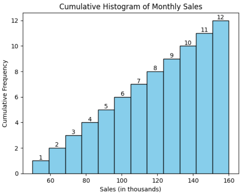
This cumulative frequency histogram can provide the retailer with several business insights, such as:
-
Overall Growth: The upward trend in the cumulative histogram indicates that sales are consistently increasing month over month. The graph suggests a positive growth trend for the eco-friendly clothing line.
-
Sales Milestones: By looking at the cumulative frequency, you can identify key milestones. For example, you can see that in April (month 4), the store reached 50% of its total annual sales, which helps in understanding the pace of growth.
-
Inventory Planning: Understanding the cumulative sales helps in planning inventory. If certain months show higher cumulative sales, the store can prepare by stocking more inventory in anticipation of increased demand.
-
Marketing Effectiveness: The cumulative frequency distribution can also help assess the effectiveness of marketing strategies. If a particular campaign led to a noticeable increase in cumulative sales in one month, this might indicate that the campaign was successful.
-
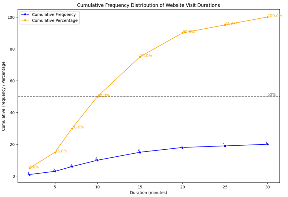
VizAcademy is a company that provides educational resources to individuals who want to learn more about data visualization methods and techniques. The company wants to analyze the time spent on its website. The cumulative distribution of the number of minutes visitors have spent on a website is represented in both frequency and percentage form using the cumulative frequency polygon below.
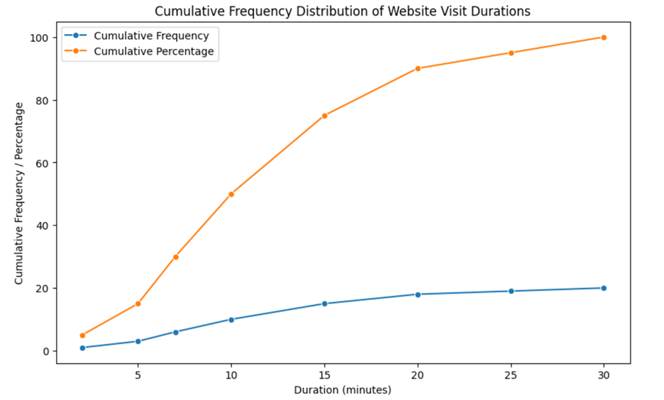
Using the cumulative frequency polygon, answer the following questions:
What is the total number of website visits recorded in the data set?
To determine the total number of website visits recorded in the data set, you can look at the highest value on the cumulative frequency line. From the cumulative frequency polygon provided, it appears that the cumulative frequency reaches its maximum at around 20 visits.
At what duration do 50% of the website visits fall below?
To determine the duration at which 50% of the website visits fall below, you need to look at where the cumulative percentage line crosses the 50% mark on the y-axis.
From the cumulative frequency polygon provided, it appears that the 50% mark is crossed at around 10 minutes. This means that half of the website visits lasted less than or equal to 10 minutes.
In this lesson, you explored how to interpret histograms, frequency polygons, and cumulative distributions within real-world business analytics applications. You learned how these visualizations provide valuable insights into data distributions, trends, and patterns, enabling informed decision-making. By analyzing histograms, you can assess data distribution and identify key frequencies. Frequency polygons offer a clearer way to compare multiple data sets, while cumulative distributions help track cumulative trends over time. Understanding these visualizations equips you with essential tools for analyzing business data and deriving actionable insights.