Table of Contents |
HTML provides six levels of headings, from <h1> through <h6>. These elements do more than display text in different sizes—they establish the organizational structure of your web page. When you use headings correctly, you create a road map that helps both humans and machines understand your content.
HTML provides six heading levels, from <h1> through <h6>. These headings create a hierarchy that shows how content is organized, similar to the outline of a paper or the table of contents in a book.
<h1> identifies the main topic of the page. <h2> identifies major sections under the main topic. <h3> identifies subsections within an <h2>. <h4>, <h5>, and <h6> continue this pattern for increasingly specific subtopics. 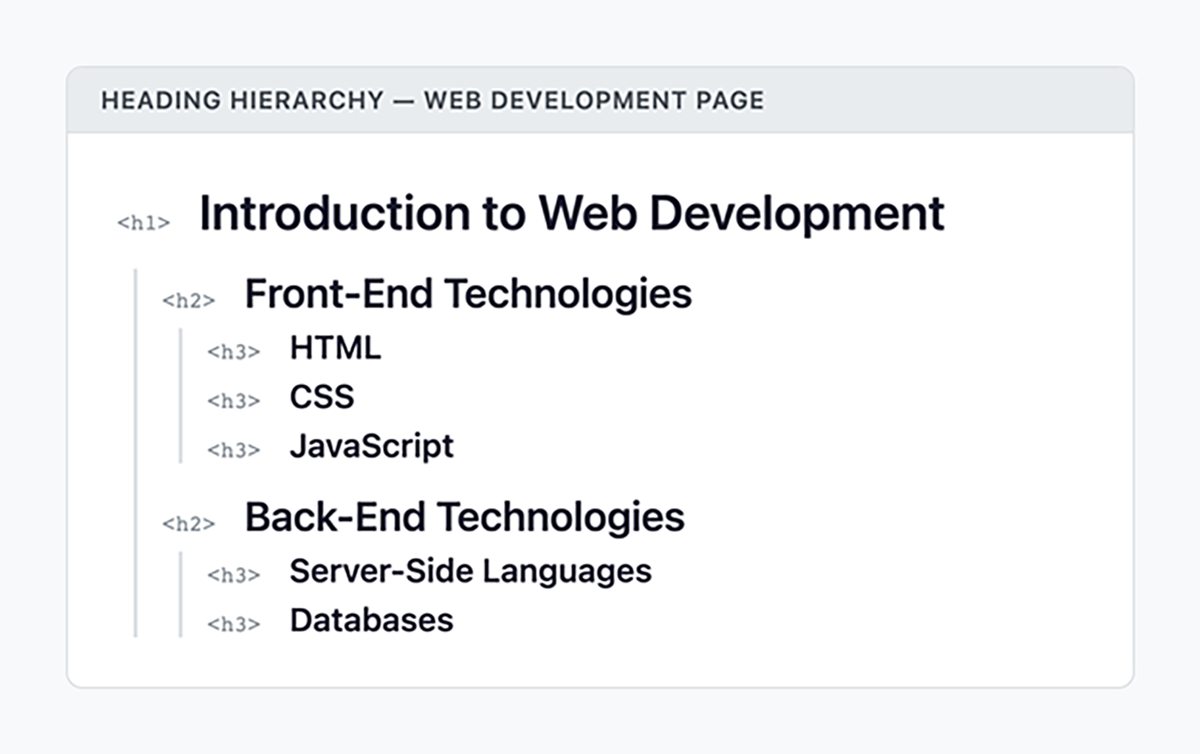
Each heading level introduces content that falls under the scope of the heading above it. For example, an <h3> is always a subsection of the nearest preceding <h2>.
EXAMPLE
Here is a heading structure for a page about web development:In this code, “Front-End Technologies” and “Back-End Technologies” are major sections (h2) under the main topic. “HTML,” “CSS,” and “JavaScript” are subtopics (h3) within the front-end section.<h1>Introduction to Web Development</h1>
<h2>Front-End Technologies</h2>
<h3>HTML</h3><h3>CSS</h3><h3>JavaScript</h3>
<h2>Back-End Technologies</h2>
<h3>Server-Side Languages</h3><h3>Databases</h3>
By default, browsers display <h1> as the largest heading and <h6> as the smallest. However, visual appearance should never determine which heading level you use. Choose heading levels based on the logical structure of your content.
When you view your headings in sequence, they should form a coherent outline of your page. This document outline reveals the logical organization of your content at a glance.
<h1>Classic Chocolate Chip Cookies</h1>
<h2>Ingredients</h2>
<h3>Dry Ingredients</h3><h3>Wet Ingredients</h3>
<h2>Instructions</h2>
<h3>Preparing the Dough</h3><h3>Baking</h3>
<h2>Tips for Perfect Cookies</h2>
The same structure displayed visually would look like this:
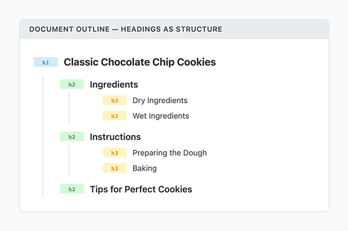
If you list only the headings from a page, they should form a clear outline of what the page covers. This outline helps both search engines and assistive technologies understand how your content is organized. It also allows users to quickly scan the structure and move to the sections they need.
Now that you understand how heading levels create structure, you can apply specific rules to ensure your page remains clear and accessible. Proper heading usage is not just about organization—it directly affects how users interpret and navigate your content.
Two simple rules guide effective heading structure: use one <h1> per page and maintain sequential heading order.
Every web page should include exactly one <h1> element. This heading identifies the main topic of the page.
Using more than one <h1> can blur the page’s focus by suggesting multiple primary topics. A single <h1> clearly signals what the page is about.
EXAMPLE
In this code, the<main>
<article>
<h1>Understanding CSS Grid Layout</h1><h2>What Is CSS Grid?</h2><p>CSS Grid is a two-dimensional layout system...</p><h2>Basic Grid Concepts</h2><h3>Grid Container</h3><p>The grid container is the parent element...</p></article></main>
<h1> identifies the overall topic, and the lower-level headings divide the content into logical sections.
On a homepage, the site name might serve as the <h1>. On content pages, the specific article or page title should be the <h1>. Repeated elements such as navigation or branding should not compete for that primary heading level.
<main> element contains the primary content of a page. The <h1> typically appears within or near <main> because it describes that primary content.
Heading levels must follow sequential order, meaning they move one step at a time when becoming more specific. After an <h1>, use an <h2> for major sections. After an <h2>, use an <h3> for subsections, and so on.
Do not skip levels when descending the hierarchy.
EXAMPLE
This heading structure is incorrect because it skips from h1 to h3:<This corrected version maintains proper sequential order:!-- INCORRECT: Skips h2 -->
<h1>My Portfolio</h1>
<h3>Web Projects</h3>
<h3>Design Projects</h3>
<!-- CORRECT: Sequential order -->
<h1>My Portfolio</h1>
<h2>Web Projects</h2>
<h3>E-commerce Site</h3>
<h3>Blog Platform</h3>
<h2>Design Projects</h2>
<h3>Logo Design</h3>
<h3>Brand Identity</h3>
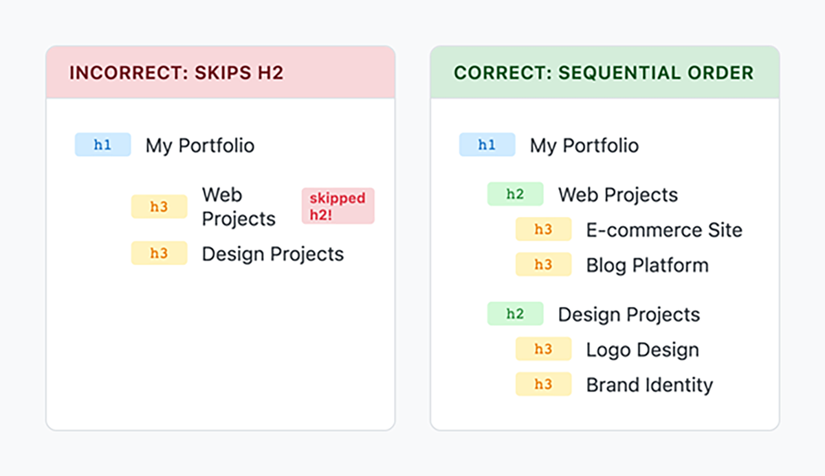
<h1> to <h3> suggests missing content. The user might think their screen reader failed to announce the <h2>. Maintaining sequential order ensures a predictable, navigable structure.
index.html file in Codespaces.
<h1> element. Headings do more than organize content visually. They create a structured pathway that allows users to understand and navigate a page efficiently. While earlier sections focused on logical hierarchy, this section explains how proper heading structure directly supports accessibility.
When headings are used correctly, they provide meaningful structure not only for sighted users but also for users who rely on assistive technologies.
Screen reader users commonly navigate web pages by moving from heading to heading. Instead of reading every paragraph, they can jump directly to major sections and subsections.
When headings follow a clear heading hierarchy, users can:
<article>, <section>, <aside>, and <nav>. These elements work together with headings to create a clear document structure.
These elements belong to a group called sectioning elements. Sectioning elements define distinct parts of a web page and help create its structural outline. They group related content together and communicate the purpose of that content to both browsers and assistive technologies.
Each sectioning element should begin with a heading that clearly describes the content inside it. The heading acts as a label for that section. Without it, users navigating by headings may enter a section without understanding what it contains.
Headings and sectioning elements work together. The sectioning element defines the boundary of the content. The heading defines the topic of that content.
EXAMPLE
Here is how headings work within semantic sections:<main>
<h1>Accessible Web Design Principles</h1><section>
<h2>Perceivable Content</h2><p>Content must be presented in ways users can perceive...</p><h3>Text Alternatives</h3><p>Provide alt text for images...</p></section><section>
<h2>Operable Interfaces</h2><p>Users must be able to operate the interface...</p></section></main>
<aside>
<h2>Related Resources</h2>- <
!-- Resource links --></aside>
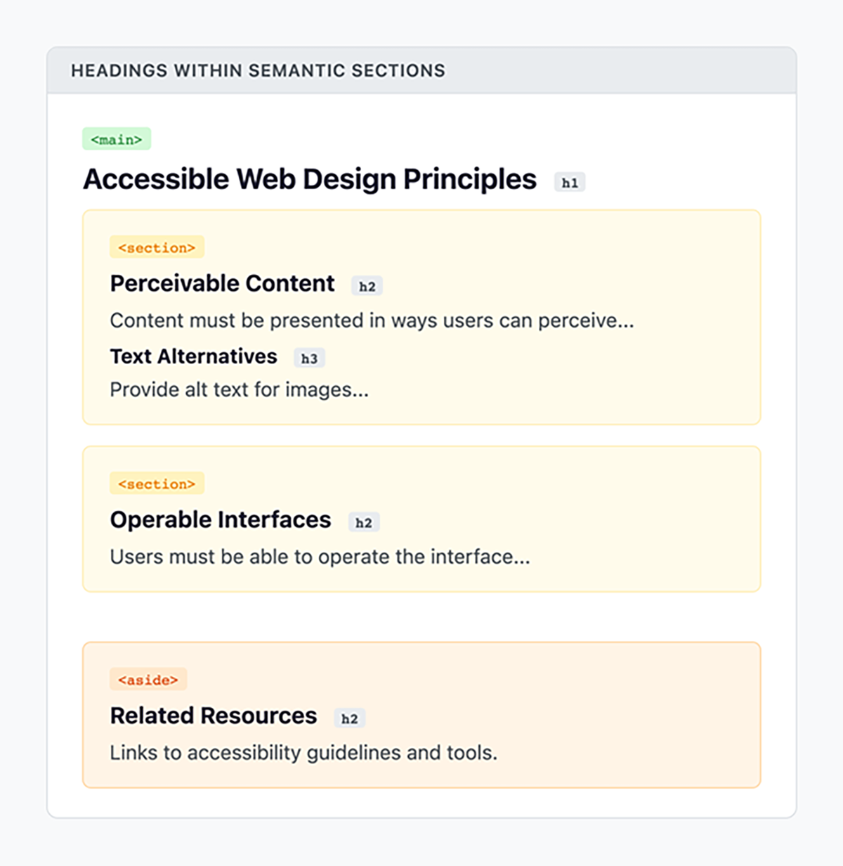
<h1> identifies the overall topic of the page. <section> begins with an <h2> that labels its main topic. <h3>. <aside> also includes a heading so users understand its purpose.You will typically have multiple <h2> and <h3> elements on a page. The recommendation to use only one <h1> applies to the overall page title.
<section>, <article>, <aside>, and <nav>.Even developers who understand heading hierarchy sometimes make mistakes. Learning to recognize common errors will help you create consistently well-structured pages.
The most common heading mistake is choosing a heading level based on how it looks rather than what it means. A developer might use an <h4> for a major section simply because they want smaller text.
EXAMPLE
This code uses headings incorrectly for styling purposes:<In this code, the heading levels skip important steps in the hierarchy. The structure of the page becomes unclear, especially for screen reader users.!-- INCORRECT: Heading levels chosen for appearance -->
<h1>Welcome to My Site</h1>
<h4>About Me</h4>
<h4>My Projects</h4>
<h6>Project One</h6>
<!-- CORRECT: Semantic heading structure -->
<h1>Welcome to My Site</h1>
<h2>About Me</h2>
<h2>My Projects</h2>
<h3>Project One</h3>
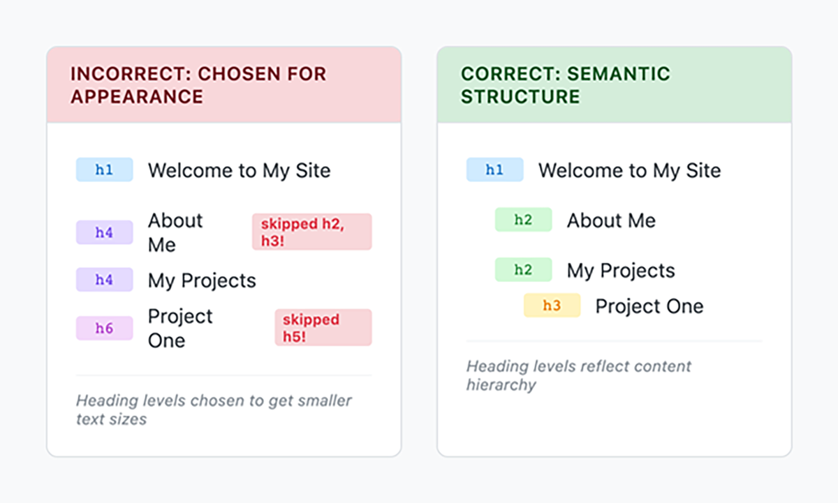
Remember this principle: Choose heading levels based on logical hierarchy, not visual appearance.
<h1> to <h4> or <h5>, pause and reconsider. Your content may need intermediate sections, or the heading level may simply be incorrect.
Another common mistake is using headings to make text stand out when it does not introduce a new section. Headings should label sections, not emphasize individual phrases.
Before publishing a web page, verify that your heading structure forms a clear and logical outline. Even small hierarchy mistakes can make navigation confusing for screen reader users.
After watching the video, validate the heading structure on your own page:
<h1> through <h6>. <h1>, or uses headings out of logical order, revise the structure and test again.
<h2>My Photography Portfolio</h2>
<h1>Welcome!</h1>
<h3>Landscape Photos</h3>
<h3>Portrait Photos</h3>
<h5>Studio Portraits</h5>
<h2>Contact Me</h2>
By regularly inspecting and validating your heading structure, you ensure that your page is not only visually organized but also accessible and logically structured for all users.
<h1> rule and maintaining sequential order to ensure logical organization. You explored how headings and accessibility, including navigating by headings and using headings within semantic sections, support screen reader users and improve overall usability. Finally, you identified common mistakes, practiced avoiding the use of headings for visual styling, and strengthened your skills in validating structure to create accessible, well-organized pages.
Source: THIS TUTORIAL WAS AUTHORED BY SOPHIA LEARNING. PLEASE SEE OUR TERMS OF USE.