Table of Contents |
Graphic literacy is important to understand scientific texts, as well as to comprehend the ideas behind graphical representations of information. Information in science is often represented visually because it can be a highly impactful and efficient way to communicate. It can save time because the viewer can grasp concepts more quickly, and it can show trends and distribution, making prediction easier.
Graphic literacy becomes very important when information has been presented in a biased manner. Being able to spot this helps the viewer take bias into account when trying to see science objectively.
EXAMPLE
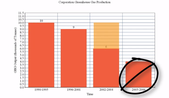
The graph below shows greenhouse gas emissions of a fictional company over time. Someone looking at this might interpret that the company's greenhouse gas emissions are decreasing over time. However, if you notice the time span sections at the bottom, they are not presenting regular intervals.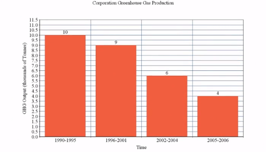
Let's break down the anatomy of what most graphs contain for a better understanding of what you might encounter. Below, the different parts on the bar graph from our earlier example have been labeled.
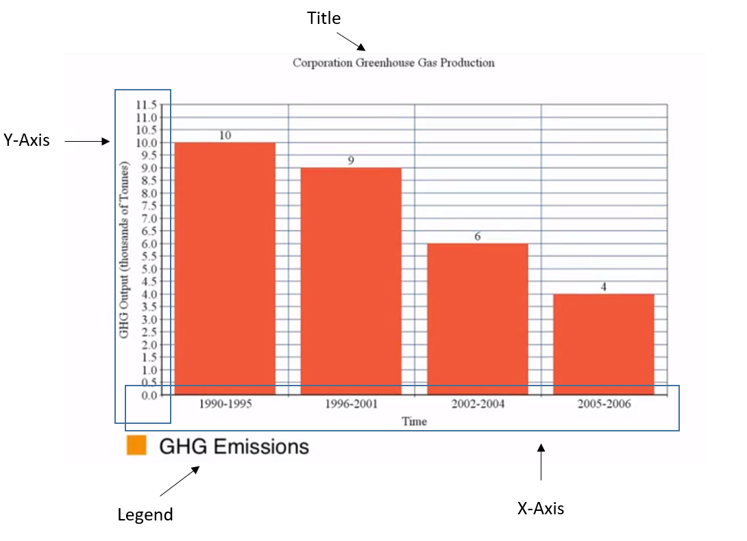
This graph doesn't have a footnote, but sometimes footnotes are placed at the bottom of a graph to provide additional explanation or interpretation of the graph. Finally, data is the information that the graph displays as a whole.
Let's discuss a few of the many different types of graphs that are used in environmental science.
| Type of Graph | Example |
|---|---|
|
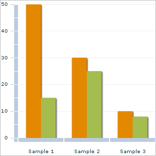
Bar graphs Bar graphs are used to show differences in quantifiable characteristics across groups. Common characteristics of bar graphs are x- and y-axes and data depicted using vertical or horizontal bars. |
|
|
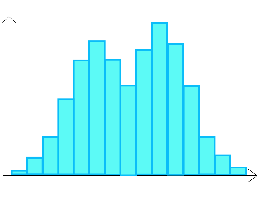
Histograms Histograms are used to show the frequency of various characteristics across groups. Like bar graphs, they commonly have x- and y-axes with data depicted using vertical or horizontal bars. |
|
|
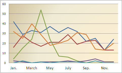
Line graphs Line graphs are used to show a trend in a characteristic relative to changes in time, space, concentration, or other variables. They commonly have x- and y-axes with data depicted as lines connecting data points. |
|
|
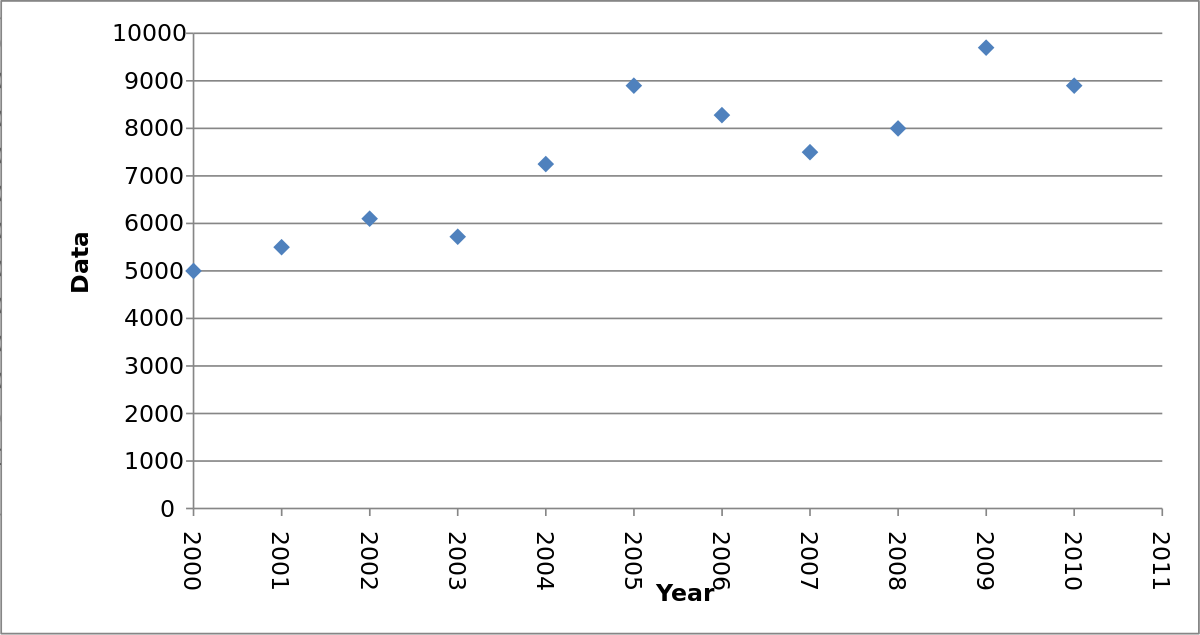
Scatter plots Scatter plots are used to show the relationship between two different characteristics. They commonly have x- and y-axes with data depicted using individual dots for each data point. |
|
|
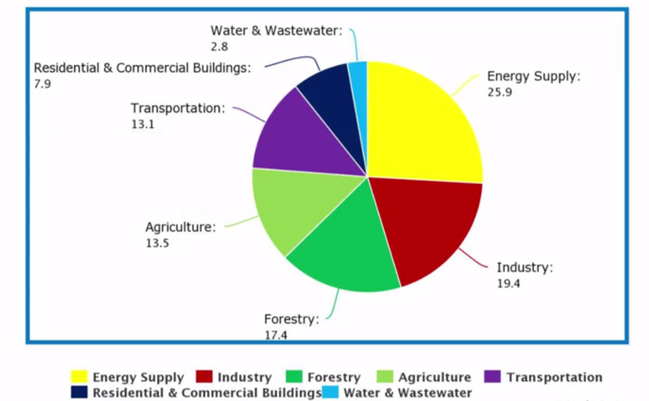
Pie charts Pie charts are useful for showing relative proportions of multiple characteristics or groups within a larger group. A pie chart typically has no axes but shows a circle with labeled subdivisions. |
|
|
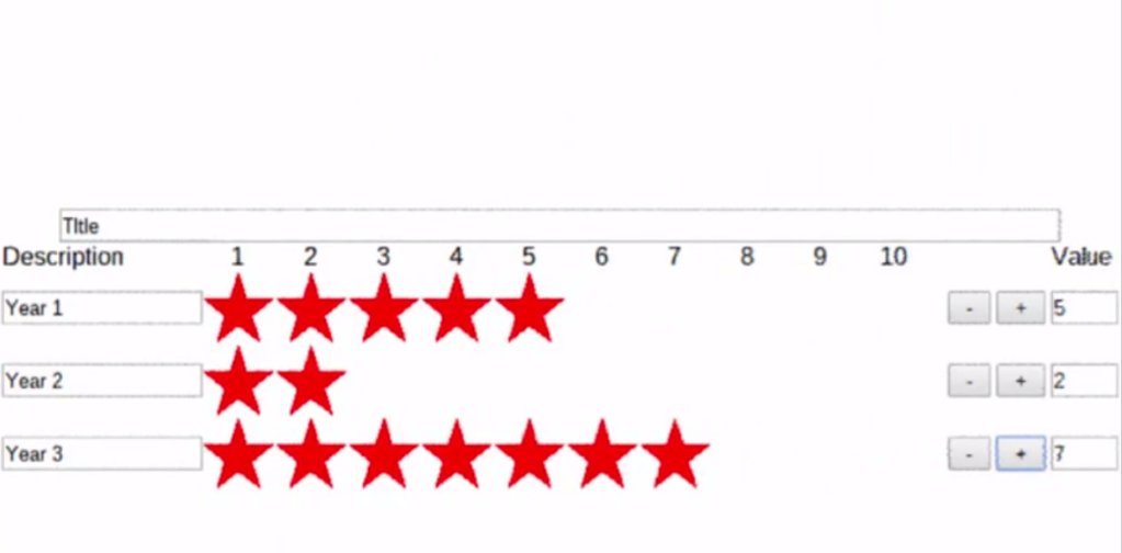
Pictographs A pictograph is like a bar graph or a histogram. It commonly uses images for values and may use the relative size of an image to represent various values for comparison. |
|
|
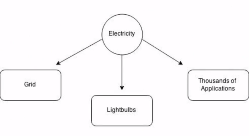
Flow diagrams Flow diagrams are used to show process, sequence, or flow and may be multidirectional or web-like. They commonly have no axes, but they use arrows to show the direction of the process by connecting images or text to represent steps. |
|
|
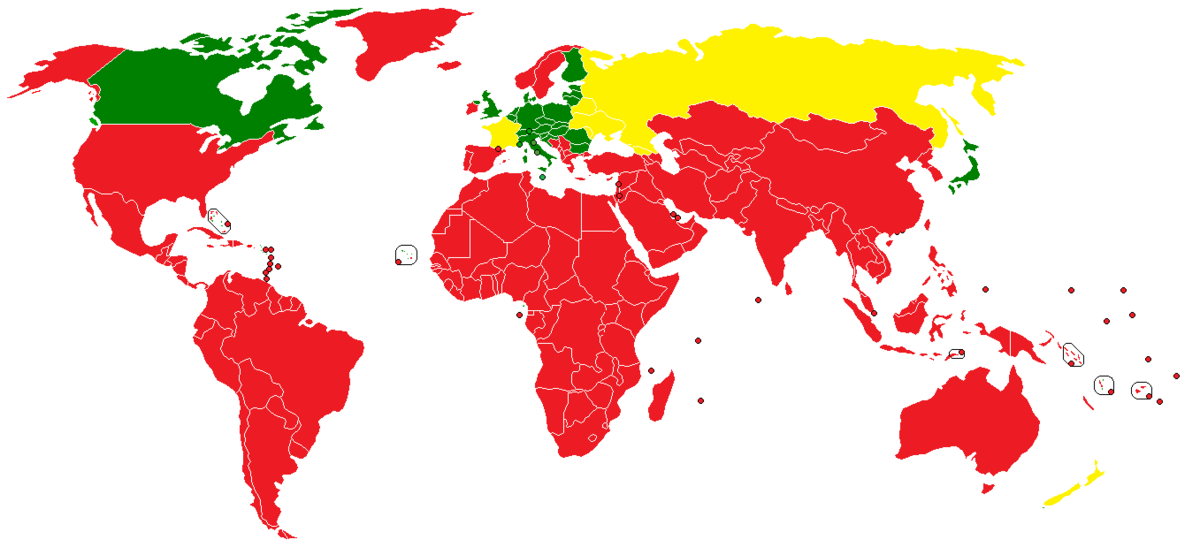
Maps Maps are used to depict differences in some characteristics or to show the location of various phenomena. They commonly show the map of a region with icons, lines, arrows, and/or coloration (as in the map shown here). |
|
Source: THIS TUTORIAL WAS AUTHORED BY JENSEN MORGAN FOR SOPHIA LEARNING. PLEASE SEE OUR TERMS OF USE.