Table of Contents |
Gestalt theory crosses over many disciplines. An important figure in the development of this theory is Max Wertheimer, a Czech psychologist and one of the founders of gestalt psychology.
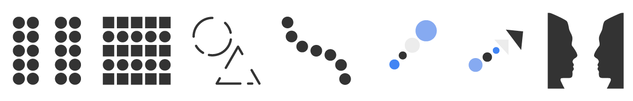
The meaning of the term “gestalt” is a unified whole. The theory has a set of gestalt principles that were first proposed by German psychologists based on the idea that the whole is greater than the sum of its parts. Gestalt theory is important in visual communications because it applies to the organization and perception of elements in groups. It also greatly impacts how a viewer perceives a design. Above are some examples of gestalt principles.
The law of proximity states that elements that are close to one another appear to form groups even if they have different characteristics.
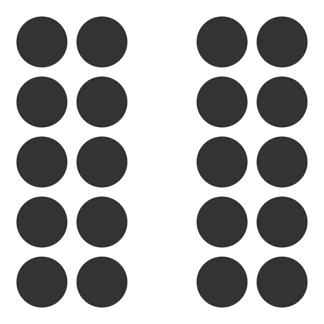
In the example above, shapes that are close together appear to belong in a group. Take note that the law of proximity dictates that elements that are near one another belong together, whereas elements that are further apart are separate from the group. The closer the elements are, the greater the implied connection becomes, with the strongest grouping demonstrated when elements touch, overlap, or intersect.
EXAMPLE
A man is walking down the street. A dog trots along next to him. Anyone watching the man and the dog walk down the street together will assume that the dog belongs to the man because of the law of proximity. The closer the dog and the man are, the stronger the association becomes to the viewer. If the man reaches down to pat the dog, carries the dog, or puts the dog on a leash, the assumed connection between the two becomes more defined because they are touching, or in the case of the leash, another element is connecting them together. Conversely, if the man is walking several yards ahead of the dog with no leash, the viewer will not be sure if the man and the dog belong together. In design terms, think about the layout of a newspaper. A news story will have a headline, an article, and images that belong together. The law of proximity requires that these elements are placed together for the reader to make the association that the headline and images belong to the same story.The law of similarity states that elements that share characteristics tend to be perceived as a group.
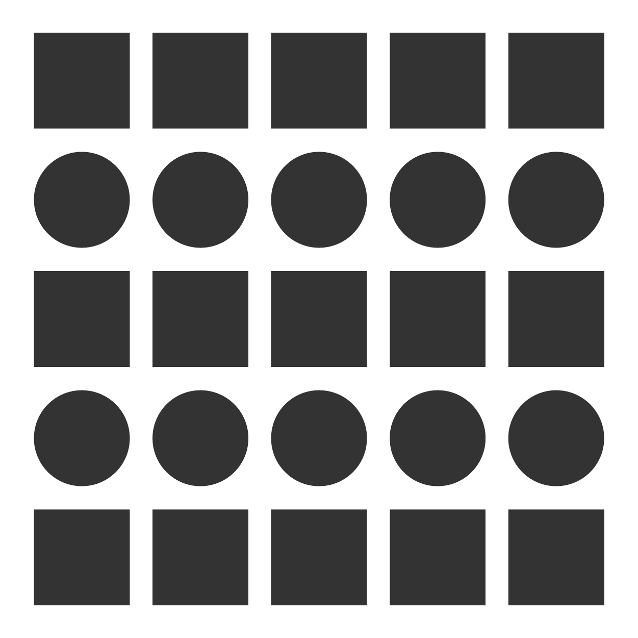
Elements that share similar characteristics like size, shape, color, texture, and orientation are recognized as belonging together. This is a result of the human brain’s need to group similar objects together to process information and avoid overstimulation. People are exposed to a constant stream of visual input, so much so that the brain filters out information and categorizes things that appear similar into groups to quickly process the information as it’s relayed from the eyes.
EXAMPLE
You’re shopping in a large store, and a child runs past you wearing a blue and white baseball uniform. Several minutes later you see a family with two boys wearing the same colors and ball caps. Later in the day, you go out for pizza and notice another family with children dressed in similar outfits. You assume that the children are all part of the same baseball team because they are wearing the same colors and style of clothing, even though you saw the children in different locations with different families, and at different times of the day. Uniforms apply the law of similarity to everyday life. We use them to identify sports teams, military personnel, law enforcement, first responders, and members of the workforce. This is done pervasively because the brain accepts that if things look like each other, they belong in the same group.The law of closure states that elements tend to be perceived as a completed whole if they are aligned, even if some information is missing.
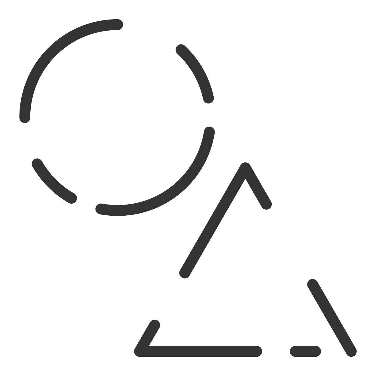
In the example above, elements are aligned and stacked. Even though some segments have been removed from the structure of the shapes, the shapes are still perceptible because they are viewed even though there is visual information missing. Over time, we develop a recognition of different shapes and patterns, so much so that our brains will connect the dots when pieces of lines and shapes are removed.
The law of continuity states that the eye will naturally follow the smoothest and most logical path.

In this example, shapes are grouped together and arranged in a way that creates a steady flow of direction. The viewer’s eye follows the line that's been created.
If you had everything spread out with no real path for the eye to follow, then your eye would naturally attempt to follow the smoothest path available.
The law of continuity applies to more than shapes and lines. In media design, the viewer cannot always see the full image being represented on a screen or a page.
EXAMPLE
You’re watching a movie on television starring your favorite actor. There are several scenes where you can see panoramic shots of a city street, cars driving by, and people walking on the sidewalk. The actor steps out of a doorway and starts a dialogue with another character. The next scene is a close-up of the two actors as they argue. The camera moves in, and now you can only see the actors from the waist up. The scene works because your brain understands that there are people being filmed with full bodies. You know that their legs are still there; you just can’t see them because they are off-screen. This same effect works in print design when a model’s arm or legs go beyond the boundaries of a page, or the back portion of a car is just out of frame.The law of common fate states that elements that move in the same direction will tend to be perceived as a group.

In this example, all the objects seem to be moving in the same direction as a group. The law of common fate gives the viewer the impression that objects moving on the same path belong together. Your eye notices the direction and will group elements accordingly—even if the elements in a design are not the same shape or color.
EXAMPLE
Dozens of people queue up outside of a movie theater. As the theater opens, movie patrons move toward the doors, all walking in the same direction. These people don’t know each other, aren’t interacting, and aren’t wearing similar colors or styles of clothing. They aren’t all going to see the same movie. Despite their differences and the fact that they are all strangers, viewers will perceive them as a group because they are all moving in the same direction, pursuing the common goal, or common fate of entering the front doors of the theater.
Note how the circles and triangles forming a line pointing to the top right corner appear as a group.
Figure ground, sometimes referred to as figure ground perception, is the ability of the human brain to visually distinguish elements from their backgrounds.
In the image below, the brain will perceive either two faces on opposite sides, or a candlestick in the center. Which image is recognized first is subjective to the viewer. However, the viewer’s eyes cannot focus on both perceptions simultaneously, so their brain will switch between the images.

Figure ground illustrations are often used in advertisement and marketing campaigns because the nature of figure ground perception causes the viewer to engage with the image, lingering as the brain oscillates between the background and foreground. This passive interactivity with the image keeps the viewer’s attention longer and makes the design more memorable, allowing the viewer additional time with the design’s message and the opportunity to create a lasting impression.
Figure ground is also used to create visual emphasis. In the image below, the shape of the man is distinguishable in the midst of a dark forest because of the bonfire directly behind him. The firelight creates a contrasting background, allowing his form to be observed.

Source: THIS WORK IS ADAPTED FROM SOPHIA AUTHOR MARIO E. HERNANDEZ. PLEASE SEE OUR TERMS OF USE.