Use Sophia to knock out your gen-ed requirements quickly and affordably. Learn more
×

Fully Responsive Page Layouts

Author: Sophia

what's covered
In this lesson, you will learn how to analyze page layouts to determine where breakpoints should occur and which responsive design strategies work best for different content types. Specifically, this lesson will cover the following:

Table of Contents

1. Content-Based Breakpoints

When building responsive websites, one of the most important skills is analyzing your content to determine where breakpoints should occur. Rather than choosing breakpoints based on device sizes, modern responsive design adds breakpoints when the layout begins to break or become difficult to use.

1a. Content-First Analysis

A content-first approach focuses on how a layout behaves as the screen changes size. Instead of targeting specific devices, you observe when the content becomes difficult to read or use.

In previous lessons, you used a mobile-first workflow, where styles are built from small to large screens. That approach does not change. What changes here is how you decide when to add breakpoints.

Rather than choosing widths based on common devices, you identify the point where the layout begins to break. For example, a row of cards may look clear at wider widths, but as the screen shrinks, the cards may become too narrow or wrap awkwardly. The point where this problem first appears is a natural breakpoint.

To analyze content for breakpoints, start by viewing your layout at a wide viewport width. Then slowly narrow the browser window while watching for early signs of layout strain:

  • Text becomes too wide or too narrow to read comfortably.
  • Images scale in ways that feel awkward or unclear.
  • Spacing collapses and reduces readability.
  • Interactive elements become difficult to tap.
When you first notice one of these issues, you have identified a natural breakpoint.

EXAMPLE

Consider a simple two-column layout using flexbox:

.container {
display: flex;
gap: 2rem;
}

.main {
flex: 2;
}

.sidebar {
flex: 1;
}
In this code:

  • The .container uses display: flex to place two columns side by side.
  • The .main area takes twice as much space as the .sidebar.
  • A gap of 2rem separates the two columns.

As you narrow the browser, the sidebar eventually becomes too narrow to be useful. That point is your natural breakpoint. You can then adjust the layout:

EXAMPLE

@media (max-width: 768px) {
.container {
flex-direction: column;
}
}
In this code:

  • At 768 pixels and below, the layout switches from side-by-side to stacked.
  • The breakpoint was chosen because that is where the sidebar became too narrow, not because a width of 768 pixels matches a specific device.

A content-first approach contrasts with a device-first approach, where breakpoints are chosen based on common screen sizes, such as 320 pixels, 768 pixels, or 1,024 pixels. While those values are easy to remember, they may not match when your specific layout actually needs to adapt.

key concept
Content-first breakpoint analysis leads to more effective responsive design. Instead of asking “What devices exist?” ask “Where does my layout stop working well?”

1b. Layout Stress Points

Layout stress points are specific viewport widths where visual problems begin to appear. These points signal that the layout is no longer functioning effectively and that a breakpoint may be needed.

Common stress point indicators include:

  • Text line length problems: Lines exceeding 75 characters become difficult to read, while very short lines feel choppy. This often indicates a need to adjust layout width or spacing.
  • Awkward wrapping: Elements wrap in unbalanced or unintended ways, such as a navigation item dropping to a new line. This suggests that the layout needs to be reorganized.
  • Touch target compression: Interactive elements shrink below the recommended 44x44 pixel minimum, making them harder to use. This signals a need for layout or spacing changes.
  • Content overflow: Text or images extend beyond their containers or create horizontal scrolling. This indicates that the layout is no longer fitting the available space.
try it
Open your project and use your browser’s responsive design mode or resize the window from wide to narrow.

Focus on your practice area and main layout.

Identify at least two layout stress points.

For each stress point, record:

  • The approximate viewport width where the issue occurs
  • What part of the layout is affected (navigation, cards, or text)
  • What problem you observe (crowding, wrapping, readability, etc.)
  • One change that could improve the layout

term to know
Layout Stress Point
A specific viewport width where visual problems begin to appear, indicating that a breakpoint may be needed.


2. Responsive Design Patterns

In previous lessons, you created responsive layouts using techniques such as flexbox and media queries. As layouts adapted to different screen sizes, they followed common structural patterns.

In this section, you will identify and describe those patterns as part of layout analysis. These approaches are called responsive design patterns. Recognizing a responsive design pattern helps you analyze how a layout responds as the viewport changes and explain those changes clearly.

term to know
Responsive Design Pattern
A reusable approach to handling layout changes across different viewport sizes.

2a. Mostly Fluid

In a mostly fluid layout, the overall structure stays consistent as the screen size changes. Elements get resized, and the spacing gets adjusted, but the layout does not significantly reorganize until a breakpoint is reached.

You can recognize this pattern when columns remain in place across most viewport widths and only change when space becomes too limited.

EXAMPLE

.grid {
display: grid;
grid-template-columns: repeat(3, 1fr);
gap: 1.5rem;
}

@media (max-width: 600px) {
.grid {
grid-template-columns: 1fr;
}
}
In this code:

  • The three-column grid scales fluidly at most viewport widths.
  • At 600 pixels, a single breakpoint collapses everything to one column.
  • The overall structure stays the same. Only the column count changes.

The mostly fluid pattern works best for content with similar importance across columns and simpler designs. You can identify this pattern when the basic structure remains consistent across most viewport widths, with only small adjustments before a breakpoint changes the layout.

2b. Column Drop

The column-drop pattern stacks columns vertically as the viewport narrows, often placing less important content below primary content. The layout gets simplified step by step as space becomes limited.

EXAMPLE

.container {
display: flex;
flex-wrap: wrap;
}

.primary {
flex: 1 1 60%;
min-width: 400px;
}

.secondary {
flex: 1 1 20%;
min-width: 200px;
}
In this code:

  • flex-wrap: wrap allows columns to wrap to the next line when space runs out.
  • Each column has a min-width that triggers the wrapping.
  • The secondary column drops below the primary content as space becomes limited, allowing the main content to take full width.

Analyze layouts for the column-drop pattern when you see multiple columns with different priorities and progressive simplification as viewports narrow.

2c. Layout Shifter

The layout-shifter pattern reorganizes content at specific breakpoints, with sections moving to different positions on the page. Instead of simply getting resized or stacked, the layout changes its structure to better fit the available space.

You can recognize this pattern when elements change order or shift into new regions of the layout as the viewport changes.

EXAMPLE

/* Desktop: sidebar on right */
@media (min-width: 1024px) {
.page {
grid-template-areas:
"header header"
"main sidebar"
"footer footer";
}
}

/* Tablet: sidebar below header */
@media (max-width: 1023px) {
.page {
grid-template-areas:
"header"
"sidebar"
"main"
"footer";
}
}
In this code:

  • On a desktop, the sidebar sits beside the main content.
  • On a tablet, the sidebar moves above the main content—a dramatic positional shift.
  • grid-template-areas makes these rearrangements explicit and readable.

You can identify the layout-shifter pattern when content regions move to entirely different positions rather than simply getting resized or stacked in place.
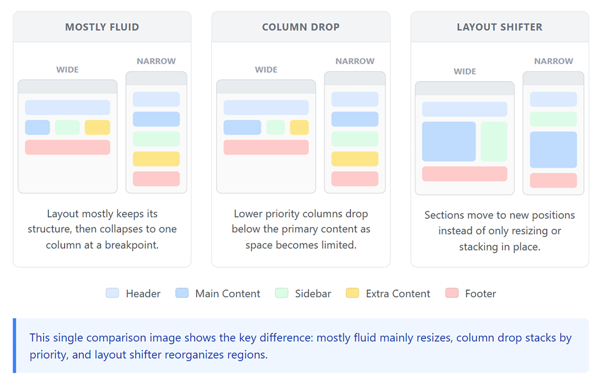
Comparison of responsive layout patterns showing mostly fluid scaling, column-drop stacking, and layout-shifter rearrangement across different screen sizes.

The following table compares the three patterns:

Pattern How the Layout Changes What You Observe Common Use Case
Mostly Fluid Minimal changes through resizing Columns stay in place and scale smoothly Simple layouts with equal-priority content
Column Drop Columns stack as space becomes limited Lower priority content moves below Layouts with multiple content priorities
Layout Shifter Sections move to new positions Content changes order or layout regions Layouts that adapt to different user needs

key concept
The three major responsive patterns are mostly fluid (resizing), column drop (stacking), and layout shifter (reorganizing). When analyzing a layout, identify which pattern it uses to understand how it adapts across different screen sizes.

try it
Use your project to identify how your layout adapts across different screen sizes.

Resize the viewport from wide to narrow and observe your .card-row and .practice-nav.

Answer the following:

  • Which pattern best describes your layout: mostly fluid, column drop, or layout shifter?
  • What changes in the layout support your choice?
  • Does your layout mainly get resized, stacked, or reorganized?
  • At what width does the most noticeable change occur?


3. Component Analysis

Different page components respond to screen size changes in different ways. Analyzing navigation, images, and typography helps you identify where breakpoints are needed and what type of changes should occur.

3a. Navigation

Navigation is often the first component to show stress as the viewport narrows because multiple elements must fit within a limited horizontal space. When analyzing navigation, consider:

  • Item count: More items require earlier transformation.
  • Label length: Longer labels compress sooner.
  • User priority: Which items must remain immediately visible?
Signs that navigation needs a breakpoint include items wrapping to multiple lines, text truncation, and touch targets becoming too small. These issues indicate that the layout needs to reorganize, often by collapsing into a menu.

EXAMPLE

.nav-list {
display: flex;
gap: 1.5rem;
}

.nav-toggle {
display: none;
}

@media (max-width: 768px) {
.nav-list {
display: none;
}

.nav-toggle {
display: block;
}
}
In this code:

  • On wide screens, .nav-list displays links in a horizontal row.
  • .nav-toggle (a hamburger menu button) is hidden on wide screens.
  • At 768 pixels and below, the link list is hidden, and the toggle button appears.
  • The breakpoint was chosen based on where navigation items begin to wrap.

3b. Media and Images

Images and media require analysis to determine when they should change size, arrangement, or visibility. Unlike layout containers, images must remain visually clear and recognizable at all sizes. Key questions include the following:

  • Do images need to remain side by side? Comparison images may need stacking to maintain visibility.
  • What aspect ratio works at each size? Wide images may need cropping for mobile screens.
  • Should some images be hidden? Decorative images might be unnecessary on mobile screens.
try it
Consider a product page with a large hero image and four thumbnails in a row below it.
At what viewport width should the thumbnails get rearranged, and why?
When thumbnails become smaller than approximately 80 pixels (the minimum size for distinguishing details), they should wrap to multiple rows. For four thumbnails with gaps, this typically occurs around 400 pixels. The content—the minimum useful size of each thumbnail—dictates the breakpoint, not device width.

3c. Typography

Typography analysis focuses on maintaining readability as the viewport changes by evaluating line length, font size, and spacing.

One important concept in typography is measure, which refers to the length of a line of text. Measure is typically expressed in characters per line and plays a key role in readability.

The following are the key typography metrics to analyze:

  • Measure: There should be 45–75 characters per line for optimal reading.
  • Font size relationships: Desktop headings may overwhelm mobile screens.
  • Vertical spacing: Line height and margins may need adjustment at different sizes.

EXAMPLE

h1 {
font-size: 3rem;
}

@media (max-width: 600px) {
h1 {
font-size: 2rem;
}
}
In this code:

  • The h1 starts at 3rem for desktop screens.
  • At 600 pixels and below, the heading scales down to 2rem to prevent it from dominating the mobile screen.
  • This breakpoint addresses a typography stress point, not a layout stress point.

key concept
Each page component requires different analysis criteria. Navigation analysis focuses on item count and touch targets. Image analysis considers visibility and detail. Typography analysis examines line length and size relationships.

try it
Open your project and focus on a text section, such as the content inside a card or a paragraph on the page.

Resize the viewport from wide to narrow.

Answer the following:

  • At what point does the text become difficult to read?
  • Is the issue caused by line length, font size, or spacing?
  • What change would improve readability?
  • Would this require adjusting typography, layout, or both?

term to know
Measure
In typography, the length of a line of text; it is typically expressed in characters, with an optimal range of 45 to 75 characters for readability.


4. Breakpoint Strategy

After identifying stress points and analyzing components, the next step is to turn those observations into clear breakpoint decisions. A breakpoint strategy outlines where changes occur, what changes at each point, and why those changes are needed.

4a. Documenting Your Plan

To organize your decisions, you can create a simple breakpoint plan that records how your layout will adapt across different viewport widths.

Your plan should include:

  • Breakpoint values: The viewport widths where layout changes occur
  • Rationale: What problem or stress point led to each breakpoint
  • Component changes: How navigation, images, or typography adjust at each breakpoint
  • Pattern identification: Which responsive pattern is used in each part of the layout

EXAMPLE

Primary Breakpoints

Breakpoint: 1024 pixels

  • Rationale: Navigation items begin to wrap due to limited horizontal space.
  • Component: Navigation
  • Change: The horizontal menu is replaced with a toggle button.
  • Pattern: Column drop
Breakpoint: 768 pixels

  • Rationale: Three-column grid items become too narrow to read comfortably.
  • Component: Layout (article grid)
  • Change: The grid shifts from three columns to two columns.
  • Pattern: Mostly fluid
Breakpoint: 480 pixels

  • Rationale: Content becomes difficult to read and interact with on small screens.
  • Components: Layout and typography
  • Change: The grid becomes a single column, and font sizes are reduced.
  • Pattern: Column drop
In this plan:

  • Each breakpoint includes a clear rationale based on a stress point.
  • Component changes describe how the layout adapts.
  • Patterns help explain how the layout responds at each breakpoint.

4b. Testing and Iteration

After defining your breakpoints, you should test how the layout behaves across a range of viewport widths. Breakpoints should not be treated as exact cutoffs. Instead, test slightly above and below each breakpoint to ensure that the layout transitions smoothly.

As you test, watch for new or unresolved stress points. These may indicate that a breakpoint needs adjustment or that additional changes are required.

Common issues to look for include:

  • Too few breakpoints: The layout appears stretched or awkward across large ranges of screen sizes.
  • Too many breakpoints: Small, unnecessary adjustments create inconsistent behavior.
  • Inconsistent component changes: Different parts of the layout adapt at unrelated widths, causing a disjointed experience.
  • Unstable transitions: The layout shifts abruptly instead of adjusting smoothly across nearby viewport widths.
Effective breakpoint strategies are refined through testing and iteration. As you observe how your layout behaves, adjust your breakpoints and component changes to improve usability and consistency.

key concept
Effective breakpoint strategies are refined through testing, not predefined device sizes. A breakpoint is successful when the layout remains clear, usable, and consistent across a range of viewport widths.

try it
Use your project to create a simple breakpoint plan.

Choose one layout issue you observed while resizing your page.

Record the following:

  • The approximate breakpoint (viewport width)
  • The stress point that indicates a problem
  • Which component is affected (navigation, layout, or typography)
  • What change should occur at this breakpoint
  • Which responsive pattern best describes this change

summary
This lesson explored content-based breakpoints, using content-first analysis to identify layout stress points where layouts stop functioning effectively. You examined responsive design patterns, including mostly fluid, column drop, and layout shifter, to understand how layouts adapt across different viewport sizes. Through component analysis, you evaluated how navigation, media and images, and typography each influence when and how breakpoints should occur. Finally, you developed a breakpoint strategy by documenting your plan and refining it through testing and iteration to ensure that responsive layouts remain usable and consistent.

Source: THIS TUTORIAL WAS AUTHORED BY SOPHIA LEARNING. PLEASE SEE OUR TERMS OF USE.

REFERENCES

Mozilla Developer Network. (n.d.). How the web works. developer.mozilla.org/en-US/docs/Learn/Getting_started_with_the_web/How_the_Web_works


Terms to Know
Layout Stress Point

A specific viewport width where visual problems begin to appear, indicating that a breakpoint may be needed.

Measure

In typography, the length of a line of text; it is typically expressed in characters, with an optimal range of 45 to 75 characters for readability.

Responsive Design Pattern

A reusable approach to handling layout changes across different viewport sizes.