Table of Contents |
From a developer or website owner’s perspective, the primary method of gathering input data from the user to the web server is through the use of an HTML web form. A web form is a document that provides users with an interface with fields (called form controls) for typing in text or numeric data or choosing from a list of options. Once all of the fields have been filled out, the user clicks the “Submit” button and the data gets transmitted to a server-side script. The script receives the data and selections from the form and processes them.
The typical web form that most individuals might think of is the form used to register a new account with a website. You will enter your first and last name, email, and desired username and password, choose a couple of options like your preferences, enroll in a newsletter, etc., and then click “Submit.” From there, the web server’s script for registering users receives the user’s submission, performs a validation check, generates database commands to insert the user’s information into a new user account, performs any additional setup for the new account, and finally sends an email verification informing the user of the successful account creation.
However, forms are just about everywhere. Even when you log in to a site, the username and password fields are part of a small form. The Google search engine is a small form with one text field and a couple of buttons, albeit a very stylized form.
We will take a look at how forms are constructed, the common <input> tag and its many types, as well as other form control types.
Web Form
A document that provides users with an interface of fields for typing in text or numeric data or choosing from a list of options.
Form Controls
Elements such as checkboxes, radio buttons, and menus, which allow users to enter, select, or edit information; perform actions; or display data.
Like a table, forms are created first by writing the <form> tags to create the form container. The <form> tag also has two required attributes.
1. The method attribute specifies the type of HTTP method to use when submitting the form. This can be either GET or POST. GET is the HTTP method normally used to “get” pages and resources from a web server; however, it is also used for nonsensitive forms as a lightweight option for sending the form. The issue with GET is that the form field’s names and the values typed by the user are sent as part of the URL request. You may recall URL parameters back in Unit 1; this is where all of the field names and values are stored, which is relatively unsecure.
The POST method is the ideal method for most other forms as it protects the data being transmitted. Once the HTTP POST request is made, the data gets encoded into the payload of the HTTP POST request. This ensures that the data gets properly encrypted when it is transmitted to the server. This only applies to web servers that do not use encryption and thus do not use the HTTPS protocol, wherein the data will still be vulnerable.
2. The action attribute is used to direct the form submission to a particular server-side script or API endpoint for processing.
The other attributes for the <form> tag are as follows:
| Attribute | Description |
|---|---|
| accept-charset | Specifies the character encoding used for the form submission |
| autocomplete | Specifies whether a form should allow the autocomplete feature |
| enctype |
When using the POST method, specifies how the data should be encoded
Values:
|
| name | Specifies the name of the form |
| novalidate | Specifies that the form should not attempt to validate the user-provided data before submitting the form |
| target | Specifies whether the response from the web server is to be displayed in the same window, the parent, a new tab, or a frame; works the same as the anchor tag’s target attribute |
Method Attribute
The HTML attribute for a <form> tag that specifies what HTTP method to use when transmitting the form data.
Payload
The portion of a network packet that contains the actual data being transmitted and is encapsulated in the packet’s header and trailer.
Action Attribute
The HTML attribute of a <form> tag that specifies what server-side script will receive and handle the form submission.
The <label> tag is the first control type to discuss as it is needed for each control within the form. The label is what the user sees next to each control. Labels are also used for accessibility as they increase the clickable area for a specific control. For example, radio buttons are rather small, and giving it a label increases where the user can click to activate the button.
EXAMPLE
The label has to be linked to the control one of two ways: the label needs to surround the control tag itself or the “for” attribute needs to be provided and given the “id” value assigned to the control.
<label>Subscribe:
<input type="radio" name="subscribe"></label>
or
<label for="subscribe">subscribe: </label>
<input type="radio" name="subscribe" id="subscribe">
This will render as follows:

The most common set of form controls can be accessed by the same <input>. The <input> tag is a self-terminating tag, and its “type” attribute determines what type of control the field is. Regardless of the chosen type, each field in a form requires the “name” attribute in order to uniquely identify each control in the form.
The following is a list of all <input> type values:
| Value | Description |
|---|---|
| button | Creates a clickable button |
| checkbox | Creates a single checkbox |
| color | Creates an RGB color picker tool for selecting a color |
| date or datetime-local | Creates a date or date time picker tool for selecting a date or a date and time |
| Creates a textbox that automatically validates the email is a valid email (not that it exists, just that it is formatted as a proper email address) | |
| file | Creates a file upload control with a browse button for selecting a file to be uploaded with the form |
| hidden | Creates a hidden text field |
| image | Used for creating a custom submit button from an image |
| month | Creates a month picker tool |
| number | Creates a textbox that only accepts numbers and includes incremental up and down buttons |
| password | Creates a text field that replaces each character with dots as they are typed |
| radio | Creates a round checkbox called a radio button; used together in groups to create a multiple-choice answer that only allows one selection (Checkboxes, on the other hand, allow for multi-answer questions, wherein multiple options may be chosen.) |
| range | Creates a numeric range tool for specifying a range of values |
| reset | Creates a button that clears the form when clicked |
| search | Creates a textbox used for searches within a site |
| submit | Creates a button for submitting the form |
| tel | Creates a textbox that only accepts numbers that are formatted as a phone number |
| text | Creates a generic textbox that accepts any text-based input |
| time | Creates a time picker tool for selecting a particular time |
| url | Creates a textbox that accepts valid URL values |
| week | Creates a week picker tool for selecting a particular week |
Each input type may require additional attributes such as the value attribute, which is used to set the value of a control. This could be the default value for a textbox or the meaning of when a particular checkbox is checked.
One attribute that is helpful for the user is the placeholder attribute.
EXAMPLE
The placeholder creates a statement within a text field that is written in light gray text and disappears when the user starts typing within the field.
<input type="tel" name="phone" placeholder="(000) 555-1234">
This will render as follows:
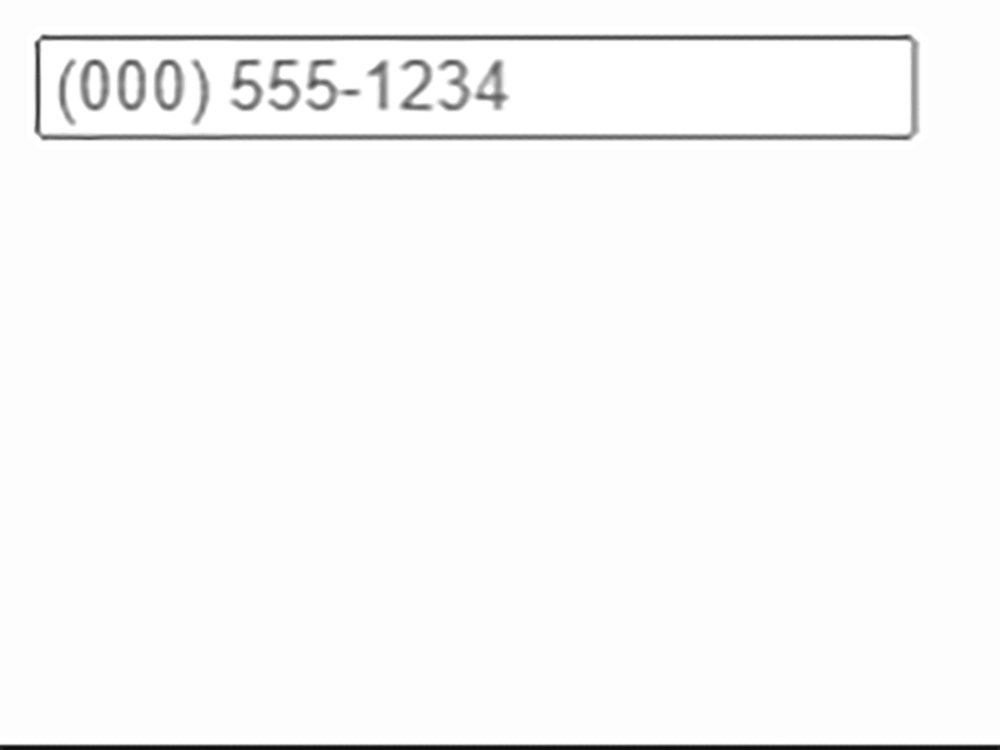
This is helpful as it demonstrates to the user what is expected in the field.
Now that you have seen how to create a web form, it’s time to practice!
Directions: In this activity, you will create a new webpage called “about.html” and link to that page in your navigation menu. You will then build the about.html page using the basic HTML code structure and semantic tags. Finally, you will practice web forms by building a simple Contact Us form.
Note: At any time if you do not see the change occur, make sure to select the refresh button in the IDE.
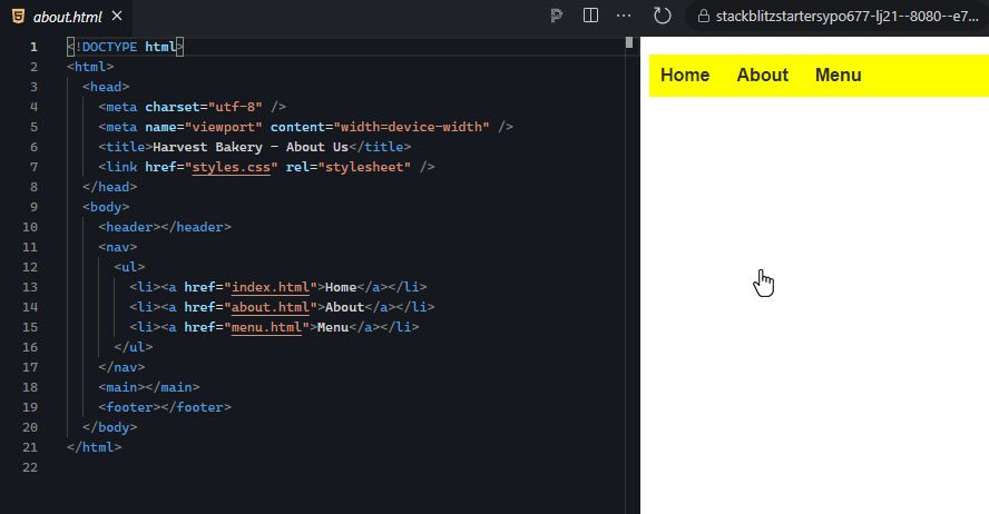
1. Return to your StackBlitz project (from the previous lesson) and, if you have not already done so, create a new file in your project and name the file “about.html.” Add the basic HTML structure and include the header, nav, main, and footer semantic tags.
2. In the head, make sure to include and complete the <title> tag, the two <meta> tags, and link to the external stylesheet:
<meta charset="utf-8">
<meta name="viewport" content="width=device-width">
<title>Harvest Bakery - About Us</title>
<link href="style.css" rel="stylesheet">
3. From the index.html file, highlight and copy all of the code between the two <nav> tags. Return to the about.html that you are working on, place your insertion point between the <nav> tags, and paste the code. (Now is a good time to double-check that the anchor tag for the “About” hyperlink is pointing to the correct file: <href="about.html">. If you had to make a change, remember to also update the navigation menu on the homepage as well.)
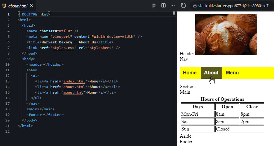
When you click the refresh button, you may default to the homepage (index.html) of your project. To see the results of your about.html file, you will need to click on the “About” hyperlink located in the nav menu. This is why it is important that your nav link points to the correct about.html file.
This is the expected output:
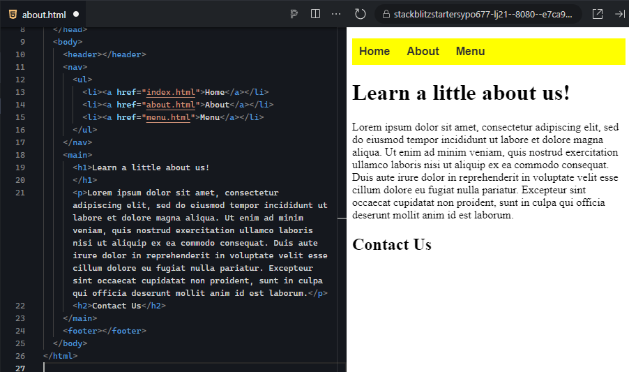
4. Within the main section of the About page, include an <h1> element, and within it include a message like “Learn a little about us!” or “Our Story:”.
5. Below the <h1> element, create a <p> paragraph and include some Lorem Ipsum (you can grab some Lorem Ipsum text using a Lorem Ipsum generator website.
6. Below the paragraph you just created, add a <h2> heading element and give it the text “Contact Us.”
This is the expected output:
7. Below the <h2> tag, add the <form> tag and give it the following attributes:
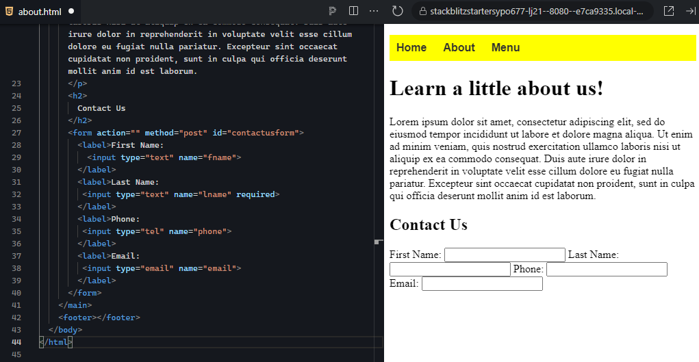
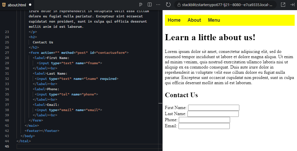
10. As you probably noticed, the labels and input tags are all “inline” and behave like normal text regarding their positioning. Let’s fix this for now by adding a <br> tag after each of the four label elements. This will separate each label and field onto their own lines.
This is the expected output:
11. Let’s finish building the form by adding the “Submit” and “Reset” buttons. Below the last label and after the <br>, add two new <input> tags, giving the first the type attribute of “submit” and the value attribute of “Submit.” The second will be a type attribute of “reset” with the value attribute of “Clear.”
This is the expected output:
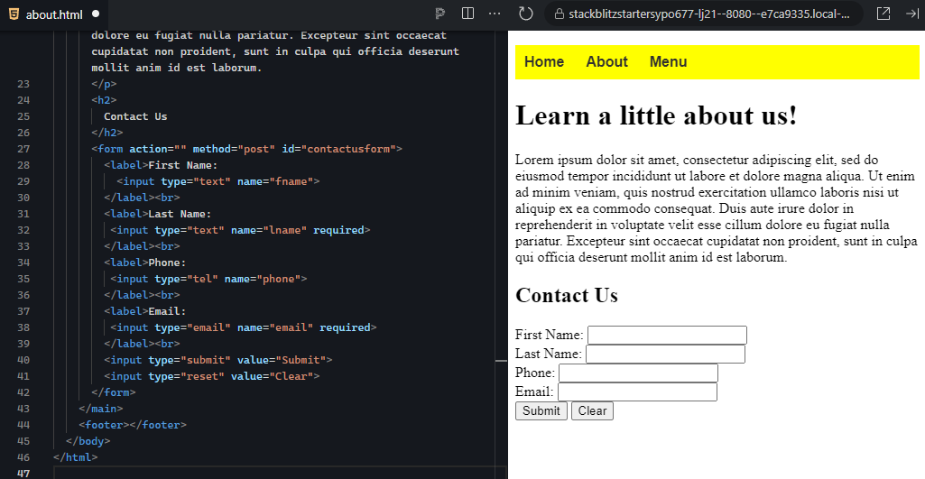
When you click the “Submit” button, it will likely reload the page and may or may not show an error message. It also might not do anything depending on your browser. Do not worry; this is because our form is not pointing to a handler script on any server, and thus the form has nowhere to submit the data.
That’s it for now. We will add a new type of control to the web form in later tutorials.
These are the basics of creating a web form using only labels and input tags to create the fields. There are more control types still to cover, but this gives you the basics of constructing an HTML web form.
The Contact Us form is probably the most common form that people think of. However, keep in mind that forms are actually rather powerful and allow us to give the user the ability to send data to a server and receive some form of response, either on the same page or via another channel of communication such as email. Furthermore, the fact that we can use a form to trigger a script file on the web server allows us to perform any kind of computational operations as a result of the form submission.
View the following video for more on using tables to display data on a page. You'll notice that the instructor is using a different text editor, however, you can still follow.
Input Tag <input>
An HTML tag used to create a wide range of form controls based on the value given to its type attribute.
Value Attribute
An attribute of most form controls that gives a unique value to the field or the field’s possible options.
Placeholder Attribute
An HTML attribute of most form controls that provide a temporary demonstration of what data is being requested within a form, but disappears when the user starts typing in the field.
In addition to the <input> control tag, there are a number of other tags used to create controls and imply organization.
The <button> tag is another option for including a custom button in your form. It works the same as the <input> button, but it uses a different tag and is more customizable. Buttons do not do anything by default as they have to be linked to some kind of action. This is often accomplished by pointing the “onclick” attribute of the button to a JavaScript function or giving it the “type” attribute with a value of “submit.”
The <select> tag is a container control used for creating either a dropdown menu or a listbox. Dropdown menus start small, but when clicked they expand to show the available options. This can help conserve valuable screenspace on smaller screens. By providing the <select> tag with a “size” attribute and giving it a number, the <select> will create a listbox, which is a scrolling box containing multiple options to choose from. The number provided to the size attribute determines how many lines of text tall the listbox is. By default, only one option in the listbox can be selected. However, by providing the attribute keyword “multiple,” the user can hold the Ctrl key down and select multiple options within the same listbox.
The <option> tag is used within the <select> container to create the options for the user to choose from. Just like the <li> items for ordered and unordered lists, the <option> elements create the items in the dropdown or listbox. Additionally, these tags require a “value” attribute to help the server script identify which option or options were chosen.
The <optgroup> tag is an optional structure that creates a grouping of options within a listbox or dropdown menu.
EXAMPLE
Visually, this creates a bold heading for each group of options.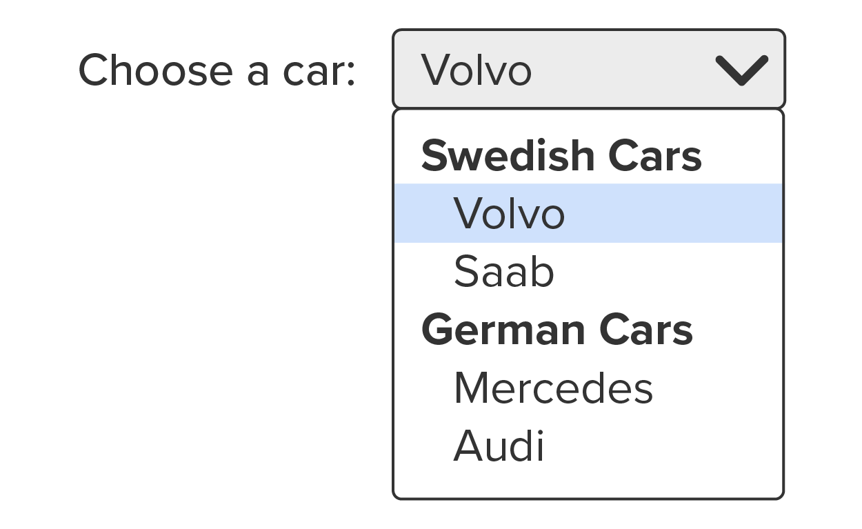
To create the groups, you simply surround the related options elements with the <optgroup> tags and give the <optgroup> tag the “label” attribute and value.
The <textarea> tag creates a large textbox for multiple lines of text. Often, textarea is used for comment boxes as it provides a larger area for the user to compose their response. Note that while you can set an initial height and width for the textarea using the “rows” and “cols” attributes, respectively, textareas are resizable by the user.
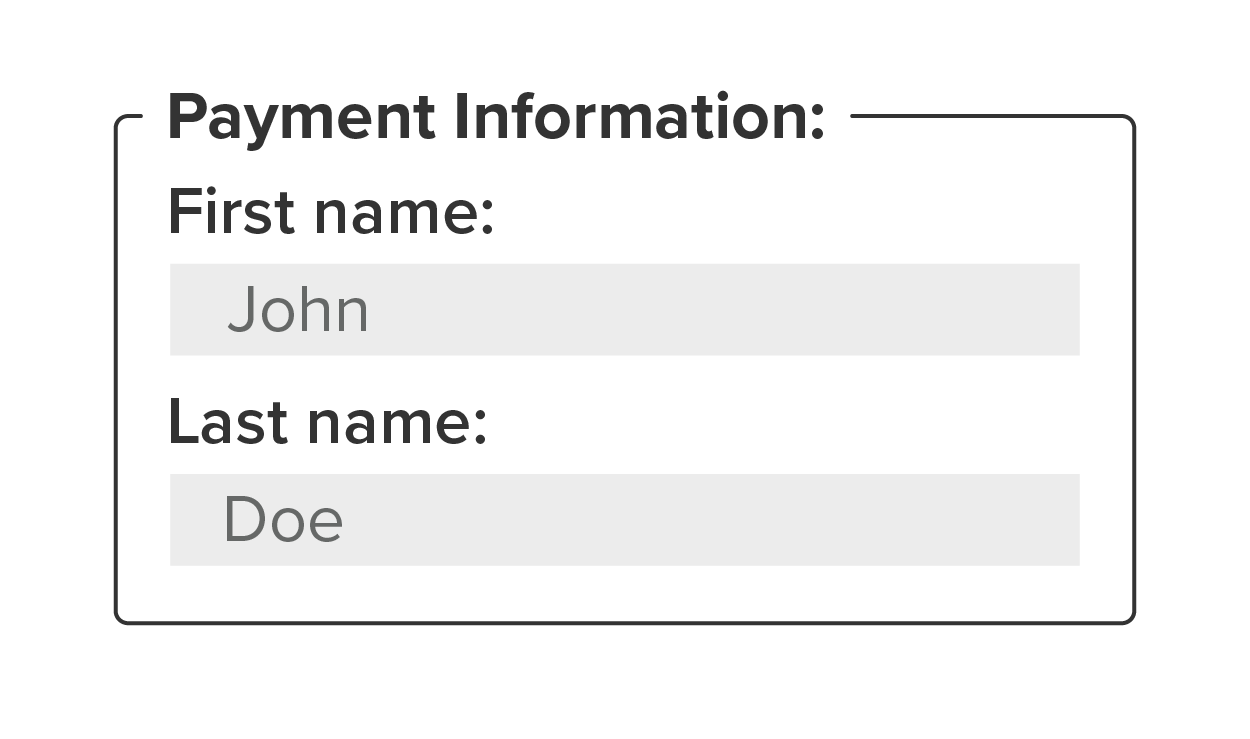
The <fieldset> tag is used to create a box that surrounds a group of controls in the form. By surrounding a group of controls in the <fieldset> tags, a line is drawn just around those controls. Furthermore, a label can be added to the box by adding the <legend> element as the first child of the fieldset and giving it a value.
EXAMPLE
<fieldset>
	<legend>Personal Information:</legend>
	<label>First name:
	<input type="text" placeholder="John"></label>
	<label>Last name:
	<input type="text" placeholder="Doe"></label>
	<input type="submit" value="Submit"></label>
</fieldset>
This will render as follows:
The <datalist> tag is an alternative option for the <select> control element that allows users to either select from the predefined list of options or type in their own choice. The HTML for a datalist is constructed the same as a select list, but it requires an id attribute and value as it needs to be linked with an input field. The <input> tag uses the “list” attribute and the value of the list’s id. This way, the input field is able to add the datalist to the text field as a dropdown but also still act as a normal text field.
EXAMPLE
The result is a text field that also includes a dropdown button on the right end.
<input list="browsers" name="browser">
<datalist id="browsers">
	<option value="Internet Explorer">
	<option value="Firefox">
	<option value="Chrome">
	<option value="Opera">
	<option value="Safari">
</datalist>
The <output> tag is a special field that serves as a textbox placeholder for the results of some calculations. Calculations are completed using JavaScript, and the name of the <output> element is what the JavaScript code uses to insert the calculated value into the output field.
Attribute Keyword
An HTML attribute that only requires the keyword to be present and does not require a value to be assigned.
When collecting data from users, it is important to validate the information provided by the user. There is an old saying that illustrates the need for data validation: “Garbage in, garbage out.” Validation is the process of verifying that what the user entered into the control fields is what was expected by the form. By default, an HTML form will not be submitted unless all the fields’ values meet their validation requirements, ensuring that only valid correct data is captured from the user. Incorrect, incomplete, and invalid data is useless to an organization; thus, it is important to put validation requirements on web form fields.
There are generally three ways to provide validation requirements for a web form.
| Method | Description |
|---|---|
| The type attribute | Each type value will provide its own default validation requirements. For example, an “email” input type will validate the format of the email provided, and a “number” input type will validate that only valid numbers are present in the field. |
| Validation attributes | Most form controls possess HTML attributes for customizing validation requirements. For example, adding the attribute keyword “required” will make it a mandatory field. |
| JavaScript | JavaScript can be called in place of submitting the form. The JavaScript can be written to examine the values in each field and test for the standard and custom validation requirements. If all fields are valid, JavaScript will call the form’s submit function. This is useful when you have a unique field type and need to create your own custom validation. |
The type attribute itself will provide its own default validation requirement. For example, if the type is set to number, the form submission will be blocked if there is a non-numeric value in the field. Furthermore, depending on the control type, there will be HTML attributes that can be added to further customize the validation requirements. Number fields can be given a “min” and/or a “max” attribute to set the range of possible values. Text fields can be given “minlength” and “maxlength” to specify the limits of characters within the field . . . and more.
There are quite a few validation attributes that can be added to input fields and other form controls. You can find a list of attributes for the <input> tag, many of which are validation attributes: www.w3schools.com/tags/tag_input.asp.
To validate using JavaScript, the form’s regular submit button will be replaced with a generic button (either an <input> with the “button” type or an actual <button> element) with the button label “Submit.” Then, the button’s HTML attribute “onclick” will point to a JavaScript function that will check the existing validation requirements set by the field type and any validation attributed, as well as perform its own custom-defined validation checks as dictated by the developer. JavaScript validation will be discussed in more detail in a later unit.
A more advanced validation attribute that most form controls possess is called the pattern attribute, which accepts a regular expression value. Regular expression is a special type of syntax that is used to validate the specific format of a sequence of characters.
EXAMPLE
If you needed to validate a user’s email to ensure that it contains any number of valid email characters (0-9, a-z), an @ symbol, any number of additional valid characters (0-9, a-z), a period, and then a 2- to 4-character top domain, you would provide the <input> tag with the “regex” attribute and give it a value that is a regular expression like this:
<input type="text" pattern="[A-Z0-9._%+-]+@[A-Z0-9.-]+\.[A-Z]{2,4}">
One final aspect of web form validation is that of security. You may recall that SQL injection is a type of attack wherein the attacker will place SQL commands in a form’s text field. If the form does not have any security checks in place, the SQL query will likely be executed by the database server, possibly exposing sensitive information. There are mechanisms within JavaScript that will prevent such attacks and will be discussed in a later unit.
Now that you have seen how to create additional types of form controls, it’s time to practice!
Directions: In this activity, you will edit the “Contact Us” web form to include additional control types, including the dropdown menu with option groups, textarea, and a fieldset organizer. Additionally, we will add some validation to the fields.
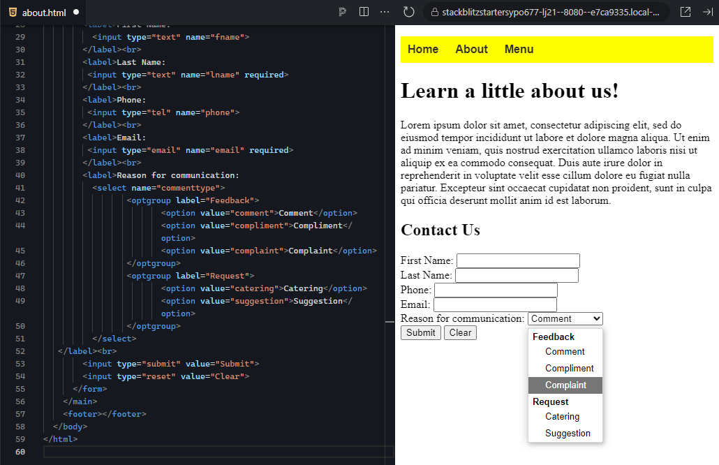
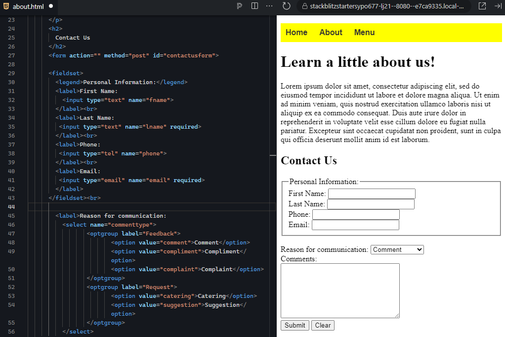
1. Return to your project, your insertion point between the last <br> in the form and before the first button. Add a label with the text “Reason for communication:” and add a <select> element, giving the name attribute a value of “commenttype.” This will be used to indicate what kind of communication this will be: “feedback” in the form of a “Complaint,” “Compliment,” or “Comment” or a “request” in the form of a “Catering” or “Suggestion.” We will use <optgroups></no wiki> for the two groups (feedback and request) and the <option> elements for the choices.
<label>Reason for communication:
       <select name="commenttype">
              <optgroup label="Feedback">
                     <option value="comment">Comment</option>
                     <option value="compliment">Compliment</option>
                     <option value="complaint">Complaint</option>
              </optgroup>
              <optgroup label="Request">
                     <option value="catering">Catering</option>
                     <option value="suggestion">Suggestion</option>
              </optgroup>
       </select>
</label><br>
This is the expected output:
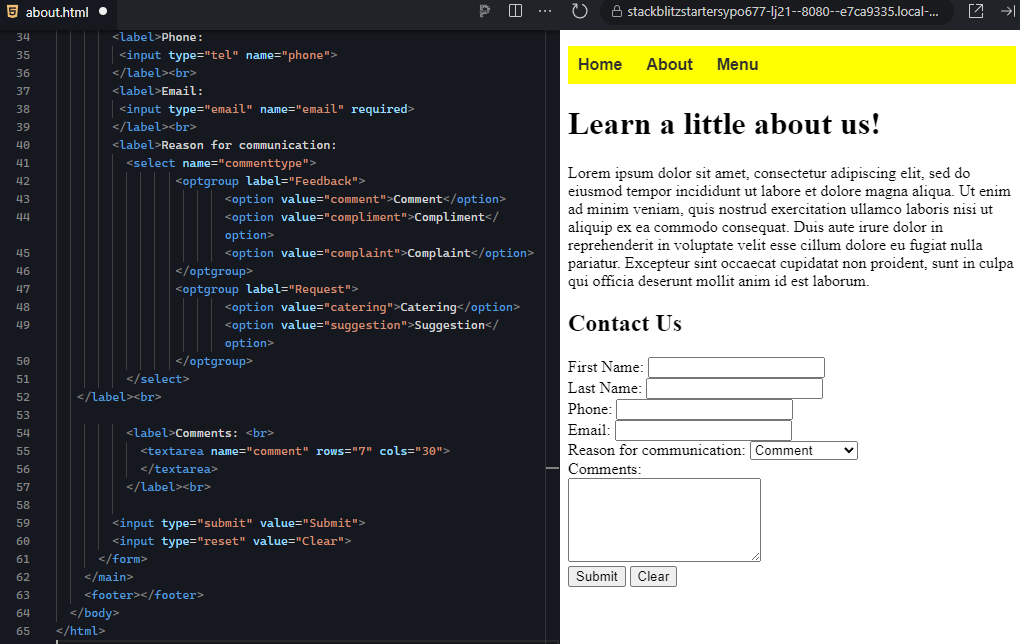
2. Next, provide the user with an area to write their feedback or request. This will need to be something larger than a text field as the user needs to be able to easily review and edit what they wrote. Create a label for “Comments:” and within it add a <textarea> element (remember, textareas are not self-closing). Give the textarea a name attribute of “comment.” Add a <br> after the label text and after the end of the label.
Additionally, set the textarea’s cols attribute to 7 and the rows attribute to 30.
This is the expected output:
3. Next, practice using the <fieldset> element to surround the first four fields, and give it a <legend> of “Personal Information.” Surround the first four fields, including their labels, with the <fieldset> element. Next, just after the opening tag of the fieldset, add a <legend> element and add the following within the tags: “Personal Information:”
This is the expected output:
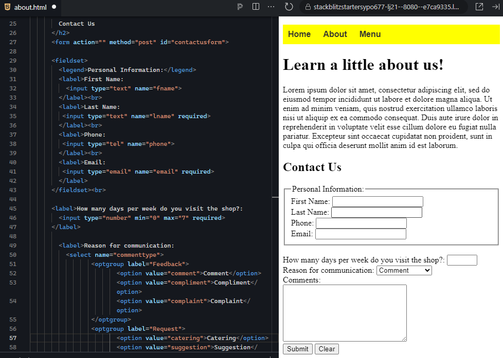
4. The last part of this activity will be to add form validation attributes. You will make certain fields required by adding the required keyword attribute to the <input> tags. You will also add a new <input> field with the “number” type, which will ask the user how many days a week they visited the establishment and you will set a minimum value of 0 and a maximum value of 7.
Below the <br> just after the <fieldset> that you just created, add a new <label> with the text “How many days per week do you visit the shop?” and an <input> tag with the “number” type and a name of “frequency.” Lastly, add the “min” attribute and give it a value of 0, and add the “max” attribute and give it a value of 7. This will limit the possible values to only 0 through 7. Don’t forget the trailing <br>.
This is the expected output:
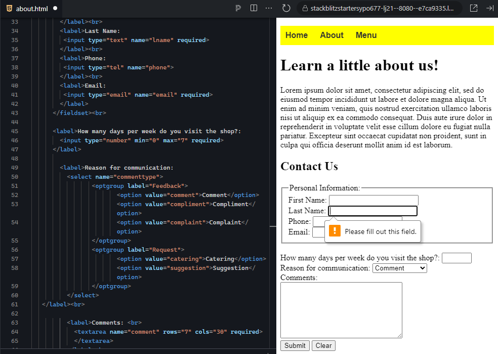
5. The final step is to make certain fields required by adding the required keyword attribute. Make the last name, email, frequency, and comments fields required. Remember to add the “required” keyword to the tag that actually creates the control, not the label.
You should not be able to successfully submit the form without satisfying the validation requirements. If you click “Submit,” validation will block the submission and will show error messages pointing to the problem within the form.
This is the expected output:
6. If you haven't already done so, now is a good time to save your project.
While there are a variety of additional form controls beyond what you have seen, you have successfully practiced creating the most common control types that you will likely use in your future. Furthermore, you also practiced adding some basic validation requirements to the form to ensure that every form submission contains valid, usable data for the recipient.
Validation
The process of verifying that each value entered into each field meets the specified requirements.
Validation Attributes
HTML attributes for form controls that add validation requirements for the data entered into the field.
Pattern Attribute
An HTML attribute for form controls that use “regular expression” statements to validate the format and completeness of the value entered into a field.
Regular Expression
A sequence of characters that specifies a pattern to compare against, used for format text validation.
Required Keyword Attribute
An HTML attribute keyword that places a validation requirement requiring that the user enter some value or make a selection within a particular form control.
Source: This Tutorial has been adapted from "The Missing Link: An Introduction to Web Development and Programming " by Michael Mendez. Access for free at https://open.umn.edu/opentextbooks/textbooks/the-missing-link-an-introduction-to-web-development-and-programming. License: Creative Commons attribution: CC BY-NC-SA