In this lesson, you will learn to examine outliers and their effects on data sets. You will learn how to use boxplots and the Quartile Method to detect outliers in the data. Specifically, this lesson will cover:
1. Identification of Outliers Using the Quartile Method
There are guidelines developed to determine if an observation is an outlier or not. These guidelines are based upon the quartiles of the data. A quartile is a number that divides the data into four equal parts. There are three quartiles in any data set. The three quartiles are:
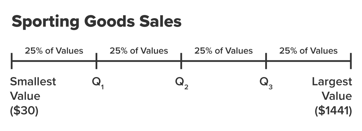
- The first quartile (Q1) is the 25ᵗʰ percentile of the dataset. It is the value below which 25% of the observations fall, meaning that 75% of the observations are above this value.
- The second quartile (Q2) is the 50ᵗʰ percentile, also known as the median. Q2 is the value that is "dead center" of the data, such that 50% of the observations are below and 50% of the observations are above this value.
- The third quartile (Q3) is the 75ᵗʰ percentile. It is the value below which 75% of the observations fall, meaning 25% of the observations are above this value.
To visualize these quartiles and how they split up data into four equal parts, imagine the line in the figure below represents the sporting goods sales data where the data values have been sorted from the smallest value to the largest value. A quartile "cuts" the data into four equal parts such that each part contains 25% of the data values.
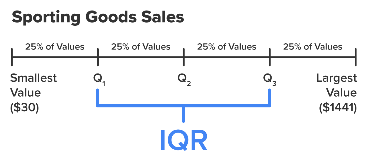
The interquartile range (IQR) is the range of the middle 50% of values.
-
- Interquartile Range (IQR)

You can visually think of IQR as the middle 50% of the data as shown in the figure below.
-
The IQR value can be used to detect outliers. Use the following method to determine if a particular observation is an outlier.
- Calculate

- Determine a threshold, which is found by multiplying the IQR by a constant, 1.5.
Threshold = 1.5 x IRQ
- Determine a lower and upper bound for potential outliers.
Lower bound: Q1 – Threshold
Upper bound: Q3 + Threshold
- Any observation below the lower bound or above the upper bound is considered to be an outlier.
-
- Upper/Lower Bound
- Lower Bound = Q1 - Threshold = Q1 – (1.5 * IQR)
Upper Bound = Q3 + Threshold = Q3 + (1.5 * IQR)
-
Why is the threshold equal to 1.5 times IQR and not some other number? The short answer is that 1.5 strikes a balance between sensitivity and specificity, effectively identifying outliers while avoiding excessive false positives. For a more detailed explanation, visit
1.5 IQR Rule Explained | Built In.
-
EXAMPLE
Going back to the sporting good sales example from the last tutorial, you can use Excel to find various quartiles of the data, IQR, and the lower/upper bounds.
|
Q1
|
Q3
|
IQR
|
Lower Bound
|
Upper Bound
|
|
439
|
719
|
280
|
19
|
1139
|
-
Find the first and third quartiles of the data, IQR, and the lower and upper bound thresholds.
1. Open
sporting_goods_sales.xlsx in Office 365.
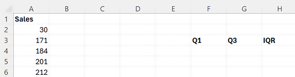
2. In the same sheet as your column of data (
Sales column), create three columns named
Q1,
Q3, and
IQR as shown in the figure below.
3. In the cell right below Q
1 use the
QUARTILE() function to find the first quartile (Q
1) as shown in the table below.
The first argument of the quartile function is the rows that contain the data (rows A2 to A86 in this case), and the second argument corresponds to the quartile you want to calculate. A value of 1 is for the first quartile (Q
1). A value of 2 is for the second quartile (Q
2). A value of 3 is for the third quartile (Q
3).
The value of Q
1 is $439. This means that 25% of the sporting goods sales are less than $439 and 75% of the sales values are more than $439.
4. Perform the same calculation for the third quartile (Q
3). The table below shows how to calculate Q
3.
The value of Q
3 is $719. This means that 75% of the sporting goods sales are less than $719 and 25% of the sales are more than $719.
IQR is the difference between Q
1 and Q
3.
5. Use the basic formula shown in the table below to calculate IQR (the difference between the first and third quartile).
The IQR value is 280.
You can now calculate the lower and upper bounds using the threshold.
6. Create two new columns in the worksheet named
Lower Bound and
Upper Bound. These will be the bounds to determine if an observation is an outlier or not.
7. Create the corresponding bounds using the threshold (1.5 x IQR).
The table below shows the formula to calculate the
Lower Bound.
|
Q1
|
Q3
|
IQR
|
Lower Bound
|
Upper Bound
|
|
439
|
719
|
280
|
=F4-(1.5*H4)
|
|
The
Lower Bound value is 19. If there are any values less than 19, those values would be considered outliers.
In a similar manner the table below shows the formula to calculate the
Upper Bound.
|
Q1
|
Q3
|
IQR
|
Lower Bound
|
Upper Bound
|
|
439
|
719
|
280
|
19
|
=G4+(1.5*H4)
|
The
Upper Bound value is 1139. If there are any sales values greater than $1,139, those values would be considered outliers.
8. Check your work by comparing your first and third quartiles, IQR, and lower and upper bounds to the one in the example.
-
Any values
below the lower bound or
above the upper bound should be designated as outliers.
-
Follow along with this video on identifying outliers using the quartile method.
-
EXAMPLE
Based on the quartile method, the sales value of $1,441 would be considered an outlier.
-
Determine if there are any outliers in the sporting goods sales data using the quartile method for detecting outliers.
Using the quartile method, you can determine if there are any sales values less than $19 or any sales values greater than $1,139. Those sales values will be considered an outlier.
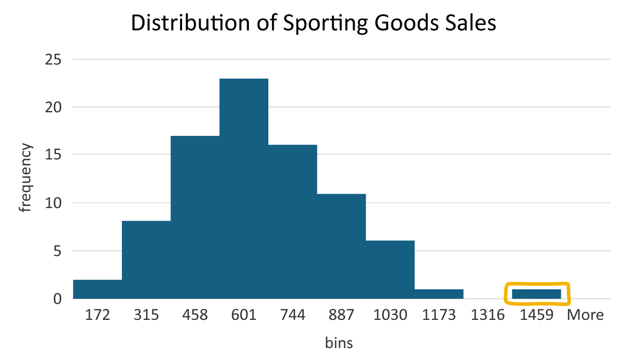
Going through this procedure verifies that the bar to the right of the other bars included an outlying observation. The sales value of $1,441 is the only value outside the upper and lower bound and should be considered an outlier.
-
- Quartile
- The three values in a dataset which divide the data into four equal parts.
- Interquartile Range (IQR).
- The range between Quartiles 1 and 3, which corresponds to the middle 50% of the data.
2. Using Boxplots to Identify Outliers
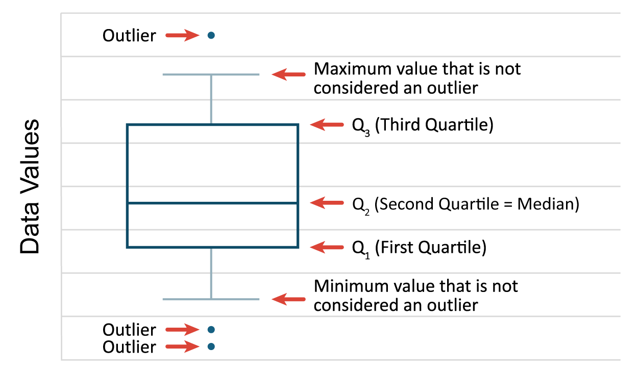
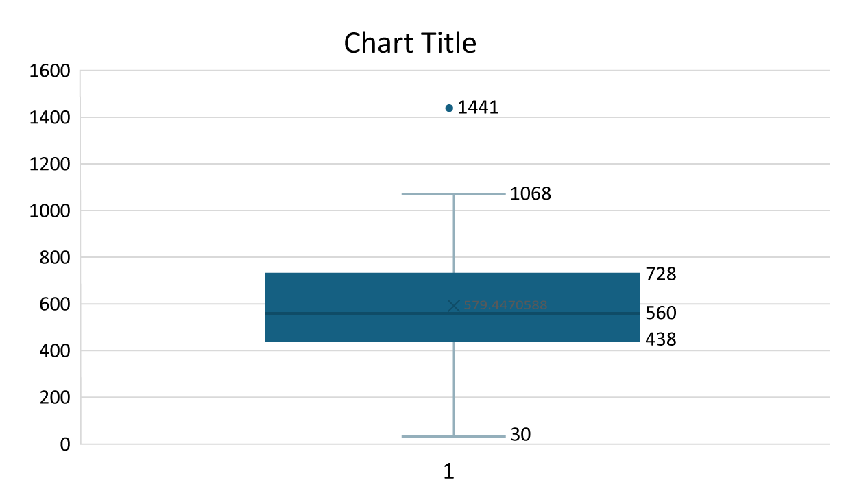
A boxplot is a visual summary of a quantitative variable distribution that assists in detecting outliers. A boxplot visually displays the five number summary. The five number summary consists of the minimum values, Q1, Q2, Q3, and the maximum value of the quantitative variable being displayed.
The figure below illustrates the basic elements of a boxplot. The rectangular box spans from Q1 to Q3, which represents the middle 50% of the data. Q2 is drawn in the body of the box to indicate the median value. The lines you see extending from the box are referred to as whiskers. Sometimes boxplots are referred to as box and whisker plots. The whiskers will extend to the minimum and maximum values of the data if there are no outliers in the data. If there are outliers, the whiskers will extend to the minimum and maximum values not considered an outlier. The whiskers attempt to capture data outside the IQR, but the whiskers never reach below the lower bound (Q1 - (1.5 x IQR)) or above the upper bound (Q3 + (1.5 x IQR)). If there are any data values below the lower bound or above the upper bound, they will be individually designated to denote those values are outliers.
-
EXAMPLE
You can use Excel to construct a boxplot for the sporting goods sales data.
Once again you should use Excel for a task like this. You will not be constructing graphs using manual or hand methods at any real-world business analytics job. Before you begin, remind yourself of the five number summary for this data displayed in the table below.
|
Five Number Summary
|
Value
|
|
Minimum
|
30
|
|
Q1 (first quartile)
|
439
|
|
Q2 (second quartile = median)
|
560
|
|
Q3 (third quartile)
|
719
|
|
Maximum
|
1441
|
-
Construct a boxplot using the sporting good sales data.
Open
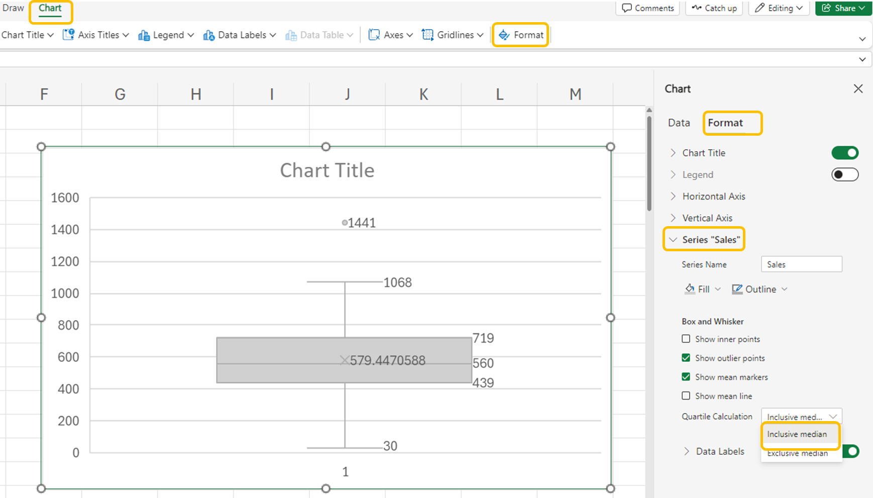
sporting_good_sales2.xlsx workbook, which now contains first and third quartiles of the data, IQR, and the lower and upper bound thresholds. Or, you can continue with the same Excel file from above.
1. In Excel, highlight all the sales values in the
Sales column as shown in the figure.
2. Select the
Insert menu. Select the drop-down arrow for the
Charts group →
Box and Whisker.
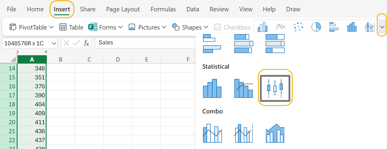
A boxplot will appear in the worksheet.
3. To view the numerical values that make up the boxplot select the
Chart menu →
Data Labels →
Right.
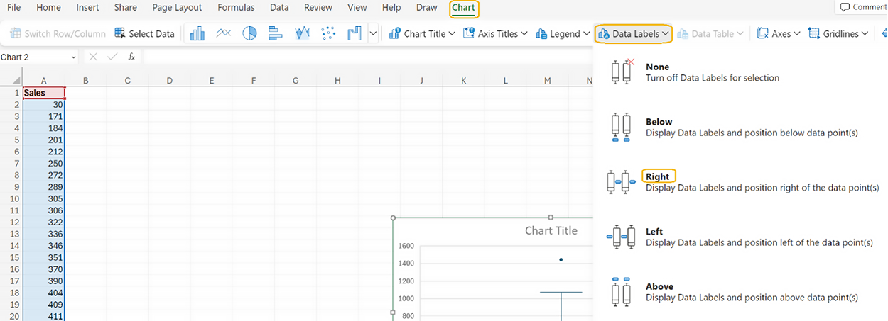
The boxplot updates to include the five number summary.
You will notice that the values of Q
1 and Q
3 displayed in the boxplot are not the same values that you calculated using the
QUARTILE() function. When the number of observations in a data set is odd, like the sporting goods sales data (

), Excel removes the median value when it calculates Q
1 - Q
3. If you want the median included in the first and third quartile calculations (like you did when you used the
QUARTILE() function), select the
Inclusive median option for the boxplot by performing the following.
4. Select
Format (under
Chart menu) →
right arrow for Series “Sales” →
Quartile Calculation →
Inclusive median.
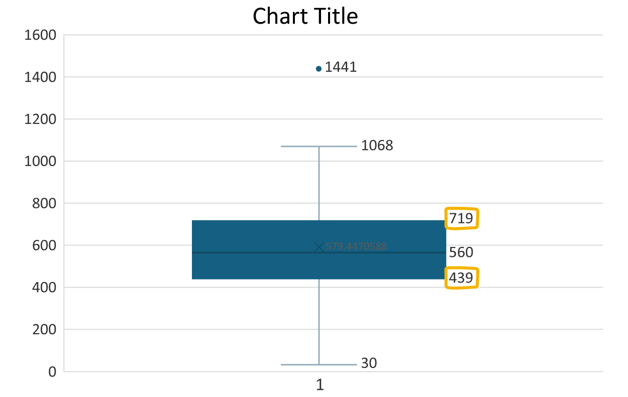
The boxplot will now update to include the median in the calculations for Q
1 and Q
3 and will match the values you obtained using the
QUARTILE() function earlier.
Let’s now remove the ‘1’ that you see on the horizontal axis, provide a label for the vertical axis, and provide the boxplot with a title.
To remove the ‘1’ on the horizontal axis, perform the following.
5. Select
Axes (under
Chart menu) →
Primary Horizontal Axis →
None.
6. To add a label to the vertical axis, select
Axis Titles (under
Chart menu) →
Primary Vertical Axis Title →
Edit Vertical Axis Title. Enter "frequency."
7. To add a title to the boxplot, select
Chart Title (under
Chart menu) →
Edit Chart Title. Enter "Distribution of Sporting Good Sales" for the title.
8. Check your work and compare your boxplot to the one in the example.
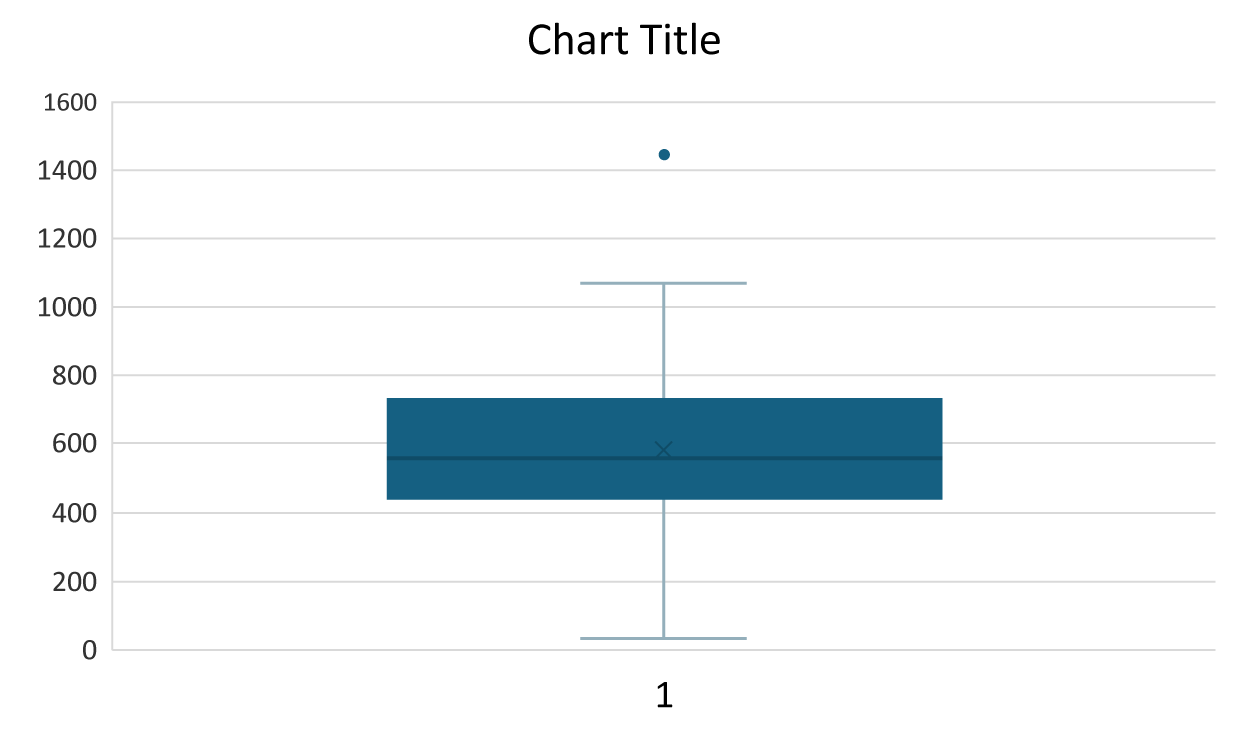
The boxplot confirms that the sales value of $1,441 is an outlier. Notice that the value denoted as the maximum value is $1,068 because this is the maximum value of sales that is not considered an outlier. Since there are no outliers in the lower values of the distribution (that is, there are no values below the lower bound of $19), the lower whisker value is the minimum sales value of $30.
-
Follow along with this video on constructing a boxplot.
-
The boxplot was created in the 1970s by the famous American statistician John Tukey. So, while the plot is over 40 years old, it remains a staple in
data exploration. Its simplicity, ability to summarize data distribution, and usefulness for identifying outliers make it indispensable.
Using a boxplot allows you to focus more on the overall distribution of the data to detect outliers.
-
- Boxplot
- A graph used to detect outliers.
- Five Number Summary
- Five numerical values computed from the data that describe the range, spread, and location of a quantitative variable.
- Data Exploration
- Process that allows you to understand the distribution of a data set and includes activities like identifying outliers.
3. Outliers and Their Effect on Data Sets
Outliers should be investigated carefully. Often, they contain valuable information about the process under investigation or the data gathering and recording process. Before considering the possible elimination of these points from the data, you should try to understand why they appeared and whether it is likely similar values will continue to appear. Of course, outliers are often bad data points.
In the sporting goods sales data set, the histogram and the boxplot both identified the $1,441 sales value as an outlier. You should then ask yourself if the value is an anomaly, or does it have the potential to be repeated. In this case, even though it is an outlier, there is a possibility (although slight) of repetition, so it should remain in the data set, or should it? In other words, someone else could spend $1,441 at the store in the future, but we wouldn’t necessarily want to include it in our sales projections. Keeping this outlier in the data may make sense in some cases and not in others, so the answer is…it depends. Outliers are specific to their data sets, so consider the circumstances before eliminating them from your data.
If you determined the data point was not likely to be replicated, then you should eliminate it from the data set, before you conduct further testing. Ignoring this outlier could lead to skewed insights and misguided strategies. Let us look at some of these now.
IN CONTEXT
Bad Decisions
Even large companies have a tough time with outliers. Here are some real-world examples of how outliers have affected businesses.
Target
What happened? In 2016, Target’s predictive analytics algorithm misjudged sales forecasts due to a data anomaly. The system identified a teenage girl’s pregnancy based on her shopping habits and began sending her targeted ads for pregnancy-related products before her family even knew about it.
What have we learned? This isolated case highlighted how predictive models, designed to forecast product demand at a larger scale, can also make highly personalized predictions—sometimes with unintended consequences.
Blockbuster
What happened? Blockbuster Video's downfall is a classic example of ignoring outlier trends. As streaming services gained popularity, Blockbuster clung to its brick-and-mortar model, dismissing the outlier of declining rentals until it was too late.
What have we learned? Trends are like fashion; sometimes what is in today might be out tomorrow. Just make sure your business is not looking into the past and ignoring the future. How a business reacts to those trends determines whether it remains successful or dies a slow and painful death.
Housing Crisis
What happened? The 2008 financial crisis serves as a cautionary tale of underestimating outlier risks. Mortgage-backed securities, once considered safe investments, unraveled as outliers (subprime mortgages) defaulted, triggering a global economic meltdown.
What have we learned? Just as our bodies give us outliers when we are about to be ill (think fever, chills, etc.), outliers in business can point to financial sickness. As we learned in The Big Short, arrogance and/or ignorance can cause major economic damage. Keep your eyes open for outliers that may help diagnose problems before they become insurmountable.
In this lesson, you focused on identifying outliers using the quartile method, understanding their effects, and utilizing boxplots for visualization. You reviewed how to calculate the interquartile range (IQR) and use it to determine outliers, which are data points that fall significantly outside the typical range. You also examined the impact of outliers on data analysis, such as skewing results and misleading interpretations. By looking at data exploration in businesses, such as the provided example of Blockbuster, you were able to see the impact of ignoring outlier data and its possible detrimental outcomes.

