Table of Contents |
Let’s briefly review aggregate supply/aggregate demand.
The x-axis, in microeconomics, generally represents quantity, as in the quantity of one specific item. In this case, however, it represents overall quantity or all output in an economy, which is GDP.
The y-axis represents the overall price level, not just the price of a specific item.
Now, real GDP, which is the x-axis, is defined as the real gross domestic product (RGDP). This is the sum of the final value of goods and services produced over a specific time interval within a country’s borders. It is calculated across time periods using a constant price level, which is where the “real” aspect enters the equation.
The “real” in RGDP indicates that we are adjusting for inflation and evaluating whether we have been more or less productive, as evidenced by our GDP.
The price level on the y-axis is an aggregate index value that provides an indication of the increase in prices from one period to another. It is used to evaluate inflation across periods.
Aggregate demand is the total amount of goods and services demanded in the economy at a specific point in time and at a prevailing price level.
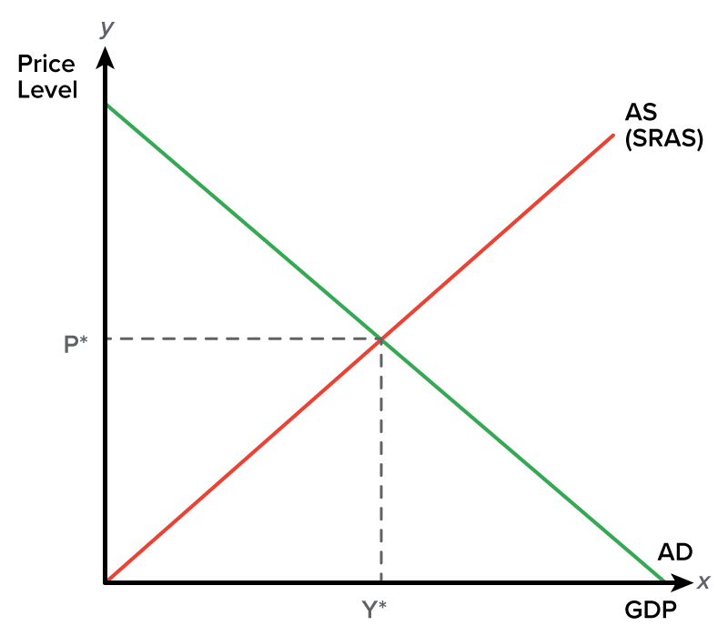
Here is our aggregate demand curve. Notice that it is a downward-sloping curve, which shows an inverse relationship between the two axes, price level, and real GDP.
 will want to purchase more as the overall price level falls.")
This indicates that people want to purchase more as the overall price level falls. So, as prices go down, people want to buy more.
However, it is important to note that when we say “people” want to purchase more, we are actually referring to different groups of people, which comprise the aggregate demand formula.

Now, in a different lesson, we cover the reasons people want to purchase more as the overall price level falls, but basically, it is because of three different effects—the wealth effect, interest rate effect, and exchange rate effect.
Short-run aggregate supply (SRAS), the other curve in this model, is assumed to maintain a positive correlation between price and quantity. More can be produced through increased resource utilization, technological improvements, or other factors.
For these reasons, the SRAS curve is, in fact, an upward-sloping curve. It represents the total amount produced at various price levels.
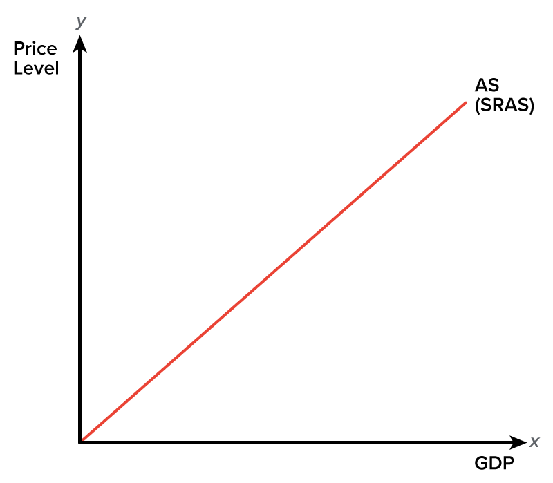
In the short run, if prices go up, businesses can take advantage of this and produce more. They will not have to necessarily pay their workers more immediately because, as prices go up, wages will not immediately adjust. In addition, businesses can use the inventories that they already have.
Therefore, this is why it is possible for aggregate supply to slope upward in the short run.
This lesson, though, is about equilibrium, so let’s shift our focus.
In the short run, the point where aggregate demand and SRAS intersect will give us equilibrium.
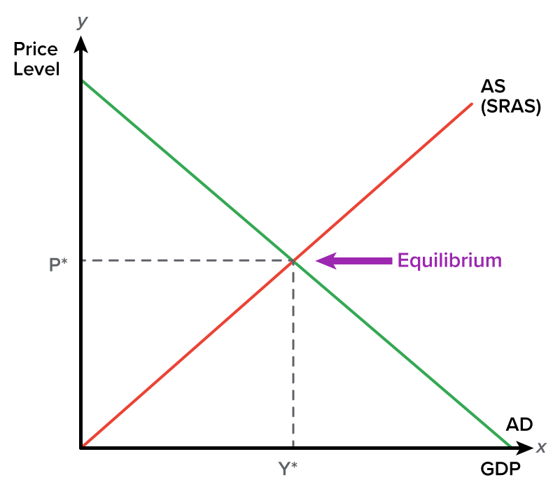
Y*—note that it is now on the x-axis—represents the equilibrium level of production or output, also known as real GDP. This is how much is currently being produced in the economy.
P* on the y-axis represents our current price level or the prevailing price level.
However, the other part of aggregate supply is the long-run aggregate supply (LRAS) curve. There is no positive relationship between the overall price level and quantity, or real GDP, in the long run.
LRAS is assumed to be constant in the long run because there are only so many resources that an economy has at a given point in time. Therefore, there is no potential to increase capacity unless more resources are found. For this reason, the LRAS curve is a vertical line.
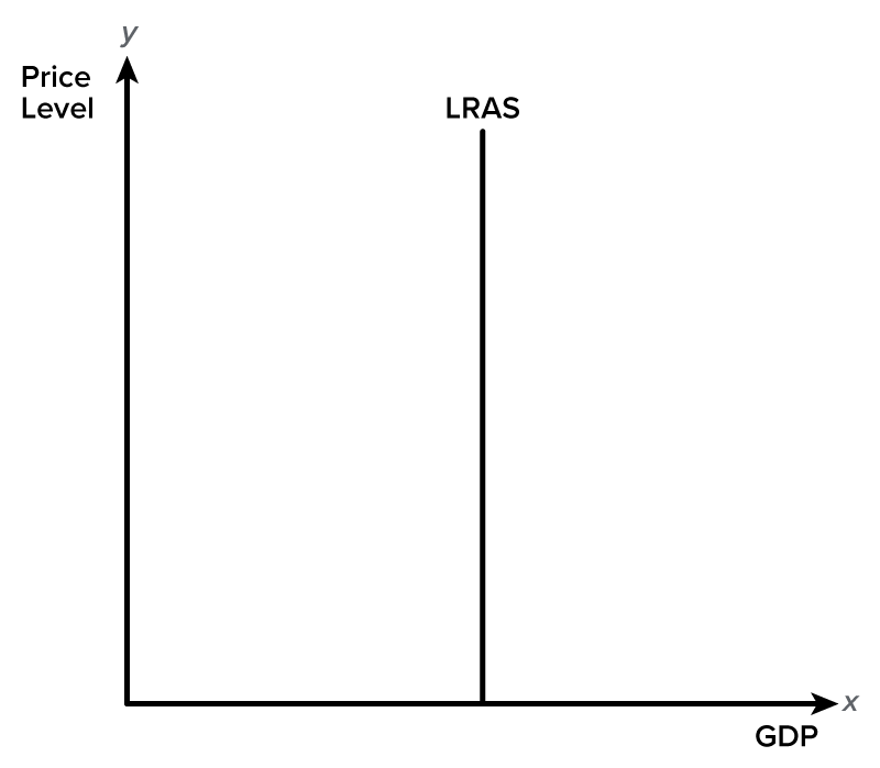
The LRAS curve represents our economy’s full potential; this is the quantity of GDP that we can produce if we are utilizing all of our current resources.
In the short run, we can ramp up our production, but this can really only get us so far. In the long run, we have a limited amount of resources, such as materials and workers.
Therefore, that vertical line represents the current potential for how much we can produce.
So, by combining all three of these things—aggregate demand, SRAS, and LRAS—we can see how our economy is doing at any given point in time.
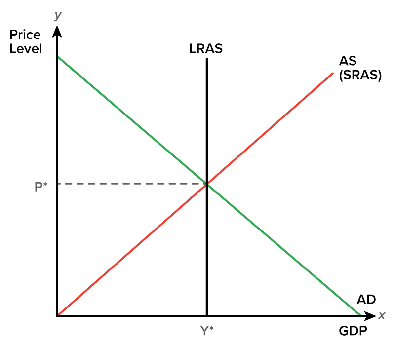
This graph shows that our economy is producing the level of GDP represented by our LRAS. If you look at Y*, you can see that we are producing where our LRAS curve intersects.
This means that our economy is fully employed; we are utilizing all of our land, labor, and capital and producing the maximum amount possible, given all of our current resources.
Generally speaking, though, this is not the case. Our economy is generally not producing the exact quantity of real GDP in the short run as represented by this LRAS curve.
So, what would it look like if we were actually producing at a real GDP less than the LRAS? Well, here is one example of what it could look like.
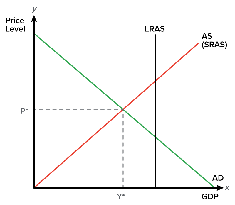
At Y*, you can see that we are producing, but our real GDP is less than our full potential.
This situation would generally occur during a recession. This means that the economy is not using all of its resources. It is not fully employed, so it is producing less than its full potential.
In turn, this means that resources are unemployed. Unemployment is measured as a percentage rate of the number of individuals who would like to work and are an active part of the labor force compared to the number of individuals who comprise the active labor force.
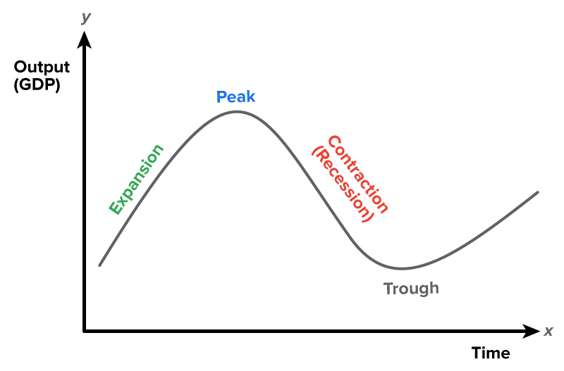
If we are in a recession, we could be nearing a trough, which is the business cycle period that coincides with the lowest GDP for a given point in time.
Remember, here is what a business cycle looks like according to the National Bureau of Economic Research (NBER):
IN CONTEXT
“A recession is a significant decline in economic activity spread across the economy, lasting more than a few months, normally visible in real GDP, real income, employment, industrial production, and wholesale-retail sales.”
A recession would occur in a period where our GDP is less than our full potential. If we are at a trough, we are at the bottom of the recession.
Since the economy is operating at less than full employment, some cyclical unemployment would exist. If this lasts a long time, expansionary fiscal and monetary policies can be put in place to try to raise the economy out of this recession.
Now, the opposite situation could also occur in the short run. This graph shows the economy currently producing a real GDP greater than the LRAS.
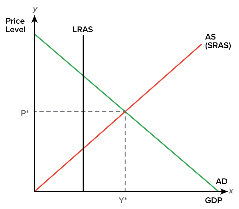
So, how can we be producing beyond our full potential? Well, this can happen during a period of expansion.
During a period of expansion, GDP grows at a rate faster than the overall time trend, as stated by the NBER:
IN CONTEXT
“Converse to a recession, if GDP is growing at a rate faster than the overall time trend, we are said to be in an expansion.”
An expansionary peak in the economy is possible only when producers are using resources faster than they are being replaced.
This would require a very low unemployment rate—less than 5%—which would be above full employment or lead to a situation of negative cyclical unemployment.
This is not sustainable in the long run, only in the short run. Hence, the economy will go back to the long-run equilibrium because we cannot sustain this type of production in the long run.
Therefore, a peak is defined as the business cycle period that coincides with the maximum attainable GDP for a given point in time.
Source: THIS TUTORIAL WAS AUTHORED BY KATE ESKRA FOR SOPHIA LEARNING. PLEASE SEE OUR TERMS OF USE.
