Table of Contents |
A dashboard is a visual display of the most important information needed to achieve one or more objectives, consolidated and arranged on a single screen so the information can be monitored. Dashboards are used in various fields, including business, healthcare, and education, to track performance, identify trends, and make data-driven decisions.
There are several key components of a dashboard, and they include:
| Dashboard Component | Description |
|---|---|
| Charts and graphs | Visual representations of data, such as bar charts, line graphs, and pie charts, help to quickly understand trends and patterns |
| Tables | Organized data in rows and columns, useful for detailed analysis |
| KPIs (Key Performance Indicators) | Metrics that reflect the performance of an organization or some aspect of it |
| Filters | Tools that allow users to customize the data displayed in the dashboard |
| Interactive elements | Features like drill-down and hover-over (tooltips) details that provide more in-depth information |
Drill-down allows users to click on a data point to view more detailed information. For example, clicking on a bar in a sales chart might reveal sales data broken down by product or region. It helps users explore data hierarchies and gain deeper insights without cluttering the main dashboard with too much information. Hover-over (or tooltips) displays additional information when the user hovers their mouse over a data point. This information can include data values, descriptions, or other relevant details. Hover-over elements provide context and additional insights without requiring clicks, keeping the dashboard clean and user-friendly. For example, in a profit margin chart, hovering over a data point might show the exact profit margin percentage and additional notes about that period.
Below is an example of a dashboard titled “Banking Loan Report” for a fictitious bank named MAD Banking, which provides a comprehensive overview of loan data. The key performance indicators (KPIs) are:

The type of dashboard you construct should be tailored to the specific needs and preferences of your audience. Here are some considerations based on different types of audiences:
| Dashboard Type | Audience | Focus | Features | Example |
|---|---|---|---|---|
| Executive | Senior management and executives | High-level metrics and KPIs that provide a quick overview of the organization’s performance | Summarized data, trend analysis, and KPIs with minimal detail | A dashboard showing overall sales performance, profit margins, and market share |
| Operational | Middle management and operational teams | Day-to-day operations and performance metrics | Detailed data, real-time updates, and alerts for immediate action | A dashboard tracking daily sales, inventory levels, and production efficiency |
| Analytical | Data analysts and business analysts | In-depth analysis and exploration of data | Interactive elements, drill-down capabilities, and complex visualizations | A dashboard analyzing customer behavior, sales trends, and market segmentation |
| Informational | General staff and stakeholders | Informing and educating about specific topics or projects | Clear and simple visualizations, explanatory text, and context | A dashboard presenting the progress of a marketing campaign or project milestones |
Sometimes the best way to determine how or why a dashboard has a poor design is to look at an example of a poorly designed dashboard. The dashboard below is designed to visualize different aspects of business data, such as sales, expenses, and profit.
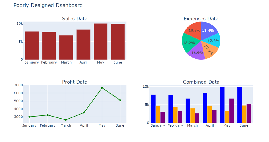
The list below provides you with several design flaws in this dashboard, such as:
Hopefully seeing a poorly designed dashboard has motivated you to learn about techniques that can be used to improve the design of the dashboard you saw in the last section. You are going to be introduced to simple yet effective dashboard design concepts in this section. In the next section, you will see the revised dashboard with several of these techniques applied for a better designed dashboard.
Below are several techniques to consider when designing a dashboard.
1. Understand Your Audience
Let’s return to our poorly designed dashboard and implement some of the design methods discussed in the previous section. Below is the redesigned dashboard.
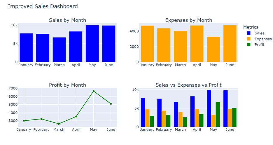
The following improvements have been made.
Consistent Colors: The same colors are used for the same type of data across all charts (e.g., blue for sales, orange for expenses, green for profit).
Appropriate Data-to-Visualization Pairing: Bar charts are used for categorical data (sales and expenses by month), and a line chart is used for time series data (profit by month).
Proper Annotation: Legends and titles are added to provide context and guidance for the audience.
Clear Hierarchy: If you want the user to focus on sales, then put sales in the top-left corner of the dashboard. Your audience will read and consume a dashboard in the same way they read a book. The audience will start in the upper left corner and scan to the right. In the poorly designed dashboard, the sales, expenses, and profit were all arranged in the same locations as in the redesigned dashboard. Now the layout is more strategic, meaning with all the design changes described above, the layout is organized to highlight key metrics and trends, making it easier to understand the most important information at one glance.
In addition, you could add tooltips and a filter for some interactive functionality. The dashboard below shows the same dashboard as above, but with some interaction added. You notice the drop-down functionality so that the user can select a certain month or months to focus on. The dashboard will update to only show the months selected. When the user toggles over a data element in the dashboard, a tooltip displays the exact value of that data element (bar, point, line, etc).
Source: THIS TUTORIAL WAS AUTHORED BY SOPHIA LEARNING. PLEASE SEE OUR TERMS OF USE.
