Table of Contents |
When the data is quantitative, dot plots are used exclusively when their values are close together and discrete. They can also be used for qualitative data.
IN CONTEXT
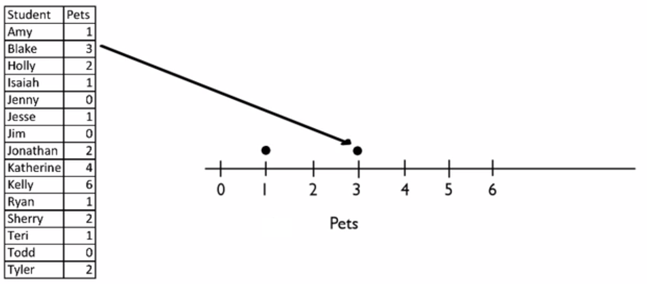
Suppose you gathered information on students and the number of pets they have, and you want to create a dot plot to visually organize the information.
Student Pets Amy 1 Blake 3 Holly 2 Isaiah 1 Jenny 0 Jesse 1 Jim 0 Jonathan 2 Katherine 4 Kelly 6 Ryan 1 Sherry 2 Teri 1 Todd 0 Tyler 2
You can create a dot plot by first drawing an x-axis. It could be vertical, or it could be horizontal; the one below is horizontal. Then, you scale your axis from the smallest number, which is 0, up to the highest number, which is 6. Include even the numbers that don't appear in the list, like 5. Label the axis as "pets."

Begin with the first number, which is for Amy. You can plot the number of pets she has by placing a dot above the 1. Next is Blake, who has three pets.

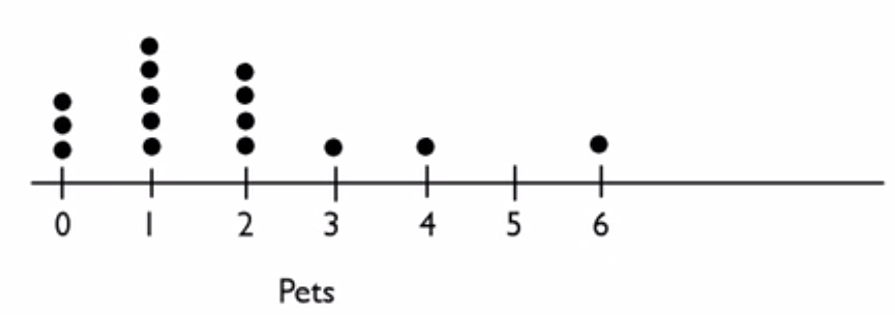
Continue throughout the table, noting that Holly has two pets and Isaiah has one, until you complete notating the dots all the way through Tyler with two pets.

Notice that you stack the dots when you get more than one value at a particular number. You can see that there is a gap from 4 to 6—no one has five pets. Most of the people have either zero, one, or two pets, but you need to keep the 5 in there to visually see the gap.
There are certain criteria to help signal when to use dot plots. When dealing with quantitative data, it is ideal when the data set is:

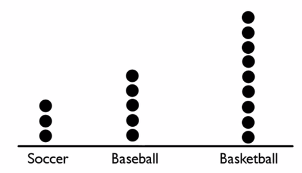
Notice how the dots are stacked when multiple students are indicating the same sport as their favorite. It was constructed by creating an x-axis with sports labeled across the bottom.
Source: THIS TUTORIAL WAS AUTHORED BY JONATHAN OSTERS FOR SOPHIA LEARNING. PLEASE SEE OUR TERMS OF USE.