Table of Contents |
A character is a member of the complete set of letters, numerals, punctuation, and symbols belonging to a typeface. A typeface is the name of a type family member, typically containing the name of the publisher, family, weight, posture, and width.

In the image above, the character “g” is shown in different weights, some appearing in a regular font weight. The characters on the bottom row are in bold.
Uppercase is a capital letterform. The name originally referred to the location of the wooden case which held the metal characters in a print shop.
Conversely, you have lowercase, which is an uncapitalized letterform. Again, the name originally referred to the location of the wooden case in a print shop.
With the early technological advancement of the printing press, movable type became widely used for letterpress printing. As the name implies, letterpress printing involved reusable letters that were arranged and then pressed onto paper to print.
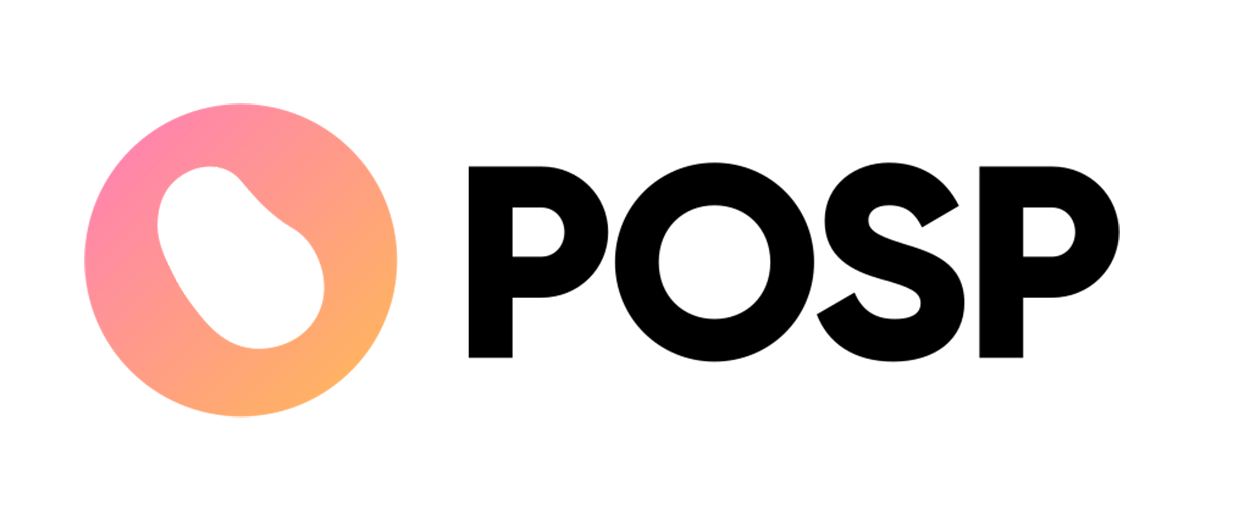
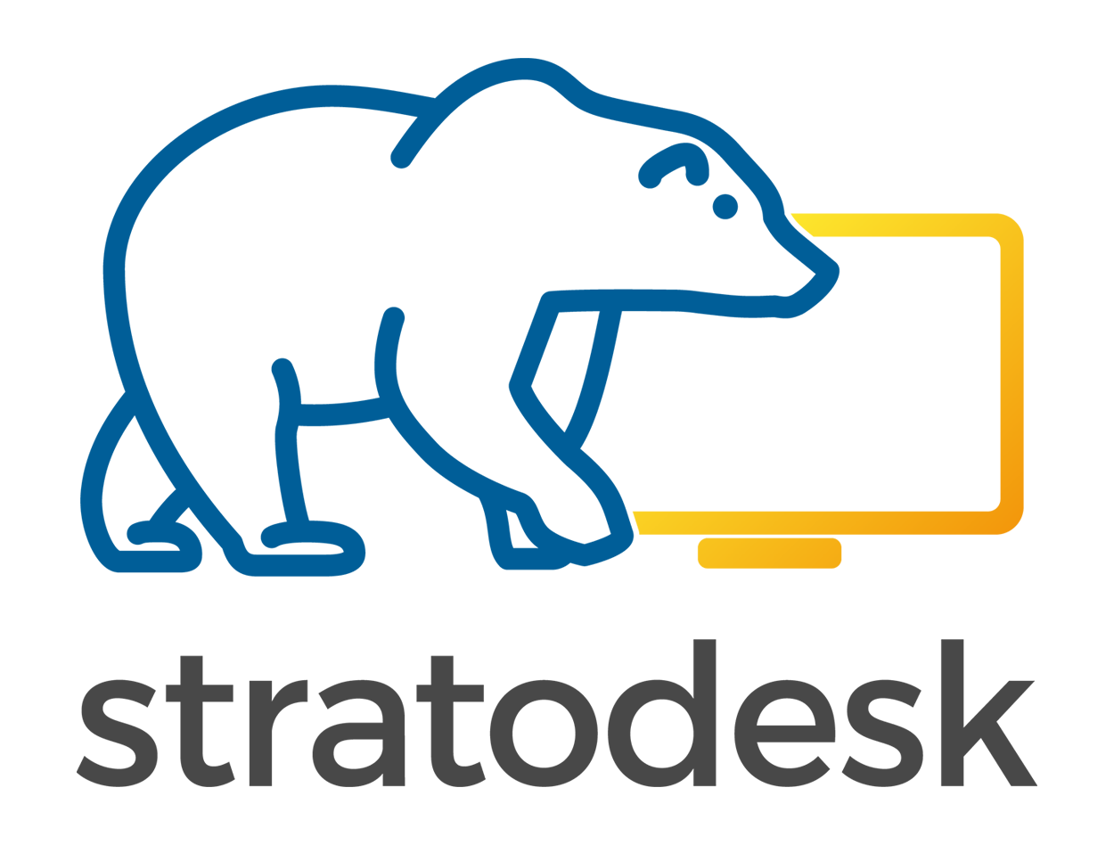
Below are a few examples of lowercase and uppercase letters in use. The POSP logo has all uppercase characters, while the Stratodesk logo uses only lowercase letterforms.
|
|
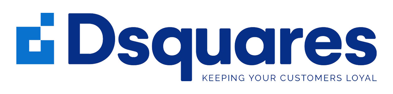
The Dsquares logo below uses both uppercase and lowercase letters in its design. The Dsquares portion of the design uses traditional capitalization, whereas the tagline is written in uppercase letters, a style known as all caps.
A type family is a complete group of typefaces available which share a common "family" name, and all weights, postures, and widths.
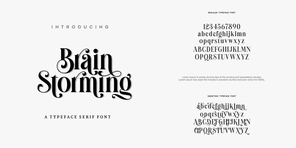
Below is an example of a custom typeface called Brain Storming. Notice how the font examples include uppercase and lowercase letters and numbers.
Widely available typefaces usually have a base typeface grouped with other related fonts. For instance, the Arial typeface has other fonts associated with it, such as Arial Narrow and Arial Black. As noted previously, typeface is the complete name of a type family member, typically containing the name of the publisher, family, weight, posture, and width.
A fully developed typeface should include uppercase and lowercase letters as well as numbers, punctuation, and special characters like hyphens and ampersand.
The majority of type families can be classified into serif and sans serif.
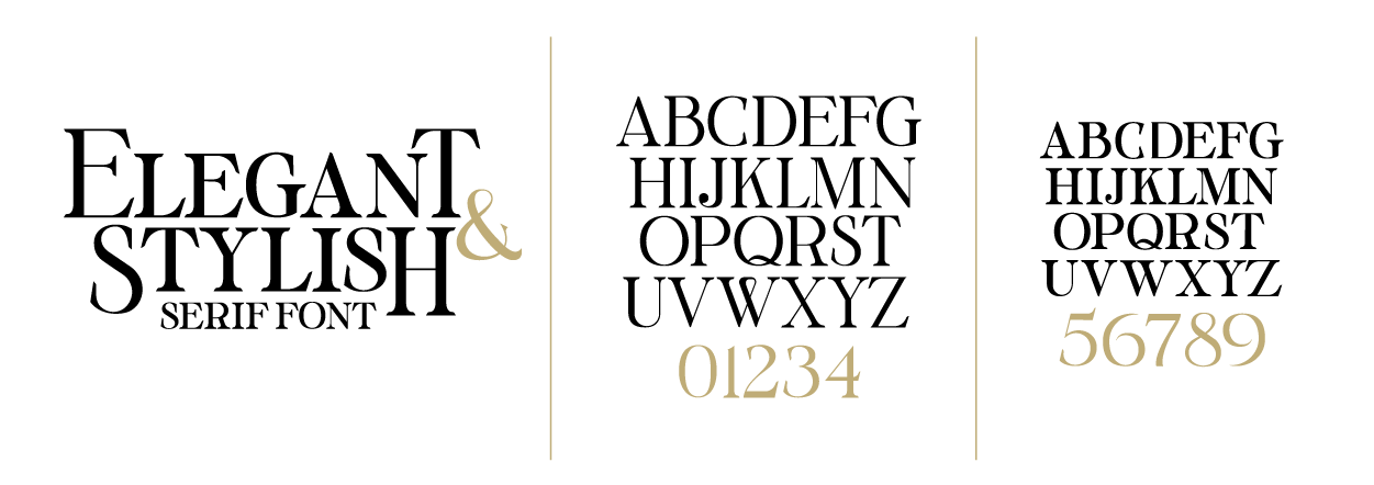
Serif is an ending cross stroke added to the stem of a letterform. Serif comes from the French word meaning "feet." Serif letterforms often have sharp angles at their tops as well, so design industry jargon sometimes defines serif fonts as having hooks and feet in exchange for the word’s literal definition. Serif fonts first came to use in ancient Rome. Roman masons used chisels to cut letters and numbers into stone. The hooks and feet of the letterforms resulted from the straight edges of the masons’ chisels. Serif fonts could be read in stone because the letterforms and the depth of the engravings allowed enough light and shadow to play on the surface to create contrast and make them legible.
Below is another example of a custom serif font. Pay attention to the hard lines on the tops and bottoms of the letterforms. These hooks and feet are indicative of a serif font.
The hooks and feet of serif fonts are visually beneficial when reading large amounts of printed text because they guide the reader’s eye. The hooks and feet suggest a sense of continuation from one letter to the next because they create lines that lead the reader, essentially linking letters, words, and sentences through a subtle method of continuation. The human brain responds well to reading serif fonts in print, but not on screens. Because people can read large amounts of text in print more comfortably with serif fonts, most newspapers, magazines, and books are printed with serif fonts.
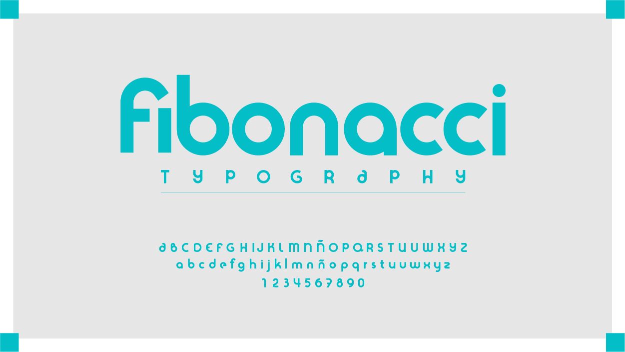
Sans serif is a category of typefaces which have no serifs. Sans serif comes from the French word meaning "without feet." Sans serif fonts were first popularized in the 1800s.
Below is an example of a sans serif typeface. Notice how the letterforms are smooth and rounded. Not all sans serif fonts will have such a round appearance. The easiest way to identify between a sans serif typeface and a serif typeface is to determine whether or not the letterforms have discernable hooks and feet. If there are no hard angles akin to chisel marks, then you’re likely dealing with sans serif type.
Sans serif fonts are easier to read and process on light displays. Sans serif fonts aren’t the best choice for print because the lack of hooks and feet on the characters makes the reader slow down to study the letterform longer and doesn’t suggest any continuation to link letters to words, longer sentences, and paragraphs. It is best practice to use serif typefaces for print publishing and sans serif for web design, video titles, mobile applications, and other designs intended for screens.
A glyph is a graphical font in comparison to a character, which is the minimal unit of writing and part of an alphabetical collection of letterforms. Remember that characters belong to a complete set of letters, numerals, punctuation, and symbols. A glyph can be a variant representation of a character, or the default representation depending on font and language selections. The word “glyph” is taken from Greek and translates to mean “carving.” It may help to remember glyphs from Egyptian hieroglyphs, an ancient pictorial form of written communication. Like hieroglyphs, glyphs often take the form of simple graphics. However, they are commonly used as alternate letterforms. Anyone familiar with different languages will be familiar with letterforms unique to specific written alphabets. We don’t have to look far for these glyphs. While comparisons to Chinese, Japanese, and Korean characters and Cyrillic and other eastern alphabets show a clear differentiation in letterforms, languages like Spanish and German have nuances to their written alphabets that are slightly different from English.
EXAMPLE
A bilingual author is translating his latest work from English to Spanish. Certain words require tildes (accent marks) over vowels to represent the correct pronunciation. The author’s word processing software allows him to add tildes by swapping the character with a glyph. The German alphabet has an Eszett, also called a scharfes S, or a sharp S. The letterform resembles the letter B, but represents the sound made by a double “s.” Because the Eszett represents the double “s” sound, German words with Eszetts are translated to English using “ss.” For example, the German city Gießen is pronounced Giessen and spelled accordingly when written in English. The ß is typed by using a glyph.
Source: THIS TUTORIAL WAS AUTHORED BY MARIO E. HERNANDEZ FOR SOPHIA LEARNING. PLEASE SEE OUR TERMS OF USE.