Table of Contents |
A character is a member of the complete set of letters, numerals, punctuation, and symbols belonging to a typeface.
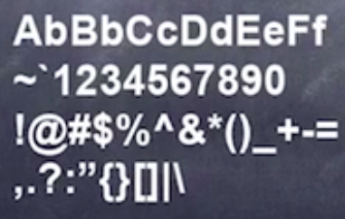
In the image above, you can see a set of letters, numbers, punctuation, and other symbols.
Upper case is a capital letterform. The name originally referred to the location of the wooden case which held the metal characters in a print shop.
Conversely, you have lower case, which is an uncapitalized letterform. Again, the name originally referred to the location of the wooden case in a print shop.
Back in the olden days, they used movable type for things like letterpress printing. As the name implies, letterpress printing involved reusable letters that were arranged and then pressed onto a paper to print.
In print shops, capital letters were stashed in the upper case, and lower case letters were kept in the lower case. That's how those names came about.
Below are a few examples of lower and upper case letters in use. The foursquare logo has all lower case letters, while the well-known Star Wars logo has all upper case letters.


A type family is a complete group of typefaces available which share a common "family" name, and all weights, postures, and widths.
Below is the Arial type family.
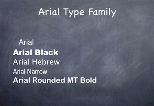
You can see the various typefaces that fall under the base Arial typeface. Typeface is the complete name of a type family member, typically containing the name of the publisher, family, weight, posture, and width.
Below you can see an example of the Arial typeface name classification, category, designers, and so on.
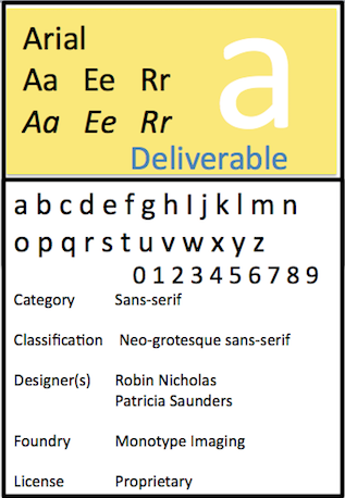
The majority of type families can be classified into serif and sans serif.
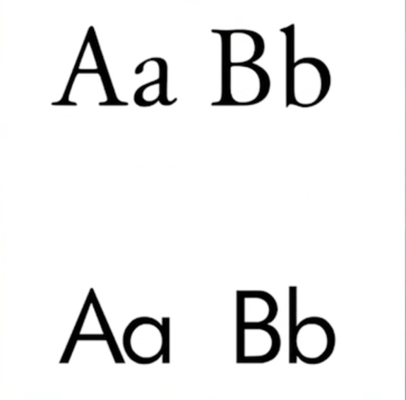
Serif is an ending cross stroke added to the stem of a letter or the category of typefaces containing only those with serifs. Serif comes from the French word meaning "feet."
Sans serif is a category of typefaces which have no serifs. Sans serif comes from the French word meaning "without feet."
In the following image, there is an example of serif on top and an example of sans serif below.
Below are a few examples of different types of serifs.
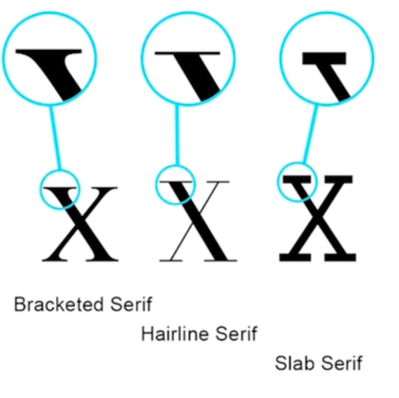
The bracketed serif has a nice smooth transition into the stem, while the hairline serif is extremely thin. Finally, the slab serif appears almost brick-like.
Source: SOURCE: THIS WORK IS ADAPTED FROM SOPHIA AUTHOR MARIO E. HERNANDEZ